
App Breakdown #43 · Alyx
The UI design of Alyx, the caffeine tracker
José would never download a coffee tracker on his own. Alyx turns out to be full of things to learn from, before he has even logged a drink.

Alyx is a coffee tracker, an app that, as José puts it, turns your coffee addiction into its recurring revenue. A few episodes ago he looked at a drink tracking app, Liquid Cats, so he has some idea of what to expect. And straight away, he’s surprised:
“Very nice animation. Let's try to see that again. Boom, with all the widgets blurring into view. Each widget is extremely colorful.” José
The button gets a nice little animation too, appearing and then shimmering:
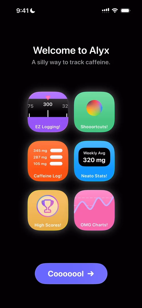
“Okay, I think we're in for a good one. We're in for a treat.” José
Even the widgets on the welcome screen react when you tap them 0:52, with little playful animations that don’t necessarily do anything useful.
An onboarding on top of the home
Then the app asks for your daily caffeine limit 1:05, and he has a guess at what’s coming:
“I think what's going to happen is we're going to have an onboarding sequence that's not too different from the ones we've seen in the past, but it's going to live on top of the home screen.” José, 1:08
The home sits blurred in the background, and he wants to get through the flow to see what’s behind it. He picks a few cups of coffee: he’s a coffee normie 1:38.
“Oh wow, exceptionally beautiful way to transition between pages.” José, 1:40
A few things jump out. The whole UI goes to the back, dissolving and disappearing 1:51, while the progress tracker at the top expands to make room for the next icon 1:58. And then the detail that, he thinks, makes the whole animation 2:06:
“Which is that this scrollable piece doesn't just come into view, it comes into view and it scrolls, so it actually shows you its affordance.” José, 2:09
“See, this, this is why I love to do the App Breakdown, because otherwise I would never download a coffee tracker, but in this way I'm learning a lot from it, and we haven't even started yet.” José, 2:22
A button that turns into Continue
He usually goes to bed at around 10:30, so he taps “Lights Out, Baby” 2:37.
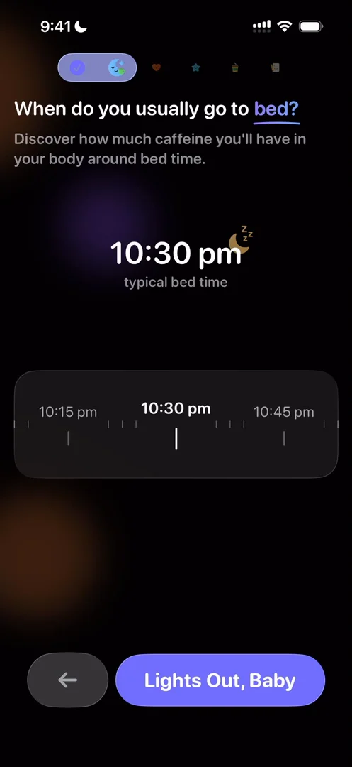
“So the entire UI goes out, but the CTAs actually are kept at the bottom and simply transform. You see the animation of the text transforming from Lights Out, Baby to Continue.” José, 2:42
Next comes an animation to connect to Apple Health:
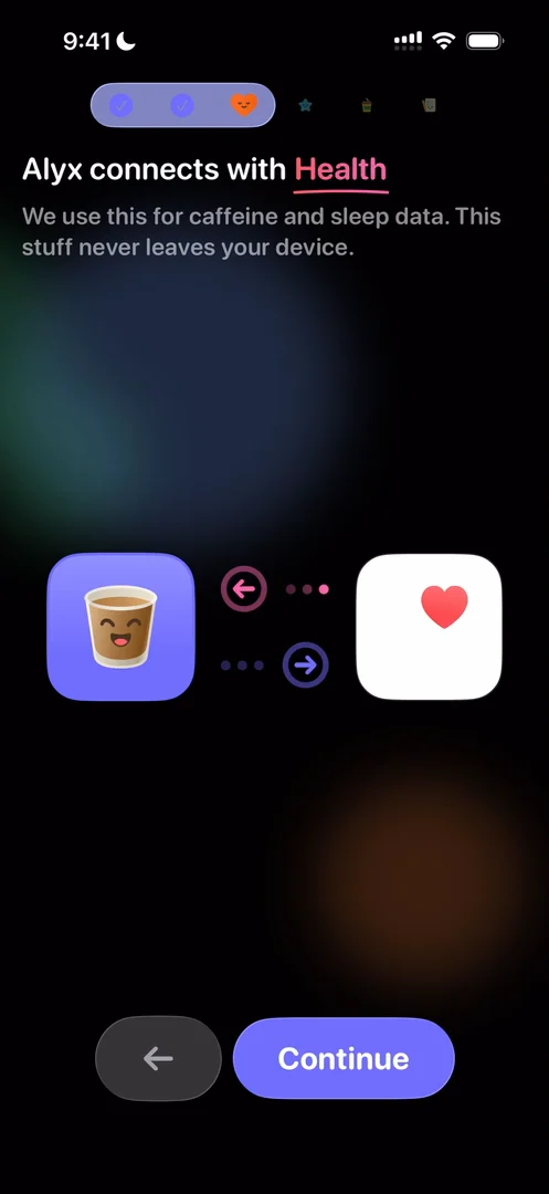
“Connect to Apple Health. Okay, very cool, because it has the arrows and it's pulsing.” José, 3:00
He tries to drag the two into one another, which would have been a cool gimmick. And the word Health at the top has a moving gradient, shimmering instead of sitting still 3:10. He doesn’t allow it, though, because he doesn’t like connecting his health data to most apps 3:18.
Themes in the onboarding
The onboarding also lets you pick a theme 3:26. There’s Classic, then Cupercinno, a play on Cupertino and Cappuccino, he thinks 3:30, then Blonde Latté and Matcha++.
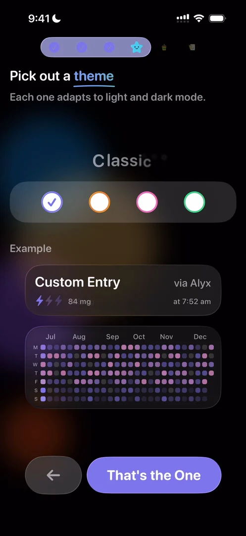
“Okay, I actually really like the classic one.” José, 3:40
He calls the interactions very cool, too. Then the app promotes its Siri shortcuts, which he wouldn’t have thought of putting first; he doesn’t use Siri, so it isn’t useful to him.
Health, the hard way
Later, Alyx won’t let him add a drink without Apple Health, though he loves the little heart exploding at the top, with its haptic. Connecting turns out to be the hard part:
“I just spent like five minutes off camera trying to connect my health data and the regular user would simply churn.” José
“Please explain it better for your own retention sake and conversion sake and for the users.” José
It’s useful to him, too: whenever he designs something that connects to Apple Health, he knows he needs a much better fallback than this.
Adding a drink
The plus opens a panel for adding your caffeine:
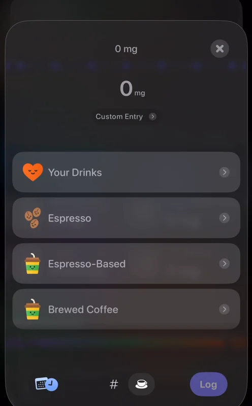
“I really like these liquid glass animations, just like popovers appearing from buttons.” José
They move a bit too much for his liking, though 7:40. It’s not extremely clear where to tap 7:58, and he thinks Liquid Cats does a much better job here 8:02. For some reason, the flow goes forward, then backwards, then logs.
On Liquid Cats, which he praised for this, you add a drink by opening the app and tapping the amount. On Alyx, you tap the plus, pick from options that don’t really look like buttons, scroll if your drink isn’t there, go forward, and press a tiny Log button.
“It's actually a great comparison to just think outside the box. Sometimes you're designing a flow and you're trying to optimize like little things about the flow you're doing when the best thing is to just break the entire flow and do it in a completely different way.” José
A keypad that lights up
Tap a drink in today’s log, and you can edit it 10:52:
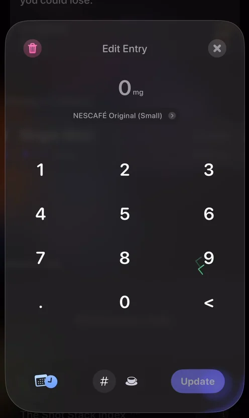
“Oh, that's such a cool little detail.” José, 10:57
“Notice the light on the liquid glass panel and the numbers coming up when I tap on them.” José, 11:03
It does it on delete, too:
“I don't think I've ever seen this keypad. Very nice tiny detail that does not take away from the main experience at all, but just adds that little flair.” José
One creator
At the bottom of the More menu, he finds the person who made the app, and learns it’s a single-creator app:
“So shout out to Jordan Morgan.” José, 13:05
“Very cool that when you do your own app, when it's just you and you're putting your craft into it, that you showcase yourself on the app.” José, 13:08
“I'm all for this. I love knowing who does things and why they do it.” José
The verdict
Among the cool things he saw: the gorgeous transitions in the onboarding, with the app’s home blurred in the background, and all the little details in them; and the keypad, with its tiny animations and glows.
“Like, this is just playful. I really love it.” José
And all of it was done by a single creator.
 1 of 2
Two design challenges from this episode
Learn design from the apps you love
Practice UI design every day with 300+ briefs from apps like Alyx. Finish one and its card is yours.


