
App Breakdown #94 · ElevenLabs
The UI design of ElevenLabs, the $22 billion AI voice app
ElevenLabs is worth 22 billion dollars and has some of the best AI voice models in the world. José has used it a lot through the API, but never its iOS app.

ElevenLabs is worth 22 billion dollars, and it has some of the best AI voice models in the world. José has used it a lot, but only through the API: he has never opened the app itself, so this breakdown is a first for him.
Not only for consumers
The sign-in screen has the usual Apple, Google and email buttons, and one more:
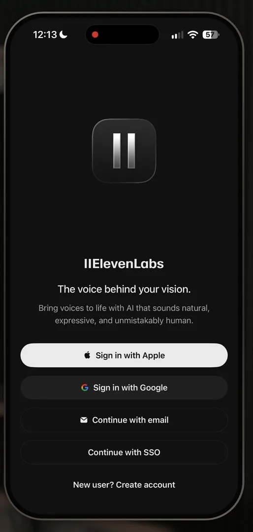
“connect with SSO, which tells us that this is used by companies with strict security policies” José, 0:42
So it’s not only a consumer product, it’s also an enterprise product.
Permission first
Right after signing up, the app asks for notifications. José has said this a few times:
“asking for notification access as the first thing in your app can be a very good thing” José
“Usually, users just want to get through whatever you put in front of them and so they will mindlessly click yes” José, 1:17
He calls it a shady technique that a lot of apps use, but a good way to get good conversion rates on the notification prompt without basically any work.
Forward is not the same as back
The onboarding questions have a little polish to them 1:56:
“notice how when I go forward, the elements come from the right and they come in a sequence and it doesn’t seem like a new page” José, 2:00
“But when I go back, it becomes very apparent that it is a new page so they kind of break the effect on the going back model.” José, 2:09
Not that it really matters, he says. It’s just polish, the tiny things.
Text to speech
Text to speech has a pattern of its own. A bubble at the top points to the pronunciation dictionary, which sits in a More menu 13:57:
“So I wonder why they did a more menu with just one item inside of it.” José, 14:02
Maybe other flows put more in it, for consistency. It turns out they do: the screen you land on after generating has a More menu with a few more things in it 19:52.
“And so now it makes sense why the pronunciation dictionary was inside a button on the previous view.” José, 19:58
The rest of the screen passes his squint test:
“if you do the squint test it is very clear where the options are it’s very clear where you’re gonna type or speak” José, 14:22
A glowing orb sits beside the Generate button. Tap it to dictate, tap it again to stop 14:30.
Voices you can see
Voice selection matters a lot in an app whose voices are its strength: it just sounds human 14:52. Show more opens a long list, and almost any voice you could want is in it 15:00.
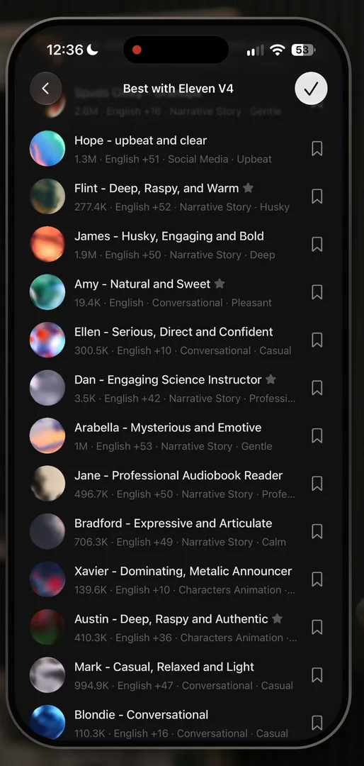
“what is also super interesting is the way they try to represent voices with these little orbs” José, 15:13
Each orb tries to show how its voice sounds, happy, sad or deep, which he finds exceptionally hard to do, and they made it look very cool 15:21. He isn’t sure how useful it is at first, so he tests it: the orb with a dark background turns out to be an extremely deep grandpa voice 15:42.
“So these orbs are not only beautiful, they are very useful to tell you the kind of voice you’re describing without having to go and listen to all of them.” José, 15:51
“Because skimming through a list of voices with your eyes takes like two seconds, but listening to all of them for two seconds will take you much, much longer.” José, 16:02
Two speakers and a little confusion
You can add a second speaker and turn the script into a dialogue 16:16. But picking the voices trips him up:
“Notice how before I thought I was keeping the grandpa voice. So that means the flow is not very clear on whether you’re canceling or continuing and what your selected voice is.” José, 16:30
Then Enhance 16:47. It seems to add tones to each line, based on his words alone:
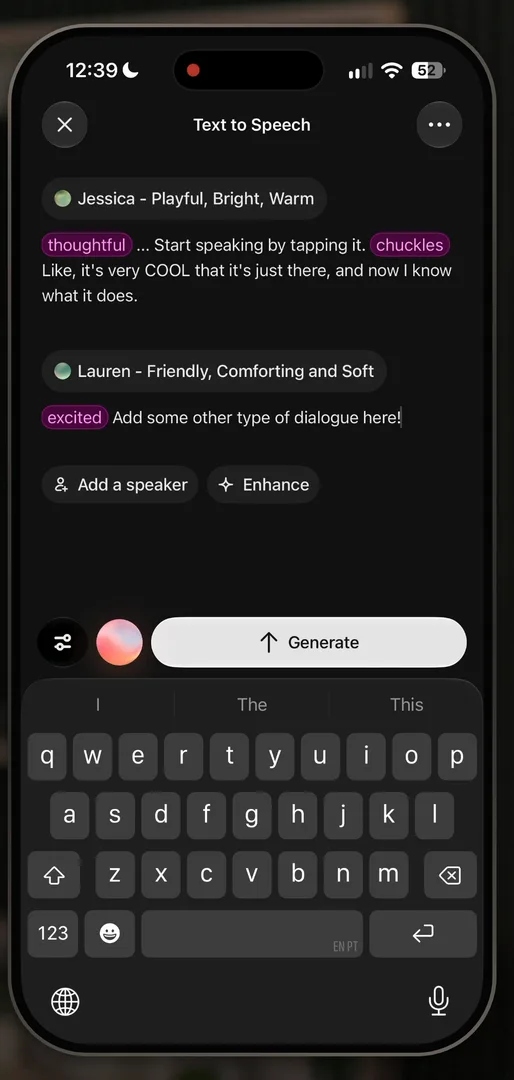
“It’s going to be a thoughtful one with chuckles and an excited one. And that’s pretty cool, actually.” José
He tries to add a tag like that himself, by tapping it and by typing a slash, and neither works 17:39:
“I don’t really know how to do these things to enhance my speech but they did it by themselves” José, 17:43
A player he didn’t expect
Generating ends on a mini player, two of them in fact, a V1 and a V2 you can swipe between:
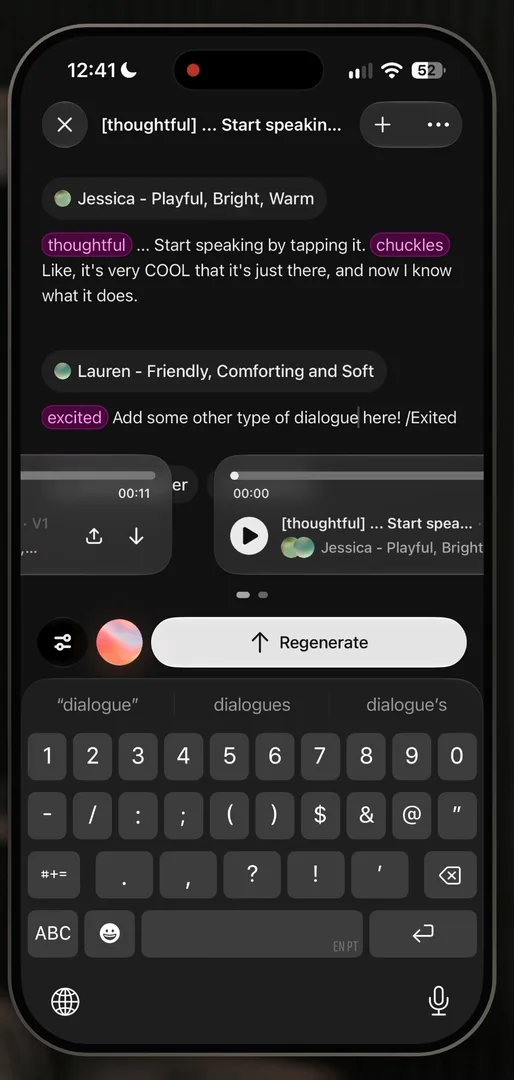
“we got this like mini player out of it which is very cool because I didn’t expect to have a mini player” José, 18:02
Then he listens.
“The quality of their output is just insane.” José, 18:34
One tiny thing in the player:
“it’s pretty awkward that the generate button is on the right side and then the play button is on the left side. So you have to move your thumb quite a bit between the two.” José, 18:47
The download button first shows the paywall, even though saving turns out to work without paying. José guesses it may be a dark pattern, to make you think you have to convert to save, and if it is, he kind of respects it: it’s a smart one.
A script that reads like a screenplay
José is a big fan of the finished script. He even takes a screenshot of it to keep:
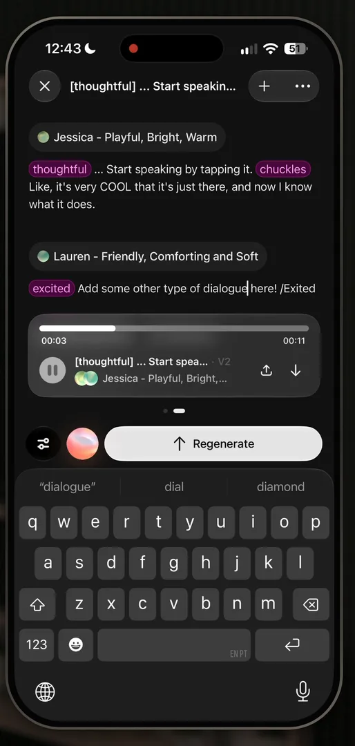
“Now I do really love this view to be honest.” José, 20:05
A lot of text, and quite complex under the hood, but they make it very, very easy to read 20:13.
“it almost looks like you’re reading a screenplay with a player at the bottom” José
One pattern for every tool
The image and video tools share the same style of UI, so learning one teaches you both, and the voice changer has a very similar type of UX at the bottom: they really built something that’s very reusable. Which brings him back to the line he opened the episode with:
“if you’re a designer in 2026 and you know how to design the perfect input bar there’s an unlimited amount of companies that are willing to throw money at you” José
“Focus on the prompt bar for 2026, but know that in 2027 or 2028 it might be gone. So don’t hinge your career on it.” José
Your voices and your generations
The second tab, Creator, holds your own voices, where you can even clone your own, and your generations.
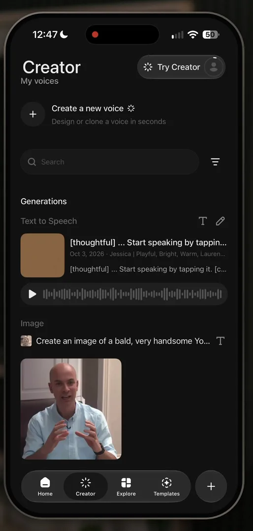
“I can clone my own voice, which is pretty cool.” José
A voice that hatches
Making a new voice ends on the voice alone, full screen, which reminds him of waiting for his Pokémon to hatch or evolve.
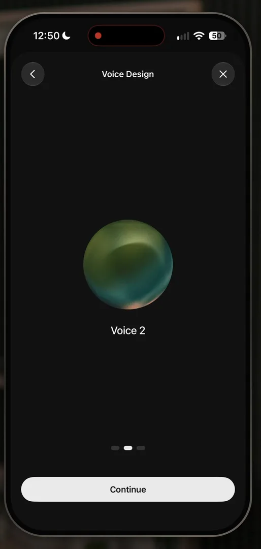
“I love that these days you can just generate stuff like this in seconds.” José, 23:44
There are three variations to pick from 23:50, and the one he picks moves to the centre and lifts with the keyboard as you name it: a very cool, very smooth shared element transition.
Back in Creator, your voices sit in a row at the top:
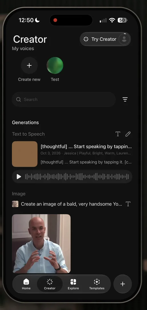
“they kind of used like the Insta Stories type of design up top for multiple voices” José
“Like it’s a bad design if you only have one voice. It’s a great design if people have multiple voices or you want to incentivize them to have multiple voices.” José
Explore leads back to creating
Explore, the third tab, is where he expects to see what other people make: mostly videos and photos, with few voices. Tap one, a running image, and it opens with its prompt, which you can copy 25:29.
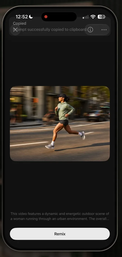
“And more importantly, the CTA is to remix. So again, exploration is nothing but a content funnel into creation.” José
Remix, though, opens his own last image creation, with the bald YouTuber still in it, which seems a bit weird to him. Going back, the dismiss is one of the standard iOS transitions he loves:
“I love these types of standard iOS transitions they’re just very clean” José
Every app is competing with Excel
The fourth tab, Templates, is a vehicle to creation too, but curated by the ElevenLabs team, so you can think of it as an App Store 26:24.
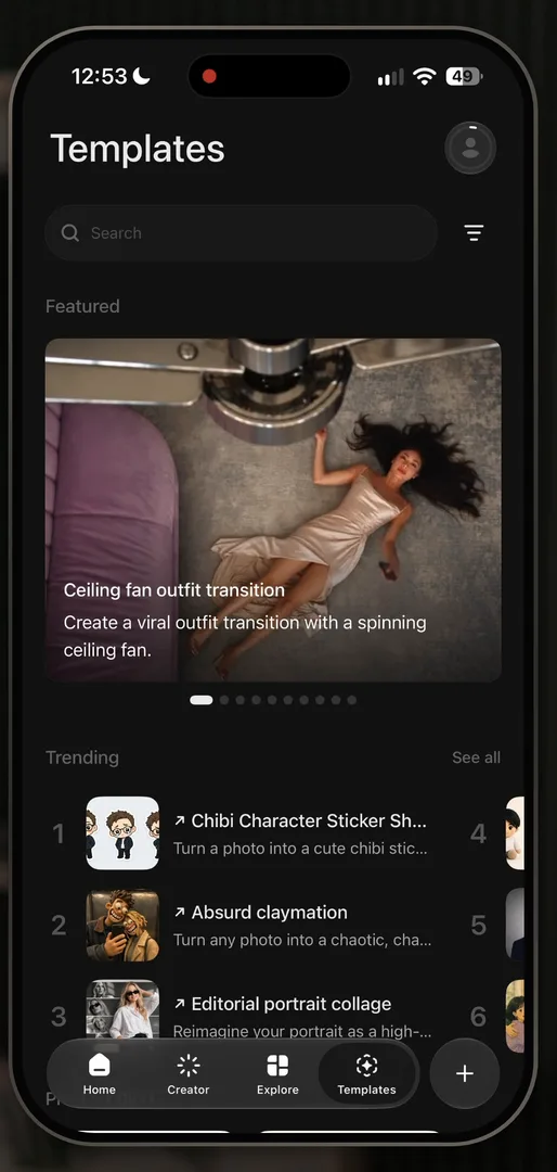
“app store is just a spreadsheet that shows you things you should be paying attention to” José, 26:39
“At the end of the day, every app is competing with Excel.” José, 26:49
There’s a featured module with a hero image, a trending list taken from App Store Music, and carousels:
“it seems like there’s only three different ways to show content, which is great. It’s consistent.” José, 27:00
A first session
That’s all four tabs, and the most common flows you’d see in a first session. For José, it was also his first time in the app after using ElevenLabs a lot through the API.
Design challenges from the App Breakdown
Learn design from the apps you love
Practice UI design every day with 300+ briefs from apps like Vocabulary, Brink and ATC. Finish one and its card is yours.
More App Breakdowns
 App Breakdown #93 · Box Box ClubBox Box Club’s UI design: the unofficial F1 app that sells with widgets
 App Breakdown #92 · PoseKitPoseKit’s UI design: 3D mockups on your phone, with controls you can feel
 App Breakdown #91 · One YearOne Year’s UI design: a daily journal drawn by hand, down to the camera