
App Breakdown #91 · One Year
One Year’s UI design: a daily journal drawn by hand, down to the camera
José opens One Year, a daily journal made by a fellow designer, for the first time. Nearly everything in it is drawn by hand, from the battery to the camera.

One Year is a daily journal made by a fellow designer, and José had never used it before this episode. It still felt familiar:
“I've never used this app, but I feel like I have seen it 10,000 times because one of the founders called Sam is constantly posting it” José
He has taken inspiration from those posts for his own apps, and wanted to see what’s beyond them.
Drawn down to the status bar
The first screen sets the tone: neon purple on near-black.
“I love this color scheme. It's kind of weird. It's almost like I'm in a neon room, but very interesting.” José
Even the system’s corner of the screen is redrawn:
“up top, we have the percentage battery and the time also done in this like hand drawn way.” José, 1:08
“They make this app feel much more immersive because now they're part of the app, not the OS.” José, 1:18
A note from the founders
Under a drawn flower, a counter of the memories planted so far is a form of social validation 1:35, and below it is a short message from the founders, signed Sam and Alec 1:25.
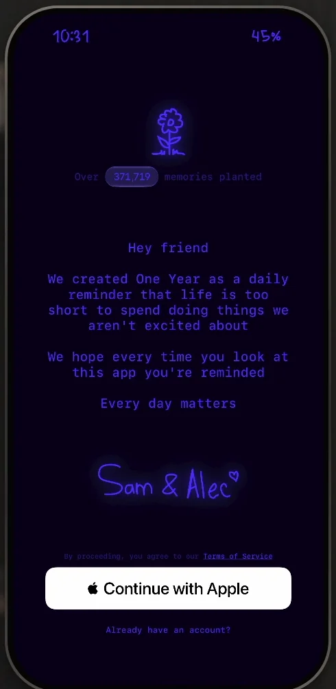
“I love it when indie apps do the sort of message from the founders” José, 1:42
Most people using apps, he admits, probably don’t care about it. But:
“But if you're a crafter, if you're someone who likes to make things, you respect the work of others and you want them to basically feel seen.” José
Hand-drawn icons, in glass
Writing the first memory brings up the keyboard, with buttons above it for a picture and the camera. Their icons are drawn by hand too, which José thinks is super cool. Their buttons are another matter:
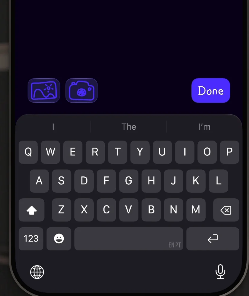
“one thing that breaks a bit the illusion of the buttons is the fact that they chose to do them in liquid glass” José, 3:32
“and so liquid glass is of course very perfect and not hand-drawn at all” José
It reminds him of grug, which he broke down a few episodes earlier: it had no glass around its buttons, so it felt truly hand-drawn 3:47. One Year, he says, is sort of an in-between.
A mood, picked from flowers
Adding a mood opens a bottom sheet with a single flower and a row of colours.
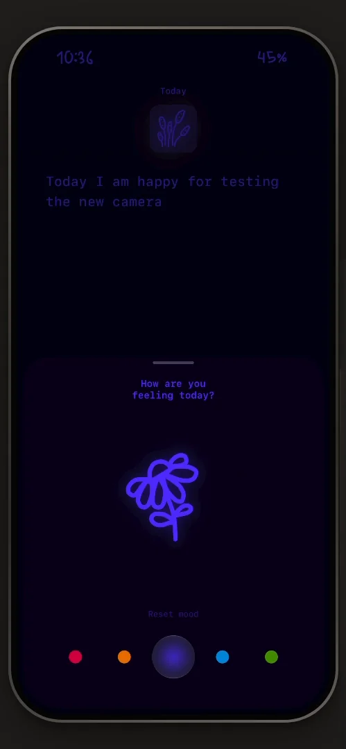
“Oh my God, this is so cool.” José
It reminds him of How We Feel, an app for describing your feelings that he has also broken down on the channel. You set the mood with little hand-drawn flowers 5:05. He picks a blue one for a good day, and back in the entry, the flower at the top turns blue.
A camera like no other
Adding a photo opens the app’s own picker rather than the standard iOS one, which José notes is what he and most apps go for. It shows how many images you can still add, a Done button, and a separator he loves for the personality it gives the app. Photos turn around as they land in the entry.
Then the camera, which he calls one of the most original he has ever seen: fully hand-drawn, the bounding box and everything. In settings, it goes by the Doodle Camera.
Privacy, in passing
Planting the memory brings up a short sheet about privacy, then lets you get on with it.
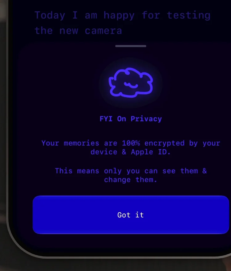
“So this is actually the first time I think that I've seen this type of privacy concern type of bottom sheet” José, 7:32
Apps that aren’t private don’t tell you anything, he says, and the ones that are tend to shove it down your throat during onboarding:
“Reality is most people don't care.” José, 7:25
“but it's a beautiful way to put it because it didn't break the product flow at all of me planting my first memory” José
A font, and reviews that drift by
The garden’s theme comes in a context menu, which José doesn’t think is the right pattern for it, and the journal’s font in another.
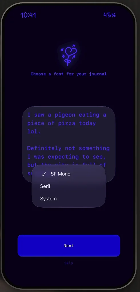
“I'm gonna go with SF Mono, of course, it's the best one out of these” José
Then a screen of reviews that come up one by one around the number of reviews in the middle:
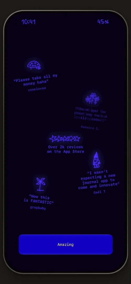
“Now we have perhaps what is the most original, like, social validation screen I've ever seen” José
“It really doesn't feel like a social validation screen, which is the whole point” José
Your memories, yours to take
Settings has a row to export all your memories, and José finds it very interesting:
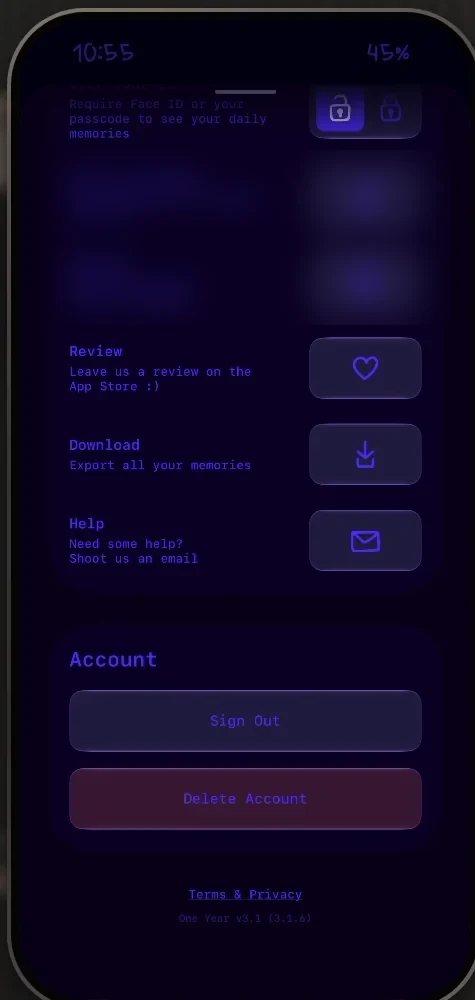
“So a lot of these journaling apps basically you put things into them and then they're locked there forever with no way of really taking them out.” José, 16:28
“They facilitate that, so it's a pretty cool feature.” José, 16:36
Sign Out and Delete Account sit at the bottom:
“I love how muted the buttons are.” José, 16:41
Deleting the account asks for only one confirmation, and the buttons really do look deactivated.
A clock for landscape
Settings also has a section called Doodle Clock 17:17. Turn the iPhone on its side, and the app becomes a clock 17:28:
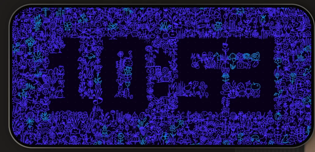
“Oh, okay, I'm so glad I did this movement. This is so nice.” José, 17:32
“And this clock just goes to show, yet again, basically how many delightful things you can put into the app without even talking about them.” José, 17:43
“Like, they're masters at this.” José
“I feel like I could do a whole video about the clock itself, honestly.” José
Littered with delightful moments
Going through settings near the end, José sums up what he has seen so far:
“I feel like this app is just littered with delightful moments. There's so much to learn here.” José
Design challenges from the App Breakdown
Learn design from the apps you love
Practice UI design every day with 300+ briefs from apps like Vocabulary, Brink and ATC. Finish one and its card is yours.


