
App Breakdown #92 · PoseKit
PoseKit’s UI design: 3D mockups on your phone, with controls you can feel
José makes a lot of mockups. PoseKit puts your screenshot on a 3D iPhone in seconds, and he spends the episode smiling at its controls.

PoseKit puts your app’s screenshots on a 3D phone and turns them into mockups, stills or short videos, all on the iPhone 0:17.
“If you’re an app designer, you know just how much of a pain in the ass doing mockups can be.” José, 0:35
Its solo founder had been posting amazing mockups on Twitter, and José had already tried the TestFlight build before recording, so he knew what was coming 0:45.
From a video into the app
The first screen is a video of a mockup, with a short line: studio mockups, on your iPhone. Tap Try it and the video turns into the app’s own interface.
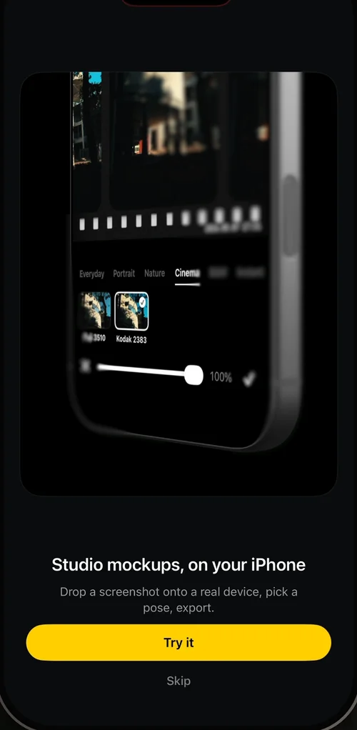
“So notice how it was clearly a video that was playing and then the video transitioned into an actual piece of UI that is pretty hard to do but also pretty simple at the same time and so I love when different apps do it.” José
A mockup in a few taps
Setting the scene is a row of backgrounds under the phone: all black, which is what José uses for most of his mockups, a teal gradient, a metallic one, and white with waves.
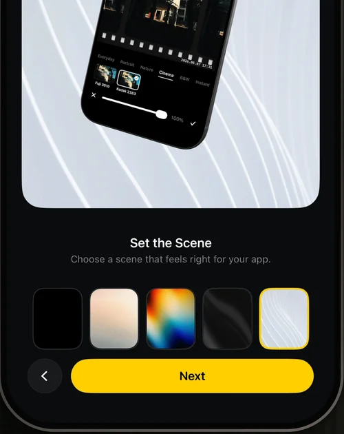
“What’s funny is it immediately looks so good as a mock-up like it was this easy no fiddling around with apps, no fiddling around on Figma.” José
Then a lens blur, which is very noticeable along the sides, and a switch that gives the mockup a slow camera move:
“Okay so we can turn it into a video instantly. Okay I love this.” José
Tap Done and the mockup stays in the middle of the screen while it moves up a bit and the editor fades in around it:
“So it was a shared element transition and then everything else just kind of faded into place and it was just very beautiful.” José
Before he knows what the buttons do, José likes how the editor’s weight is spread across the screen. It’s extremely clean, he says.
A gallery that already knows what you want
Adding a screenshot opens the photo library already filtered to screenshots, since that’s what most people put in a mockup. It’s a pro tip he gives to any app with a photo input:
“If you have a slow motion editing app, please just show people the things that are shot in slow motion on their gallery.” José, 5:57
“Whenever you put a gallery input, you can actually tailor what’s inside of it to give better results to the user, to just make it easier to use.” José
A share menu for people who make mockups
Share opens a small menu: export the whole video as MP4, or just the frame you’re on as PNG or JPEG at 1x, 2x or 3x. If one frame of your video looks better than the rest, you can export just that one.
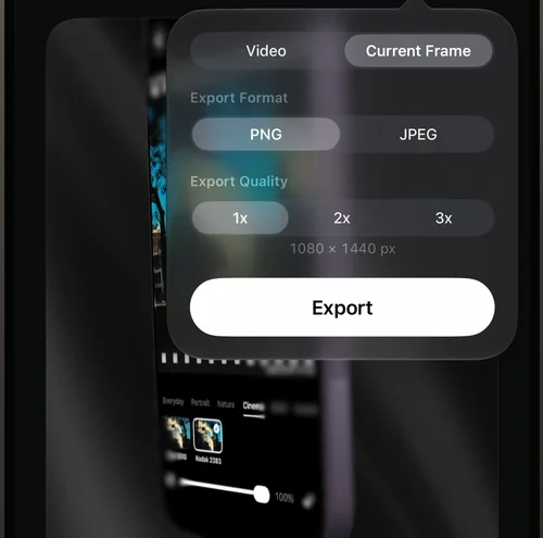
“Honestly, if you do mock-ups regularly yourself, you know how much time this tiny menu saves.” José
“And so I can tell that the person who’s making this actually uses their product and knows what they’re doing because this is very thoughtful design and very designed for a specific use case.” José
The founder’s other apps
Settings is fairly standard. At the bottom, it lists the developer’s other apps.
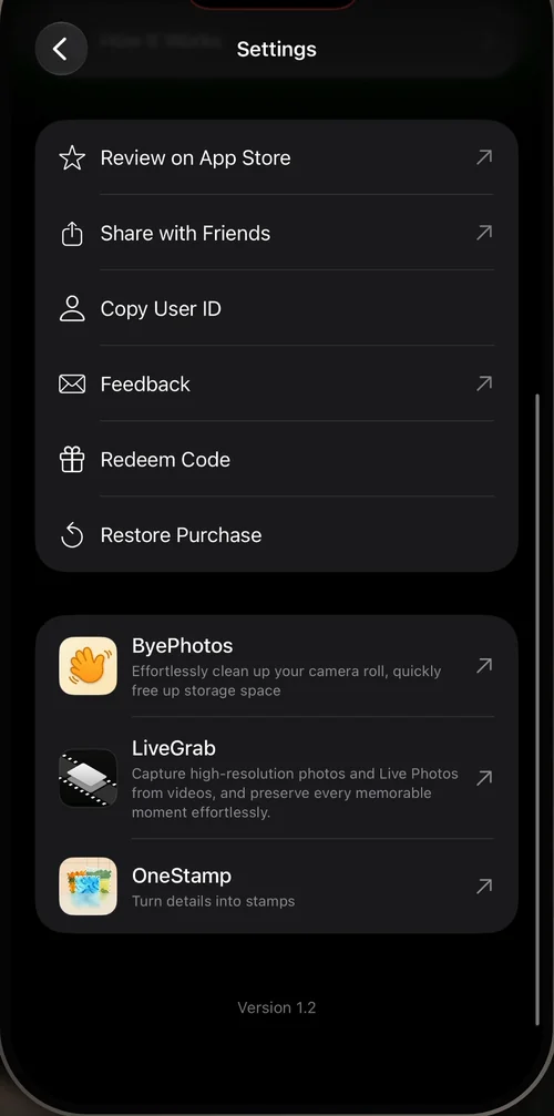
“I love it when the creator of an app, especially when it’s indie developers, indie designers, just showcases all of their products inside of the app store.” José, 7:59
And knowing how good this one is, he says he’ll very likely download one of the others.
Panels that open from their buttons
The editor’s tools sit in a row of square buttons at the bottom. Tap one and its panel grows out of the button you tapped, and a small bar along its bottom shows the other tools and which one you’re on. You can jump from panel to panel from there, without closing one and opening the next.
“When you’re editing something you’re likely going to be editing multiple facets of it so you want to switch fast between menus and this allows you to do just that.” José
The first panel turns the phone: sliders for X, Y and Z rotation, with little haptics as you drag them. Next to them, a move pad, and a zoom slider 9:16.
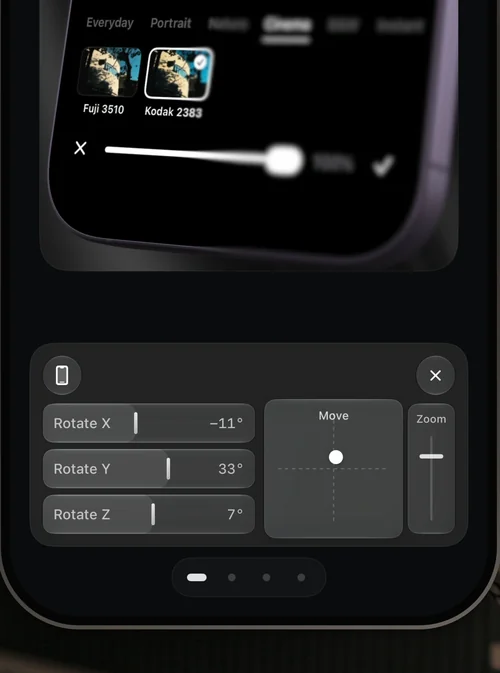
“I feel like I have tons of control and I can control what is a 3D scene with just my thumb from down here so that’s just amazing” José, 9:29
He says he doesn’t have much 3D experience, so don’t take his word for it, but:
“This is like actually easier to use than most other 3D softwares out there in the world.” José
Saving a pose in one tap
The second panel holds poses. Tap one and the phone glides into it with a nice easing curve. Change the angle, and the empty slot at the start of the row turns with it; tap save, and it’s a new pose in the list.
“This is once again the kind of flow that on other apps and other softwares takes like going somewhere, hitting save, saving to a folder, doing whatever and in this case it’s literally moving things around and hitting one button.” José, 10:31
An App Store screenshot preset
The same panel has a tab for the frame’s aspect ratio. Next to 3:4, 9:16, 4:5 and the rest, there’s one with the App Store’s icon.
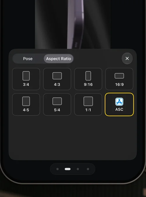
“Okay there’s an app store screenshot preset. So if you want to do your apps or screenshots using this app, you can do it super easily.” José
“I didn’t even know this was here. It’s just like such a good surprise.” José
Controls that feel physical
Turn the lens blur on and off, and its sliders slide in and out while the numbers roll:
“It doesn’t feel digital because things move with purpose and like they would in the real world.” José
You can place the blur on the phone, set how wide it is and how strong, and change its angle with a small dial:
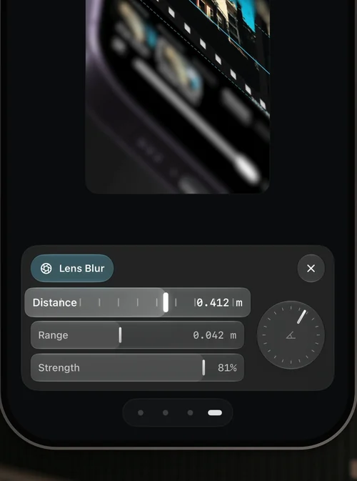
“Not only that but we can also change the angle and once again I love this little dial like all of the controls on this app are just so cool.” José
The way the panels open and close is the animation he’d study:
“This is one of those cool animations that you should actually download the app, screen record, and play frame by frame to basically really deeply understand how an animation like this is done.” José
And the video button next to play switches the editor to photo mode: the controls tuck away and the rest of the layout makes room.
“Notice how the buttons come in and out of the video button and then the rest of the layout adapts.” José
Where it gets in the way
Two places for backgrounds. The backgrounds panel has the same backgrounds as the setup, plus a few basic additions. A wand button at its top corner opens more of them, a set of gradients 11:37.
“Okay, so here I don’t really understand why these are inside the magic button and the other ones are not.” José
The verdict
José signs off saying he absolutely loves the design of PoseKit, even more so because one founder made it, and he leaves the founder’s Twitter in the video’s description.
Design challenges from the App Breakdown
Learn design from the apps you love
Practice UI design every day with 300+ briefs from apps like Vocabulary, Brink and ATC. Finish one and its card is yours.


