
App Breakdown #93 · Box Box Club
Box Box Club’s UI design: the unofficial F1 app that sells with widgets
José, who knows close to nothing about F1, opens Box Box Club for the first time. Its opening almost reminds him of a game studio, and some of its best ideas are about growth.
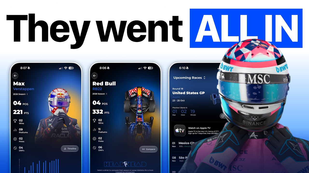
Box Box Club is an unofficial Formula 1 app, with no licenses and no team deals, and yet its users say it’s better than the official one 0:00. It’s built around Home Screen widgets, and it claims over 4 million fans 0:09. José has broken down an app from the same team before, Go Club in episode 25, so he expects this one to be very, very good. He also warns that he knows close to nothing about F1.
An opening like a game studio
The app starts on an animation that almost reminds him of a game studio. One thing would make it perfect:
“The only thing that is missing is like some haptics as the image passes, basically.” José
Then comes a splash screen with a parallax effect: tilt the phone and the cockpit moves slightly, to make you feel like you’re inside the car.
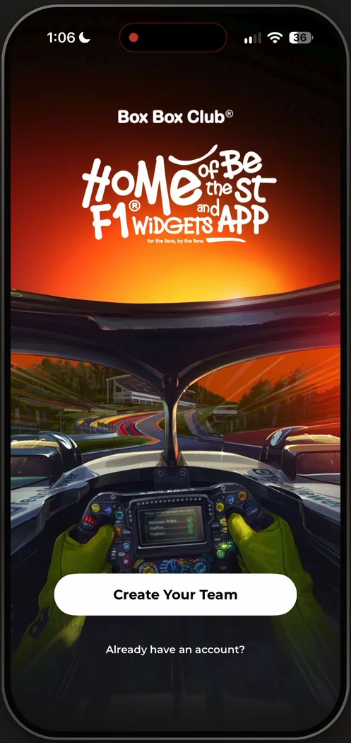
“I wonder if the rest of the app is going to have this style of illustrations because this is not something that this team usually does I think.” José
Create your team
The button doesn’t say create an account, log in or join. It says Create Your Team, which puts you in the mood 1:16.
“UX writing is actually more important than people usually think it is.” José, 1:25
Drivers in their team’s colors
You pick two drivers and a team, on cards that match the colors of each team and its suits, with little accent colors and gradients behind them 1:46.
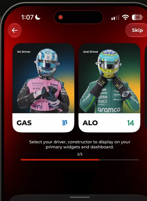
“This is all clearly custom made and it's a lot of work to do for every single driver. So I love it.” José, 1:53
A Done button out of reach
He notices one mistake on the way out 2:04. With the third pick made, the button to move on is Done, at the top right of the screen.
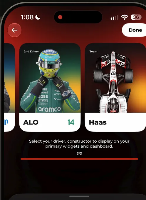
“I was looking for the done button or like continue button but it's on the top right. So it's kind of hidden.” José, 2:07
“I'm selecting like one, two, three things in the bottom of the screen. So I expect to continue by hitting the bottom of the screen.” José
What he gets for it is a graphic made from his team and his two drivers:
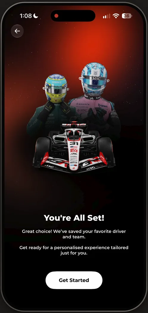
“Love that with some shaders and effects on the background.” José
Two kinds of paywall
Right after onboarding, the app puts its widgets in your face: 120+ of them, for the Apple Watch, for everything.
“And this is essentially a paywall that doesn't really look like a paywall, but has a big subscribe now button at the bottom.” José
Later, a Timeline button opens a second paywall in a completely different style. This one scrolls, and has reviews and the other kinds of social proof paywalls usually carry.
“it doesn't mean that it converts better but it is a lot more complete in terms of information” José
A guide that breaks
On a race’s page, José finds the app’s first onboarding guide: a card about setting race alarms, since the app hasn’t asked for notifications yet. He taps it, and it just says upgrade, while every upgrade button is at the bottom of the page.
“This is kind of broken guys. Let's fix it.” José
“But other than that, the page is just exceptional. I love their use of color.” José
Navigation inside a page
A funny-looking toolbar sits in the middle of the home. Its first button asks for notifications: a timely prompt, he says, since the button is clearly about notifications, but not a well explained one. The second, a game controller, changes the page: the toolbar is navigation.
“So it seems like they have navigation within a page and then bottom navigation attached to that.” José
When an app needs two levels like that, he says, they’re usually tabs at the top and a tab bar at the bottom.
“there's nothing wrong with it but because it's not standard I didn't know what it meant but now I do” José
Rate the race, then the app
The five stars along the bottom bar turn out to be a review, but not of the app: of the track, or the race. Then the app asks for a review of itself 12:42.
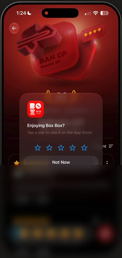
“it is an interesting way to ask for reviews where you ask for a review of something else and then if it's positive the user is in a good mood you ask it to review your own app” José, 12:46
The race then opens on what is basically its own App Store page, with comments and upvotes. To comment, you have to sign in.
“So there's a whole social app inside of here.” José, 13:32
He loves the structure of that page, though the stars in the bottom bar don’t quite match the rest of the app.
A tab that borrows from the App Store
The fourth tab in the bottom bar swipes between races, each a card in its own color, with a 3D badge of the race and its rating.
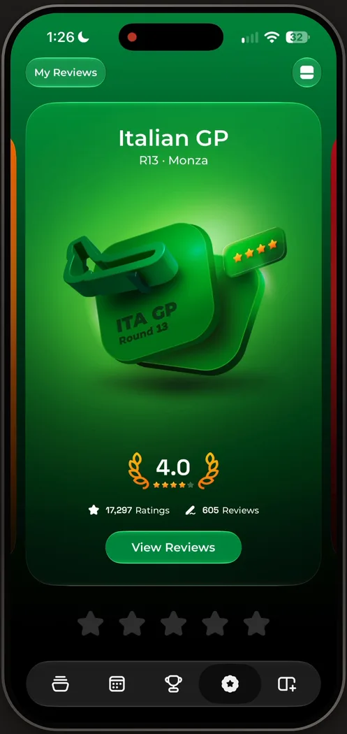
“I really really love the use of color here it really makes things pop and makes for amazing screenshots if we're being honest” José, 13:45
It’s clearly heavily inspired by the App Store, he says 13:53. View Reviews opens with a window-like animation, and a swipe down dismisses it: bonus points 14:05.
It breaks the layout of everything else, he says, but it’s very beautiful. The calendar, the second tab, goes back to the layouts from the first pages: a list of the races ahead.
A designer nerd snipe
Back on the races tab, which looks like nothing else in the app 16:20:
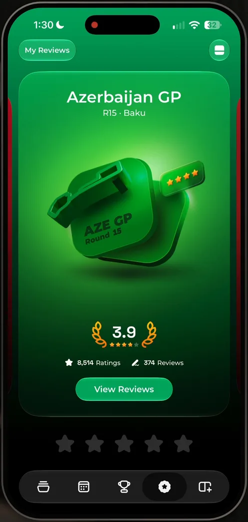
“to be honest this to me feels like a designer nerd snipe” José, 16:20
“us designers love to make things that look very good in videos, that look very good in screenshots and sometimes we throw a bit of fundamentals out of the way” José
Spicing up an app is totally fine, he says, but it often hurts conversion and people’s understanding of what’s going on 16:58. He was confused himself the first time he landed there, on a layout he hadn’t seen before.
“So, if you're a designer and you want to nerd out on some hero image, on some layout, do it, but also know the cost and when not to do it.” José, 17:12
“Restraint is very, very important.” José
120+ widgets
The last tab is all widgets, and 120+ of them is, in his words, really insane.
“I don't think any other app or any other team does this. So kudos for the originality.” José
He isn’t sold on the tab’s own style, though: very bold, one color, large text and large numbers. It fits the team’s other apps, he says, but he doesn’t really feel it fits this one.
Then he adds a widget from the Home Screen. Search for Box Box, and there’s a race countdown, a season calendar, a favorite driver in three different styles, a favorite constructor, your team.
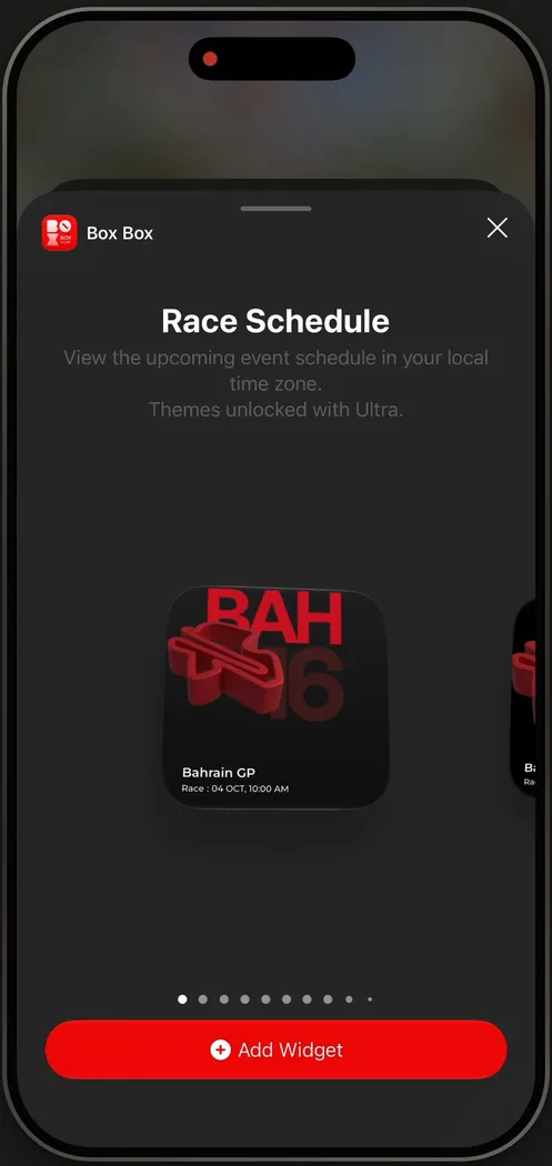
“they all look so so so so gorgeous” José
“Like there are so many good layouts here for honestly other apps and other designers to copy.” José
Not to copy, he adds, but for inspiration.
A widget that is the paywall
He adds one, and two things jump out. The widget takes up the whole Home Screen, which you only do when your users are true fans of what’s on it:
“it's very unique for apps to have widgets that take the freaking entire home screen.” José
And it’s the paywall. Without Ultra, what lands on the Home Screen is a very large paywall, and tapping it opens the paywall inside the app.
“this is very clever an awesome monetization hack and one that honestly, I have never seen other teams do.” José
The verdict
José closes episode 93 on that creativity, and on that growth hack. Maybe other apps do it, he says, but if he has never seen it, with the number of apps he sees, a lot of people probably haven’t either.
Design challenges from the App Breakdown
Learn design from the apps you love
Practice UI design every day with 300+ briefs from apps like Vocabulary, Brink and ATC. Finish one and its card is yours.


