
App Breakdown #41 · Apple Games
The UI design of Apple Games, the App Store for games
José has long wanted to break down the App Store, but it never felt like an app. Apple Games, to him, is almost an upgraded version of it.

Apple Games is a parallel version of the App Store, just for games 0:00. José has wanted to do a deep dive into the App Store’s design for a long time, because he really loves it as a separate app 0:08. But he could never bring himself to do it, because it’s the App Store, not really an app. Maybe in the future.
“And Apple Games to me is almost like an upgraded version of the App Store.” José
There’s a lot he loves about it, though he has only browsed it briefly.
A home that feels light
One of the things he loves the most is visible straight away on the home:
“How light it feels, even though it's very information dense.” José
The featured carousel comes first:
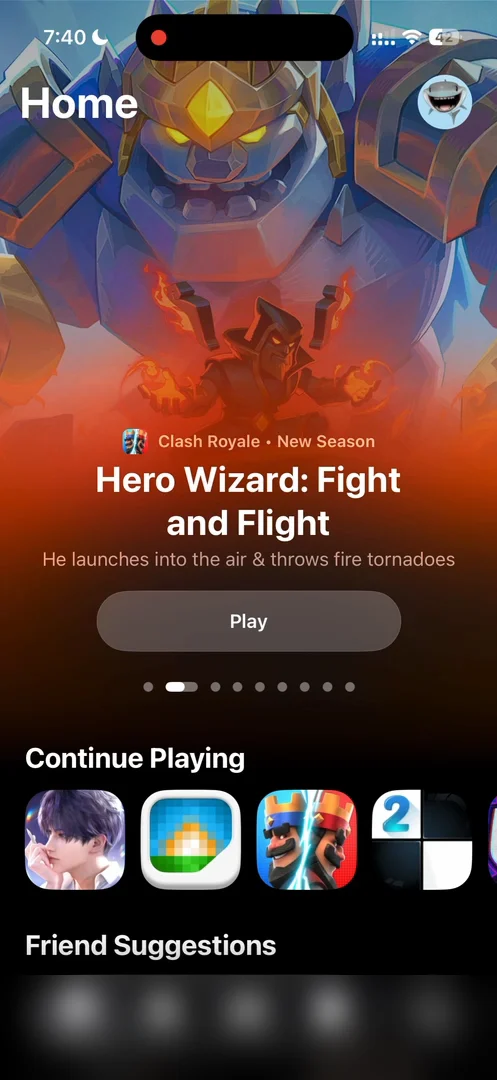
“Here you can see the featured section up top that takes up like two-thirds of the screen.” José
Even on this one screen, with almost no text, you can open six different games in one tap. One tiny detail: he wishes the featured carousel kept its central button as you swipe, so there would be just one button.
Games without titles
Continue Playing shows just the icons of games he has tested in the past. He’s not a big phone gamer, but he does like to test games.
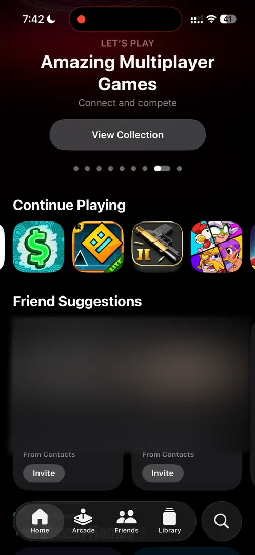
“Notice how on the games that you've played in the past, so the games in the Continue Playing section, they don't have titles, they don't have descriptions, they don't have ratings.” José, 1:39
“They just assume that you know the game. And by doing this, they basically lower the amount of visual noise by a lot.” José
Invites straight to the OS
Inviting a suggested friend needs no message: they’re simply invited.
“I guess this is one of the benefits of being Apple themselves is that you can deliver invites to people straight to their OS without any friction whatsoever.” José
He guesses it arrives as an OS-level notification, which, he reckons, also means high conversions.
Colors from each game’s icon
The top played games get a completely different section:
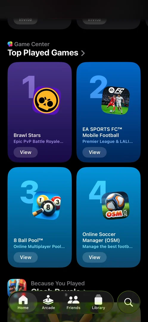
“Very cool, actually, this section, very colorful.” José, 3:03
“You can see how every background color is adaptable to the icon of the app. And this is a theme throughout the entire app.” José, 3:05
Recommendations based on a game you’ve played 3:13 change style again:
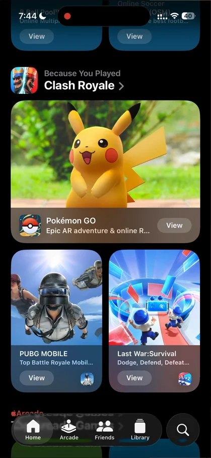
“And here, they use more of the App Store style, where you have an image from the game and then kind of the blurred view at the bottom.” José, 3:24
A game’s own page
A section’s title opens a full list, sliding in from the right. He wishes the bottom nav did something as you scroll, since it feels kind of intrusive there 5:08. A game’s page slides in from the right too, with its background completely adapted to the app’s icon 5:19, center-aligned text up top 5:26, and rounded previews 5:29:
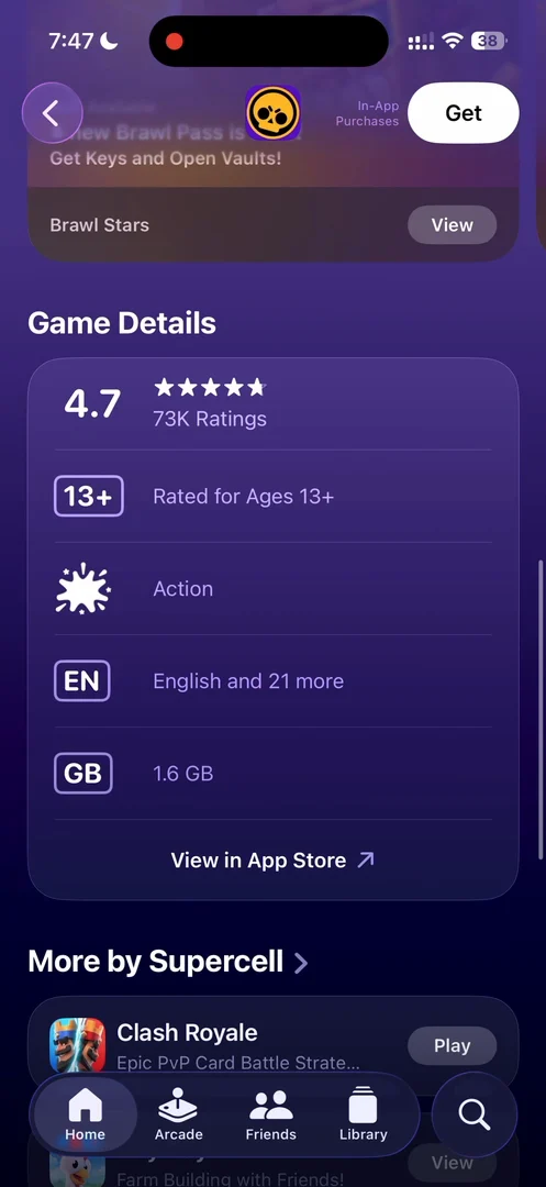
“I love these glass boxes. It's one thing where iOS 26 really shines is in these types of compartmentalized information.” José, 5:37
Tap the tab to go back up
Tapping the tab you’re already on takes you back to its first page, and tapping it again scrolls back to the top:
“Very important navigational pattern: to tap to go back to the view, and if you're in the view, tap to go back up. I cannot recommend doing this enough, because this is something that I do on all the apps.” José
A Create button from Apple
The Friends tab opens on a banner to challenge your friends: pick a game, invite your friends, set the rules. Once a challenge is running, it gets a big banner, and on the Challenges page there’s a button he didn’t expect:
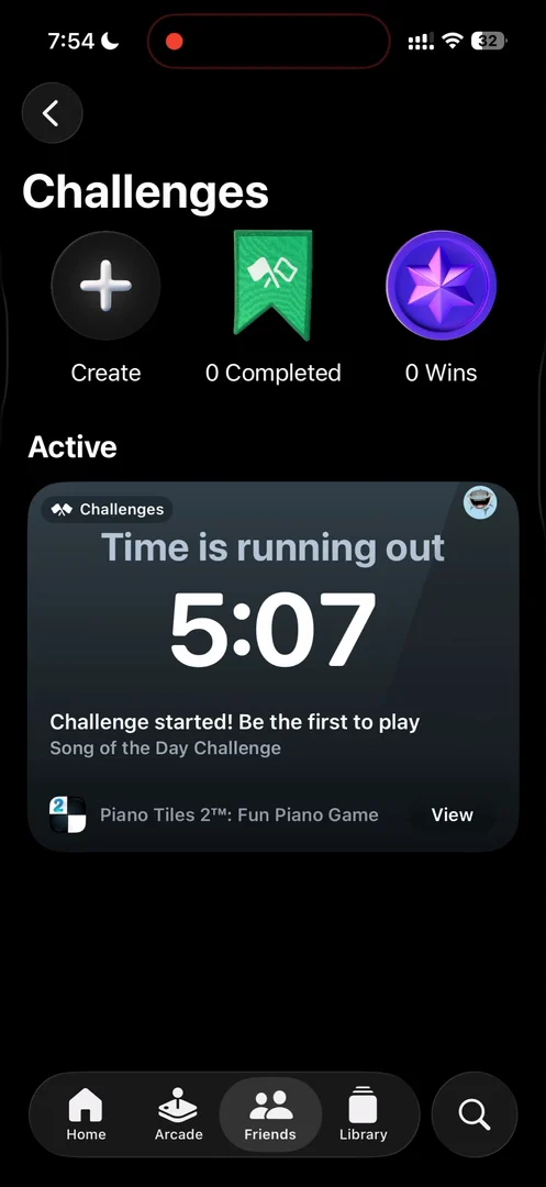
“Whoa, is this a CTA to create a challenge on the top left? Okay, this is a very interesting button. I did not expect to see Apple do this as a button.” José, 11:40
The verdict
He has seen great ways to display different information at different densities, a light interface that doesn’t lean on lots of panels, and some interesting flows to add people and start competitions.
“I think there's a lot of gold in some of these Apple apps that it goes underexplored.” José, 14:15
So if you have the time, he says, go through the app yourself 14:20.
 1 of 5
Five design challenges from this episode
Learn design from the apps you love
Practice UI design every day with 300+ briefs from apps like Apple Games. Finish one and its card is yours.


