
App Breakdown #70 · Apple Music
The UI design of Apple Music, beyond the Home tab
Apple Music needs no introduction. José looks at its native animations and content design, and finds both a lot to learn and a few small inconsistencies.

José opens the episode on Apple Music, focusing on its native animations and content design. It really needs no introduction, he says: he’s looking at it because the design is just exceptional, and there’s a lot to learn from it.
The Liquid Glass look of iOS 26 runs all through the app, and not only on the bar at the bottom, which is standard in most apps these days: you can see a little shimmer around the album art too. They really went all in on glass.
A search that takes a swipe and a tap
Pull down on a playlist page and a search field appears. He isn’t a huge fan of search up there. Usually you put search on top when pulling down brings the keyboard up, so searching is fast. Here the keyboard doesn’t come up, so it’s a swipe and then a tap.
Friends, and artists in circles
Further down a playlist, there’s a way to see friends who have listened to it. It connects to the app’s social features 8:25, and he finds that very cool, but he wishes it looked better:
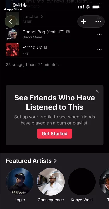
“It kind of looks out of place here.” José, 8:30
It doesn’t look updated, he says. Below it, featured artists are a different way to organise the content 8:35: circles this time, to say these are people and not just songs.
An artist’s page, aligned its own way
An artist’s page works much like an album’s, with the image as a large header, the title and a play button. Further down, Essential Albums is full width and left-aligned, which contradicts what he said earlier in the episode about Apple centring full-width elements. Then a new layout for music videos:
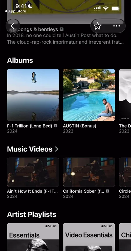
“Very similar to the albums layout but cropped to be 16x9 like the majority of video clips.” José
Back on the playlist, tapping a song doesn’t open a page for it, he finds. It just starts playing.
New, with the words on the picture
The New tab brings a featured layout where the text sits on top of the image, everything left-aligned: a supertitle, a title and a subline 14:06. Some even carry an image of their own at the bottom right. Tapping one just starts playing it 14:24, a radio takeover of K-pop in his case.
Radio’s tiles, and glass you can’t see
The Radio tab opens on a layout of its own: the top six radios, which you can’t scroll in any direction, only tap to play 15:31.
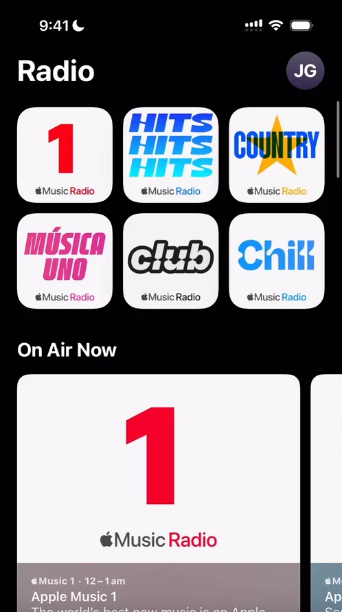
“I actually don’t really understand why they did this type of featuring layout here” José, 15:46
The New tab uses a completely different featuring layout 15:51, maybe just for differentiation’s sake, but Radio’s still looks very good, and he really likes the way they do the rounded corners. Something reads as a bit of an inconsistency to him, though: these tiles don’t seem to have the glass treatment the others do, or maybe they have it and you can’t see it because they’re white.
“I wish there was a treatment of iOS glass that you could actually see also on white backgrounds.” José
In real life, he says, if you put white behind glass, you still see some refraction.
Near the bottom of Radio, the station tiles use bright gradients:
“I really like these gradients that they’re doing here.” José
Search, in colour
Search opens on a two-column grid of categories:
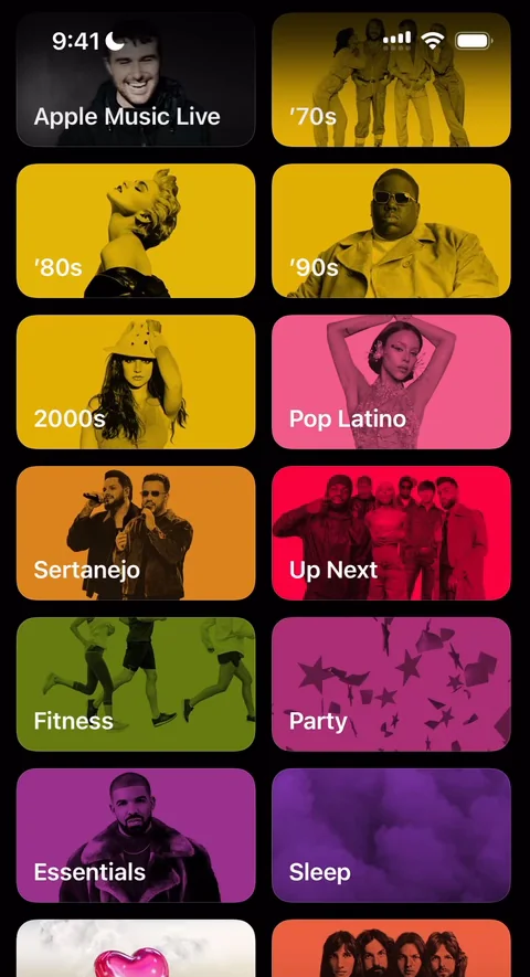
“As you can see I really love the way Apple plays with colors.” José, 17:31
One thing he doesn’t love on that page is how it mixes people and colours with geometric abstractions in 3D 17:35:
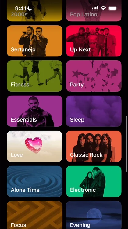
“Like why does love look so different from focus or evening” José, 17:50
Maybe they’re just different kinds of categories, he says. But inside, Love and Classic Rock use the same layouts as everywhere else, so he doesn’t see why the covers differ, and they would be a cool thing to standardise 18:17. Concerts turns out to be a fully different page 18:21: it isn’t even in the app, it’s online, which is fair enough 18:26.
Replay
Then Replay, the monthly recap:
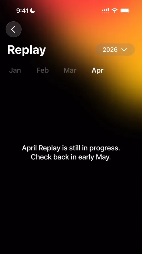
“I had never seen this layout from Apple with the gradient up top.” José, 18:33
He doesn’t use Apple Music himself, so there’s nothing in it yet, but he likes the beginnings of it:
“Very cool I’m glad I tapped in.” José
The verdict
Closing the episode, he sums it up:
“There’s a lot to love here” José
 1 of 6
Six design challenges from this episode
Learn design from the apps you love
Practice UI design every day with 300+ briefs from apps like Apple Music. Finish one and its card is yours.


