
App Breakdown #89 · Apple Podcasts
Apple Podcasts’ UI design: data density that keeps you discovering
José breaks down the fourth Apple app on the channel. Its pages are built from a handful of components, and they get denser the further down you scroll.

José’s reason for the episode:
“There is no better way to learn app design than from Apple themselves.” José, 0:00
Apple Podcasts is the fourth Apple app on the channel, after Games, Journal and Music 0:24. He had used it before, but uninstalled it so he’d get the actual onboarding 0:35. It opens with what he calls “the very classical Apple thing”: a full sheet you can’t swipe away 0:44. He’d like it to be more engaging; Apple Music’s, he says, is at least more colourful.
A handful of components
José goes through every kind of card on Home before looking at any one closely: a wide carousel whose background matches the artwork, with two buttons; a smaller carousel; one three rows tall; and a bolder card for channels 4:13. That small set matters because of what the app is for:
“When you have an app like a music app or a podcast app in this case the primary function of the UI is actually just displaying a library of content.” José, 4:32
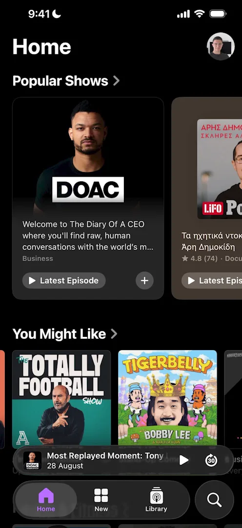
“One of the most important things about this app and almost all other Apple apps for that matter is the clean way in which they’re able to display content with just a few different components.” José, 4:47
The components also adapt to what they show. New Shows for You uses the big Popular Shows card in two versions, one with the artwork in the middle and one with it full bleed behind the text 6:21:
“The biggest thing here is adaptability to the content: no matter what podcast, what show you want to show here, the component can do it.” José, 6:45
Denser the further you scroll
Popular Shows, at the top, gets more room and more detail than the rest: a rating, the number of ratings, the genre and two buttons 5:00. Lower down the page, the cards lose some of that:
“As we move down in the importance of the content they start to take some of that information away and just making the content more dense in general.” José, 5:20
José makes it a rule:
“As a general rule you want to increase the data density of your pages as the user goes down, because if a user goes down a page, at least a content library page, they’re probably looking for something, and so the more things you can show on the screen within reason the better.” José, 7:01
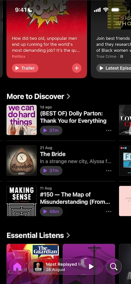
“That’s why they do this style of grid here where they are able to show three different shows while still having a CTA for each of them, which is pretty unique.” José, 7:18
The next column peeks in from the right, so you can tell it scrolls 7:28. José is surprised there aren’t more shows in it 7:32. At the very bottom, channels get a card of their own. He finds its design basic, but it does keep channels apart from shows and episodes 7:55.
A category page, Health & Fitness here, is a very different page with new components, but it follows the same rule. Its Top Shows is the same artwork-and-title tile used on Home, with a rank number added. More to Discover’s three-row carousel comes back larger, without its play buttons, making it even denser 9:25.
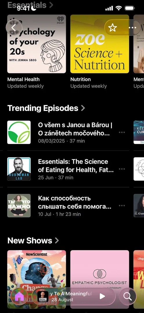
“Remember the thing that I was saying about the more you scroll the more you want to increase data density: they do exactly that.” José, 9:36
Near the bottom, the page becomes, in his words, “literally just a list”.
The show page
A show opens with Apple’s standard transition, which José would like better if the artwork travelled with it 10:36. The page itself packs in a lot:
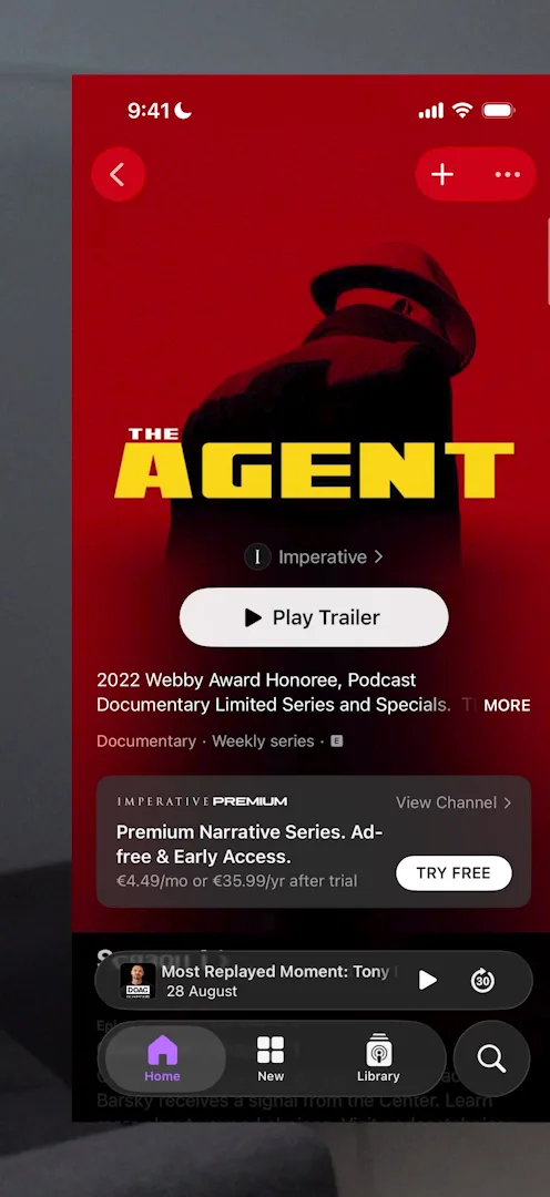
“There’s a lot of information and there’s two buttons that have similar visual weights, the play trailer and the try free. And even though it has all of these things, it’s still extremely readable. It’s something that Apple is just king at doing, is readable text everywhere, proper spacing.” José, 10:53
“And also the progressive blur on the background on top of the images. I’m just a sucker for that type of thing.” José, 11:11
Further down, the list of episodes has no artwork at all 11:25, because each one would only repeat the show’s:
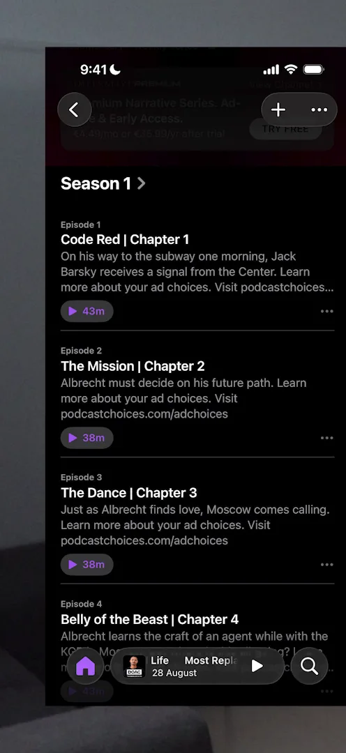
“Whenever you’re looking at a list and there’s one piece of information that’s always repeated, you usually just want to take it out.” José, 11:41
A notification prompt at the right moment
An episode’s page lists the shows mentioned in it, each with a plus to follow it right there, which José calls a very well thought-out flow 12:06. Tap one, and a sheet asks to notify you about new episodes 12:16.
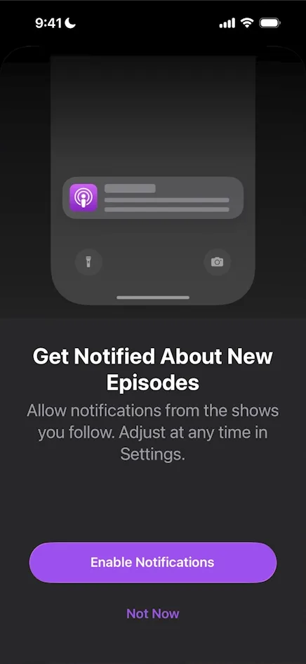
“This is the perfect way to prompt for notifications yet again, because you’re literally requesting to see something and they’re saying, hey, if you want to see it, give notifications.” José, 12:24
Discovery at the bottom
Scroll a show’s page to the end, past the description and the details, and there’s more from the same channel 13:07.
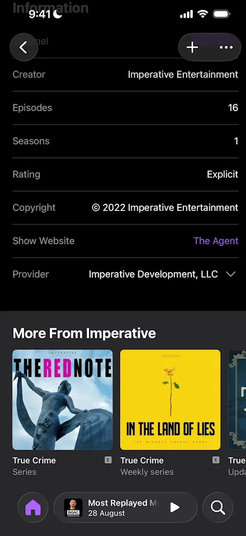
“Put recommendations slash discovery features at the bottom of your pages, because if a user is scrolling all the way to the bottom, again, they’re probably either bored or they’re looking for something.” José, 13:21
The player
Before José had played anything, the mini player at the bottom of Home was already showing something: a “Most Replayed Moment” from one of the Popular Shows:
“So they’re using the player itself as a content suggestion surface, so that’s pretty cool, and I did not know that Apple ever did this.” José
Scroll Home and the mini player slides down into the tab bar 13:44:
“It’s just an exceptional transition.” José, 13:51
He thinks it comes kind of by default with any player built in SwiftUI or UIKit 13:57. The full player is basic: a vertical video sits on a horizontal background, which he finds a bit weird, over a gradient that matches the video 15:13. It closes with a bounce:
“I also love the animation of this panel closing. Look at it… it’s very satisfying to see it bounce at the bottom.” José, 15:37
New, and why versatility matters
The New tab brings its own formats, among them a big banner that, José thinks for the first time, puts the text above the artwork 14:16. José’s advice, if you design components like these:
“The thing that matters most is how versatile they are, because how versatile they are basically constrains the data that you’re able to put into them and how many times you’re able to reuse them for different things.” José, 14:35
Library is yours
Home and New are for discovery. Library only holds what you’ve saved, added or downloaded, and José says Apple treats it as “your sacred place” 15:45.
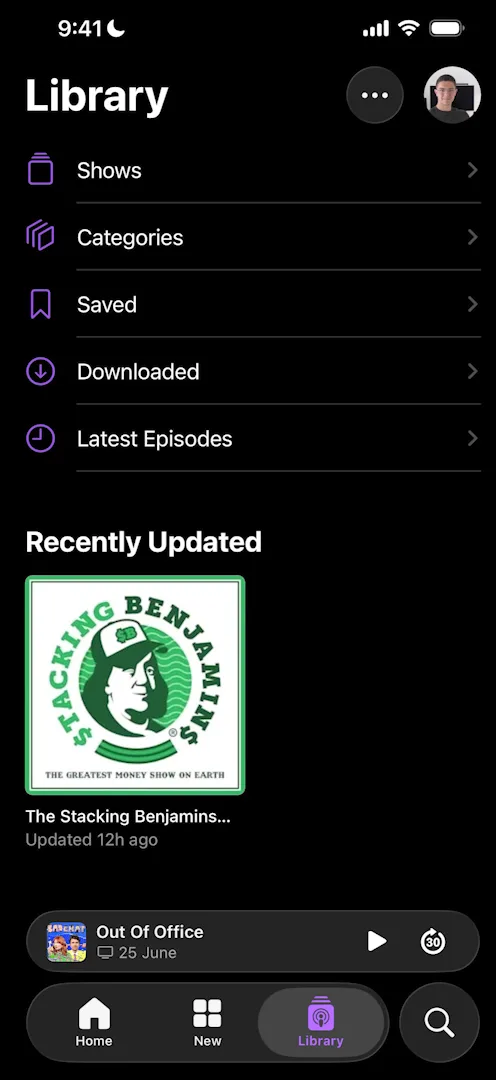
“When you go into library it’s your personal space, they’re not touching it.” José, 16:00
Because Apple puts no suggestions in it, Library is nearly empty until you save something (José’s, on a fresh install, has one show), and he admits that doesn’t make for the best empty state 16:12. But knowing what’s yours and what will change, he says, is also very important, and plenty of apps get it wrong:
“For example, I vividly remember when I was using Windows and they first introduced ads and suggestions on the start menu. It just felt off because the start menu is supposed to be mine.” José, 16:45
Search
Tap the search bar and it expands, which José likes. The results are another matter: as you type, they show up as plain suggestions, and only after pressing Search do they appear properly formatted 17:45.
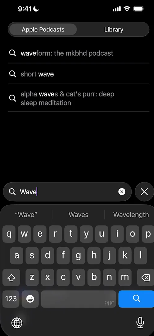
“There’s no reason for me to have to press search to actually see the results properly formatted.” José, 17:54
Once they do, filters at the top split them into shows, episodes and channels, each in its own kind of row 18:10. Open a channel from the results, Apple Music’s for example, and it’s the same components again 18:30.
Design challenges from the App Breakdown
Learn design from the apps you love
Practice UI design every day with 300+ briefs from apps like Vocabulary, Brink and ATC. Finish one and its card is yours.


