
App Breakdown #64 · Apple Sports
The UI design of Apple Sports, an app that does one thing very well
Apple Sports only does one thing, but does it extremely well. José opens the app whose screenshots he kept seeing shared, and finds a lot of UI worth studying in how it shows scores.
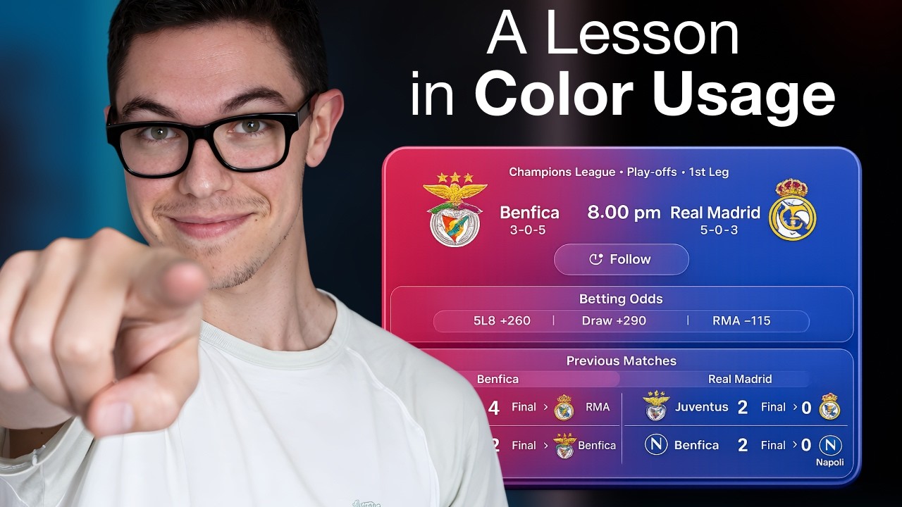
José opens the episode on Apple Sports, the app that only does one thing but does it extremely well 0:00. He kept seeing screenshots of it shared on social media, and had been wanting to check it out 0:09. He expects this episode to be more about UI than UX and onboarding 0:17:
“If the screenshots and the other Apple apps are anything to go by, this is going to be very, very sweet in terms of UI.” José
No onboarding, and value from the start
After a short welcome sheet:
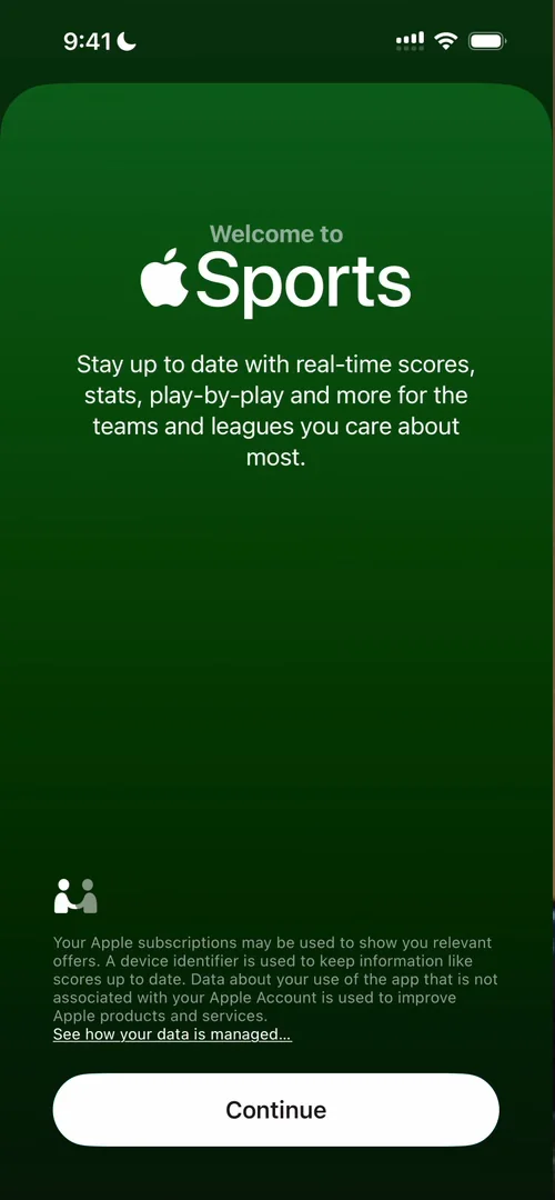
“Yeah, this is kind of what I was expecting. There’s no onboarding.” José
You’re just dropped on the home screen 0:49:
“Very refreshing to see.” José, 0:51
The home has a header with a row of league logos and a Get Started button, and below it, real games you can open:
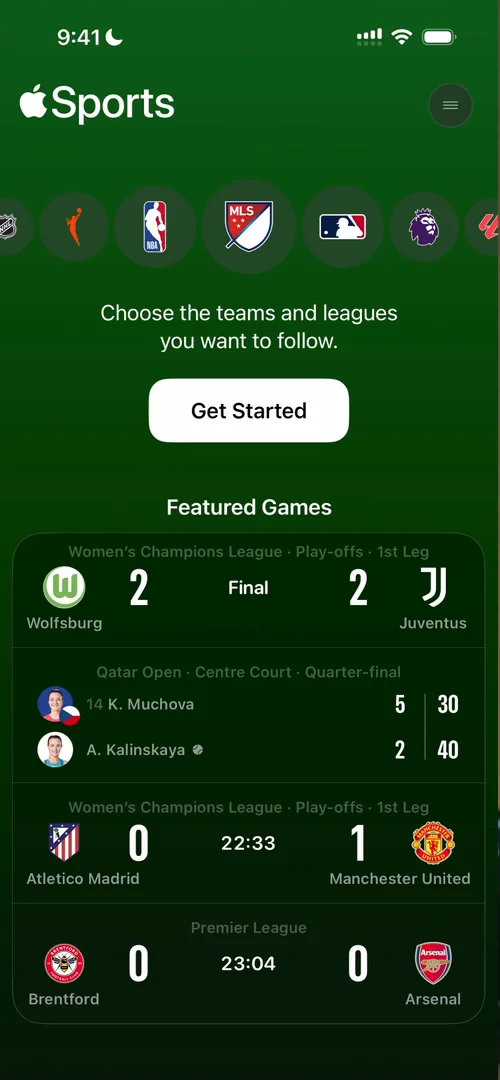
“This is a pretty cool home screen and get started experience because I can already get value” José, 1:09
They’re probably showing the most trending games, he says, so a new user gets value from the moment they get in 1:19, and can still go deeper with Get Started.
Scores, organised by day
Once he has picked what to follow, the home organises games into Yesterday, Today and Upcoming. It’s a pretty simple organisation. He had kind of expected one scrolling page, since there’s a lot of empty space; that may be because he picked only a few teams, but it still looks like a lot of wasted space 3:58.
What’s really cool to see, he says, is how they organise the results for each sport 4:11. Google’s sports results do a fairly good job at this too, and he thinks Apple will kill it 4:18. It does seem weird that he can only go back to yesterday, not last week or last month 4:32:
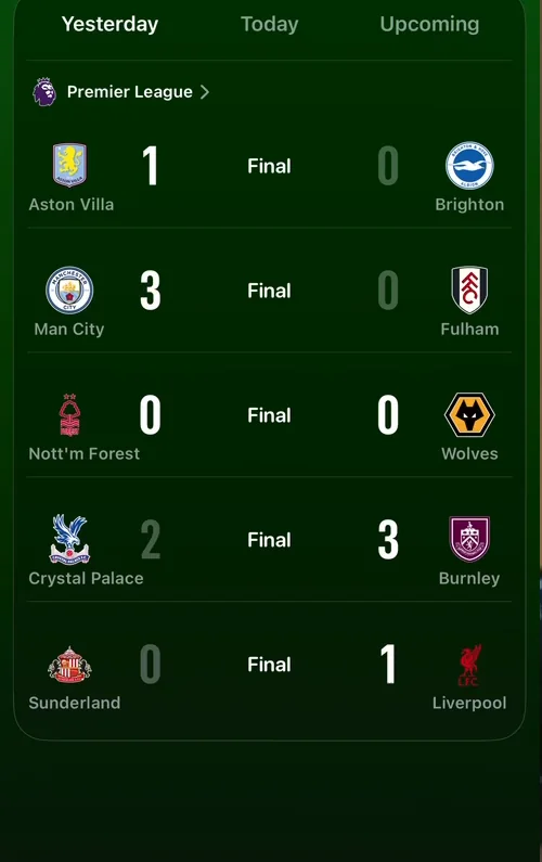
“Very clean grid of scores. Pretty cool.” José, 4:40
Today has the PGA Tour and the Premier League side by side, and you can see how the scores differ between golf and football 4:50.
A golf leaderboard in a tiny space
He knows close to nothing about golf, and there’s no especially interesting data visualisation here 7:56. But:
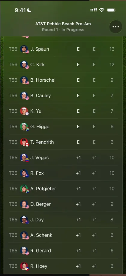
“I think the most interesting part of this data visualization is the fact that they managed to cram the person and the flag and the name in such a tiny space” José, 7:58
They do it with the first letter of the name, the surname, and tiny images of the player and their flag.
“I think it looks phenomenal and it’s very challenging to put this amount of information in such a tight space.” José
A scorecard that tells you who won
He wants to take a moment to appreciate just how clean the NBA scorecard is 10:24:
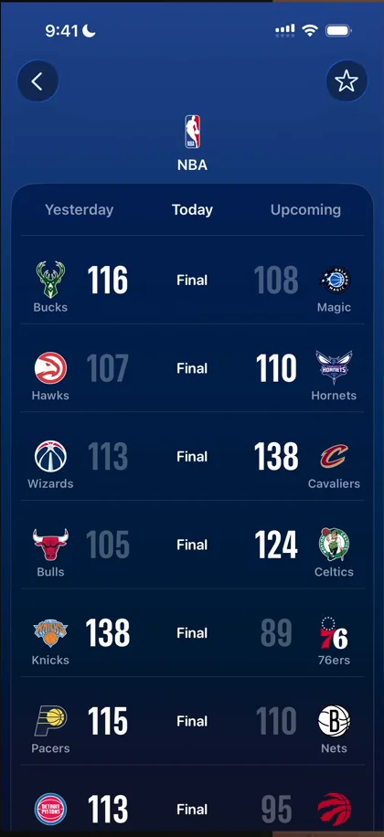
“They make such a good job at highlighting who won by how much” José, 10:29
The losing team’s score is dimmer than the winner’s, a tiny detail that 10:35:
“Just drives your eyes in the correct orientation” José
It handles very short team names and very long ones, like the Cavaliers 10:44:
“It’s like all of these things look trivial until you try to do them and you realize how hard it actually is” José, 10:51
Colour
Apple is so extra on backgrounds across its apps, he feels, and somehow makes even a full red, blue or green one look good:
“Apple apps like Apple Sports and Games and App Store are very good references to learn how to do colors properly” José
The verdict
The whole point of Apple Sports is coming in and seeing how a game is going, very fast and in a very clean way, and it does an exceptional job at that. One of the things he calls out:
“Just how clean they make the scores look. Like this view, I’m in love. It just looks exceptionally good and it’s very easy to skim through.” José
“There’s a lot of UI gold and just UX gold to go through here” José, 16:21
 1 of 6
Six design challenges from this episode
Learn design from the apps you love
Practice UI design every day with 300+ briefs from apps like Apple Sports. Finish one and its card is yours.


