
App Breakdown #84 · ATC
ATC’s UI design: how a niche aviation app gets it right
José opens ATC for the first time and ends up calling it maybe one of his favourite apps for UI design. Here’s why, and where its boldness goes too far.

ATC lets you listen to air traffic control radio and watch the planes it’s talking about, on one screen. José’s way of putting it:
“So you know those websites where you can hear the radios from all over the world and also those websites where you can see where all the planes in the world are? ATC is kind of like if those two had the baby.” José, 0:21
He had never used it before the episode, and opens it for the first time on camera 0:37.
Solid colour, strong contrast
ATC’s look is settled before you tap anything. On the splash screen, José can already tell what kind of app it is:
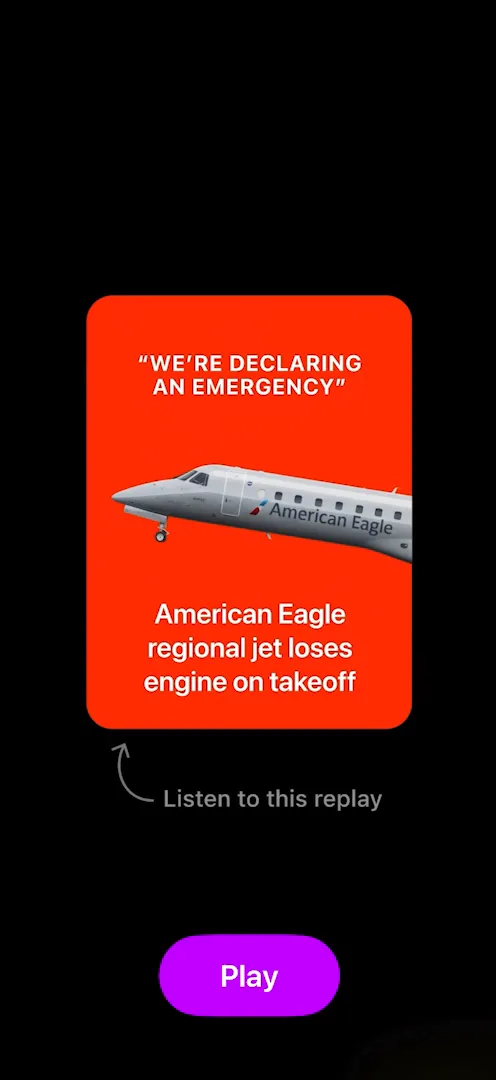
“From this splash screen alone I can tell that it’s going to be a simple yet colorful app. They use very solid colors for everything.” José, 1:05
The player, where you listen and watch the planes, keeps it up: ATC’s own take on Apple Maps in the background, saturated colour on everything, and text set straight on the map 2:10. Even Settings uses ATC’s own design language rather than Apple’s standard controls 15:52.
A paywall with nothing on it
The paywall has the outlets that featured ATC up top, small Terms, Restore and Code links, and one big button to start a 14-day free trial 5:37. There are no pictures and no list of features, and José likes it that way:
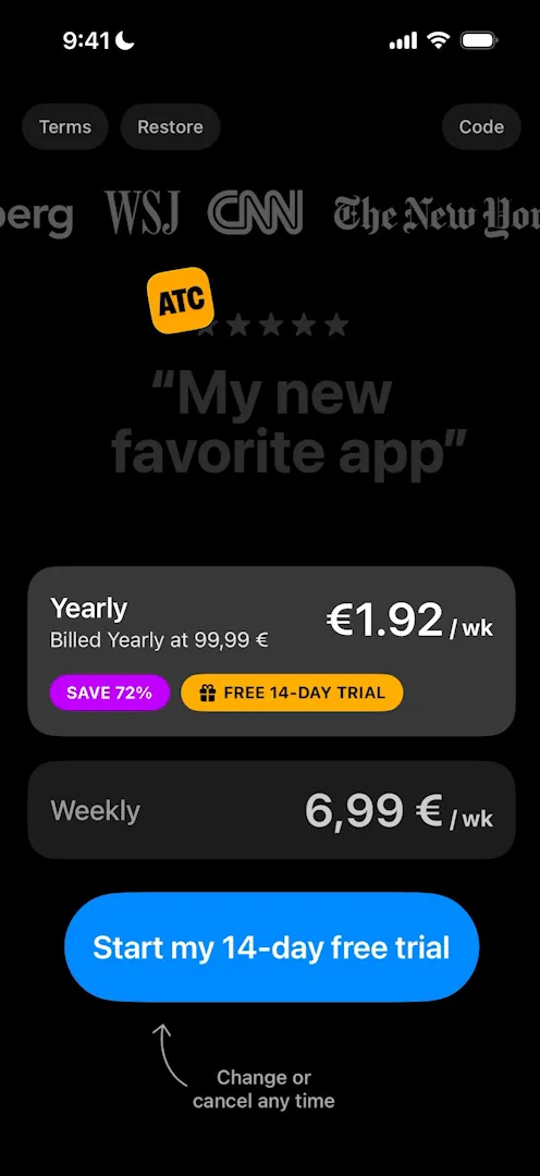
“I actually really love this paywall. I wonder if it converts well because it has no images, no features, none of that.” José, 5:53
The free trial only comes with the yearly plan 6:07. José calls it a dark pattern, and explains why it pays:
“Either they hopefully convert you into an actual user and you want to keep the membership or you forget to cancel it, and then both of these cases it’s way better if you pre-subscribe for the yearly than if you pre-subscribe for the weekly.” José, 6:25
There’s no free version of the app at all: you always have to pay.
One sheet for everything
Almost everything in ATC opens in the same sheet, a player with the map, the planes and the radio transcript, and it stays smooth:
“Like the entire app runs at 120 FPS, even though there’s maps and planes and things moving all around with transcription.” José, 8:12
The player is full of small details. When José went back into it, the skip-silence button was shaking to show it was there, then it stopped 8:27. The calendar opens a half sheet to jump back to any earlier time, even days ago:
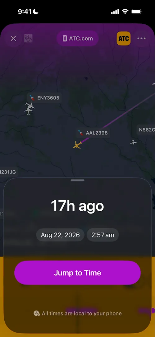
“A great example of a half sheet that is extremely obvious.” José, 8:52
Featured stories, search results and the Latest Events list (under New) all open the same kind of sheet 9:32. José says that’s why the app is quick to learn:
“So it seems like the entirety of the app is a shell into these sheets which is cool because you always know where you are and you become familiar with the interface very fast.” José
Bold on everything
ATC sets nearly everything in a heavy typeface. José loves the look, and names what it costs:
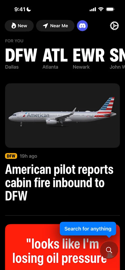
“I love just how bold they went with a typeface everywhere. Maybe it’s a bit too much, like they give a bit of too much importance to everything and so things kind of lose the hierarchy, but it’s so clean that I really love it.” José, 9:11
The Latest Events list shows the cost. Each row is easy to read on its own, but a screen full of them is a lot:
“I really like them although when it’s too many… the bold kind of throws you off.” José
Layout details
The home feed starts with big cards and ends in plain rows, which José recommends as a rule:
“So it’s a good rule of thumb that usually whenever you have a big scroll view, you start with less data density up top, so the things that really matter and that you want to give more space for, and then data density increases as the user scrolls on the page.” José
One piece doesn’t fit: the “Search for anything” tooltip 12:25.
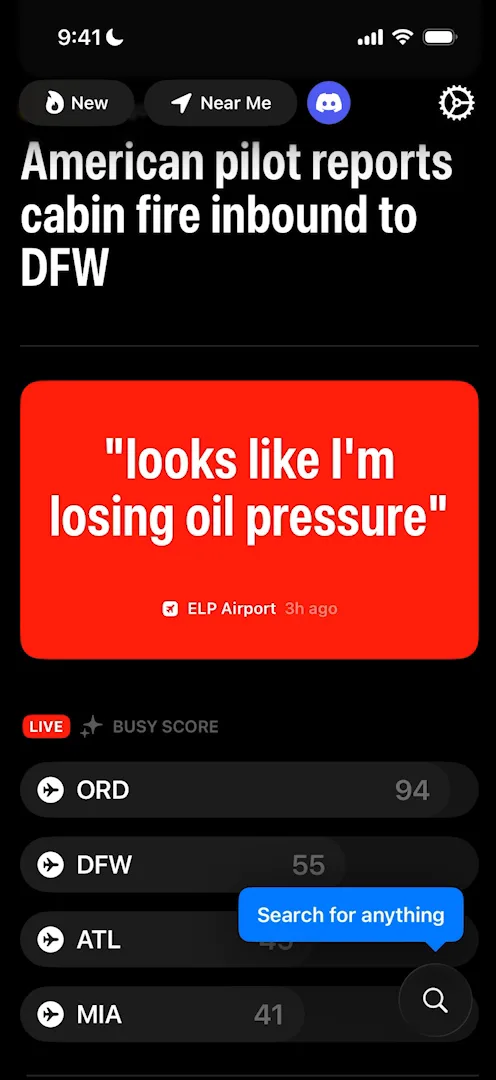
“The tooltip looks kind of out of place. I think it’s because of the rounded corners that don’t really match the rest of the app.” José, 12:28
It notices when you’re recording it
On the home screen, a yellow banner asks whether you’re a content creator 15:10. José taps it, and finds out why it showed up:
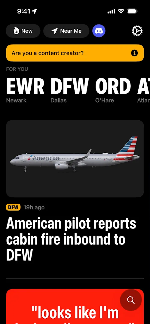
“So if you’re screen recording or recording through the computer like I am they recognize that and they offer to put you on a white list. This is very, very cool, actually. I had never seen an app do something like this, but it can also be used as a growth tactic.” José, 15:27
Where it could do more
Near Me starts with a plain screen that just asks you to turn on location, which José calls “a very cool empty state” 13:48. The list of nearby airports that follows is thin: each airport’s code, its name and a busy badge.
“I wish there was more information about the airports here. For example, how many flights there are there. Is anything exciting happening at the airport?” José, 14:14
The verdict
“This is very unexpectedly maybe one of my favorite apps that I’ve seen in terms of UI design, their use of color, the clarity of the typography, the way they organize content…” José, 16:09
“Consider that this is an app for a topic that I don’t even really care about but it’s just extremely fascinating.” José, 16:29
 1 of 2
Two design challenges from this episode
Learn design from the apps you love
Practice UI design every day with 300+ briefs from apps like ATC. Finish one and its card is yours.


