
App Breakdown #73 · Binge
The UI design of Binge, the indie movie tracker built like an Apple app
Binge tracks the movies and series you watch, and it’s made by one indie developer. José finds an app that looks like Apple made it, with a shared element transition he calls the star of the show.
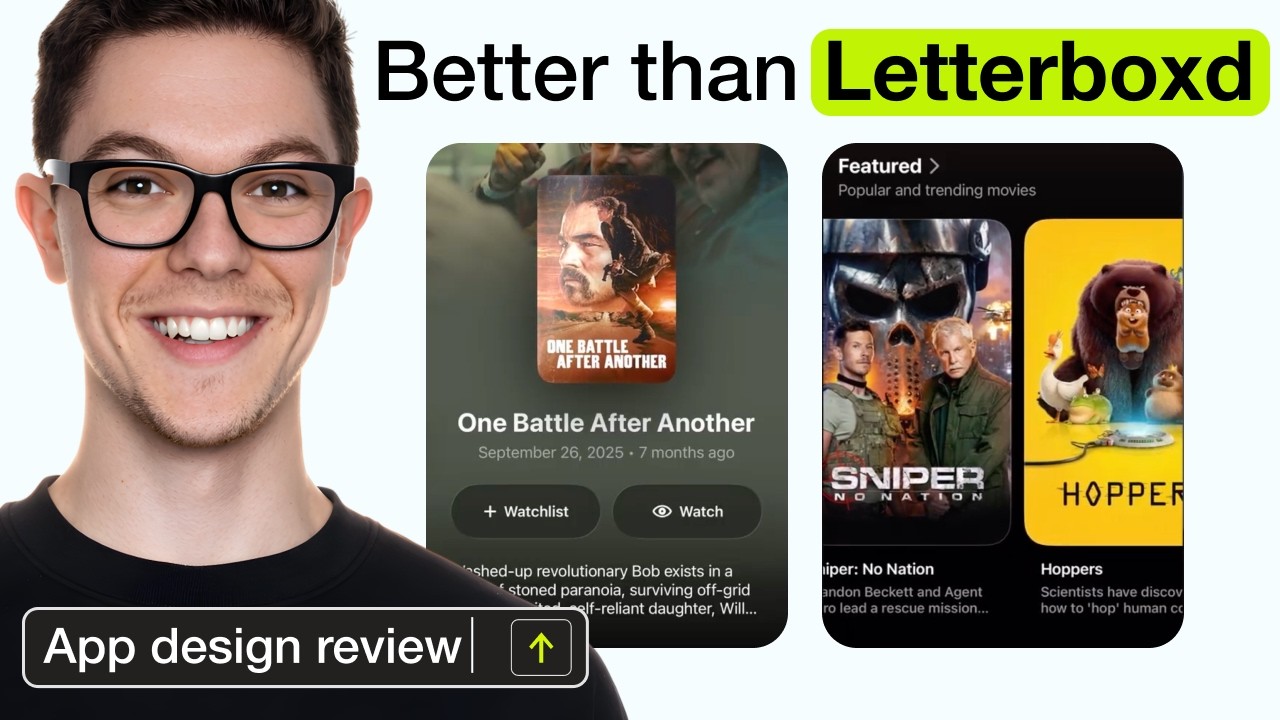
José opens the episode on Binge, arguably one of the best apps to track your favourite movies and TV series 0:00, and one made by an indie developer 0:06. He has explored it before, but he’s by no means an expert user, so he’s looking forward to learning from who he thinks is a great developer.
If Apple made a movies app
“If Apple made a movies app this is what the home screen would look like” José
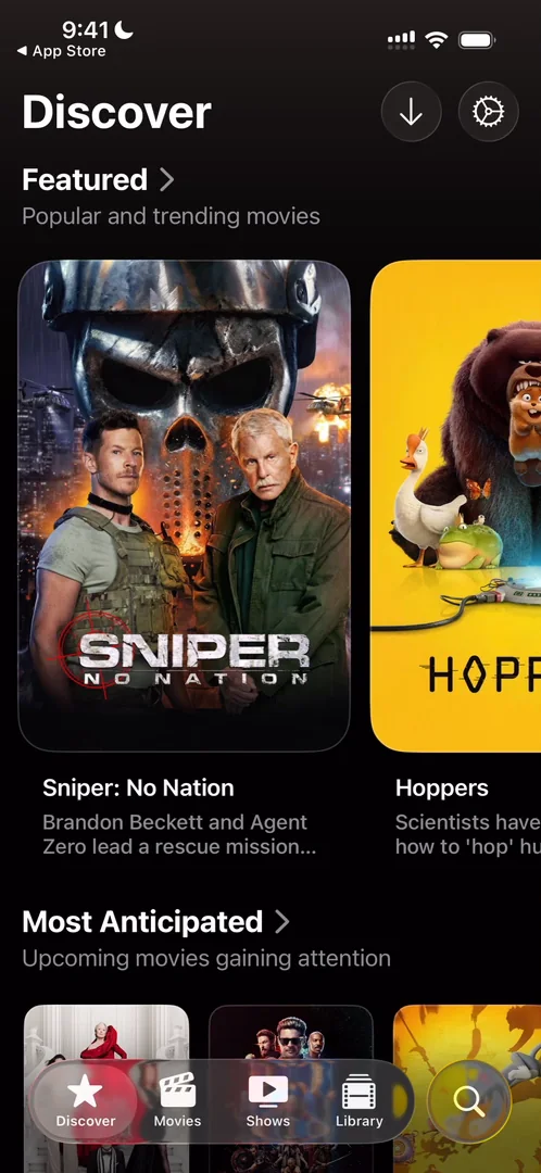
“As we’ve seen on the many Apple apps that we have reviewed […] they are very good at content organization” José, 1:04
An app for discovering and rating films and series is all about content organisation, so why not take what already works 1:18. A button up top that looks like a download turns out to be a menu that jumps to each section 1:28, which isn’t very clear: it could become a pattern, he says, but since he hasn’t seen it anywhere else, he wouldn’t know what it is at first glance 1:32. The carousels themselves are so smooth:
“This is what I love about native apps” José, 1:49
One shared element, done right
He taps a movie at the bottom of the home screen:
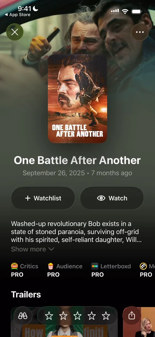
“Oh beautiful shared element transition, I love this” José, 2:04
The poster stays in frame, the rest of the content fades in, and the buttons at the bottom come up in sequence 2:17, with haptics:
“Okay this app already won for me” José, 2:27
One little thing it could do better is cache the logos, which come in and out every time 2:29. Other than that, the transition is basically perfect 2:39. The poster also has a shine that moves with the phone 2:42, which he guesses is a Metal shader, and it just looks fantastic 2:59.
Gestures everywhere
You can close the page with the cross at the top left 3:09, or swipe from the left 3:14. Drag the poster sideways, and it adds the movie to your watchlist, or marks it as watched, with a magnetic feel and haptics 3:31:
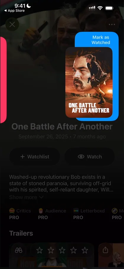
“It’s the type of thing that really did not need to exist on this app but it exists and that makes it special.” José, 3:48
The page takes its colours from the cover, very nice colour extraction 4:04. He doesn’t love the colour the Liquid Glass buttons for Watchlist and Watch turn into once tapped 4:16, though otherwise they look very good:
“It’s very blocky compared to the rest of the app” José, 4:19
Further down come trailers, where to watch, the cast and the crew:
“They have so much information on each of these things” José
So far, to him, it’s Letterboxd if Letterboxd were good 5:18:
“Letterboxd is very ugly.” José, 5:26
So he’s glad Binge exists as an alternative for him 5:32.
Redesign the one piece you care about
A featured movie at the top of the home screen opens differently 5:48: not a shared element this time, he thinks, but a fake one, a 2D effect made to seem 3D, with depth 5:57. And swiping down sends it back into place 6:08:
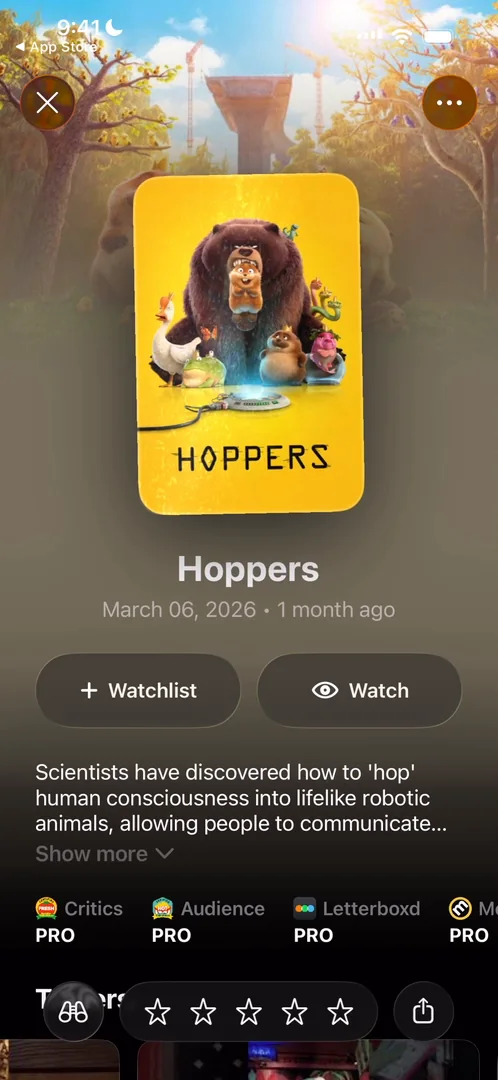
“This is just beautiful what an animation” José, 6:14
“See this is exactly the type of thing that I love about apps that are native and use mainly just like native modules and native design language but then add that little bit of flair to make it feel their own” José, 6:18
That page, he says, makes the entire app 6:31:
“Don’t redesign the wheel but redesign the one piece that you really really care about” José, 6:39
Lists, people and a gesture back
Lists mostly look the same, with different tints at the top 6:52, but the Academy Awards list is different 7:03: each award’s title, then the film and the person it went to.
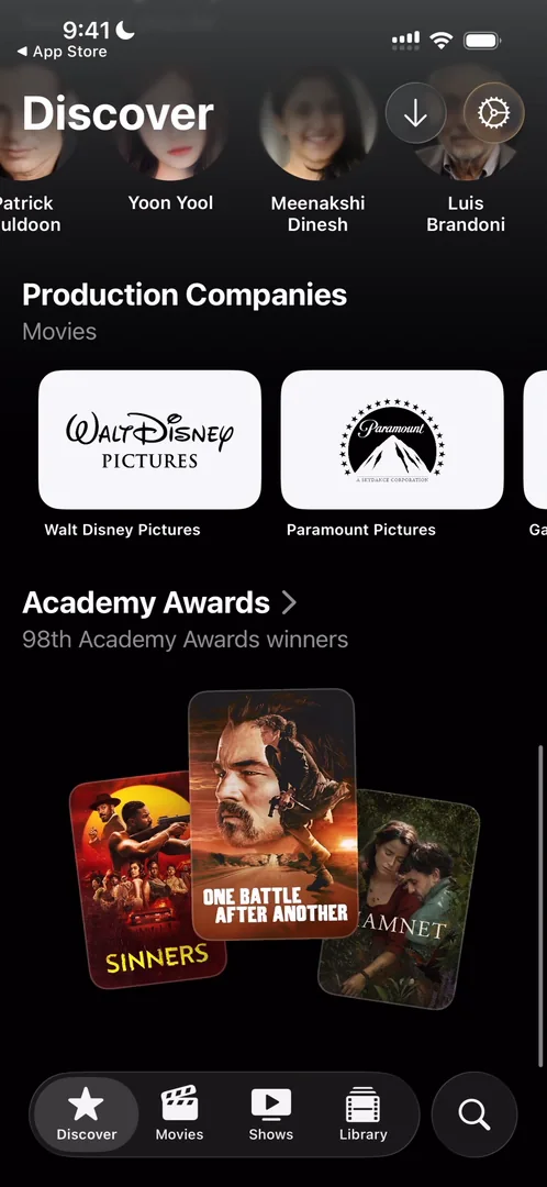
“Oh, Academy Awards is different” José, 7:03
People have pages of their own too, with the same shared element transition 7:24:
“I really need to learn how to code this specific shared element animation.” José, 7:32
“It’s just so complete in terms of information.” José, 7:40
He also notices you can close a page not only by swiping down from the top, but by reaching the bottom and swiping up 7:42. It isn’t something you see very commonly 7:53, but it makes the app feel more gestural.
Reused, on purpose
The Movies tab’s genres work like the categories on the App Store 8:23. You can put movies in a top three from their pages 8:35, and share it with a beautiful card made for sharing, to help the app spread, what he calls its K-factor 8:54. He keeps saying “nothing too new” and “same thing” 9:25, but that’s a good thing:
“It means that the creator found models that work, ways to display information that work, and is reusing them across the app.” José, 9:33
“And that’s like the proper way to do design, to be honest, especially if it’s scalable design.” José, 9:40
On your own side project it’s fine to make everything custom, he says, but for a larger product, the scalability and maintainability of the design system matter a lot 9:56.
A library that picks for you
The Library tab brings new layouts 10:12:
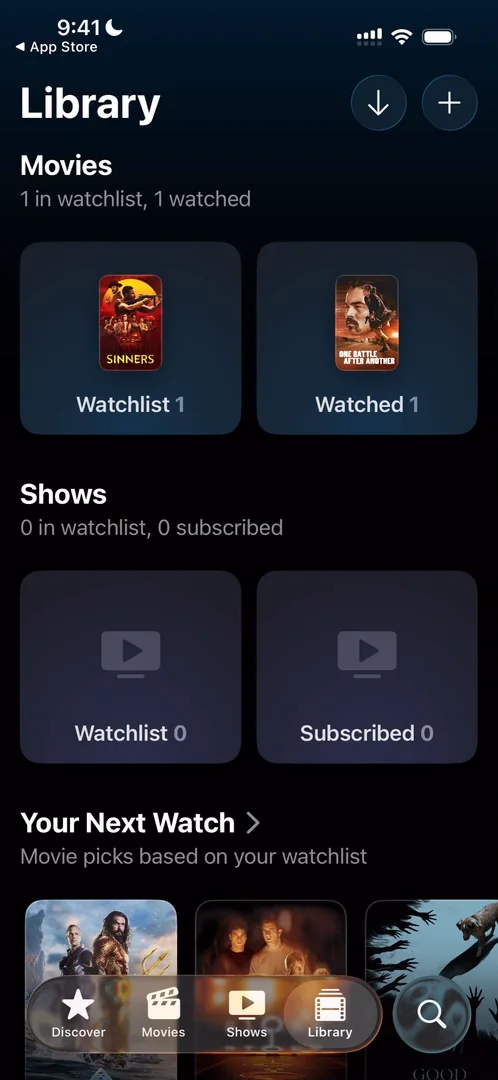
“So this is basically my personalized home” José, 10:18
“Your Next Watch” suggests movies based on what you’ve watched and added to your watchlist 10:23, and a shuffle button just picks a random one 10:39:
“This is so cool. I feel like this could be a whole app.” José, 10:42
“Clearly this page is what all of the attention went to and I’m not mad about it.” José
Stars that turn gold, and a share card
On a show’s page, rating comes with very nice haptics as you swipe across the stars 11:56:
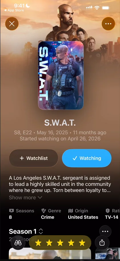
“When you get to five stars it turns gold amazing little detail” José, 11:57
Sharing generates a custom image of the show:
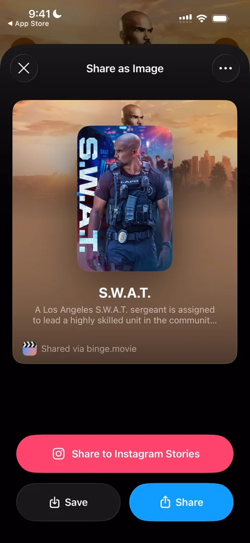
“I thought it was just going to be the standard share sheet but once again they surprised me here” José
The verdict
“On this app the star of the show is clearly the shared element transition that they’ve done” José
He has said it maybe ten times in ten minutes, but he loves it:
“Kudos to the people doing this it’s extremely smooth extremely clean.” José, 12:46
He hopes to see Binge on the top charts one day, and to see it replace Letterboxd 12:51.
 1 of 2
Two design challenges from this episode
Learn design from the apps you love
Practice UI design every day with 300+ briefs from apps like Binge. Finish one and its card is yours.


