
App Breakdown #40 · Blinkist
The UI design of Blinkist, the book summaries app
Blinkist promises everything you can get out of a book in 15 minutes. José opens it for the first time and finds an app that doesn’t try to be fancy, and doesn’t need to.

Blinkist is an app that concentrates everything you can get out of a book into 15 minutes 0:00. The concept is very appealing 0:13: instead of spending a day, a month or three months on a book, depending on how fast you read, you can get it in 15 minutes, because you’re listening to it. You can learn more, and explore wider ranges of topics.
José has never used it before. He thinks he has used a similar one, but he can’t remember its name.
Copy that tells you when to use it
The first screen is pretty standard and static, with some popular books:
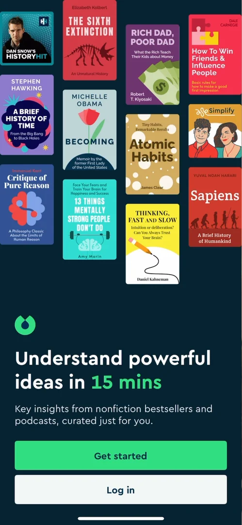
“Okay, I really like their copy. It's just extremely clear.” José, 0:53
The next screen tells you to invest in your personal growth while running 0:58:
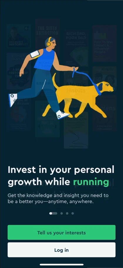
“So they're basically telling us what the use case is. They're telling the user, hey, if you want to use this app, this is the time to do it, this is where it fits into your routine.” José, 1:00
“This is somewhat of a subconscious way to create retention by fitting your app into your users' routines.” José
A first session with no profile
Then he’s on the home without having created an account or done anything at all. He looks for his profile, under My Library, notifications, edit and highlights, and can’t find one:
“So I'm going to be honest. I have no idea where my profile is or if there's a profile, which is a very interesting approach.” José, 2:19
“I had never seen anything like this on an app where they don't ask you to create an account.” José
“But I got to say, it's a very confusing like first experience because I'm just used to having a profile.” José, 2:42
He’s used to some kind of onboarding, and it was skipped completely; maybe it was a bug, he says 2:54.
A home of things to explore
At the top of the home there are notifications, settings and a plus 2:56, then a banner for a weekly learning goal 3:14:
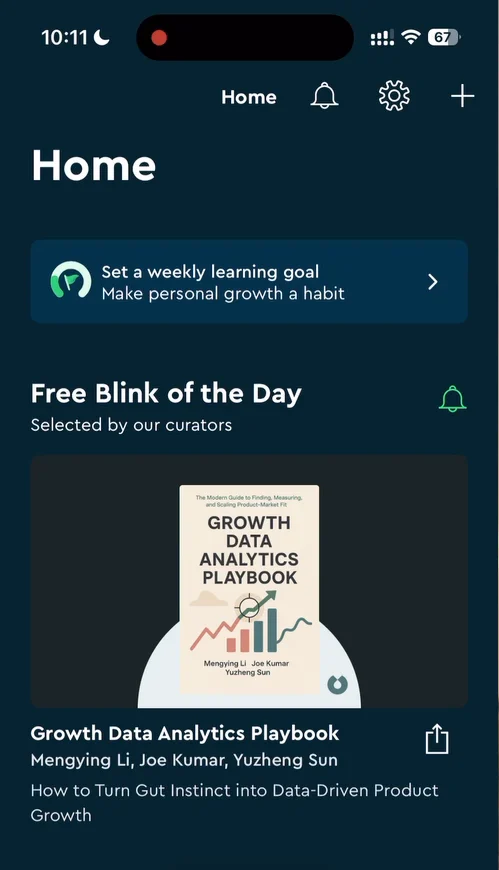
“So let's start by scrolling here a bit on home.” José, 3:27
There’s a free blink of the day, which he calls a daily habit thing, then sections recommended and personalized for you: all the things you can get to in the app. A lot of them are locked, probably behind the subscription.
Simple, and it works
The free blink of the day opens a page that looks like the inside of a blink, Blinkist’s name for a book summary:
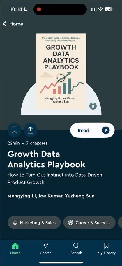
“Okay, nothing too interesting in terms of design. It's all very flat, just very standard.” José, 4:20
“It works and it shows that you can build a really massive app and a really massive brand without overcomplicating things.” José
“But from an app breakdown perspective, it's not very interesting.” José
Reading asks you to create an account; he signs in with Apple, which he loves for how simple it is.
A Spotify-style player
The reader opens with some tooltips. He doesn’t really like tooltips, but these have some information. One tooltip says to swipe up and down to view or dismiss the audio player 5:08:
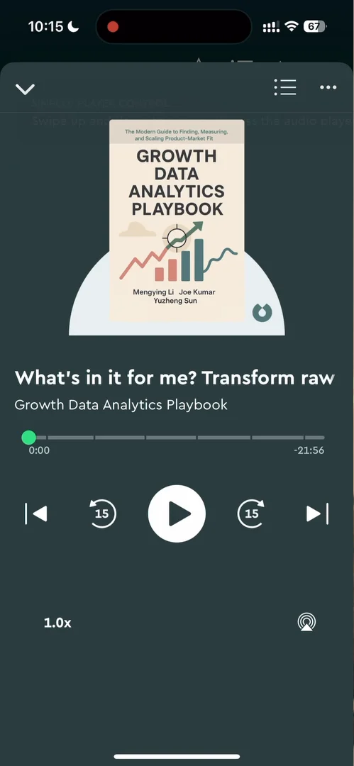
“So we have a little Spotify style audio player here for the book.” José, 5:08
Then there’s the text: a pretty standard reader, with a panel at the bottom that isn’t particularly smooth.
Shorts
The second tab is Shorts 8:03:
“Don't tell me this is short form content like YouTube.” José, 8:13
It’s vertical video 8:20, things to learn, with little progress dots at the bottom:
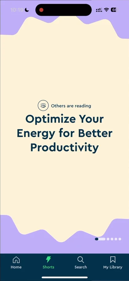
“So it's vertical video.” José, 8:20
“Not very exciting, I'm gonna say that. If this is supposed to rival your addiction to TikTok, it's gonna have a tough time.” José
The home has an entry point for Shorts too, Smarter in 5 minutes, where you can tell the app whether you liked them 13:32.
A personalized pick, on the usual page
He opens a book personalized for him, and it opens on the same kind of page as any other blink:
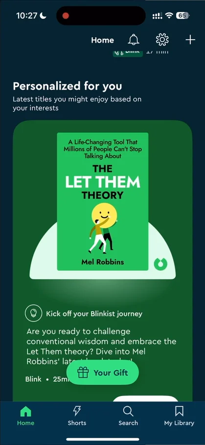
“I was expecting the page to be different” José, 13:52
The verdict
A lot of it sits behind the paywall: it might as well be a paid app, he says, which there’s nothing wrong with, but he wasn’t expecting this level of blocked content. Still, Blinkist is, for him, a good example of building a very big app and business without overcomplicating the UI or the transitions:
“Basically, it works. It takes you to where you want to go, except that little shenanigan on the onboarding where I couldn't find my profile.” José
“And it just does its job and converts you into a paid user when they want to convert you.” José
 1 of 4
Four design challenges from this episode
Learn design from the apps you love
Practice UI design every day with 300+ briefs from apps like Blinkist. Finish one and its card is yours.


