
App Breakdown #58 · Brilliant
The UI design of Brilliant, the learning app with an almost perfect onboarding
You’ve probably seen Brilliant’s ads. José hadn’t opened the app in a long time, and finds beautiful animation work, an onboarding full of small touches, and an app where you almost always know what to do next.

José opens the episode on Brilliant, a beautifully designed and wildly successful learning app 0:00. They sponsor just about every YouTuber on the planet 0:13:
“But their product is actually very, very cool.” José, 0:16
He tried it a few years ago but hasn’t touched it in a long time, so this is basically a first impression.
A splash and a button that presses in
“Beautiful and extremely simple splash screen just with their logo and the shine coming through.” José, 0:32
“It’s so simple and so clean.” José, 0:39
He wishes there were a haptic as the shine comes through 0:43. Then a nice little touch on the buttons:
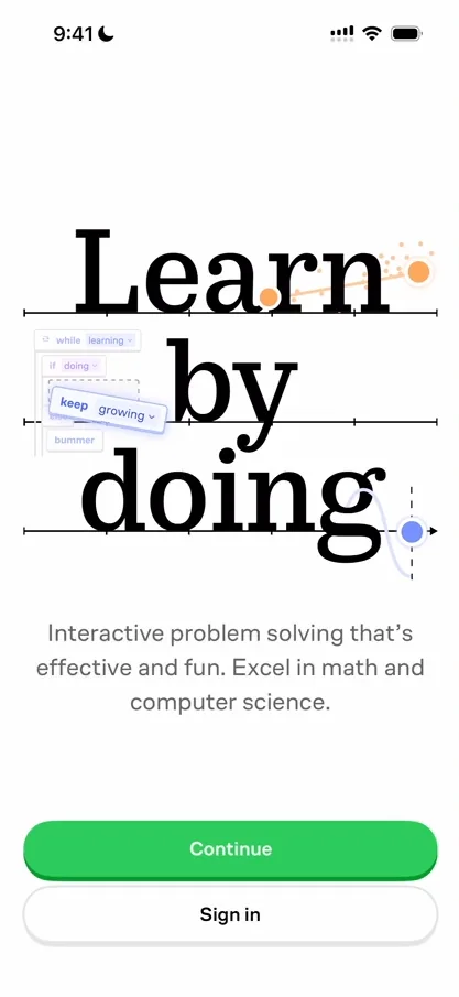
“Nice little touch on their CTAs.” José, 0:56
The button has a little shadow at the bottom, and when you tap it, it presses in 1:03. He supposes they’ll use it throughout the app.
A mascot that reacts
The mascot reminds him of Duolingo’s 1:12, and it guides you through building your learning path. Each answer gets a different reaction from it 1:33, though they feel a bit pre-programmed: tap quickly and they switch very fast.
“Whenever people do characters in apps I always wish for them to be as natural as possible” José, 1:41
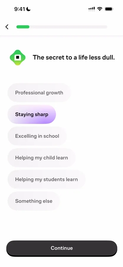
“I’m digging this selected state with a purple gradient on the background.” José, 1:52
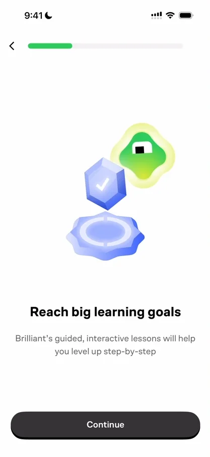
“And their animations are just incredible.” José, 2:05
He wonders whether it’s Rive or Lottie 2:10, two frameworks for this style of animation. The whole app is built on active learning: doing something instead of just learning about it 2:52. When you pick a time of day, the mascot acts it out 3:05: a coffee for a morning routine, Sudoku for an afternoon break, tea for a nightly ritual.
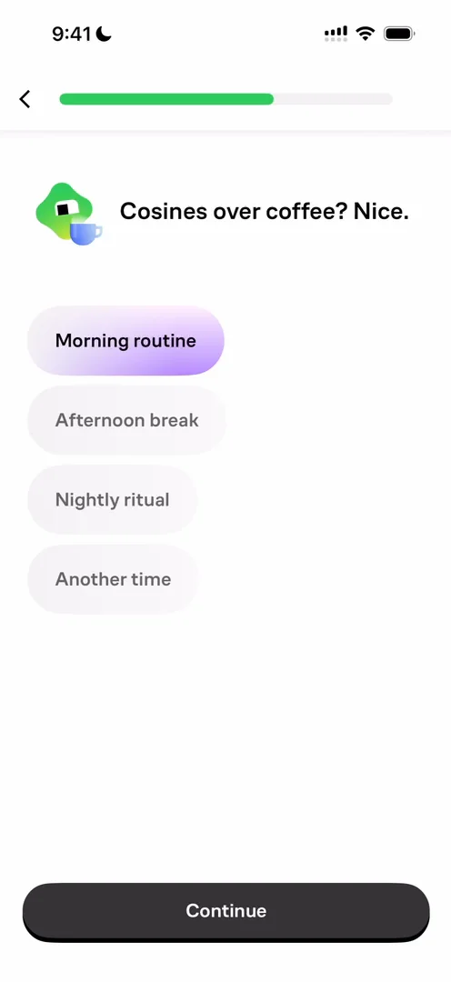
“But I’m really loving these like small interactions with the character.” José, 3:17
A fake notification prompt, done wrong
Then comes the classic notification step, with a fake copy of Apple’s notification pop-up 3:24. He taps Allow, and nothing happens:
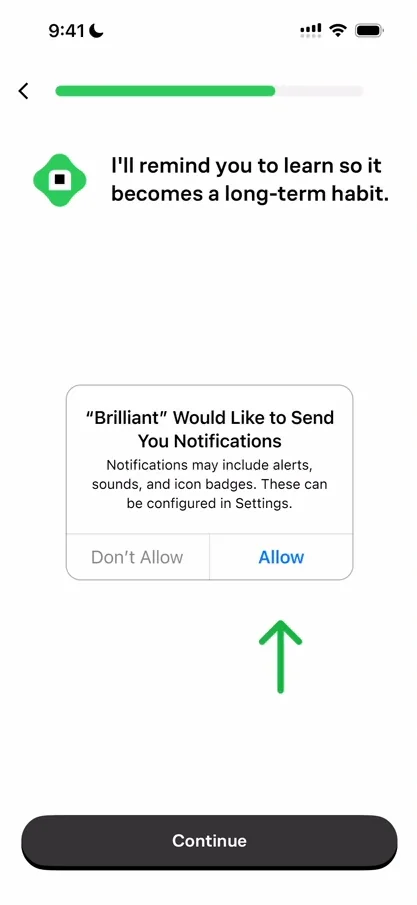
“Okay, actually, this is a good example of a bad use of this technique.” José, 3:35
Usually, designers show you the fake prompt with an arrow to press Allow, and when you do, the real prompt appears 3:41. Here, the arrow points at Allow, but only the Continue button moves you on 3:58, so by instinct he tapped Allow on the picture.
“If you’re gonna go for the fake pop-up, make people press allow and not continue for the actual pop-up to appear.” José, 4:13
Then another classic: asking you to create an account only after you’ve put in all that effort in the onboarding 4:32. After the paywall, a course picker expands the course you pick, though the animation itself isn’t great.
Notifications, asked again on the home
On the home, the first thing is another ask for notifications:
“We have a very cool example of a basically fallback for notifications.” José, 6:56
Apps as big as Brilliant know very well that a user without notifications sticks much less than one with them 7:02. He’s generalising, he says, but it’s true for the vast majority of apps, so the first thing they do on the home is ask again 7:16. His guess is they’ll keep asking almost every day 7:26.
The home itself is very clean, much cleaner than the onboarding 7:59:
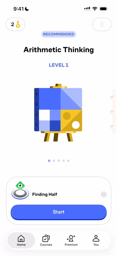
“I like the icons. I love the illustrations.” José
A carousel full of tiny details
The recommended courses sit in a carousel. Scrolling it is very satisfying, with a little haptic as each one is selected, and the courses grow as they come into view:
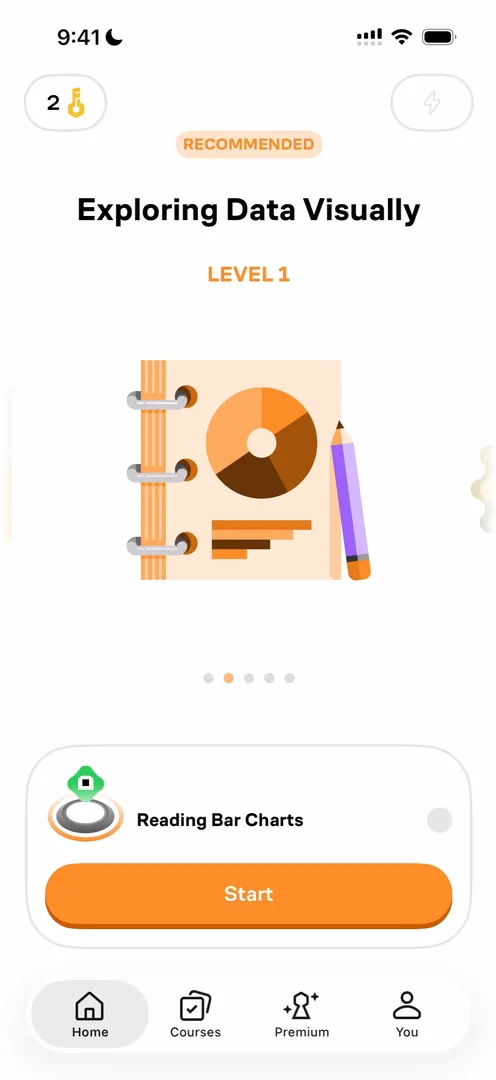
“And then the fact that the top elements and the bottom at the bottom change color is just fantastic” José, 9:27
Even the little ring around the mascot changes colour 9:36:
“These types of tiny details are just amazing” José, 9:41
When a lesson starts, the mascot comes down just like Duolingo’s 9:52:
“One of them definitely takes inspiration from the other.” José, 10:09
Reminders, right after the first lesson
At the end of his first lesson, the app asks for notifications once more:
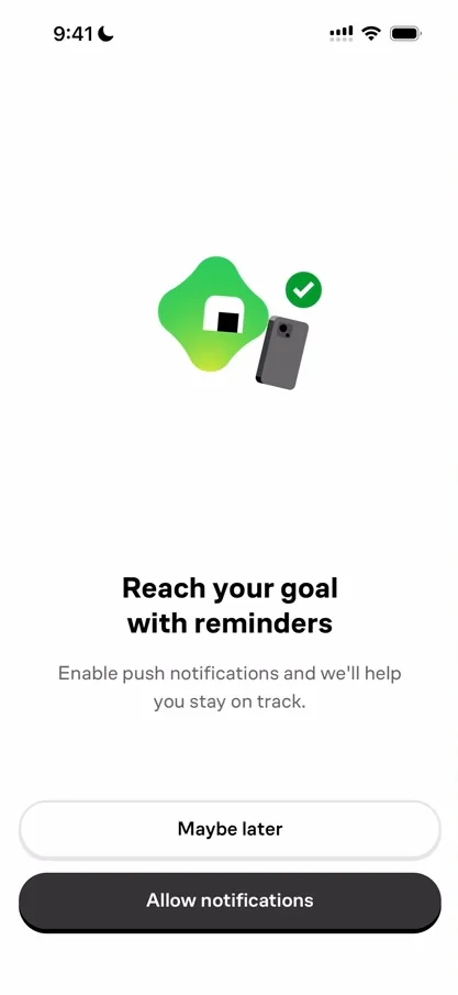
“And this is a very timely way to do it.” José, 14:32
Asking then works because now he gets what the value is. And they do something very good and unique 15:04: they link straight to the notifications toggle for Brilliant inside Settings. When you ask again for notification access, you can link to the notifications tab, or to the app in Settings 15:15. Linking to the app’s own notification settings means there’s only one toggle on the screen, so people know exactly what to do 15:30:
“So it’s a tiny detail, but that matters a lot when you’re trying to regain the confidence of people to activate notifications.” José
After a lesson, the mascot leaves its little circle and sits behind the card, with a nice glow at the bottom of the home. One miss, though: he swiped, hoping the mascot would slide back into its circle 16:25.
“That would have been an exceptionally cool touch.” José
A course like a game
He really likes the design of the bottom navigation. Opening a course shows its complete learning path, with the navigation bar gone 17:18:
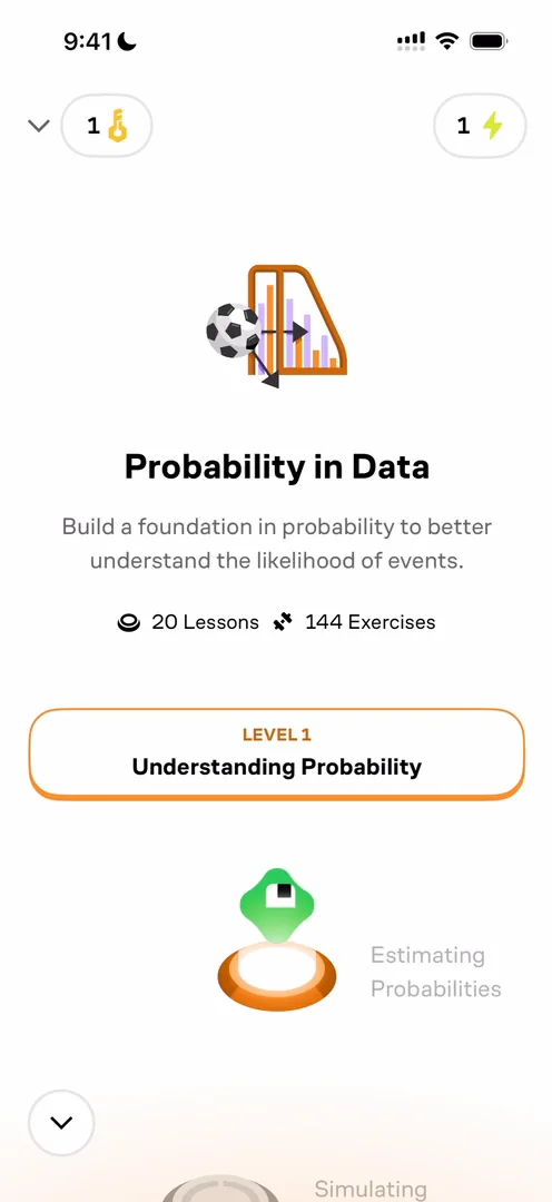
“It reminds me of the arena selection in Clash Royale.” José
There’s no button to start until you scroll, and then it stays. He wishes it were there from the beginning. The courses list is one big list, and he wishes it had more variety: the News app is just news, and the App Store is just apps, but both show them in different formats.
A profile that could do more
The profile looks just like Duolingo’s, and he wishes they did a bit more with its empty state 19:51. You downloaded an app to learn something, so there are probably resources you’re looking for 19:59, and people you know who are learning it too, whom you could share it with, to help the app spread, what he calls its K-factor 20:09.
The verdict
What he shouts out first is the animation 20:23, then the general product and graphic design 20:25: things look extremely clean, even if not everything does.
“And one thing that I’m going to call out actually is just how clear the app is.” José
“You know where to go next and you know what to do. You’re never lost.” José
Small misses aside:
“I think this app is exceptionally clear and does a very good job at putting you through the golden path and pushing you through it.” José
 1 of 6
Six design challenges from this episode
Learn design from the apps you love
Practice UI design every day with 300+ briefs from apps like Brilliant. Finish one and its card is yours.


