
App Breakdown #85 · Brink
Brink’s UI design: a solo designer’s podcast app, details and rough edges
José opens Brink, a podcast player by a solo founder who’s also a designer, for the first time. It’s full of small touches, and has plenty of rough edges.

Brink is a podcast player made by a solo founder who’s also a designer 0:00. José saw the founder posting screenshots of it on Twitter 0:19:
“They look very cool. Looks like we’re gonna have some sauce.” José, 0:29
He hadn’t used it before the episode, and opens it for the first time on camera 0:35.
The first seconds
Before its splash screen, Brink flashes a “Setting up your podcasts” view 0:40. José would cut it:
“It’s just a bad bad impression when there’s a flicker or a flash right when you open the app the first time.” José, 1:05
The splash that follows is very clean: podcast covers scattered above “Welcome to Brink” 1:09. You can’t drag them around, which he says would be a cool touch, if useless. He doesn’t expect a solo founder to have time for details like that 1:14. The covers do move with the phone, in what he says looks like a gyroscope-driven parallax 1:30:
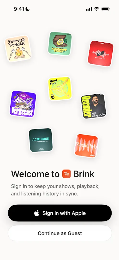
“So there is some flare. Nice bonus points there.” José, 1:35
He thinks the bottom button has a gradient, though it’s so subtle he isn’t sure 1:46.
Setup
The onboarding runs long:
“It is a very long onboarding, I’m gonna be honest, as a user I wouldn’t read any of this.” José
Two screens later, on “Pick what you love”, the category icons only load once he gets there 3:36. His advice:
“It’s also important for designers to think not just about how things look but how they manifest in the app.” José, 3:50
“If you’re developing it, try to load the content on the previous screen.” José, 4:05
The categories themselves, once picked, light up in bright colours 4:27:
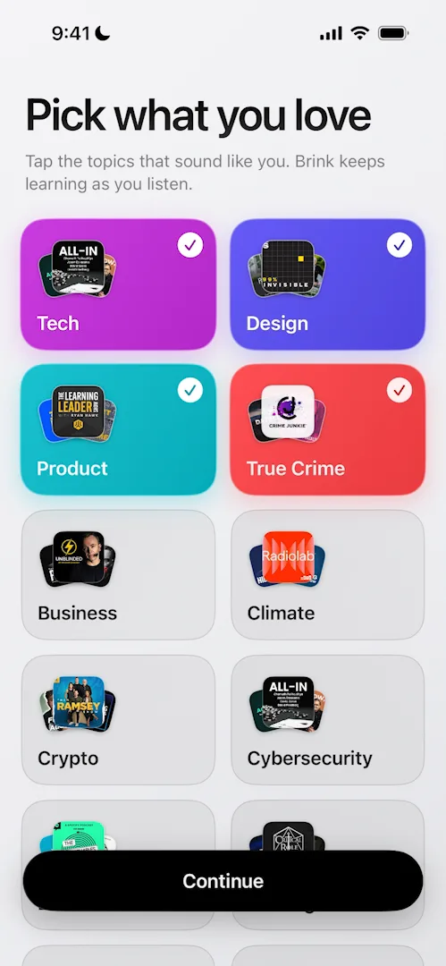
“Very cool color scheme here. I think it’s very based on what Apple does for the App Store… I really like it, it stands out.” José, 4:28
The podcasts to follow come next, each in its own box:
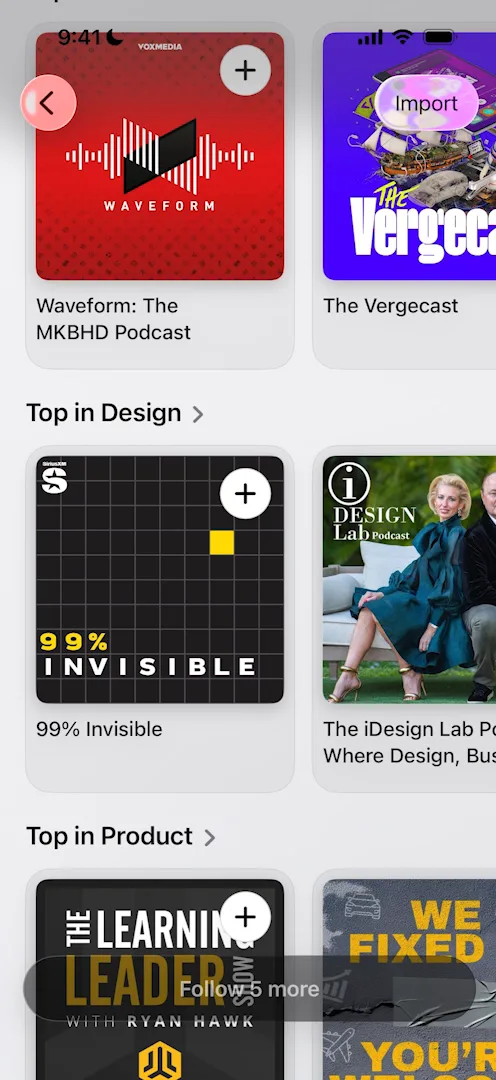
“I gotta say I’m not the biggest fan of this like bounding box around things. I wish the box was just taken out.” José, 4:58
He’d rather have a menu in the style of the App Store, Apple Books or Apple Music 5:02. The “Getting things ready” screen after that has nothing moving on it, where he’d expect some animation 5:52.
The paywall
The paywall is “a very beautiful paywall actually”, its pieces sliding up into place 6:00. José likes the button at the bottom, set to the right, and says he recently designed one very like it 6:11. But it’s a lot to digest, even well organised, and the prices sit far from the pay button 6:24:
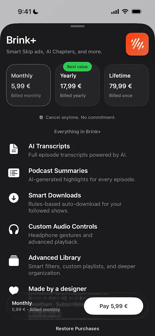
“If you’re paying for something you usually want the price to be close to where you’re clicking pay.” José, 6:40
He calls these tiny details 6:46.
Home
Home is very clean, with not much happening, which José says can be very positive or very negative depending on who you ask 6:53. A show appears at the top out of nowhere, which he guesses was loading late in the background 7:13. It’s the first of a carousel, and the carousel has a detail he likes:
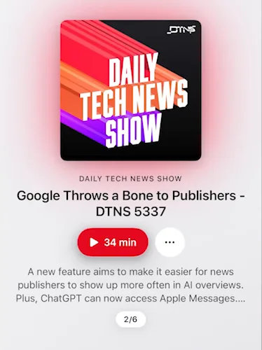
“When I scroll horizontally the text moves faster than the image.” José, 7:41
“I mean parallax effects have been around for extremely long on web on apps everywhere and I just really like them.” José, 7:48
Each show also casts a glow from its artwork onto the background, and the play buttons change colour to match.
A show’s page
A show’s page takes on the colour of the show itself:
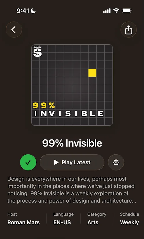
“The design is just very clean, I actually love it, so it looks very much like Apple Music, which is to be expected.” José, 11:13
When he follows a show again, a tip about its settings pops up by the gear button on the right; it leads back to the paywall, again nicely animated 11:21. Going back, the transitions aren’t the smoothest 11:37.
Little animations everywhere
Further down Home there are folders in a liquid glass style 11:43. Open one and things animate in, as they do across the app:
“The guy that did this really loves these animations when you open the page and there’s things appearing. He does that all over the place.” José
Tapping “Expected releases tomorrow” opens a plain sheet, not the calendar José expected; he guesses it’s cleaner that way. The content is still slow to load in places, which he says needs fixing.
Stats
From the profile you can open full listening stats: time listened, streaks, genres, monthly trends.
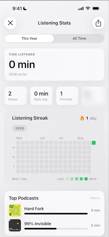
“I feel like podcast nerds would actually love a view like this, and it would probably also be cool for marketing, because people love numbers.” José
Clips
The centre tab is a mystery to him; it opens on “Cueing up clips…”. It plays clips, and you scroll vertically to switch between shows 16:34.
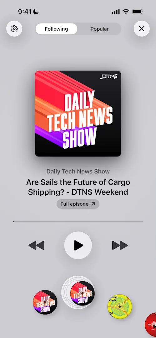
“It’s cool as a designer, it’s a very cool screen.” José, 17:17
He isn’t sure why you’d want it, since he listens to podcasts an hour or more at a time 16:48. Maybe it’s for finding which podcast to listen to next 16:56. It also takes over the whole screen, so the rest of the app’s navigation is out of reach 17:08. Looking at the app as a whole, he isn’t sure it’s worth everything it breaks 17:20.
A map of what’s trending
The compass tab opens on a map of what people are listening to around the world 17:37:
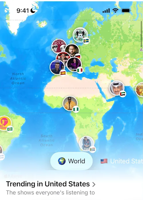
“This is what’s trending in Mexico, what’s trending in Canada. Okay, this is very cool actually. I did not expect to see something like this in the app.” José, 17:51
There aren’t many data points on it, which he’s fine with 18:02. The lists below run into the same loading issues as before 18:16, and the map itself, he says, isn’t very well designed where its shadows and gradients meet the text at the bottom 18:53.
The verdict
“We’ve seen plenty that is lovely, we’ve seen plenty of rough edges.” José
“Very cool app. Not a podcast guy, so I’m probably not going to use it, but I’ve learned a few things that I’m going to apply to my designs.” José, 20:55
 1 of 4
Four design challenges from this episode
Learn design from the apps you love
Practice UI design every day with 300+ briefs from apps like Brink. Finish one and its card is yours.


