
App Breakdown #71 · chilli
The UI design of chilli, the climate action app with a clean, bold look
chilli is all about taking action against climate change, with feeds of people doing the same. José opens it for the first time and finds a clean, confident app that knows what it wants you to do.

José opens the episode on chilli, the app that won Apple’s Editor’s Choice award for making a difference 0:00. He legitimately doesn’t know what to expect: he found it browsing the App Store, and it seems to be all about taking action against climate change and engaging in feeds with people who do the same. But the screens look great, and there might be cool social features, so why not jump in.
His first reaction on opening it:
“I love the pink. Very bold.” José
An onboarding with effort in it
The carousel brings its content in with nice, cool animations:
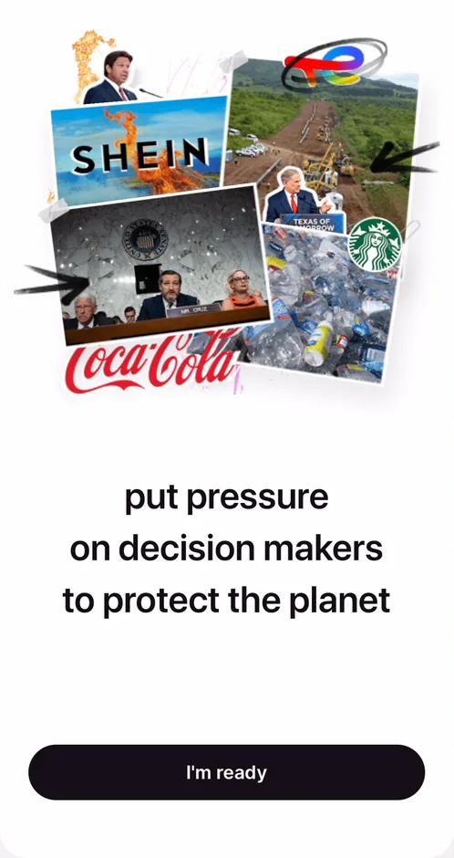
“Okay, they really put some effort into this onboarding carousel. I dig it.” José
And:
“It’s not the best in the world, but also it’s far better than most.” José
You can skip creating an account from the top right, but that brings a second ask:
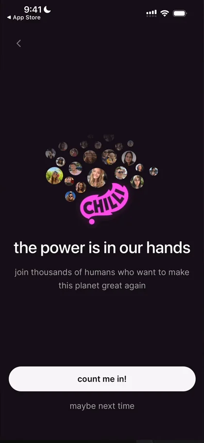
“Very cool, so they give you an option to skip but when you click skip they try to lure you back in” José
So the app tries twice 1:54. He also finds the UI very readable 2:14: fully white UIs can sometimes feel almost overwhelming, especially if, like him, you use dark mode for most things, but this one feels pretty good 2:30.
Choosing what you’ll do
One question asks which actions you’re willing to take 2:40:
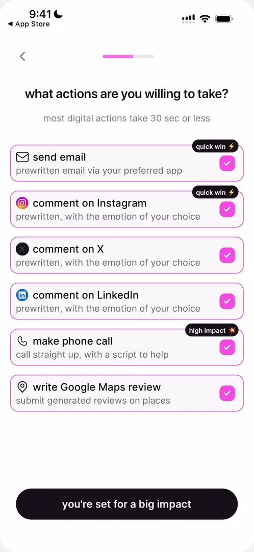
“And that’s probably gonna impact what they suggest inside of the app.” José, 2:50
A fake prompt done wrong
Then, after quite a big onboarding 3:06, a mock of the iOS notification prompt:
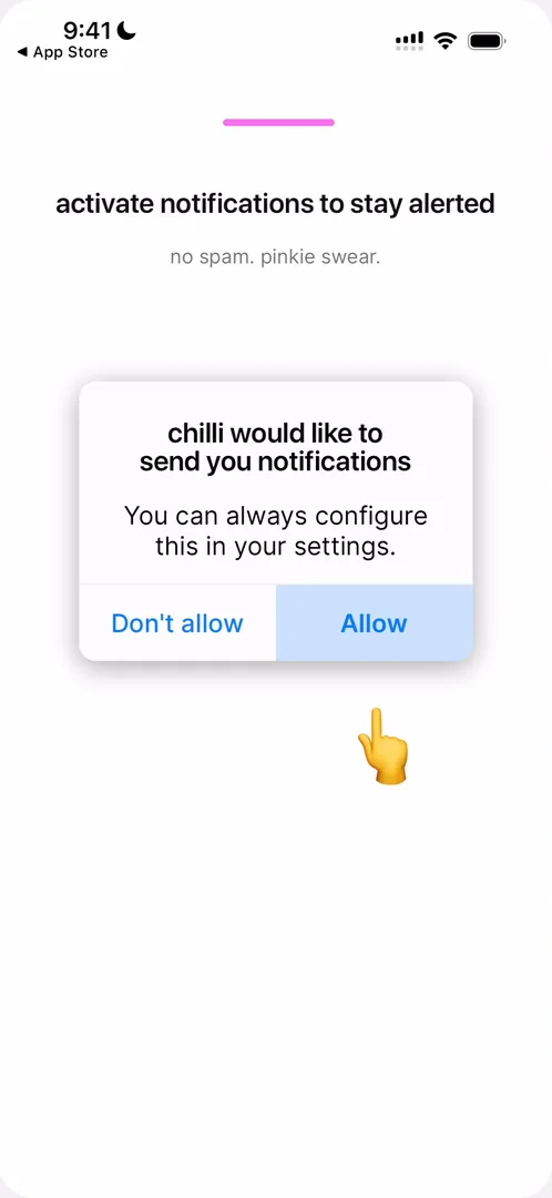
“This is the classic technique of apps to get you to activate notifications by doing a fake iOS prompt” José, 3:13
You tap Allow on the fake prompt, and they show the real one after. This is how you should not do it, he says 3:27: the fake prompt looks nothing like the real one 3:32.
“It’s outdated. It’s made for like iOS 16.” José, 3:36
So it doesn’t fulfil its purpose 3:39, and it breaks the App Store guidelines, so you risk your app being taken off the App Store without reaping the benefits.
“Either do it properly or don’t do it at all” José, 3:54
A clean home, and one thing to do
On the home feed 4:00:
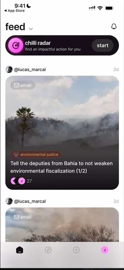
“I’m really loving how clean the UI is” José, 4:06
He doesn’t mean it as a dig, but apps around activism tend to be made by consultancies that don’t know much about design, or by people who don’t care, and they tend not to look very good 4:09:
“Chile looks great” José, 4:23
The icons in the nav bar remind him of the ones in the apps Family and Honk 4:38. And at the top, the chilli radar finds an impactful action for you:
“This idea of the Chile Radar is pretty great because I get on the app and they’re immediately giving me an action.” José, 4:55
They tell you what to do, with a clear call to action, and he always likes that:
“Ambiguity is the worst when you download a new app.” José
An email, already written
For one action, the radar has him send an email. The app drafts it 6:47:
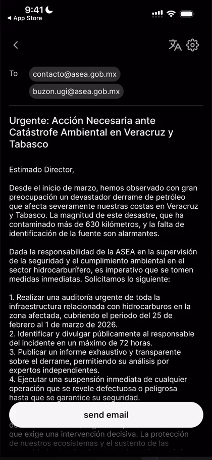
“This flow is like scarily good.” José, 6:58
It lands on the written email, ready to send, with a translate button at the top right in case it isn’t in your language 7:01. Tapping Send Email asks him to set up a mail client first. If it were a one-click send, he says, that would just be insane.
Pages that know what they’re doing
On @seaspiracy’s profile, he opens an action, a page asking Iceland’s government not to allow whaling 11:27:
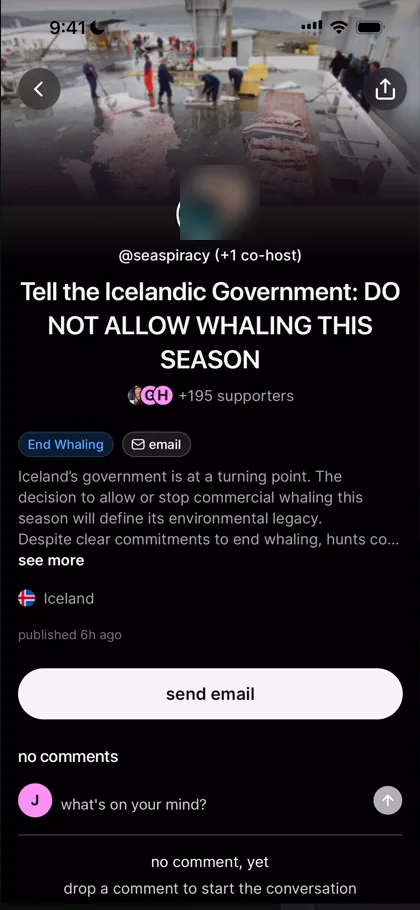
“They know what they’re doing with the way they organize content.” José, 11:29
The hosts are at the top, the number of supporters for social credibility, the type of action with its icon, and the cause:
“It’s a very well constructed page.” José
A profile keeps the actions it has taken in a folder:
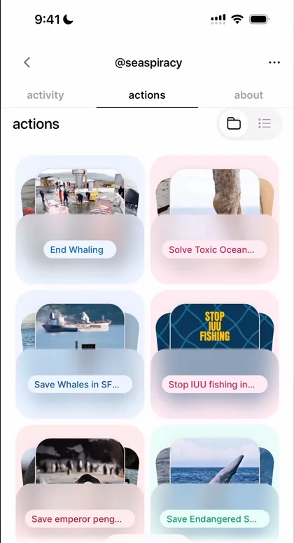
“Oh and they have a cute little UI for a folder with actions taken.” José, 12:02
It’s not the best, and very basic, just a glass layer, but it stands out, he says.
A grid with too much in it
The second tab is Discover, with trending actions 13:52:
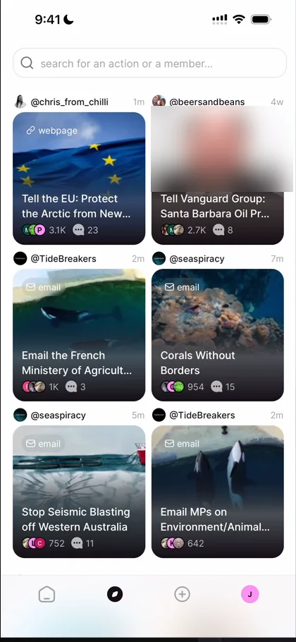
“This layout is very cluttered” José, 13:52
Each square has the person’s picture and name, how long ago it was posted, the type of action, the title, three avatars, the number of people, and a comment count 13:56:
“When building UIs like this, it’s very important to exercise restraint and just take away as many things as possible.” José, 14:12
It’s not so bad, he adds, but it is very cluttered.
The dates make a second point 14:31. If you sort content by recency and have few users, everyone can see you have few users 14:40. Here, trending actions were posted weeks to months ago:
“So to me now it seems like there’s no one posting on this app.” José, 14:54
If you don’t have a lot of activity, he says, don’t sort things by when they were posted, or at least don’t show when 15:02, and show the bigger numbers you do have instead 15:16.
Creating an action
The plus tab creates a new action:
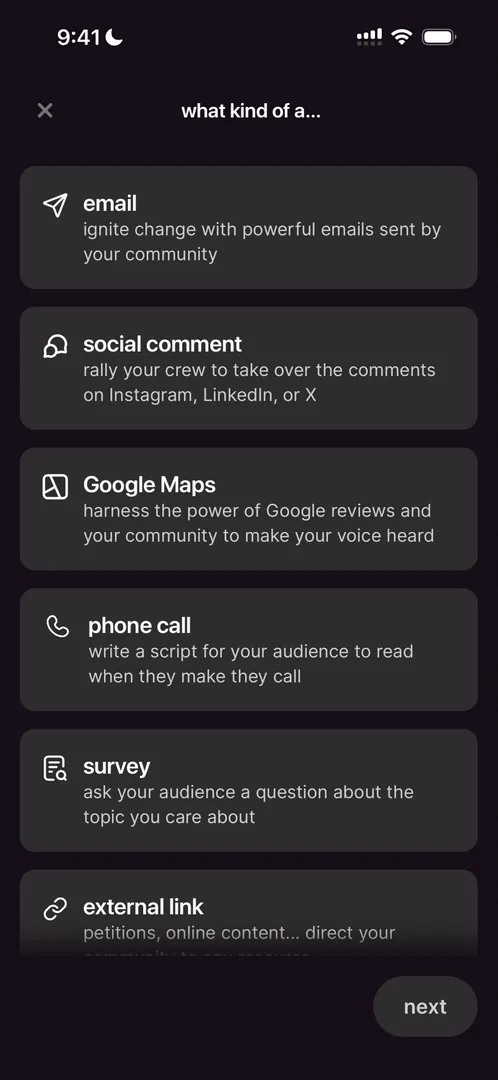
“Okay, very funky this UI. I don’t like it at all.” José
The verdict
One thing he calls out as extraordinary is the clear call to action when you enter the app: you know exactly what to do, there’s one action for you to take, and they put you there.
“I was truly surprised” José
 1 of 4
Four design challenges from this episode
Learn design from the apps you love
Practice UI design every day with 300+ briefs from apps like chilli. Finish one and its card is yours.


