
App Breakdown #53 · Claude
The UI design of Claude, the calm AI app
Claude is the AI app José uses the most. He signs in with a fresh account to see what a new user gets, and finds an app that is calm, serene and playful.

José opens the episode on Claude by Anthropic, one of the leading AI apps in the world and, to some, the best designed one 0:00. It’s the one he personally uses the most 0:25, but instead of his own busy account, he uses an empty one to show what a new user would see.
Straight into a chat
After signing in, you’re dropped straight into the chat:
“The first thing that I really love is that even though it’s a new account, you’re just dropped in the chat and there’s a prompt for you so that you know what to ask of the AI.” José, 1:15
It’s very general, but it helps you frame what the app is for 1:31. Then a little nugget that’s easy to miss 1:34:
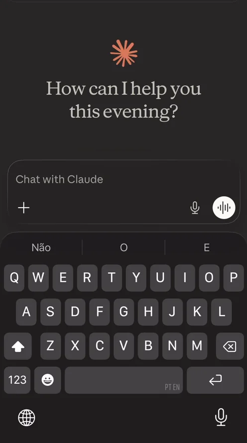
“But very important is that the keyboard opened by default so that you’re ready to type.” José, 1:37
As a user, you don’t have to decide whether to type something, because that decision has been made for you 1:43. He doesn’t know Claude’s metrics, but in other apps he has seen that simply putting the keyboard up whenever there’s an input field makes a lot more people type something 1:54. The input bar, he adds, is arguably the most important component of any AI chatbot 2:57.
A sidebar behind the screen
Tap the top left, or swipe, and the sidebar opens 3:17:
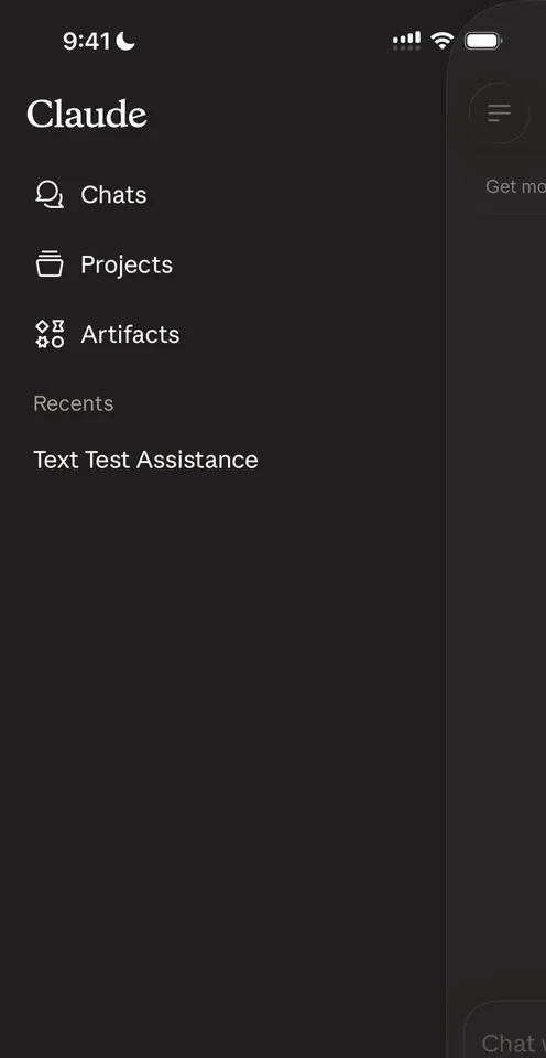
“I really like the effect that they have given it where it looks like the sidebar is behind the main screen.” José, 3:24
The main screen gets a little shadow and a border 3:30, and it’s extremely fluid 3:35, with a little haptic when it opens and closes:
“So it’s really quite perfect” José, 3:47
He doesn’t know exactly what they did to Apple’s standard Liquid Glass on the buttons at the bottom of the sidebar 4:10:
“But theirs looks a lot better for some reason. It’s almost as if it’s more frosty and just shines less light on it” José
The ghost icon at the top right opens an incognito chat, though he wonders why they don’t reuse the incognito icon everyone already knows from Chrome 5:17.
The nice thing about sidebars is that wherever you are in an app, a well-done sidebar is always there 7:24. In the account screen, there’s no notion of a profile that isn’t settings 10:19, which is fine; not every app needs a profile 10:23. And when you start a new chat, the keyboard is up by default again 10:33:
“Again, that very nice touch.” José, 10:43
Voice, photos and files
Voice messages start with a short onboarding:
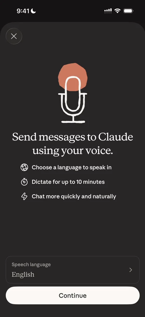
“Okay, we get dropped into a little onboarding for sending voice messages with Claude” José
The sound waves are very vanilla, nothing too special, but clean; he thinks his favourite for this kind of UI is Telegram 14:51. While a reply loads, the little orange logo comes alive 15:01:
“And you can see how they reuse it as a loading animation with like the little tentacles going in and out” José, 15:04
The plus button holds Camera, Photos and Files, a web search switch 16:14, and a way to choose a style 16:28:
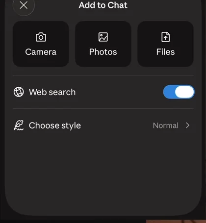
“And we can also change the choose style here.” José, 16:28
The style can be learning, concise, explanatory or formal. One of the reasons some people choose Claude over ChatGPT is the AI’s personality, and this goes back to that non-visual side of design 16:37: you may want the AI to talk to you differently depending on the conversation 16:43.
“And so you can change the style from the input bar here. Very cool.” José, 16:48
“Basically design is a lot more than just the pixels” José
A photo shows up in the chat as a plain square:
“This looks very, very basic and I wish they added some more personality to it” José, 17:28
A PDF shows only its name, with no preview 18:03, and tapping it does nothing, though he wishes he could preview it.
A starred section that appears when you need it
Once a chat is starred, a new section appears in the sidebar:
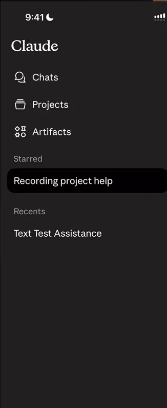
“And it’s a good example of progressive disclosure of UI” José
Before, nothing was starred, so the section didn’t exist:
“So very cool example of just progressively disclosing the features that are available to you” José, 20:05
A voice mode that glows
Inside a project, a pill at the top shows which project you’re in 20:25. Then voice mode:
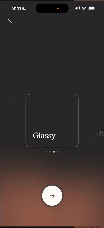
“So we can choose the voices here with a nice little carousel” José, 20:54
“I love the glows at the bottom because they’re they’re not quite glows, it’s more like just flat gradients appearing as glows, it gives it a very distinct look” José, 21:01
When you tap Continue, it splits into three buttons 21:28, and the gradient tells you it’s listening 21:38:
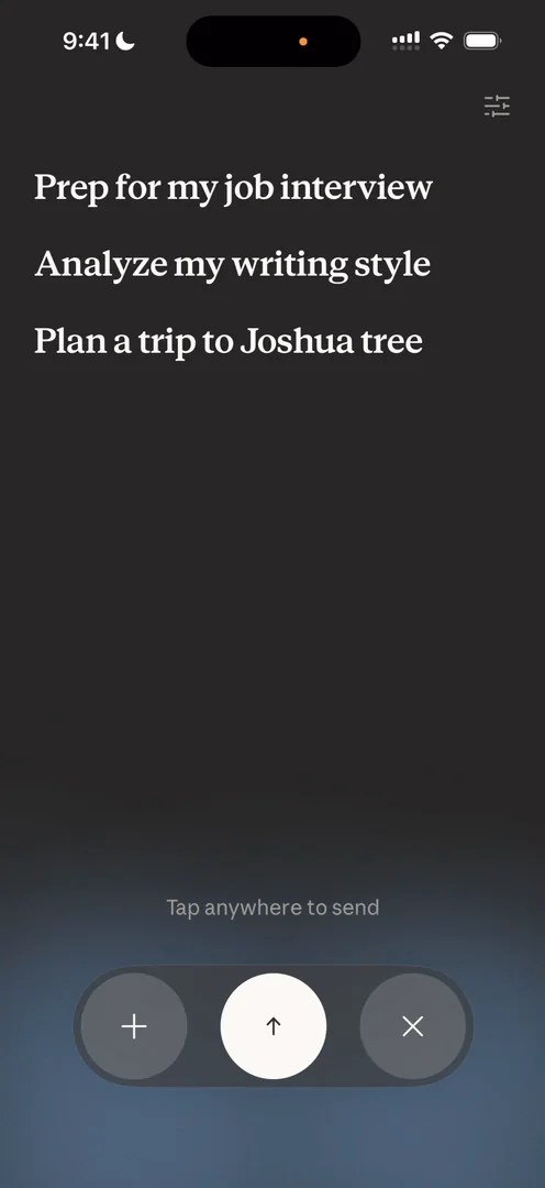
“Notice how the gradient goes up and down as I’m speaking.” José, 22:02
“I think this entire bottom interaction here is one of the most underrated and coolest things about this app” José, 22:05
But the buttons are less clear. The plus and the close look extremely similar 22:28, and opening the plus menu leaves you with two close buttons 22:42. Summing up voice mode:
“I think that I really, really love the gradients and the treatment that they have on the back” José, 22:47
“However, the interaction methods here, like they’re not clear.” José, 23:02
He wishes they put a bit more thought into it 24:00. There’s also a settings button at the top right to change the voice mid-conversation 24:03.
The verdict
He loves that it opens to a conversation, that the keyboard comes up when it should, and the little prompts that tell you what to engage with. He really loves the gradients behind voice mode, which show what’s happening without having to read anything:
“Also, big plus to the sidebar. I think it is better conceived than some of the alternatives.” José
“And just in general, the look and feel of the app is very premium, but not in a flashy way. It’s very calm.” José
“Claude is very calm, it’s very serene, and it’s playful. So it’s very joyful to use.” José
The voice mode UI could be a lot clearer, but overall, it’s his AI app of choice.
 1 of 5
Five design challenges from this episode
Learn design from the apps you love
Practice UI design every day with 300+ briefs from apps like Claude. Finish one and its card is yours.


