
App Breakdown #56 · Eimi
The UI design of Eimi, daily learning cards with delightful animation
Eimi turns the things you love into daily learning cards. It caught José’s eye with its UI style, and he’s smiling from the very first screen.

José opens the episode on Eimi, an app that lets you turn the things you love into daily learning cards 0:00. It came to his attention for its UI style, and he saw videos of it on 60fps 0:09, a great website for finding cool apps and designs.
An opening that makes him smile
“Okay, extremely cool opening animation” José, 0:36
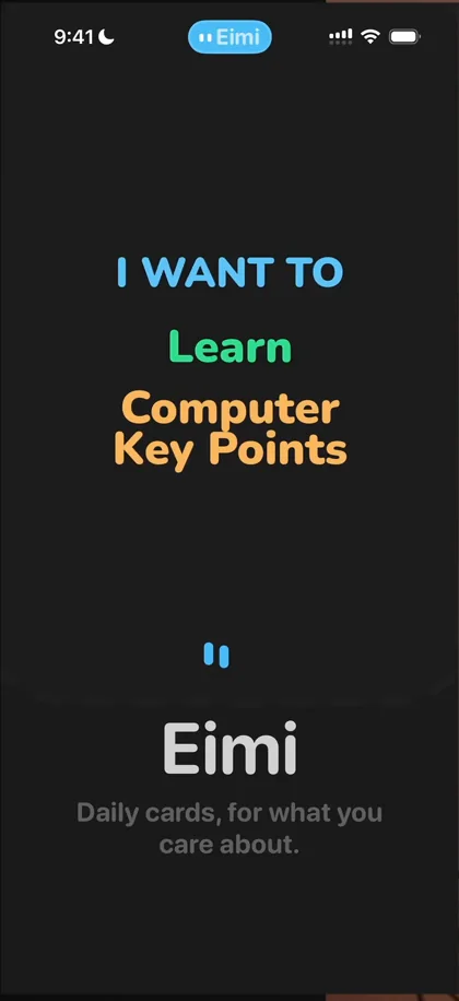
“I’m already smiling so it’s already a good episode” José, 0:40
As the letters change, there are custom haptics, and on the shake too 0:46:
“So many cool details just on the first opening screen.” José, 0:50
First, the two little dots that stand for eyes 0:55:
“And straight away you understand that it’s eyes looking around.” José, 0:59
Then the card comes into view and expands, so you understand the spatial model you’ll see in the app 1:05, with haptics throughout the whole thing.
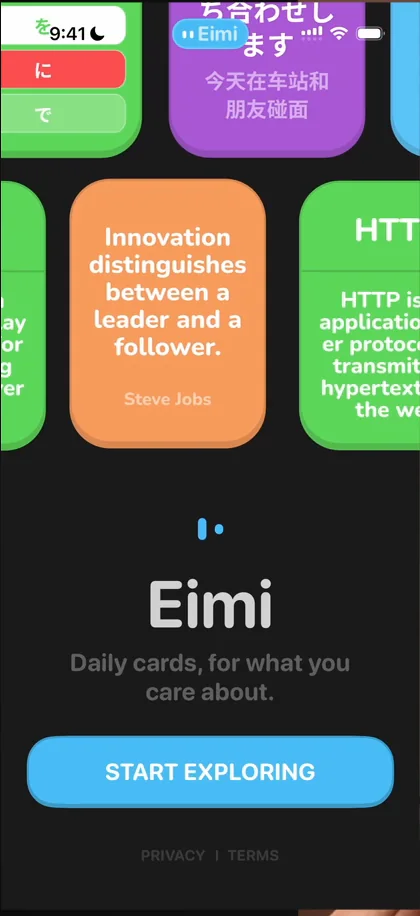
“I’m already very happy.” José, 1:15
Straight to the home screen
Tap Start Exploring, and after a soft, smooth animation 1:23, you’re dropped straight onto the home screen 1:33. “Thank you” 1:35, he tells Eimi:
“Because we’ve been doing so many episodes where I have to go through a 37-step onboarding before getting to the app” José
“So this feels extremely refreshing.” José, 1:42
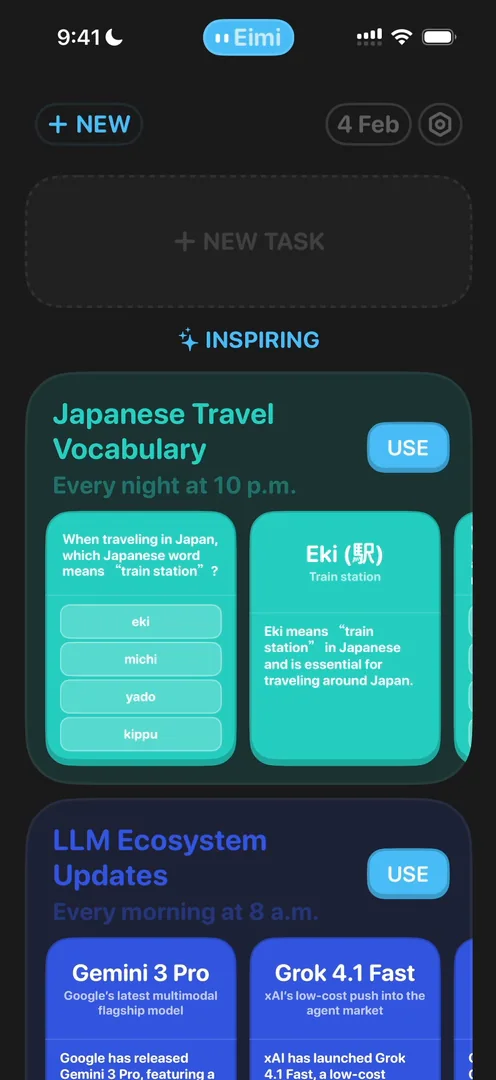
“What do we have here?” José, 1:47
He thinks the inspiring cards are things you can learn, like Japanese or LLM ecosystem updates 1:57. The first thing he notices is that “New” is repetitive 2:07: there’s a New at the top and a New Task button, and he isn’t sure which to tap.
Eyes that say a lot
In Settings, the two little eyes come back at the bottom of the screen. He really loves how expressive they are, even though they’re just two little lines growing, shrinking and moving to the side:
“This type of animation is just amazing to me.” José
A share card that shows more than the card
In his UI/UX Design Details deck, each card can be shared, and the animation is great: the card comes to the front, with a bit of a glitch 10:06, then turns into a sharing card:
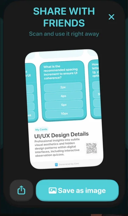
“And you actually see not only the card that you answered, but the two cards next to it, the explanation of the cards that you are answering and then a QR code” José, 10:10
“I’m not sure what I was expecting in terms of sharing, probably just the card, but this is very, very cool.” José
Designer animations
To star a card, you long-press it and pull it down 10:56:
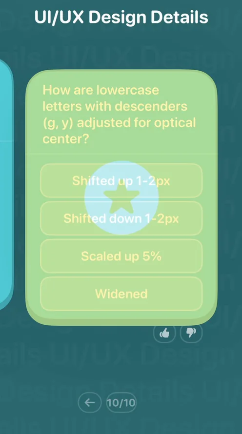
“Okay, this is one of those what I usually call designer animations, which are animations that are really clever, really cool, look amazing, but no normal user will ever find out.” José, 11:04
It’s a classic, he says 11:19: you’re in Figma, prototyping, you find an extremely clever animation and feel like the king of the world of design 11:26, and then realise only 0.5% of users will ever find it 11:30. That’s fine, he says:
“If you’re doing Easter eggs or things that just bring joy to your power users, but not if you have one of the main features like starring a card, that should come easy for every user.” José, 11:37
Then, out of curiosity, he swipes a card up, and that brings up the share card 12:00:
“So again, perfect example of designer animation that looks extremely cool, but I’ll never find it out.” José, 12:06
He loves that the card goes out of view and comes back in, and that it isn’t a new card.
The verdict
“I love the transitions and the animations. I love how clean it is. I love how to the point it is.” José
“There’s no shenanigans, no 10 step onboarding, no dark patterns.” José
Most of all, he loves the tiny details, like the effort that went into the sharing animation:
“I think this is an amazing example of an app that does one thing, does it extremely well, and does it most of all in a delightful way.” José
 1 of 3
Three design challenges from this episode
Learn design from the apps you love
Practice UI design every day with 300+ briefs from apps like Eimi. Finish one and its card is yours.


