
App Breakdown #69 · Endel
The UI design of Endel, the sleep and focus app in black and white
Endel promises to help you sleep and focus better with sound. José opens it for the first time because of its illustrations, and finds an app built with remarkable care, with a few screens that need work.

José opens the episode on Endel, the App of the Day in over 138 countries, which promises to help you sleep and focus better 0:00. He was browsing the App Store when it caught his eye because of its style of illustration 0:11:
“They have this like black and white style that is very distinct and yet very simple” José, 0:17
An onboarding that sells the problem
It opens on a great animation 0:30:
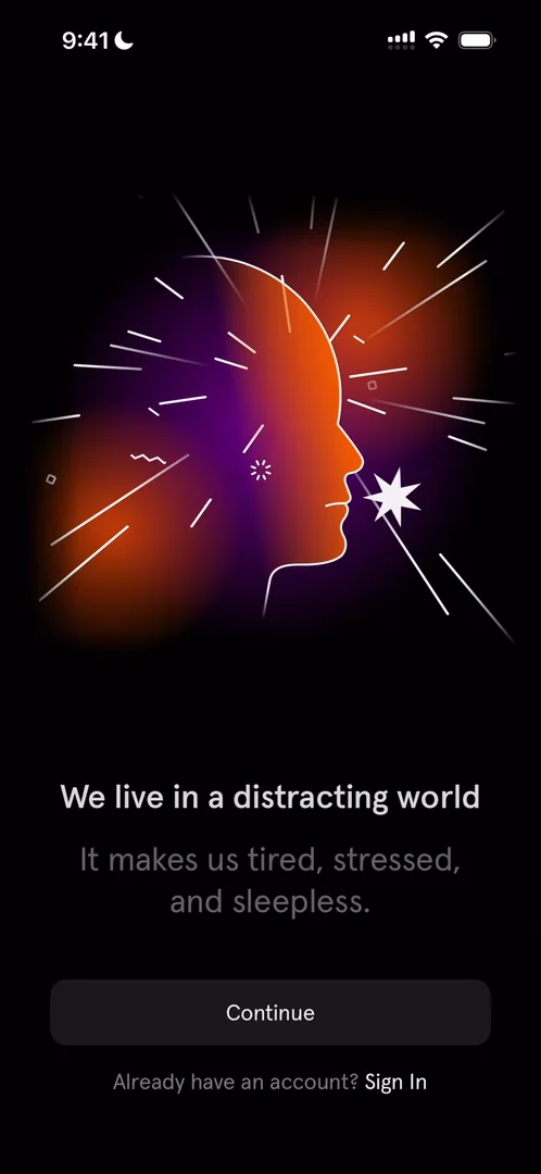
“The only thing I’m missing is custom haptics to match the animations.” José, 0:37
It’s funny, he says: black and white is what caught his eye, and the app opens with pops of colour 0:51. Apps like this are making a killing now, he thinks, because everyone is kind of feeling this, and if you really hammer down the problem during the onboarding, you can convert on the paywall 1:01. Everything fades in and out 1:16:
“It really feels like soothing” José, 1:19
Notifications at the bottom
Then come questions about your sleep. Partway through, a button to allow notifications sits at the bottom of the screen 2:28:
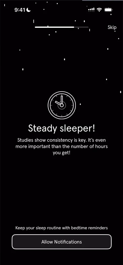
“It’s a very odd place to put because like I’ve been tapping on numbers at the center of the screen” José, 2:31
The button could be in the middle, where he’s been tapping 2:38, and there’s a skip at the top right as well.
“This is an odd way to ask for notifications.” José, 2:42
“They could do a much better job here and increase their conversion.” José, 2:46
Then the questions turn into the pitch 2:56: hammering down the problem, tailoring it to you, and selling the solution 3:02.
A paywall with a hidden option
He was expecting a paywall straight away, but first comes Sign in with Apple, with a “later” option he doesn’t understand 3:10. Then the paywall offers a year or three months, and no monthly or weekly plan, until you tap All Plans 3:19:
“It’s an odd choice to put it behind all plans and still offer it” José, 3:29
Maybe they A/B tested it and it’s what converted, he says.
Black and white, done well
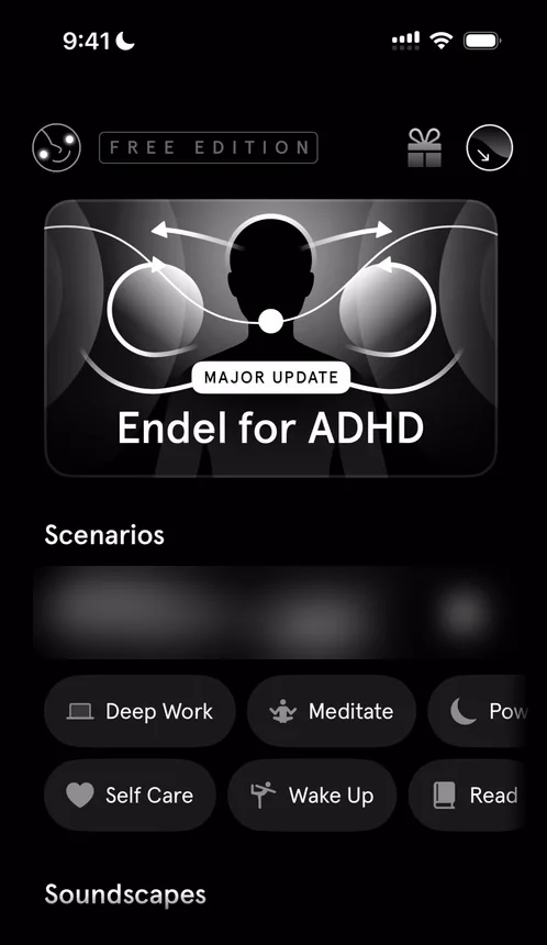
“The first thing I’ll note is whoever designed this app is an amazing designer because they were able to put this all together with black and white and still look fantastic” José
“There’s a saying that says if your design doesn’t look good in black and white it will not look good in color.” José, 5:09
You could apply ten different colour schemes to this one, he says, and it would still look good, because the fundamentals are very good 5:16. There are a few spacing issues 5:21, but overall it’s really cool. And there’s animation everywhere 5:30.
A profile behind locks
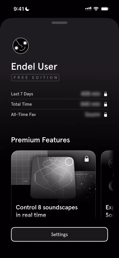
“So we have last seven days and it’s locked.” José, 5:42
Tapping the locks does nothing, which he thinks is a missed chance: if there’s a lock and he taps it, put him on the paywall. The premium features below are a carousel he expected to be paginated, but it just swipes freely.
“I really want to find out who does these illustrations because they’re genuinely exceptional.” José
An invite flow, and a preview that says “hey”
The present at the top opens an invite flow 6:36: invite friends who go premium, up to three, and you get rewards 6:40. At the end of the day it’s an acquisition channel 6:54, and one that can be very powerful when it’s properly done inside the product 6:57:
“Like I respect a lot the kind of care that is going into every single one of these screens” José, 7:08
Invite Friends opens the standard share sheet 7:26:
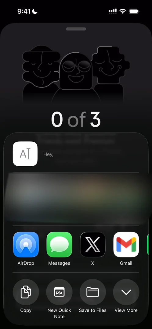
“The preview of the sharing just says hey and there’s no image there’s no link preview nothing” José, 7:31
“So the team has work to do here to make this invite better” José, 7:37
It seems trivial, he says, but it’s hard to do properly, so no shame 7:44.
Inputs that feel like a chore
The circle at the top right is “your guide” 7:59. It reads “Night Energy Dip”, because he’s recording at almost midnight 8:03. Below are the inputs you can allow:
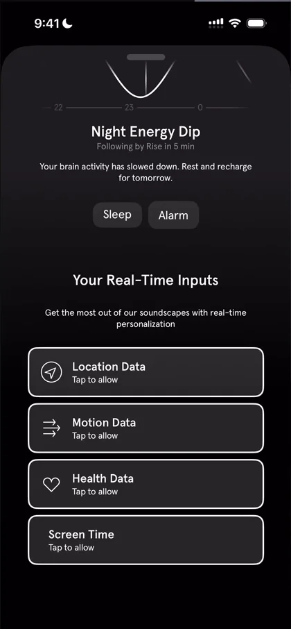
“To be honest, this screen does not entice me to actually add these.” José, 8:12
They could tell him what he gets for each, he says: allow your location, because this is what you’ll get.
“Like this, it just feels like a chore list and I’m not going to do it.” José, 8:25
A flow that loses him
The main card announces Endel for ADHD 8:34, a market he calls huge. Like almost everything in the app, it opens in a sheet with an illustration at the top 8:42, which is a bit repetitive, but since the illustrations are so good, it feels great 8:46. Continuing, though, puts him in a flow he doesn’t follow:
“So I just went through a long flow based on the top card. The top card is still there. I didn’t really get it.” José
Scenarios and soundscapes
The scenarios play with their own animations:
“Very very cool honestly I’ll be distracted just by this” José, 12:29
The soundscapes have a screen he loves 13:06:
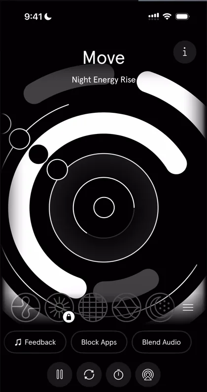
“Like it’s just such a clean screen.” José, 13:16
They really like to walk you through things 13:27, though: it feels like every tap brings a walkthrough. In theory that’s good, because you inform your user 13:34, and users will probably have more patience than him, quickly going through to record the video. But when you put people through so many screens, they won’t read them.
“People don’t want to read, that’s why they download apps like this” José
Colour, almost nowhere
“Have you noticed how there’s not a single color on this app apart from in the paywall” José
They put colours in the paywall, and in one or two other screens, and nowhere else 14:48:
“That’s so cool” José, 14:54
The exercises include box breathing, four seconds in, four seconds hold, four seconds out 15:07:
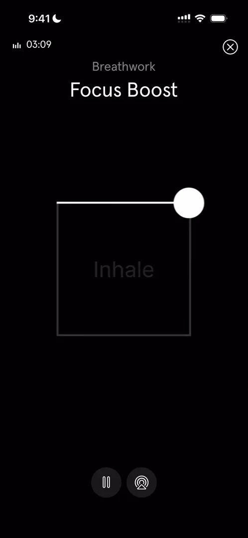
“This is called box breathing.” José
A feed that ends with answers
Further down the home, a premium module sells the app inside its own feed 15:20, very common in apps with a premium tier 15:23. Then Endel merch 15:31, which he hasn’t seen many apps sell 15:34, in a carousel he loves 15:45. And at the very bottom, how Endel works 16:06:
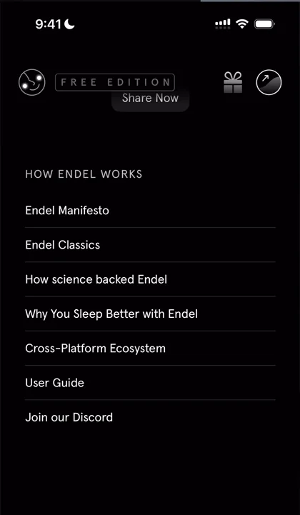
“This is a very cool section and one that more apps should do” José, 16:09
When people are using an app for the first time, or looking for something, it’s good to give them the information they might need at the bottom of scrolls 16:21, because someone mindlessly looking for an answer will scroll everywhere 16:27.
The verdict
He wasn’t expecting the app to be this delightful: everything silky smooth, the sheets working super well, and the animation breathtaking.
“The illustration is incredible.” José
He never expected to like a focus and sleep app so much:
“I’m very glad that we took a look at it.” José
 1 of 2
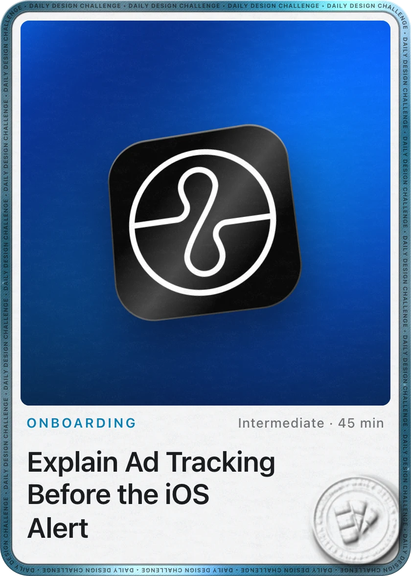
Two design challenges from this episode
Learn design from the apps you love
Practice UI design every day with 300+ briefs from apps like Endel. Finish one and its card is yours.


