
App Breakdown #88 · Fabulous
Fabulous’s UI design: how a confusing first experience loses people
José opens the habit tracker Fabulous for the first time and gets lost. What its first experience gets wrong, a good idea it does poorly, and a tip it prompts.

Fabulous is a habit tracker that looks nothing like the apps José usually breaks down 0:00. That’s why he picked it:
“Fabulous caught my eye because at least from the screenshots the app looks like it was designed in Canva, which if you’re a designer you probably take it as an offense, but in reality just means that it targets a very different audience from most of the apps we look at here.” José, 0:23
He had never opened it before the episode 0:43.
A busy first screen
It opens with a simple animation, then a loading screen, though José isn’t sure what it needs to load; it seems to be loading only the sign-in screen 0:48. That screen has press logos, buttons and a Skip:
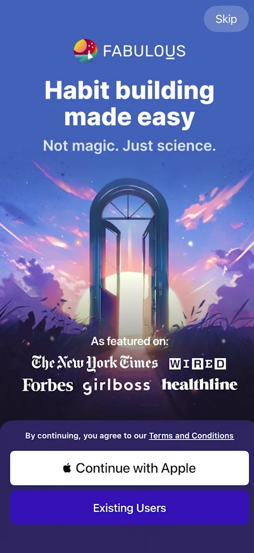
“The information density in this page is not necessarily the best.” José
He isn’t sure why there’s a Skip at all, and signs in with Apple.
Storytelling that doesn’t land
The onboarding tells a story with animations, over backgrounds he isn’t sure are drawn or AI-generated, and doesn’t like either way 2:01. The questions are static screens, with a bird drifting in the background:
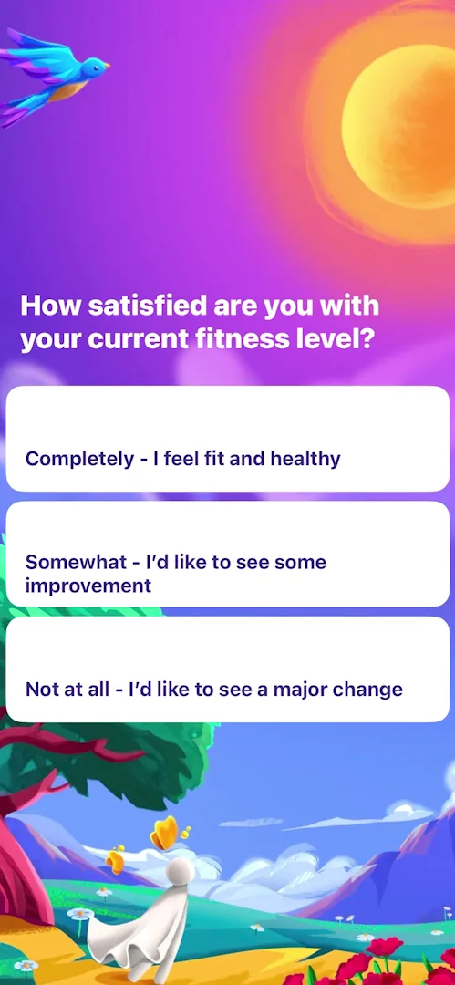
“No transition, just backgrounds changing. I’ve never seen something like this, at least on the channel.” José, 2:34
Then comes a screen he can’t make sense of:
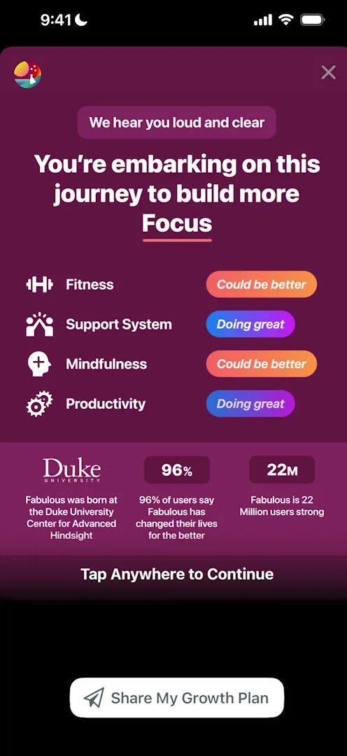
“This screen is extremely hard to read. There’s a lot going on.” José, 2:54
He doesn’t write the style off, though:
“There’s a lot of audiences that are very different from me, and so this might actually be better for some people to attract them from ads and things of that nature.” José, 3:45
A good idea done poorly, and a tip
The contract that follows types itself out slowly, and José taps three and four times to hurry it along 4:22. That prompts a tip:
“If you want to do a long animation or show a long video to a user that’s totally fine… but if they want to skip they should be able to skip.” José, 4:34
“One little trick I’ve used before is not including any skip button or X button but detecting if users triple or quadruple tap and skipping them in that case.” José, 4:43
Then he has to hold to commit:
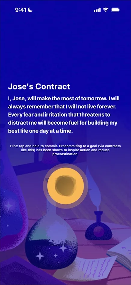
“Holding to commit or signing to commit generally is a good way to make a user feel a heavier intention towards what they’re about to do.” José, 5:08
Here it isn’t done well: the text is tiny, it isn’t clear you’re meant to hold, and holding brings no haptics, only the circle getting bigger 5:02.
Where the onboarding leaves him
What looks like a paywall follows, a scrolling one, and to José there’s nothing to learn from it. His verdict on the onboarding so far:
“This onboarding was just not good. It was not good from the visuals, transitions, etc., but especially from storytelling, because I didn’t understand what’s going on.” José
He admits that, recording, he’s answering kind of at random, so he’ll understand less than an average user would, but:
“Even if a user is like speed tapping through your onboarding, they… should understand the logic of what’s happening.” José, 6:06
Closing the paywall had brought up a second offer, which stays up while he talks. He closes it too; it seems to be a web view, with its X right in the corner 6:14. An “Are you sure?” offer follows, and he cancels that too. Then the app quotes a study 6:30:
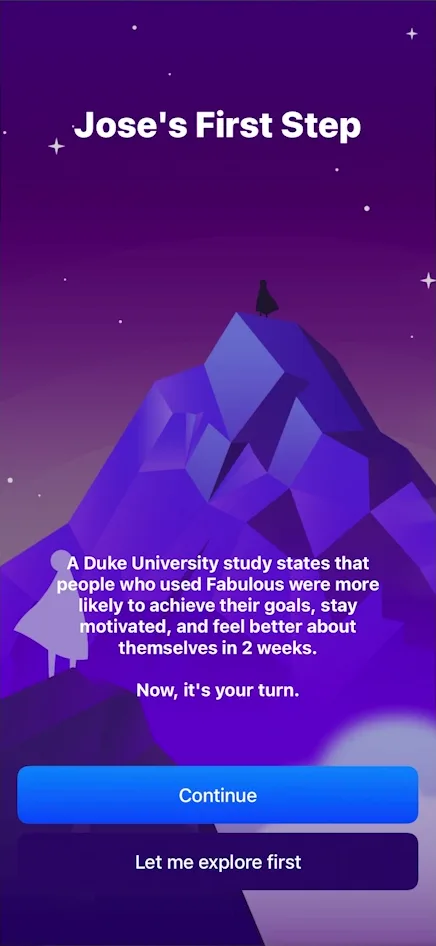
“There’s a lot of apps that do this type of thing, or like, oh it’s science based, there’s science behind what we’re doing.” José
He finds it extremely cringe.
Tabs full of things that look tappable and aren’t
After the onboarding, the app has five tabs. On the second, Journey, the path of steps is the most prominent thing on screen:
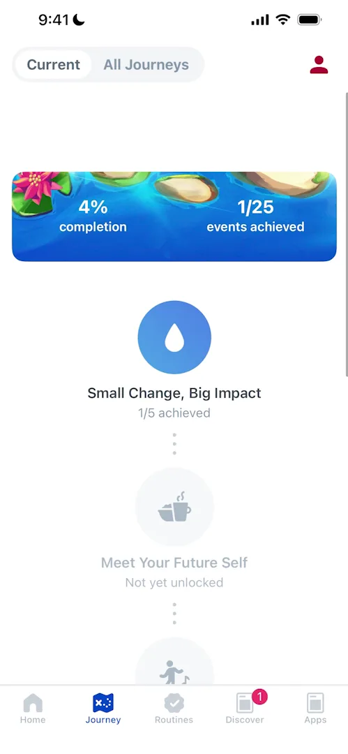
“If I tap that nothing happens, so this looks like the most tappable thing ever, and it’s pulsing, but it’s not tappable.” José
Discover is the same:
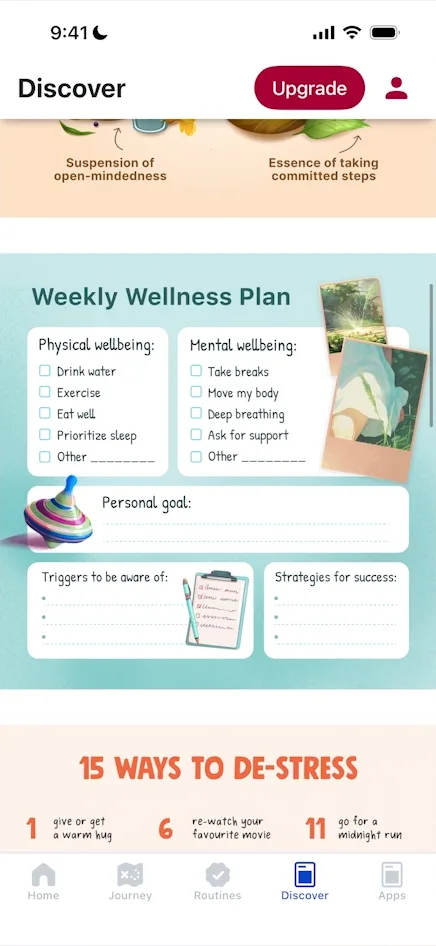
“And these are just images placed here. If I tap them, literally nothing happens.” José
“It’s like I’m looking at Instagram.” José, 12:28
The last tab, Apps, lists the team’s other apps 12:37. Tapping one sends him through a web link to its App Store page, and from there to the developer’s:
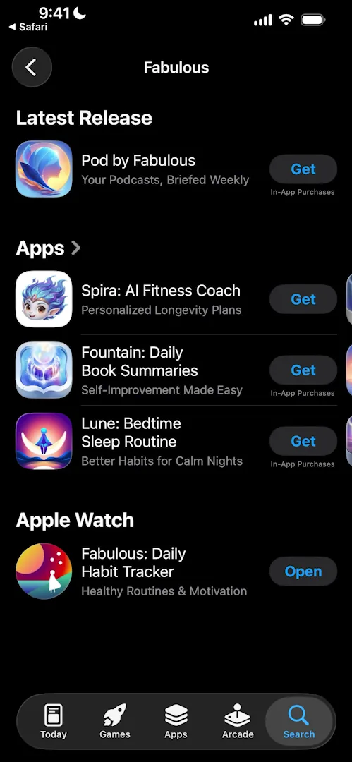
“They have a whole tab dedicated to upselling me on different apps.” José, 12:46
The verdict
José ends the episode early 13:23:
“It blocked me so much that I completely lost focus.” José
“Let this video serve as an example of how not to guide your users through an app.” José
Design challenges from the App Breakdown
Learn design from the apps you love
Practice UI design every day with 300+ briefs from apps like Vocabulary, Brink and ATC. Finish one and its card is yours.


