
App Breakdown #79 · FIFA
The FIFA World Cup app’s UI design: a lovely brand, a broken app
José had low expectations for FIFA’s World Cup app. The logo and splash screen are lovely. Almost everything after them breaks.

José breaks down the FIFA World Cup app 0:00, and he starts with low expectations 0:21. Organisations like FIFA, and music festivals, usually get ripped off by a consultancy that builds them a bad app, he says 0:24.
A lovely start
The branding, at least, is great:
“I do love very much their logo. I love the icon. I think they’ve done a phenomenal graphic design job.” José, 0:38
“Beautiful splash screen. I love the colors. Okay, we’re off to a good start.” José, 0:49
Then the web views
“And this is where I think things will start to break apart.” José, 0:53
The cookie screen that follows is a web view, and José can tell 0:56:
“Whenever you see something like this it probably means the app was done by a consultancy whose results are in no way tied to the actual performance of the app.” José, 1:01
The onboarding is a carousel of images, and the images in the background are pixelated:
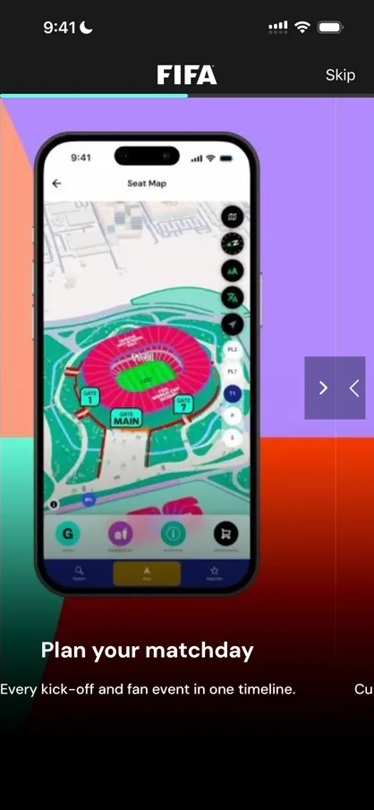
“The arrows don’t make any sense. This is like a carousel just of images.” José
Skip it, and the app asks for his location:
“They asked for my location without telling me why or how they were going to use it.” José
Then it drops him back on the sign-up screen: “the flow is just very broken”. Signing up takes a long time, including an email code that takes him about five minutes to get, and somewhere along the way he says:
“Okay this is this might be one of the worst apps we’ve ever reviewed and we’re on episode 79.” José
Home, and everything that leaves it
On the home screen, José tries to forget the onboarding and give the app a shot. A banner for tickets sits at the top, then matches and other cards 4:17:
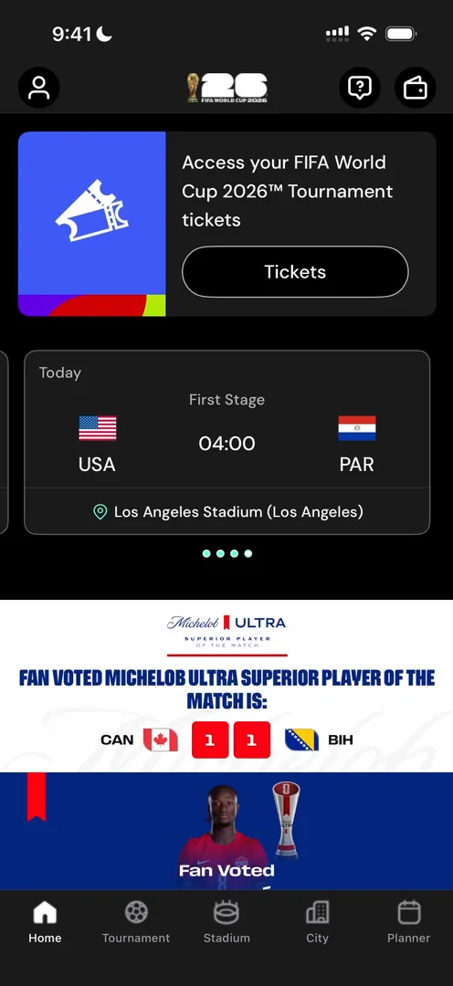
The carousels on it don’t follow his finger and pick up the wrong gestures 4:27:
“Whenever you have horizontal scrolls inside of vertical scrolls, it’s very important that you configure the gestures correctly so that things like this don’t happen.” José, 4:47
The biggest button on the screen, Tickets, takes him out of the app 5:01:
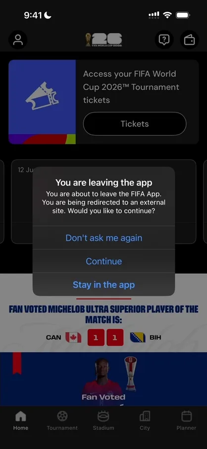
It turns out the tickets live in a separate app 5:17:
“They went through the hassle of doing a whole app and then they did a different app for mobile tickets. This is not promising.” José
The help button at the top right opens what José calls a nice little bottom sheet, with ticketing help, FAQs and live chat:
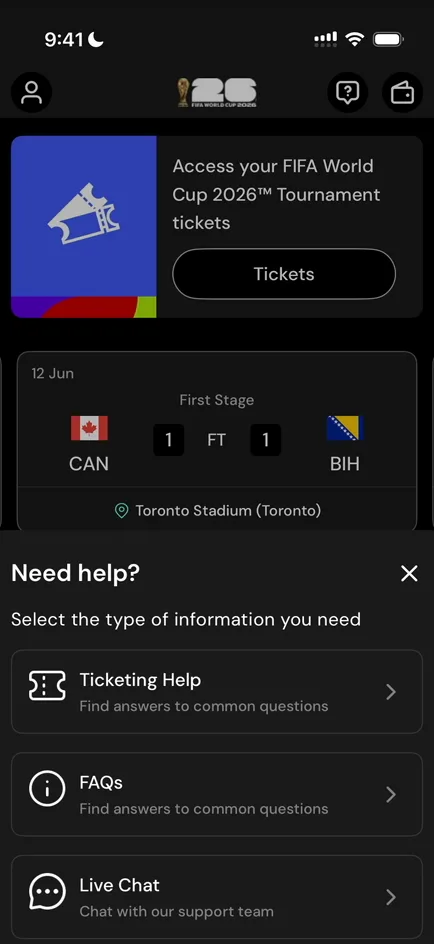
Ticketing Help tries to take him out of the app too. Next to it, the Wallet has a whole Tickets section, and it sends him to the other app as well 6:36:
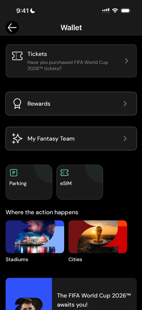
Rewards doesn’t do anything 6:46, and My Fantasy Team loads a web view 6:53:
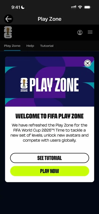
“It’s a completely separate product that they tried to integrate and the scroll doesn’t work.” José, 6:59
Parking, eSIM, Stadiums and Cities don’t do anything either 7:05:
“I’m literally trying to tap these things and they are extremely slow and don’t do anything.” José, 7:12
Even a match opens as a web view inside the app 7:23:
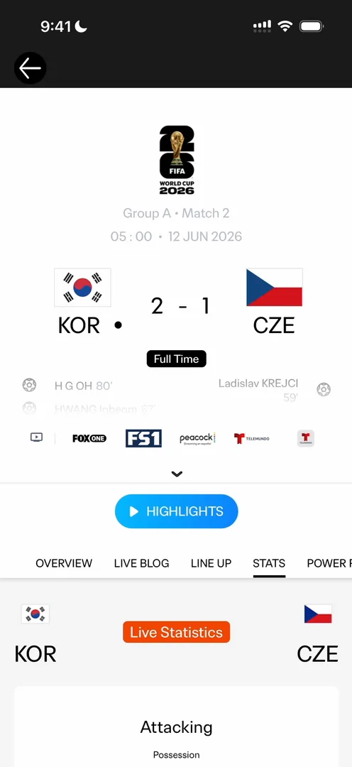
“So this app is basically a shell for just web views and different types of products that don’t really work.” José, 7:32
Back on the home screen, the Quick access buttons don’t respond either:
“I’m not joking, I’m not trying to be negative, it literally just doesn’t work, and this is the number one app basically worldwide now.” José
On the Tournament tab, the news opens in web views 8:59, and so does the Bracket Challenge when he submits 9:07:
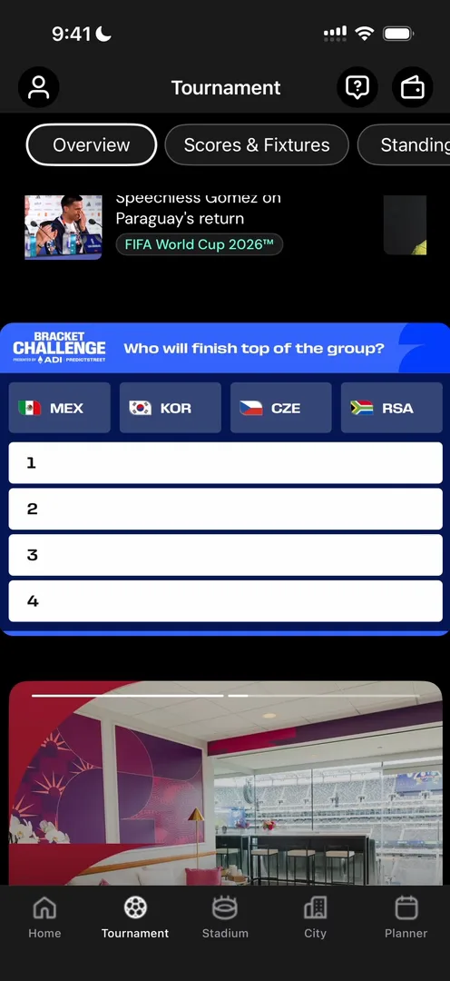
“I swear that in like 79 episodes there is two apps that I’ve trashed and this is one of them.” José, 9:21
A message to FIFA
After a quick look at the Stadium tab, José skips City and Planner and puts the phone down to speak to FIFA, and to big companies outside tech, about apps like this 9:35:
“So imagine you’re someone who has bought the very expensive tickets for the FIFA games. You go on the stadium, the Wi-Fi there in cellular is terrible.” José, 9:49
With everything built on poorly optimised web views, your tickets won’t load, and you’ll have a terrible experience 10:01.
“And apps that are as poorly built as this one are shockingly common for large non-tech corporations.” José, 10:09
They’re used to outsourcing their tech work to classic consultancies, he says, and this is the result 10:19:
“So if you’re watching this video and you’re thinking about ever hiring a classical consultancy to build tech products for you, please, please, please look for some like tech first companies.” José, 10:40
If you don’t know any such company, he offers to point you to some, and adds that he isn’t selling services, since he doesn’t do consultancy himself 10:50. To him, the app would be better as almost nothing:
“It would be so much better if it was like one button and that one button opened the ticket if you happen to buy one.” José, 11:11
A lesson about distribution
The app is still at the top of the charts, and José takes a lesson from that 11:19:
“You can literally make an app that has nothing inside of it and it reaches top one if you have a big audience to publish it.” José, 11:27
“So I guess it’s also a reminder for builders like me and many others to focus on distribution.” José, 11:34
The verdict
“The app is just really bad. The worst I’ve seen in 79 episodes.” José, 11:42
 1 of 4
Four design challenges from this episode
Learn design from the apps you love
Practice UI design every day with 300+ briefs from apps like FIFA. Finish one and its card is yours.


