
App Breakdown #75 · FocusFlight
The UI design of FocusFlight, the focus app that feels like a flight
FocusFlight, an Apple Editor’s Choice winner, promises to help you focus by pretending you’re flying. José tries it for the first time and finds an app full of delight that doesn’t always tell you what to do next.
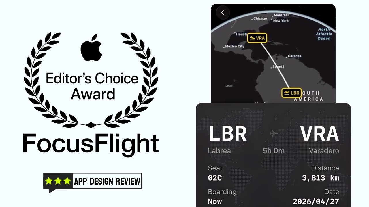
José opens the episode on FocusFlight, an Apple Editor’s Choice winner that promises to help you focus by pretending that you’re flying 0:00. He saw an ad for it on social media and knew he had to try it 0:13. Judging by the ads and the screenshots, the UI looks crisp, and the animations too 0:21.
“And by the way, just the whole concept is so cool.” José, 0:36
An onboarding that stays in place
The first questions stay on screen, faded, as new ones arrive:
“I’m liking this type of onboarding where things stay in the back.” José, 0:41
It gives you a very spatial sense of where you are in the app, and still feels very smooth and not distracting 0:45.
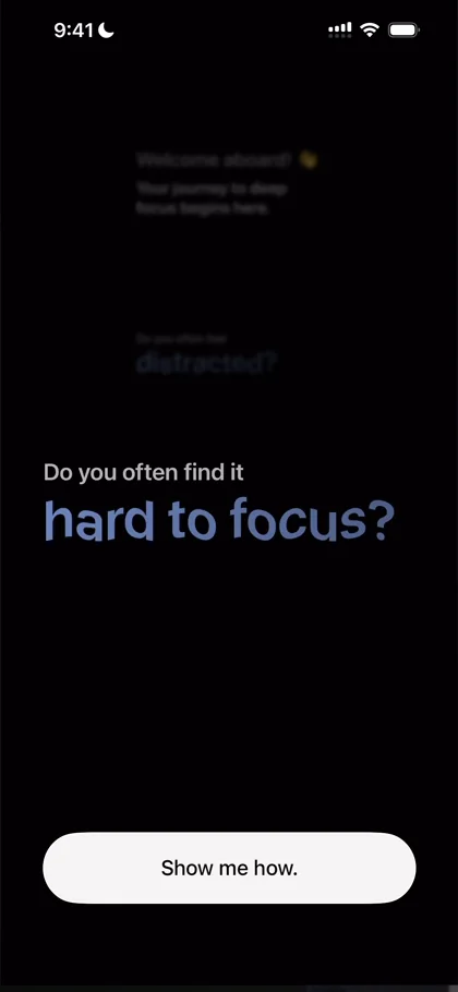
“So they’re doing the classical storytelling onboarding, but in an innovative way in terms of UI, which I do appreciate” José, 0:58
He finds it a bit repetitive, since it’s always the same mechanic 1:11. When a map zooms in, he wishes it zoomed in on where he is 1:21. That’s possible with IP tracking, he says, without even asking for the location permission 1:24:
“So maybe that’s a gold nugget for the team there” José, 1:30
Boarding passes pop up next, with nice haptics. The attention to detail is great, and so far everything fades in and nothing glitches.
Options you can play with
Then comes choosing your focus scenario. The options drop in with haptics as they hit the walls of the screen, and he can tap them 2:40:
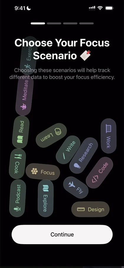
“This is the perfect example of a UI that is of course not the most functional thing ever” José, 2:42
It isn’t meant to be functional, he says, but it is fun:
“It makes me think highly of the app, it excites me and basically it brings me back the motivation to finish this onboarding” José, 2:51
Screen Time, and a map style
FocusFlight asks for Screen Time access, which not a lot of apps ask for, but which you need to put the phone on Do Not Disturb or to know how long you’ve used an app. Apple guards it well: it takes three steps, so Apple really wants to make it hard to give this kind of permission mindlessly 4:05.
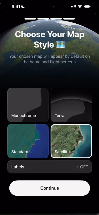
“I really love the preview on the back.” José, 4:20
He wishes the preview were a bit less covered, though, with text on top of it and the options below, but it does its job 4:22. Then he sums up the onboarding:
“I want to say that this is an amazing case study for a good onboarding” José, 4:48
They got all the permissions they needed, told the story they wanted to tell, and added some flair 4:53.
A start screen that leaves you guessing
After Start Journey, almost nothing happens: a small panel slides up from the bottom to pick a starting airport 5:10.
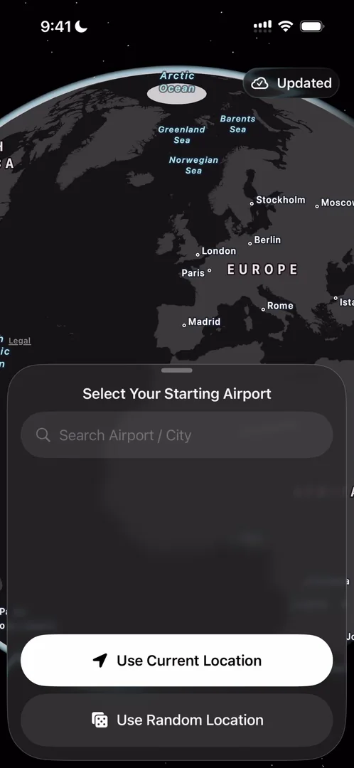
“I am gonna say that this is not an exceptional start screen” José, 5:24
First, his next action isn’t immediately obvious 5:28: Use Current Location seems to be the main button, but why would he want to? Second, an empty home like this doesn’t show the value of the app 5:41. For all intents and purposes, it could be Flighty, a flight tracking app, or a Google Maps style app 5:52.
“So this screen I think in particular needs some work” José, 5:59
A paywall, then a print
Before the home, a very beautifully designed paywall offers yearly, lifetime and monthly plans 6:23, and he loves the way it shows the features. He closes it, and a promotion for the lifetime plan prints up from the bottom, over the whole screen, with haptics as it prints.
“Like really really cool experience” José
Flights you have to figure out
He starts a journey and sees “no flight selected”. Once again, what to do isn’t obvious: you scrub along the bottom to set how long the journey is 8:04.
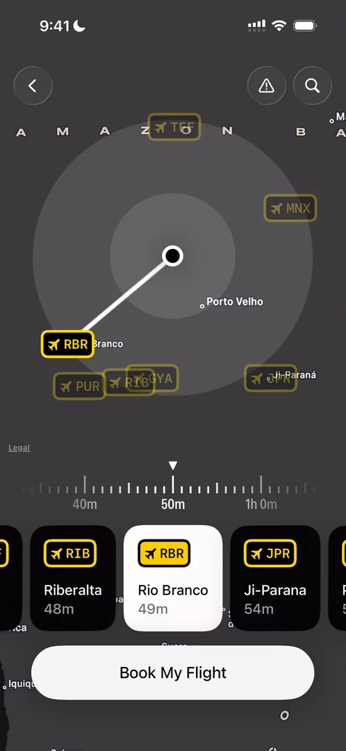
“The concept itself is very cool” José, 8:13
He loves that you widen a radius and then choose an airport inside it, but the empty state just wasn’t obvious 8:23. The little radius on the map and the carousels at the bottom are very, very cool, he says 8:35. When he books, the airplane comes in:
“I’m smiling so much looking at this which is how you know it’s good” José, 8:50
The same problem is back here, though 8:56: you pick a seat by tapping one, with no indication of it at all 9:08.
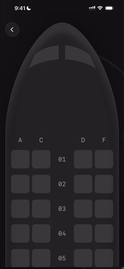
“The animation was amazing, the UI is amazing it’s very smooth but it’s not obvious what I need to do” José
He picks Design as what to focus on, finds he can pick more than one, and opens a screen for making his own focus types. Its window animation isn’t extremely smooth, but it does the job, and he has never seen one in this kind of context 9:40. There’s a colour picker too:
“I feel like they went into extreme detail in these types of things and the app just feels so delightful to use because of that” José, 9:47
“So kudos to the team” José, 9:54
The plane goes up, and his boarding pass prints from the bottom. Then he boards, to a screen that says “Cabin doors closed, Ready for takeoff.”:
“I really love this style of design it’s like extremely clean almost nothing on the screen but very well thought out” José
In flight
The time and distance remaining sit at the bottom, very easy to read, which is hard to do on maps 12:02. At the top right is a kind of button he has never seen, a vertical toggle in Liquid Glass 12:09:
“It is like so cool it looks so cute because of the rounded corners at the bottom.” José, 12:19
The button at the top left opens white noise:
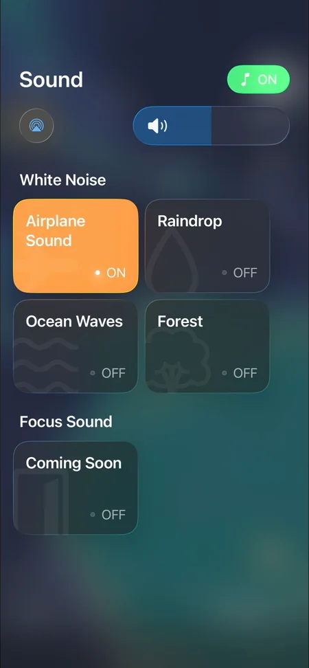
“The menu looks very much like an iOS menu I really love it” José, 12:46
Notice how the colours match the vibe of what you’re picking 13:00. The idea is clearly to look like the iOS menu, which they have achieved 13:10, and if you tap away, you see it going back into the button 13:16.
A button offers free premium for sharing your focus journey, something he doesn’t think the series has seen before 14:07. Here it just pulled up an empty sheet:
“So guys you need to fix this one” José, 14:19
The map is very smooth 14:38, and pausing brings in a smooth gradient 14:48. The button on the right opens a menu, and that animation gets one note from him 15:12: when an expandable button sits on the right of the screen, generally speaking, put the icons that come out of it on the right too, and right-align the text, and things will look cleaner 15:19.
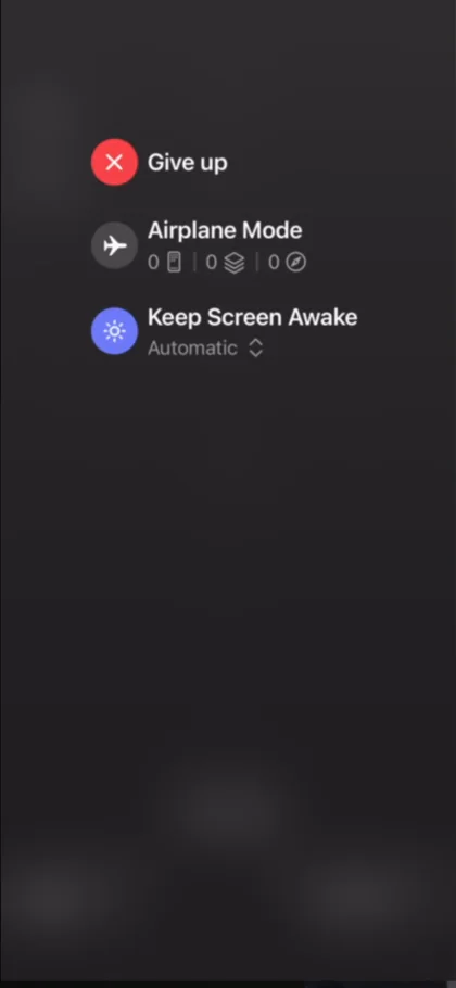
“This menu still looks cool but not the best” José
To give up, you have to hold the button, extra friction so that you don’t fail on your goals.
The verdict
Once a flight is over, he can’t open its boarding pass again, a very big missed opportunity: the pass looks amazing, and it’s something he would share. He would let people reach any boarding pass, with a big sharing button, which would probably bring more of the app’s content out to other networks, which in turn creates growth.
Tapping the discount at the top right of the home plays the promotion again, haptics and all:
“I’m not sure if it converts well or not, but from a nerdy design perspective, I love it.” José
“In general, I’m really glad we got to look at this app for the smoothness of the animations, for the storytelling, for the concept itself.” José
“There’s a lot to love here” José
 1 of 3
Three design challenges from this episode
Learn design from the apps you love
Practice UI design every day with 300+ briefs from apps like FocusFlight. Finish one and its card is yours.


