
App Breakdown #65 · Forest
The UI design of Forest, the app that turns focus into trees
Forest turns your screen time into real trees, and it has been on the App Store since 2014. José finds an app whose screens feel old, but whose concept is strong enough to carry it.

José opens the episode on Forest, the app that turns your screen time into real trees 0:00. He really loves the whole concept 0:09, because it’s so easy to explain and to market in almost any medium 0:11:
“You tell anyone on social media that by focusing they plant a real tree, of course people are going to install that.” José, 0:18
So it’s no surprise it has more than 50 million downloads (or users, depending on how they count) 0:24, or that it has been around since May 2014. There aren’t a lot of apps that have been on the App Store for more than 12 years and still make a good chunk of change 0:36.
A story told with one seed
There are a few glitches to begin with 0:52, and the buttons seem to have some weird inner shadows 1:05. From the screenshots, he isn’t expecting the app to look the best, so he hopes to learn from its mechanics instead 1:10. Then the onboarding has him plant a seedling 1:24:
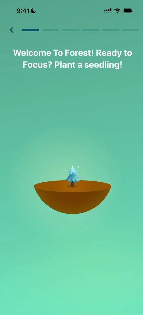
“Plant a seedling, oh very cool, so we get to plant our first seed and see it grow” José, 1:24
He guesses the app will use the same gesture whenever you plant something, so they’re teaching it to him early 1:37. The seed then grows, or withers if you use your phone:
“I really like how they are just like through one seed telling me the story throughout the onboarding and showing the different stages of it.” José, 1:54
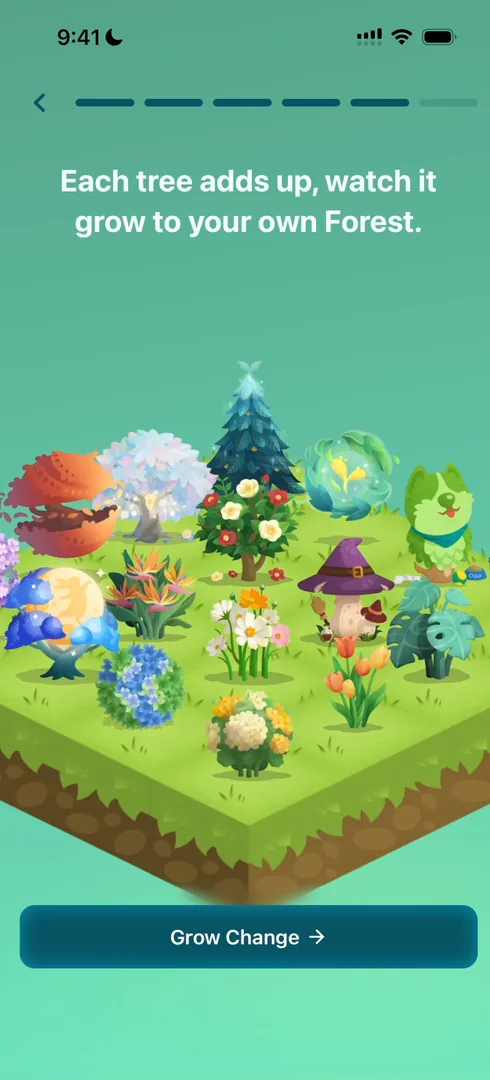
“It’s a very nice narrative to have an onboarding based out of.” José, 2:02
Features, told as a story
Notice, he says, that at the end of the day Forest is just a screen-blocking app, like Opal and many others 2:20. But those competitors focus on features: focus time, blockers, all the nerdy, technical things 2:28. Forest’s onboarding barely mentions any of those:
“They just told me a story about me planting trees and either growing them or letting them die.” José, 2:45
“So I think they did an exceptional job of transforming their feature sets into an actual narrative that people understand and want to support.” José, 2:51
Storytelling explains to your users why they should use your product, and when 3:01, and they have done a fantastic job on this onboarding without being technical at all.
When a blocking tutorial is fine
On the home, a short tutorial steps him through the timer, and he can’t skip it. When should you use this kind of guided onboarding, mandatory and blocking 5:03? His take: it’s okay, even great, when it’s very short, like these three steps, and when your users aren’t in a hurry 5:11. If you have a trading app, or an emergency app, never block the user 5:24. But for a simple app where people have some time, it can save you trouble down the line 5:34. Make it very long and people will likely churn halfway 5:51:
“So the TLDR is you can use blocking onboardings as long as they are short and your users are not in a hurry to do something.” José, 6:10
They take that little bit of pain, and are better informed afterwards 6:17.
Screens from 2014
The timer button on the home opens a small overlay to switch between timer and stopwatch:
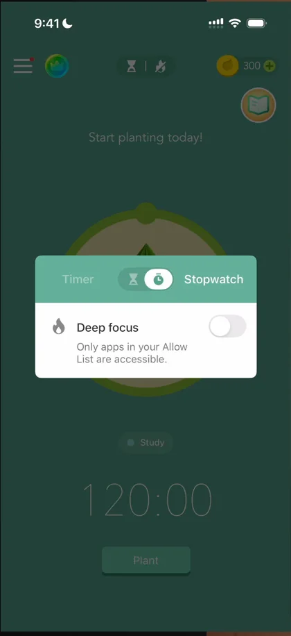
“This little overlay in the middle of the screen looks like it was done by Google in 2013.” José
“It’s just very outdated. It looks like it was not changed that much since 2014 when they released the app.” José
Quests behind a book
What’s behind the little book icon on the home isn’t what he expected at all, and the icon itself is not the best, he says 9:42:
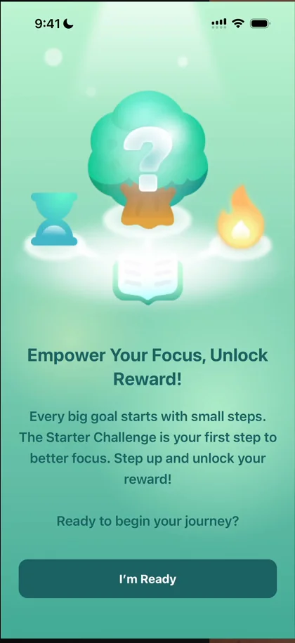
“Okay, this is not what I expected to be behind that button at all.” José, 9:38
Behind it are quests: one countdown focus, one stopwatch focus, a visit to the forest 9:55. He would never have guessed that’s what was there 9:59.
Notifications, at the perfect moment
He sets his first ten-minute session and plants it, and the app asks for notifications 10:12:
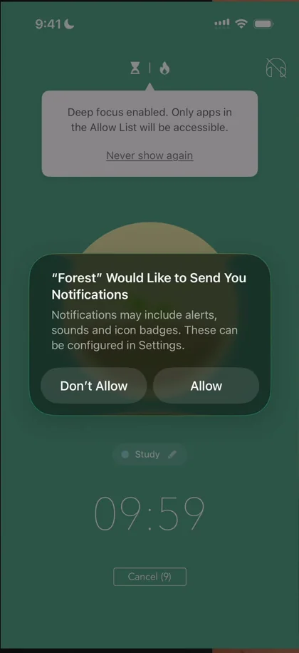
“This is a very good time to prompt for notifications because I want to know when the time is up.” José, 10:14
“So I’m sure this has an almost 100% acceptance rate.” José, 10:19
A forest like FarmVille
His forest view shows the tree he just planted:
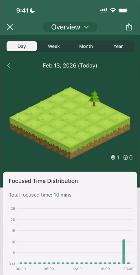
“Again this app feels like it was built in 2014.” José
“This feels a lot like FarmVille. It reminds me of OG FarmVille.” José
Corners that look like other apps
Time Guard, the app-blocking feature, opens with an introduction:
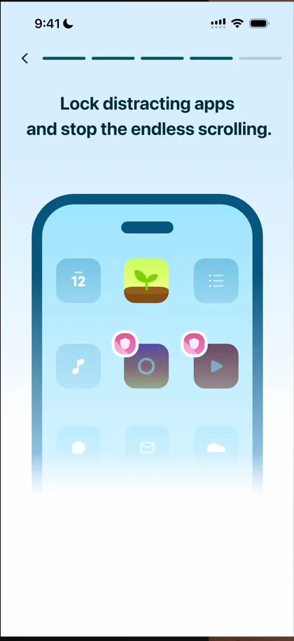
“I love their animations with the phone and showing you what is happening. They’re very intuitive.” José, 13:35
It’s very long and he can’t skip it 13:39, and then the design language changes completely:
“Okay and now it seems like a completely different app.” José
Mindful Space is very different again, with gradients, haptics, what looks like a different font and different buttons:
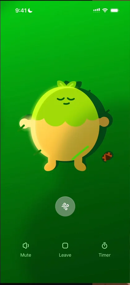
“I really like these icons, very sexy.” José
It reminds him a lot of Calm and Headspace:
“I actually really love this, it’s very cute. It’s a shame that the rest of the app looks nothing like this.” José
A leaderboard of forests
In Friends, there’s a global leaderboard, and you can open other people’s forests 16:20, though he finds it a bit underwhelming: he thought he could tap to see the trees.
If it isn’t broken
He keeps saying the screens were made in 2014 and never updated, but that isn’t always a bad thing. When something on the App Store really, really works and you don’t want to break it 16:59:
“Sometimes it’s better just to leave it alone.” José, 17:03
There are plenty of apps that came out many years ago and keep printing cash with the same design, UI and flows 17:05, and he guesses Forest is one of them 17:20:
“So the TLDR is just because something hasn’t been touched for a long time, it doesn’t mean it’s bad because if something is not broken, don’t fix it.” José, 17:32
You can always update the UI and do small things, which they should have done, he adds, but if the money-maker wasn’t broken, that’s what matters most.
A slow window
In the store, items open with a version of Apple’s window animation:
“It’s so slow like this animation is just so slow I’ll lose my mind if I was a regular user.” José
The verdict
“This is an extremely good example of just how many broken flows and how many like subpar UIs you can have when the concept of your app is good.” José
If you manage to acquire people and get them to do the one thing that matters, the focus time, that can carry it:
“Like this app does a lot of things very wrong, but it also does the core very right.” José, 22:13
“But I really love when an app nails one thing, nails one concept and then just runs away with it.” José, 22:32
 1 of 5
Five design challenges from this episode
Learn design from the apps you love
Practice UI design every day with 300+ briefs from apps like Forest. Finish one and its card is yours.


