
App Breakdown #62 · Gentler Streak
The UI design of Gentler Streak, the fitness app that feels approachable
Gentler Streak helps you build and keep a fitness habit, and has won two Apple awards. José opens it for the first time and finds a feature-packed fitness app that still feels simple.

José opens the episode on Gentler Streak, the app that helps you build and maintain new fitness habits 0:00. There are a lot of streak apps and workout trackers out there: some are pure scams, some are quick MRR apps, and some are fully fledged companies with a bunch of features 0:08. He thinks Gentler Streak falls in that last group 0:20, and from the cute designs he’s excited to try it 0:27.
The goal, in one line
Opening the app, you’re greeted by a cute character 0:37 called Yorhart (“your heart”), a pun José likes 0:53:
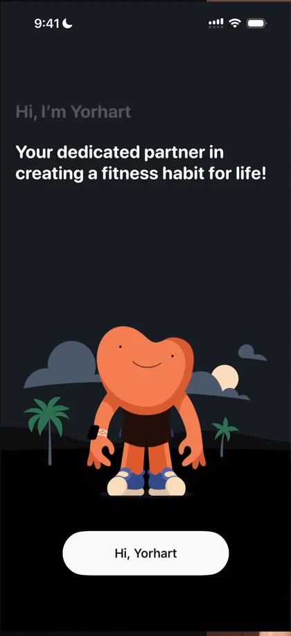
“Cool, it’s interesting that on the first screen they set the goal of the app very, very clearly” José, 0:58
The point of the app is to create a fitness habit for life 1:05: not to lose weight fast, not to do one thing right now, but something long-lasting.
“I like when the initial screens explain the whole point of the app so clearly in just one phrase” José
A notification ask with a reason
Whenever a panel comes up, the app is explaining things to you, and whenever it goes away, you’re telling the character about yourself. Then it asks for access to your health data 2:55, and asks for everything up front 3:02. In the Technogym episode, the app asked for health data in pieces 3:07, which meant bothering you more often; Gentler Streak takes the complete opposite approach 3:24.
Then it asks for notifications:
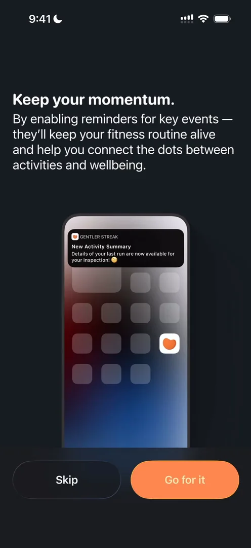
“Very cool way of asking for notifications. I love this.” José, 3:43
There’s a bit too much text for his style throughout the onboarding, and this paragraph should have been one line 3:46. But they’re giving you something:
“It’s to keep the momentum going, it’s to enable reminders, it’s not just to get notifications” José
A paywall that wears its awards
The paywall puts the app’s two awards, App of the Year and a design award, front and centre, and the little sheet holding the Continue button disappears once you scroll to the end of the list. The regular paywall pushes the yearly plan, with the other plans behind “More options”.
“And I really love the design of this one” José
A home with three tabs
Even though a fitness app could ask about your routine and what you like to do, Gentler Streak doesn’t 6:06. It’s very simple, and you land on a very clear home 6:16:
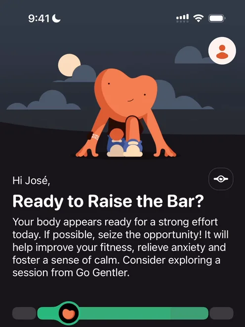
“I am really, really loving just how simple everything looks.” José, 6:42
The bottom navigation has just three things: Streak, Activities and Insights 6:35. The profile comes up as a sheet 6:51, and he’s a big fan of sheets:
“They just feel very light and manageable.” José, 6:56
Let me taste it first
A small button beside the greeting sits behind the paywall, and the app doesn’t really explain what it is. It’s completely fine to put features behind paywalls, he says, but he may well be interested in paying, and he can’t tell what the feature is:
“Generally speaking, I like it when apps give me a little preview of what’s there” José
The main chart does have a tapped state, though it took him quite some time to figure out 8:17, because it doesn’t look like something tappable 8:31. Further down, one of today’s recommendations is locked, and opening it shows a different kind of paywall:
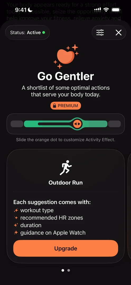
“This is exactly what I was talking about before where they’re giving me a taste of what I would actually get when paying for this feature.” José, 9:01
“This is something that I’d pay for, for example.” José, 9:16
He also loves the little connection between the bottom carousel and the slider at the top 9:18. And you can set a status, like on a break or injured, so the recommendations adapt, or choose to rest today.
Monthly recaps
The monthly recap is pretty cool and super complete 10:45: days of activity, the number of activities, time active, calories burned, distance, and time in each heart rate zone.
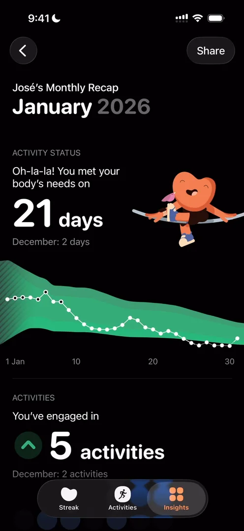
“Big fan of this monthly recap actually, it looks very, very fun and it’s actually something that I will consume” José, 11:43
The calories you burned turn into food:
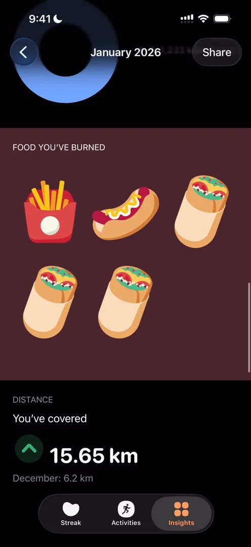
“So the whole month I only burned three kebabs. That’s pretty bad.” José, 11:17
“I’m a big fan of these types of data visualization where there’s like one text you should care for” José, 11:33
A home that changes
Back on the home, the recaps he has seen have disappeared 11:50; to see them again, you go to Insights.
“That just shows how a home page can be dynamic and display content based on what’s interesting, what’s not interesting.” José, 12:01
If you’ve seen your January recap once, you won’t open it every day of February, so it makes sense to show it big on the home and then move it elsewhere.
“I’m a big fan of modular homes.” José, 12:20
Clean graphs
Below, the steps view shows how little he walked that day:
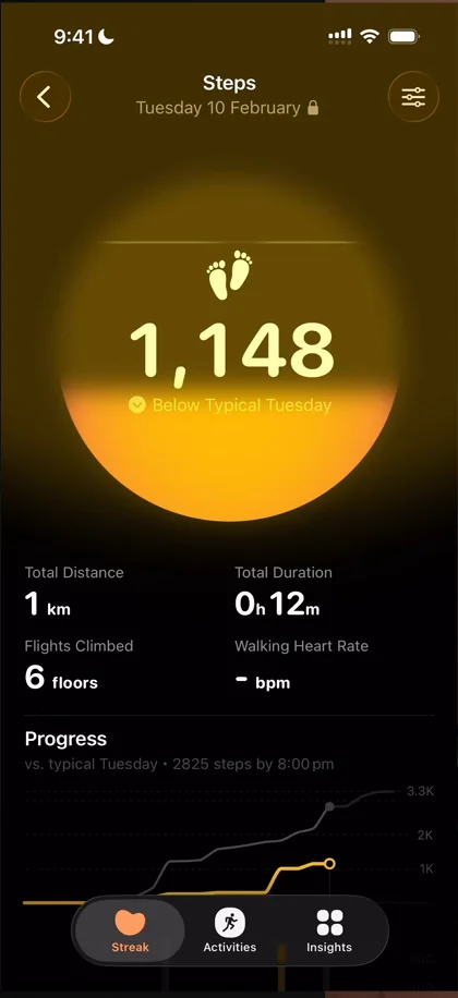
“I really like the way they do graphs” José, 12:48
“I feel like whoever designs this app, I don’t know who the team behind it is, but they do extremely clean design and extremely clean data visualizations” José, 12:51
Insights, in colour
In Insights, each recap gets its own bright card:
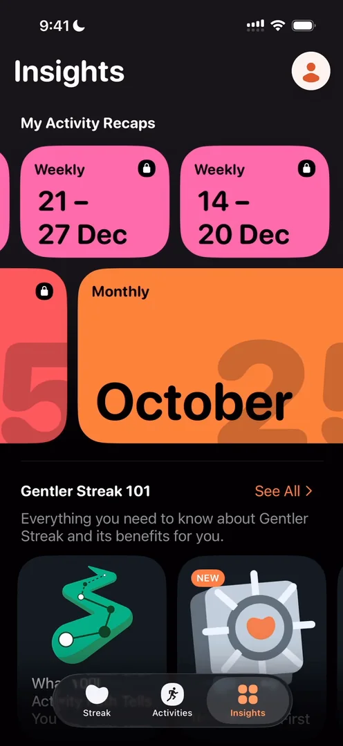
“I love the way they use color to display these. It’s really, really fun.” José
Then come short guides that answer the questions and worries a new user has. It’s cool, though he doesn’t expect a lot of users to go through them. Further down come workout essentials and illustrated articles on the body, eating and sleep:
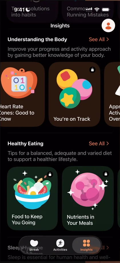
“I love their illustration style, it’s very, very cool” José
The verdict
He loves the way they do data visualisation in general. Most apps with this many workout features feel complex, but:
“This feels approachable, relatable” José, 18:51
“Few kinks here and there to iron out, but overall it’s just extremely solid.” José, 18:58
“There’s a lot of inspiration to be taken from here.” José, 19:06

 1 of 4
Four design challenges from this episode
Learn design from the apps you love
Practice UI design every day with 300+ briefs from apps like Gentler Streak. Finish one and its card is yours.


