
App Breakdown #63 · Headway
The UI design of Headway, the book summary app built to replace doomscrolling
Headway promises to replace your doomscrolling with microlearning. José opens it for the first time and finds an onboarding that throws a lot at you, and one bold idea hidden deep in the app.

José opens the episode on Headway, the app that promises to replace your doomscrolling with microlearning 0:00. A few episodes ago he broke down one of its main competitors, Blinkist, which compresses books into micro lessons 0:09, so he expects something similar, though he has never opened Headway.
Stories, then quizzes
From the very first screen, it starts with storytelling 0:32. No fancy animations, no fancy illustrations, just a plain splash screen 0:44, told in an Instagram-story-style onboarding 0:54:
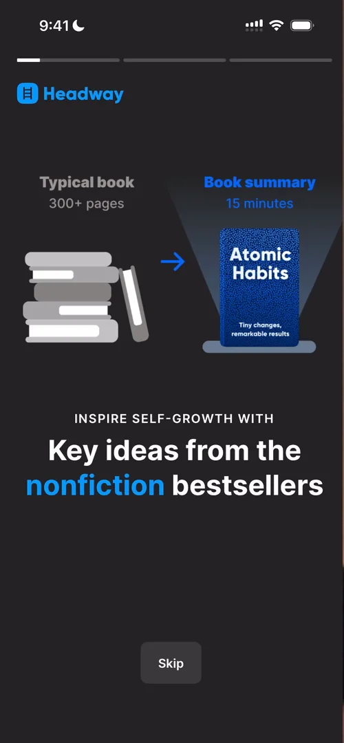
“And I love that they use Atomic Habits as an example” José
It claims to be the number one most downloaded book summary app, which surprises him 1:35. And when the time runs out, the Skip button turns into Get Started 1:37. Then come the quiz questions:
“I love that all apps now have quizzes on the onboarding and if it’s not obvious enough, yes, I’m being ironic” José, 1:52
Even if the metrics prove otherwise, as a user he doesn’t like it 1:59. One screen, asking his gender, is completely empty, with the answers at the bottom in a different layout from the question before 2:13:
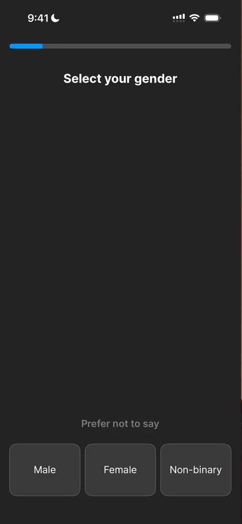
“I’m not entirely sure why they made the screen this way” José
A story that gets diluted
He doesn’t feel they do a great job of painting the narrative: they started with a very big one, and it got diluted 2:40. Asked for a monthly goal of summaries, he doesn’t even know what a summary is yet 2:49. His guess is most people just pick the pre-selected value 3:01. The next screen says it only takes five minutes a day to complete 15 summaries a month 3:11:
“They should have told me this up front” José
Then the classic streak commitment, which he has seen in so many apps that he’s losing count 3:29. He would love to know if any of these apps have run an A/B test, keeping the feature for some people and removing it for others, to see whether it actually affects retention 3:51. He bets that for a lot of apps it makes no difference, and for a few it has a massive impact 4:04.
A notification ask you barely notice
The app pushes him to start a summary on day zero, which he calls very smart 4:18. Then it asks when he would like new ideas, and he picks 9 a.m.:
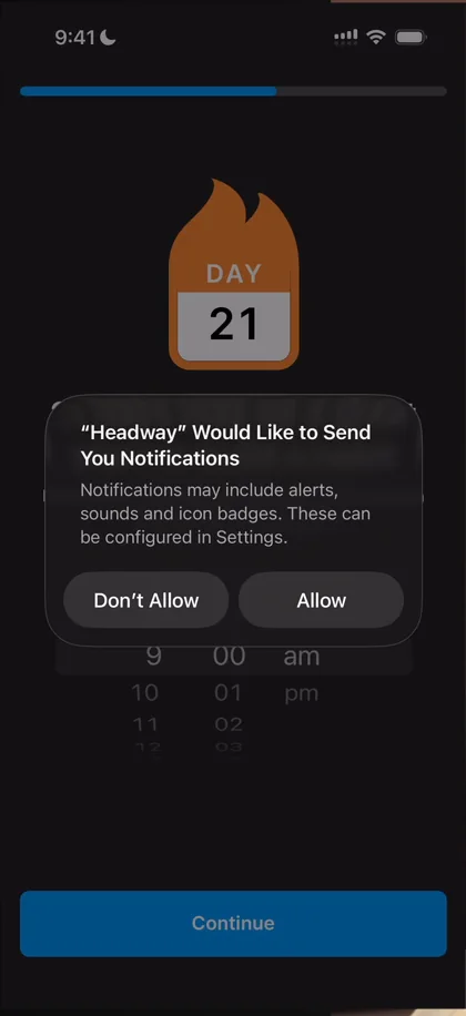
“Oh, very smart way to prompt for notifications. They didn’t even mention notifications anywhere.” José, 4:33
He almost pressed Allow without thinking about it 4:37:
“Very contextual, feels completely effortless.” José, 4:48
Still, the onboarding scatters illustrations and lines that don’t really connect to the story 4:56:
“And so I feel like this onboarding is very jumpy” José, 5:07
A loading screen that stops to ask
While the app crafts his learning experience, the loading stops halfway to ask him a question 6:24:
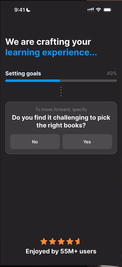
“Okay, this is a very interesting UI. I don’t think I had seen this before” José, 6:30
Stopping midway, as if you’re unblocking them, is pretty cool if the answer actually has value 6:37. But after three questions, each at 50%, it stops feeling natural 6:57:
“Nevertheless a cool pattern that I’ve never seen” José, 7:18
A commitment pact
Then the commitment pact, where you put your fingerprint on the app to commit 7:28:
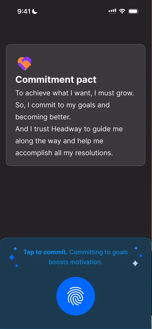
“You know I’m a fan.” José, 7:32
It adds a little friction, so you feel you’ve committed to something rather than tapping random buttons.
“So not the fanciest of interactions but it gets the job done” José, 7:59
The paywall, which he thinks comes from the same playbook as Opal’s 8:07, gives seven days free and then bills the whole year, which he calls a very common black-hat technique, though it prints money. And they only ask him to create an account after trying to charge him 9:30, which shows how much monetisation matters in this first session.
Persistent badges
On the home, two things are badged. Opening one doesn’t clear its badge:
“I really, really hate persistent badges that don’t go away when you actually tap on things.” José
A reader and a mini player
The reader has an index to jump between parts, and you can change the background colour and text size 16:17. It doesn’t have as many options as Apple Books’ reader, which he thinks is spectacular, but it does the basics 16:29. Back on the home, the button that picks a random summary has turned into a progress bar for the book he’s reading, a minimised player like Apple Music’s or Spotify’s 16:43.
Apple Books, but a little worse
The first carousel cuts every cover to the same aspect ratio, and adds a crease, like Apple Books, to make each one feel like a physical book:
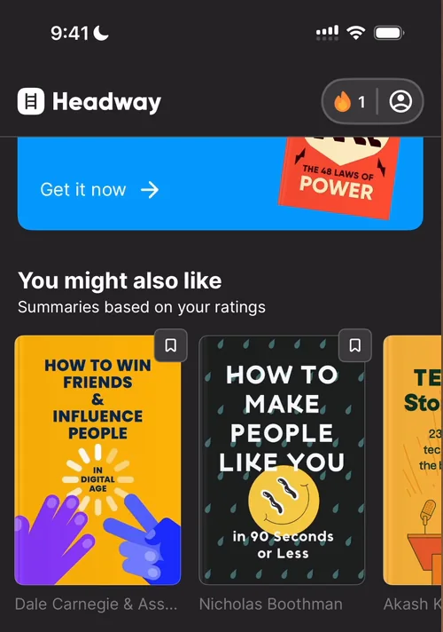
“I can’t shake off the feeling that they’re just slightly worse versions of Apple Books.” José
Categories open as a big grid of books. Daily micro-learning sessions are stories, and he isn’t sure anyone goes through them, though as you read the main message you might discover the book, so it can be a cool discovery mechanism.
A profile button that’s hard to hit
At the top right, the streak and profile look like one button, with a very small tap target:
“I almost had a hard time tapping on the profile so I don’t know why they didn’t just make it two separate entries” José
Shorts
The Shorts tab mixes little lessons from the books with AI-generated videos and polls:
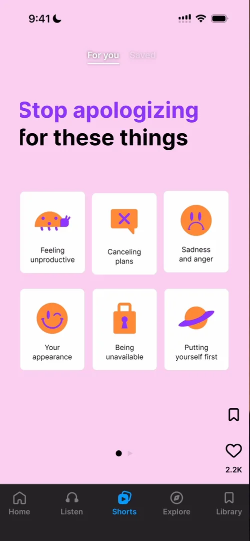
“To be honest it’s a bit of a weird form factor for this type of thing” José
“It feels like they’re just copying from elsewhere and retrofitting to the type of content that they have” José
A skill tree, buried in Explore
Then Explore, where you drag around a map of topics 22:26:
“I am a sucker for these types of interactions” José, 22:28
Each cluster is a little skill tree:
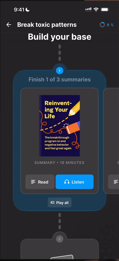
“This part of the app, exceptional” José, 22:57
And you can browse the whole map:
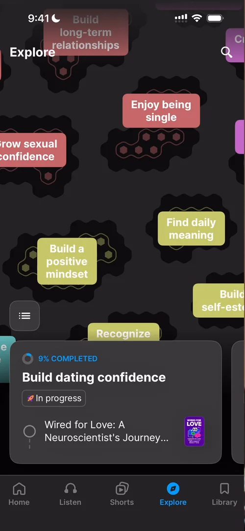
“I’m laughing because these types of UI are like extremely unpractical for the average user, but I really, really love them.” José, 23:13
What puzzles him is that the same app with the boldness to build skill trees also adds Shorts and Instagram stories just because everyone does:
“If you’re confident in it, make the whole app about it. Like make this the home screen, make the skill tree an integral part of my profile.” José
“I can guarantee you that there’s a viral app to be made just on this screen.” José, 24:12
He finds it strange that features like this are so buried in the UI 24:31.
The verdict
One of his favourites is the clustered exploration and the skill tree. What needs work, he says, is the app’s general information architecture and navigation:
“I feel like they bury a lot of things that don’t need to be buried. And also it’s just not very clear to browse.” José, 27:07
 1 of 4
Four design challenges from this episode
Learn design from the apps you love
Practice UI design every day with 300+ briefs from apps like Headway. Finish one and its card is yours.


