
App Breakdown #42 · Hipstamatic
The UI design of Hipstamatic, the analog camera app
Hipstamatic launched in 2009, roughly alongside Instagram. José finds custom craft in every corner of it, and a good reminder about where that craft should go.

Hipstamatic is a retro camera and photo sharing app that, believe it or not, launched in 2009 0:00. Hipstamatic and Instagram kind of launched neck and neck, as some of the few useful apps on the App Store 0:11, back when Instagram was just a photo app and not a photo sharing app 0:20.
“But then Instagram implemented photo sharing and we all know how that went.” José, 0:24
The last time José downloaded it was about three years ago, when he was building a camera app himself. They do a lot of cool things, so he’s excited about this one.
Digital, made to look analog
It opens on a custom 3D video, under the line “Digital never looked so analog”:
“You notice the even the letters that are like just digital letters are slightly out of focus to feel more analog.” José
Even a plain Continue button gets the treatment: because the app wants to look analog, as if engraved in a photo, it blurs the digital button a bit, so it feels more organic.
“It's a very nice touch that they do a bit throughout.” José
A day of premium for everyone
When you download the app, you get premium for a day by default:
“This is an interesting approach to monetization. I don't think I've seen many apps do this.” José, 3:07
He’s seen freemium models and seven-day or one-month trials, but not, he thinks, the paid version given to everyone for a day.
A camera you step inside
Then the camera turns as you go into it 3:34:
“It tells you that you're in the physical thing.” José, 3:39
At the top there’s a counter for the premium day 3:51, and a button that turns the camera around, so it faces you 3:59:
“I had never seen this, this detail. It's actually so cool.” José, 4:06
The star of the show is the analog camera, with a little viewfinder in the middle 4:21:
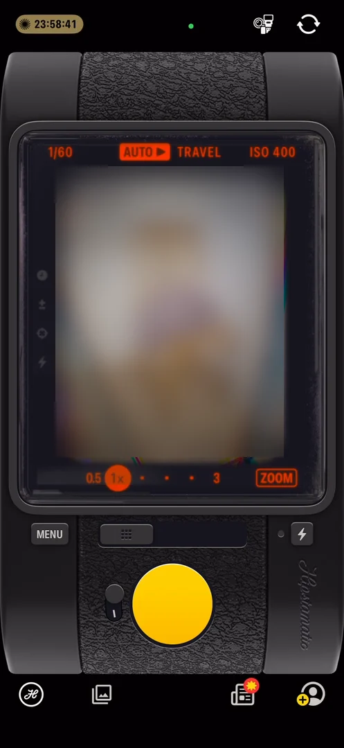
“We have settings all around and these are you can interact with them.” José, 4:29
Zoom puts a little mask on top that distorts the image 4:45, and tapping zoom opens a menu for fisheye and pinhole 4:52:
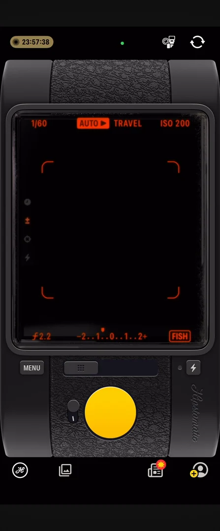
“I feel like they've used shaders probably for everything. That's just so cool.” José, 4:59
You can play with the exposure too, all with the engraved buttons 5:12. The menu opens inside the viewfinder:
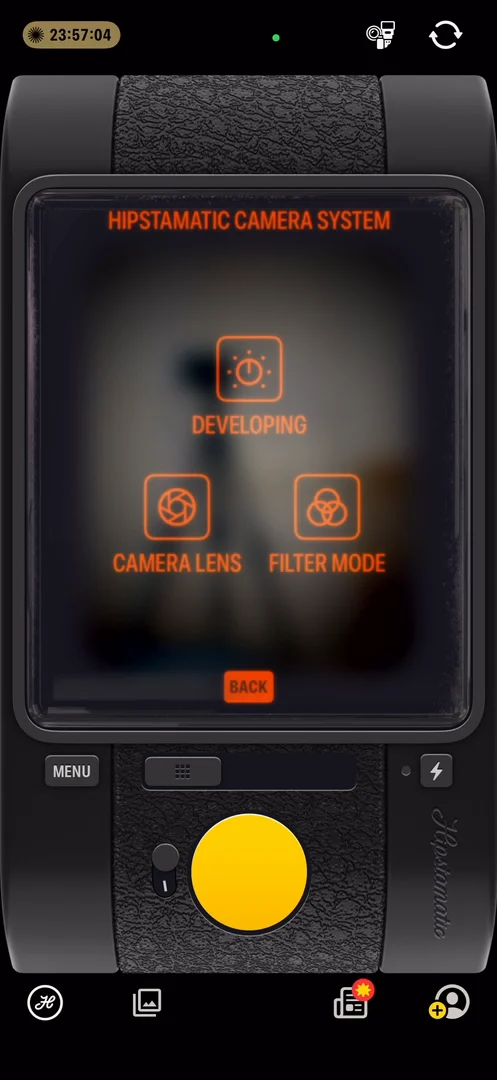
“The menu also opens within the viewfinder.” José, 5:19
A slider in the middle turns on double exposure 5:38, and the flash button moves in and out:
“I love seeing the buttons go in and out.” José, 5:45
Shake to develop
He takes his first photo 6:07, and it comes down to the bottom with a nice animation 6:11:
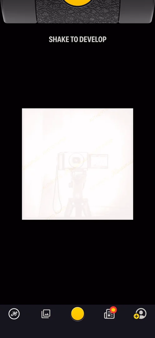
“Oh, shake to develop. Okay, so just like a physical photo, you have a whole shake interaction.” José, 6:15
The gear behind a photo
On the feed, the banner at the top is very hard to read, because of the yellow 9:20. Tap Gear on a photo 9:37, and it tells you the film, the lens, the iPhone and every setting used 9:40. You can tap Use to shoot with the same ones 9:48:
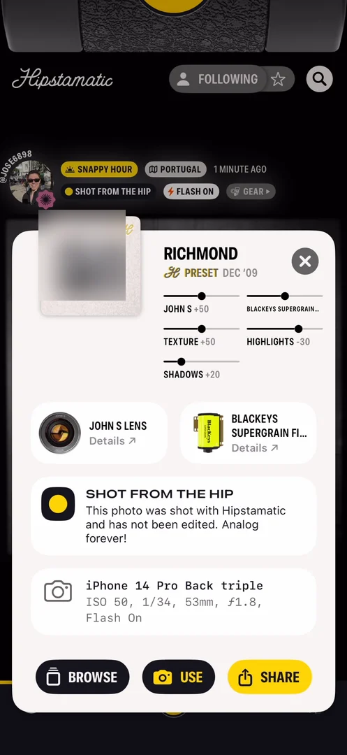
“And also I like this custom panel with the photo on the top left. Like this entire panel feels very aesthetic.” José, 9:51
Comments open in context: the photo just goes up, and you still see your camera up top 10:18. He’s not a fan of the little bubble, though that’s personal preference 10:26.
Likes you stamp on the back
Tap a photo, and you see its back 10:36:
“On good old printed photos, you write the date on the back. You write the memory on the back. You write where it was on the back.” José, 10:40
“That has been completely lost in digital photos, but Hipstamatic brings it back.” José, 10:48
The likes are stamps on that back 10:53. On any other social app, a like is just there among the others 11:02; here, you can see who stopped by a photo and what reaction they left, even on a stranger’s 11:10:
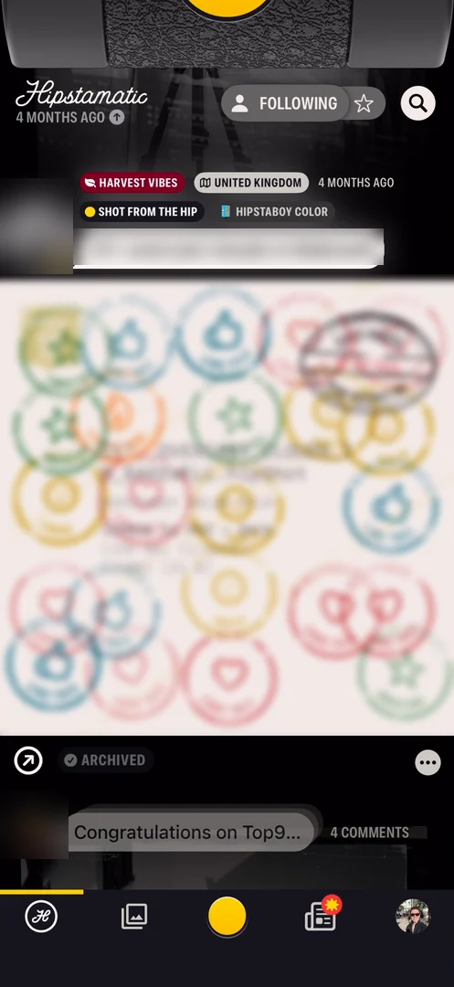
“So I think this is like basically LinkedIn reactions if they have any soul.” José
You can make your own stamp too, with the pen icon, from a whole set of symbols:
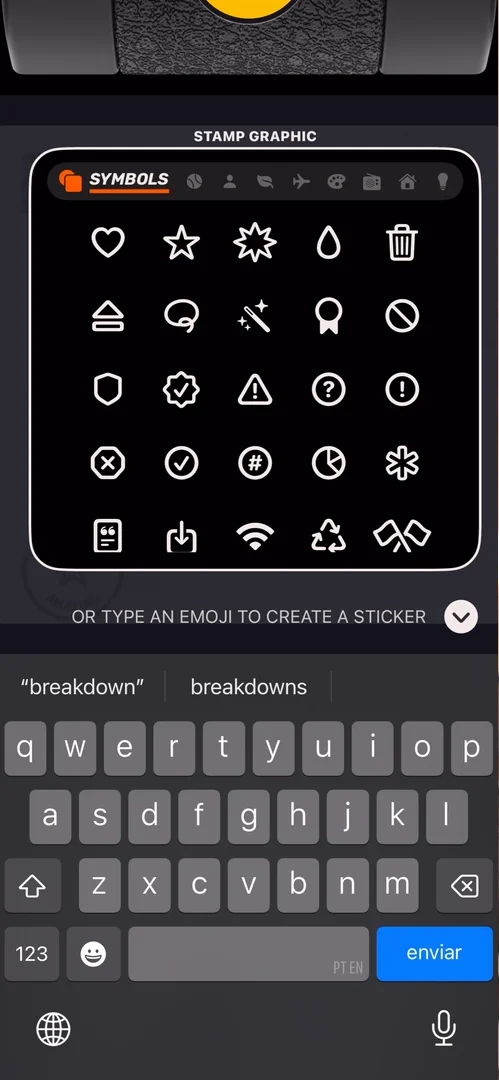
“We have all of these symbols here, and all of these are like custom views. Like, this is incredible.” José
A feed that moves too much
Between photos, each one straightens, and its creator and settings come out from behind it 13:09:
“It's cool if you see it once or twice, but on every photo that you go through, it's a bit too much.” José, 13:14
“Like it feels heavy and it feels tiring.” José, 13:20
A camera pinned up top
Wherever you go in the app, the camera stays pinned up top 14:06. But you can’t swipe back up to it 13:57; to get back, you press the middle button, which looks like a shutter 14:10:
“The way to access and exit the camera should feel cohesive. Like if it's up, let me swipe. If it's there, let me tap.” José, 14:16
“If it's here, don't take the button away.” José, 14:24
“And in general, I think this is just something that Hipstamatic does a lot, which is try to reinvent the wheel.” José, 14:32
Two feeds
On the right of the camera is another feed, What’s New, with the top nine, activity, buddy activity and a feedback forum:
“I don't really know what What's New feed is, to be honest. Like, why not just put this in the feed?” José, 17:53
“It feels like they were basically trying to do too much.” José, 17:59
A profile like no other
“The profiles on Hipstamatic are very rich. They don't look like any other profile.” José, 18:21
On someone else’s profile there are entry animations for everything 18:50, and you can open each of their stamps 18:56:
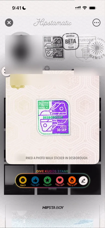
“So this is just exceptionally cool.” José, 19:01
You can even like the stamps 19:03. There’s a passport for every stamp you get, and everything is animated:
“I feel like they overdo it, but anyway.” José
Lenses and films made by people
The menu at the top right picks lenses and films 20:43, and the lenses are made by people 20:51. He picks a film, HipstaBoy Color 21:02, and even the flashes are custom 21:10:
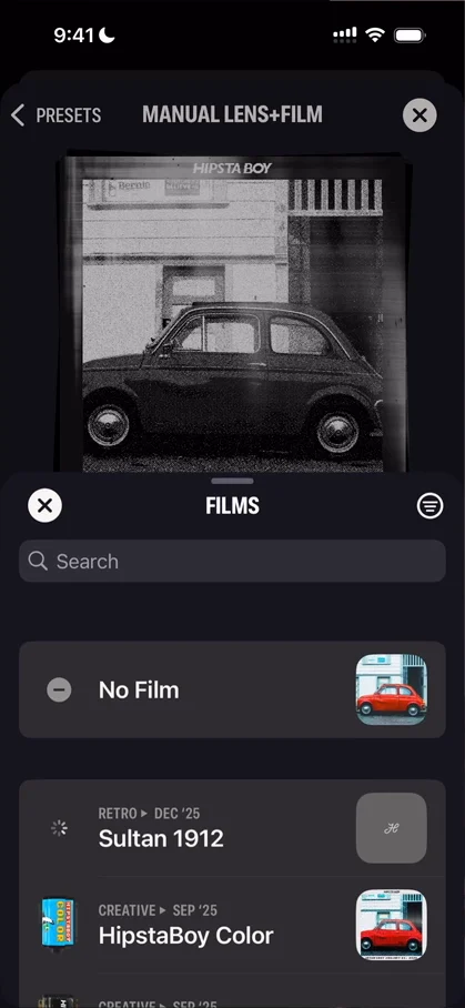
“So the amount of play you can do with this app, the amount of play you can do with all the settings is just out of this world.” José, 21:32
The verdict
He closes with a rant he feels the app deserves 21:40. If you’re extremely good at UI and animation, there’s often a temptation to put them everywhere, to reinvent navigation, and to make the best camera, editor, settings and feed 21:57. But very often, if you’re trying to make a successful app:
“It's much more important to focus on the thing that actually matters, your differentiation point, and really put the craft and all the reinvention you want into it.” José, 22:24
“But then on everything else, basically just use what's standard, use what the user is expecting.” José, 22:35
When you reinvent, you also often confuse the user 22:41.
“And I've done this mistake a bunch myself, which is why I'm speaking about it.” José, 22:50
“I think Hipstamatic is a great example to look for little details of animation, little details of UI, little details of almost everything, and to copy them, to put them on your app.” José, 22:53
“Hipstamatic is an incredible piece of craft, incredible piece of work, a great reminder that sometimes less is more.” José
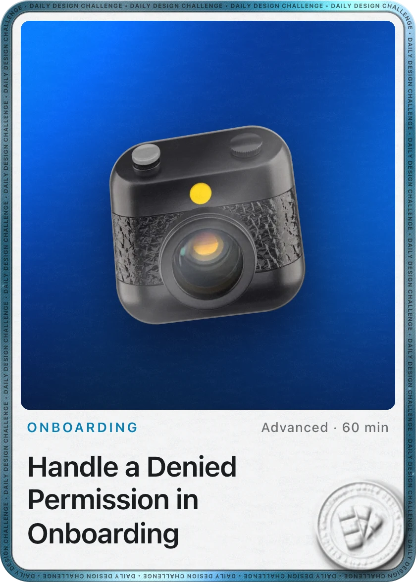 1 of 3
Three design challenges from this episode
Learn design from the apps you love
Practice UI design every day with 300+ briefs from apps like Hipstamatic. Finish one and its card is yours.


