
App Breakdown #80 · Hypic
Hypic’s UI design: a great photo editor, held back by its UX
José opens the photo editor from the makers of TikTok and CapCut for the first time. What it does to a photo is stunning. Getting there is another story.
Hypic is a photo editing app from the creators of TikTok and CapCut 0:00. José had never used it, so these are his first reactions, live 0:20.
An intro that shows instead of tells
It opens with a video of what the app can do:
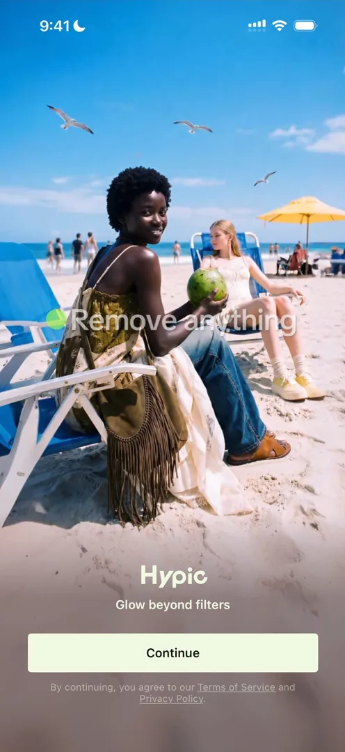
“I really love these types of video introductions on apps because they’re such a clever way to teach basically all of the features within it without saying a single word.” José, 0:33
“So if you want to make a kind of introduction video to explain the features of an app, this is the perfect way to do it.” José, 0:52
No onboarding, permissions up front
Continue drops him straight on the home screen 1:04:
“It’s the first app in a while that I’ve seen that has no onboarding whatsoever.” José, 1:09
Instead, the app asks for tracking, then notifications with no introduction 1:13. José doesn’t mind the bare notification prompt: asking for notifications the moment the app opens, or on first reaching home, is common and converts well 1:24.
“So if you’re wondering where to actually put your notification prompt, start by the simplest: when the user first opens the app and when they first get to the home screen. You might be surprised by the results.” José, 1:47
Photo access comes next. The app seems to front-load the permissions it needs, as its own kind of onboarding 2:04, which to him feels a bit like a pain to get through:
“They could do it a bit more in context later in the app, but at least they get it out of the way. They know the metrics better than me.” José, 2:17
The home screen itself is plain, he says:
“The UI is extremely basic like it’s flat and there’s some very basic gradients so nothing too impressive. It’s the content that really shines on this app.” José
Sign-up, saved for later
The onboarding turns up once he tries to use the AI editor:
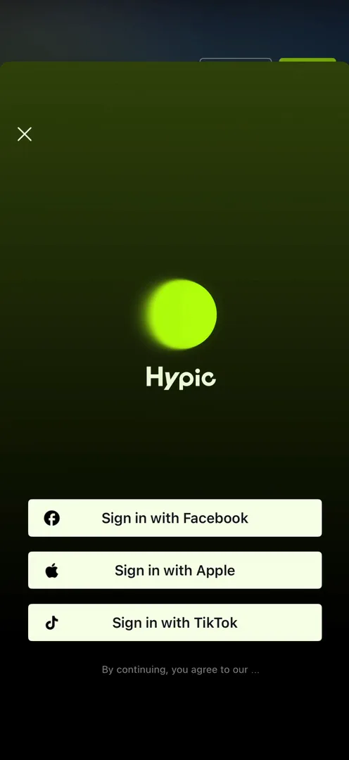
“So this explains why there was no onboarding. It’s because they’re actually only asking me to create account when I try to do things.” José
José has tested this on his own apps, and the gap was drastic 4:26:
“Putting the onboarding behind features usually results in much less signups than front loading it.” José, 4:37
“If you front load, users are highly motivated.” José, 4:44
By the time people have explored, their motivation has dropped, so his general advice is to front-load 5:00.
A lost prompt
Signing in with Apple leads to a birthday question, in a sheet with a white bar across the top that he can’t make sense of:
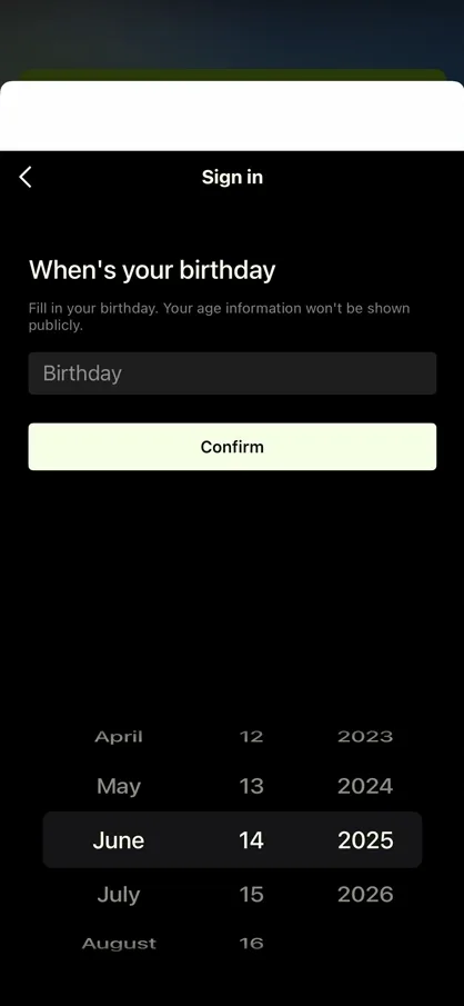
When he gets back to the AI editor, the short prompt he had typed before signing in is gone:
“So I was doing something, they broke the flow, and they didn’t give me the thing back that I was doing. That’s like one of the worst things you can do to a user.” José
“You should only take a user out of the flow they’re trying to complete as a last resource.” José
And the AI editor turns out to be paid only, with no free trial:
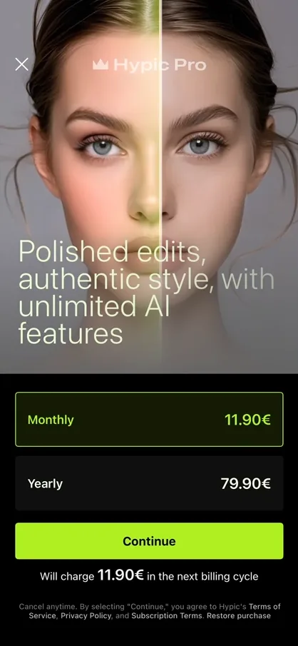
“This paywall is actually quite nice. It just gives you the features up top and the continue at the bottom.” José, 6:44
Walls of AI text
Back on home, the carousel now leads with what looks like a new feature, an AI stylist 6:58. It starts well, with one clear button rather than an open chat 7:22:
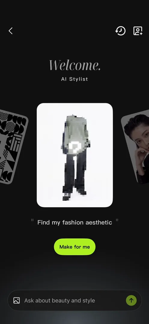
“It’s often better to give users simple one-click actions than open-ended things, and so here they did it well.” José, 7:33
Then the replies get long:
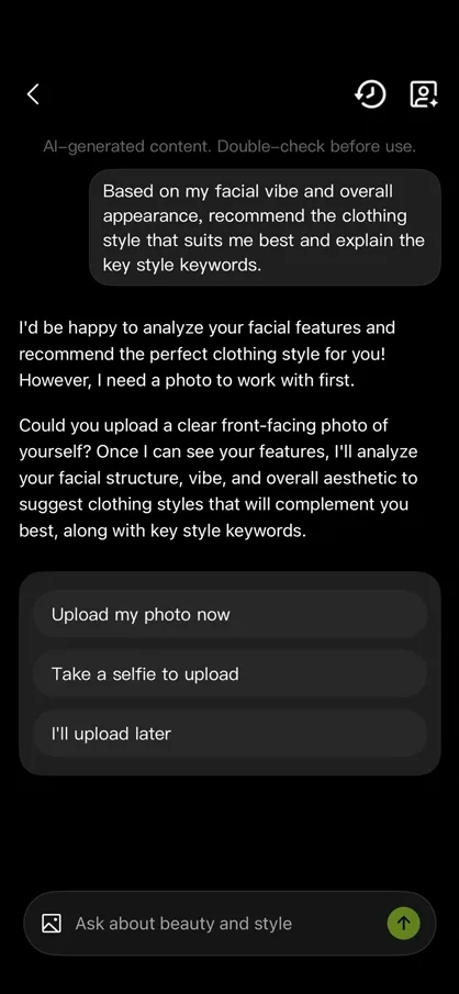
“No user wants to read AI text instead of like clicking on simple buttons.” José, 8:09
The app doesn’t seem to have a camera of its own, so a selfie means leaving for the iPhone’s camera 8:33. José calls the flow completely broken 8:46:
“Given how good TikTok is with their flows and how good CapCut is with their flows, I was expecting a lot better from this app.” José, 8:48
“This does not look like an app from a major company with the resources that they have. Like this entire screen and this entire feature feels extremely vibe coded.” José, 9:11
The editor
The editor is the part he was most excited to see 9:24. Its controls are rows that scroll sideways, with a second tier of adjustments under each tool 9:55. They don’t feel refined to him, but they work, he guesses 10:13, and some of the tools are remarkable:
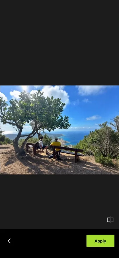
“Okay this is actually amazing, like I wouldn’t be able to tell that the outside of this photo has been completely AI generated.” José, 10:33
The pills above the tools are another matter 11:12:
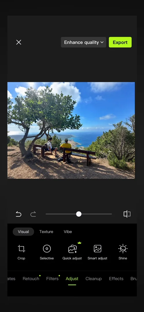
“Personally I don’t really like these selectors. Like they are confusing.” José, 11:18
It isn’t clear that tapping them changes the row below, and he wouldn’t recommend the pattern 11:25.
Presets, and too many kinds of them
Then he tries templates on a portrait. After the app asks him twice to confirm the upload, he’s stunned by the result:
“It’s wild just how much it changed the image, like this is way beyond normal photo editing.” José, 12:46
“Presets are probably the main selling point of this app if I had to guess.” José
But to him, templates, filters and effects seem to overlap:
“How is a template different from a filter and different from an effect? I don’t really get that.” José, 13:39
He sees a chance for design to simplify the app, perhaps by merging them into one category. And the bottom row of categories sits so close to the edge of the screen that he keeps swiping out of the app by mistake:
“Generally speaking, for either buttons or horizontal scrolls, you don’t want to put them less than like at least 48 pixels away from the bottom of the screen.” José, 14:42
A tool that turns social
Back on the home screen, what stands out is how social it is. Further down are trends, like the 2026 World Cup, which he bets come straight from TikTok 15:36:
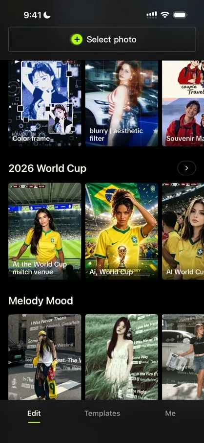
“I am a very very big fan of this home screen as like a social way to display trends and making people jump on trends, which in turn creates more content.” José, 15:58
The Templates tab is a feed of edits to discover, each with the person who made it and a way to use it on your own photo 16:25. If you make templates, you can become a creator there too, which José calls a very cool content flywheel 17:25. His own profile could do a lot more, he says: there’s no clear way to add a photo or make a template.
The verdict
Photo editing is usually just a tool, José says. Hypic turns it into something else: it “does a very very good job at converting something that is a tool into a social experience”.
“Even though like the UI isn’t exceptional, some of the flows are broken, etc. The key thing here is that they do a fantastic job at two things.” José
It pulls value from TikTok’s trends into the app, and it moves people from editing photos to creating content for ByteDance’s networks 19:01.
One design challenge from this episode
Learn design from the apps you love
Practice UI design every day with 300+ briefs from apps like Hypic. Finish one and its card is yours.


