
App Breakdown #68 · Journal
The UI design of Journal, Apple’s own app for recording your life
Journal has been out for a while, but very few people have dug into what it holds. José starts from an empty journal and finds an overlooked app full of small lessons for designing a simple app.

José opens the episode on Journal, Apple’s own take on the popular category of recording your life 0:00. It came out some time ago, so it’s not news that it exists 0:10, but very few people have actually dug into what secrets it holds 0:14.
A native welcome
It opens on the classic sheet Apple shows when you open one of its new apps 0:25:
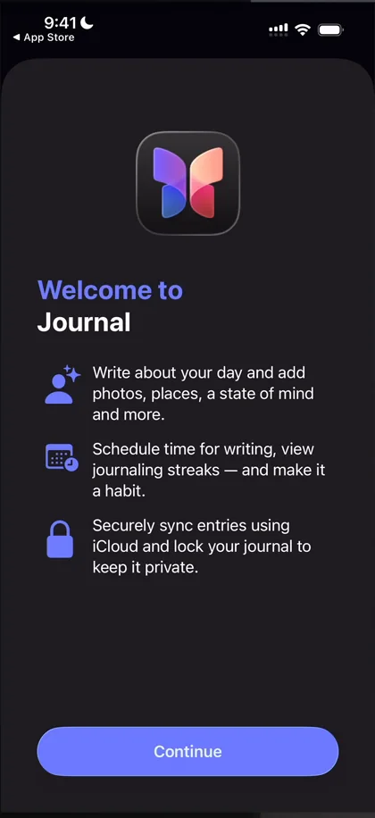
“I’m actually a very big fan of doing onboarding like this” José, 0:30
Yes, it interrupts, and it could have been a plain full screen, but since it’s native it’s very smooth, and they make it look good 0:39. He admits he would never read it, though 0:54.
An empty home
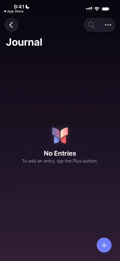
“I was expecting a better empty state” José, 1:03
At the top there’s a back arrow, which is weird, since he hasn’t tapped into anything 1:05. Going back leads to a general view of insights, places and journals, where the button to create a journal is very, very tiny.
He takes a moment to appreciate the gradient behind the home, from a very subtle purple to full black:
“It’s like not disruptive at all but it gives the app a lot of character” José, 2:51
“I’m a big fan of these like small things that kind of make up the app but are also subtle at the same time” José, 2:55
A notification ask, at the right moment
Tapping the plus to create his first entry brings a little onboarding for journaling suggestions, and then their notifications:
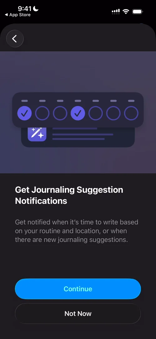
“This is the perfect kind of notifications prompt” José, 3:18
You’re in the middle of turning on something to make it better, they give you value for allowing notifications, and then they ask. Three panels in a row, though, a bit out of nowhere, is a bit disruptive 3:33.
Morphing, and a keyboard that’s already up
The plus morphs, the glass buttons at the top right morph, and the new things come into view 3:50:
“It’s just such a smooth animation” José, 4:00
A suggestions sheet comes up by default while it’s still generating things, so it should come pre-loaded, he says 4:12. When he closes it, the keyboard comes up on its own, because writing is what you do on this screen:
“Please raise the keyboard by default. Save them that tap.” José, 4:30
Progressive disclosure, and glass that moves too much
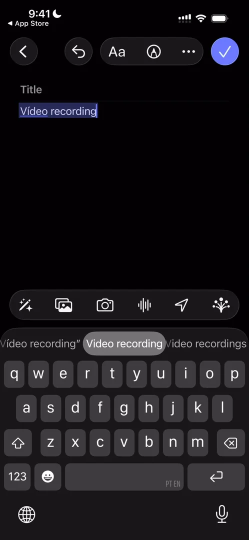
“Notice how the undo button only appeared now so that’s pretty cool” José, 5:05
“So progressive disclosure of UI is very cool you should only show UI if it’s useful” José, 5:14
The same moment shows what is, to him, one of the shortcomings of Liquid Glass 5:22: the pill at the top jumps a lot as he types.
“This to me is one of the worst parts of liquid glass is just how much it moves” José, 5:45
Glass sheets done right
The Aa button pulls up a very clean glass sheet of formats:
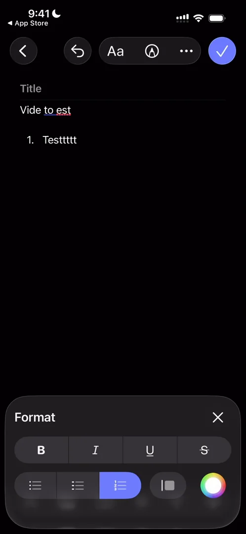
“I really love these glass sheets” José, 6:15
He was just criticising Liquid Glass, he says, but for something like this it looks so clean 6:17: seeing a bit of the UI behind it makes the app feel new instead of old 6:28. The colour picker is the standard iOS one, though, where he was expecting something a bit more fun 6:43.
A drawing board you can resize
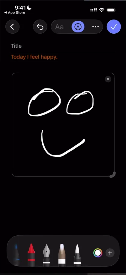
“Okay, this is so cool.” José, 7:21
“It’s so cool that I can just like free form the space for this drawing.” José, 7:27
Suggestions only the OS could make
Once suggestions are on, the app pulls information from basically everywhere on his phone: a morning run, photos, what he was listening to on Spotify, places from Maps 8:12.
“Basically this is what good context pooling looks like and the type of thing that you can only do if you are the OS” José, 8:30
Adding suggestions builds the entry at the top, mixing songs with photos, video and location into one tile:
“I really love the kind of data visualization they’re doing here because it seems very simple but they’re mixing in songs with photos, with video, with location and somehow they’re making a beautiful tile out of it.” José
As he adds more, the layout changes to fit, with two vertical columns for his vertical pictures:
“So so far if I had one thing to study from this app it would be how the data layout works on these suggestions.” José, 10:19
Recording a voice note works in a fairly standard way, and apps like Untitled do a much more magical job of that UI, he says. But it shows up in the same tile:
“This UI piece is just exceptional” José
Something else to take away from the whole menu system, he thinks: ways to open toolbars with small sheets, without covering the entire screen, that still give people a lot to do.
An entry that becomes the journal
Marking the entry done and going back:
“Oh beautiful transition with all of the notes basically becoming persistent” José, 14:11
They keep the screen and just shrink the entry onto your journal 14:20:
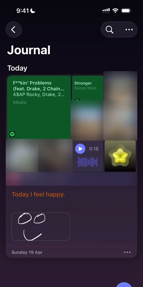
“So now we have our first journal entry, we know what it looks like when it’s on the journal screen.” José, 14:27
There’s a count of words written, which is pretty cool to encourage you to do more.
Places, and an audio player he loves
Places shows the entry on Apple Maps. Swipe up the sheet and tap the entry, and each kind of entry gets its own card in a carousel:
“Like carousels have been done over and over and over again but sometimes they just work well” José
The voice note gets a player of its own:
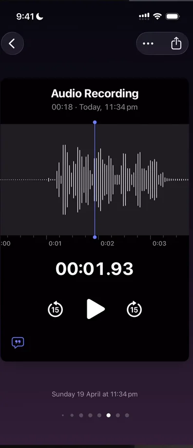
“It’s extremely clean, I’m loving the boldness of the numbers” José, 18:47
“Okay, now this is amazing. It has haptics as the seconds are passing by.” José
A journal you can print
The menu on an entry has a print option, which makes a very nice PDF of everything he added 20:03:
“This is pretty cool. So you can in one click print the things you’ve been thinking about and feeling.” José, 20:14
Not a lot of apps properly connect the physical and digital worlds, so whenever there’s room for it, he loves that apps do it.
The verdict
“I love the adaptable UI of the journals that we have seen. I love their use of color both in the subtle gradients and also on the bulky gradients” José
Journal is very overlooked from a design point of view, he thinks, because not that many people use it, but there are many gold nuggets to pick up:
“If you’re trying to learn how to design a simple app this is the place to be” José
 1 of 2
Two design challenges from this episode
Learn design from the apps you love
Practice UI design every day with 300+ briefs from apps like Journal. Finish one and its card is yours.


