
App Breakdown #36 · Liquid Cats
The UI design of Liquid Cats, the water tracker
José saw Liquid Cats on some list and its drawings caught his eye. If you can make water tracking fun, he says, he’s listening.
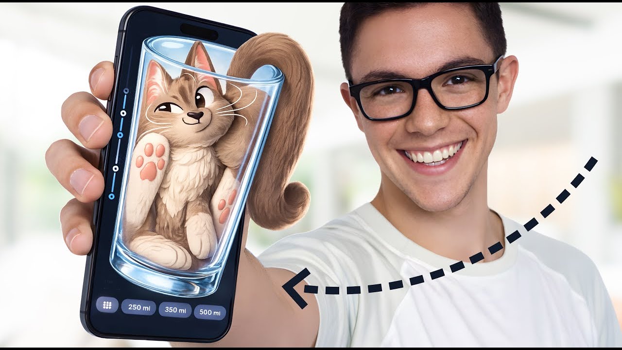
Liquid Cats is a water tracker, and José is looking at it because its graphic design really caught his eye: he saw it on some random list, and the drawings stood out.
“So I was like, okay, if you can make water tracking exciting and fun, then I'm listening, then I'm learning.” José
As far as he could figure out, it’s made by a duo, Nikita and Natalie.
A heart that pulses
The onboarding opens on a heart with a cat curled in it:
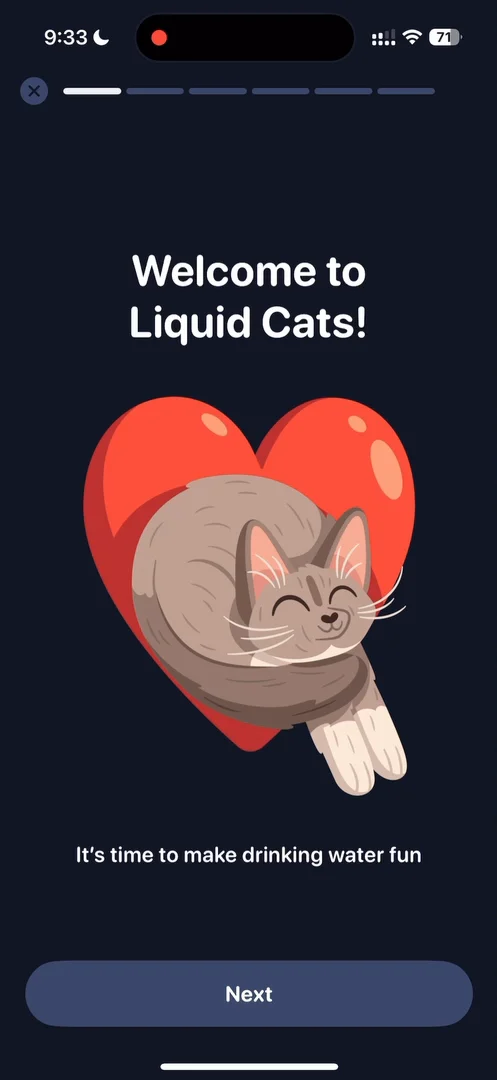
“I wish it had haptics when it pulses. It would give it that extra step with almost no work.” José, 0:55
“I really love the the touch of the heart animation pulsing, very lovely.” José
You can also swipe to go through the steps 1:09: counting every drink, coloring in your days, which, he guesses, introduces the app’s main job of filling an empty jug 1:21, and collecting cats, a gamification of the whole thing 1:26.
Value first, then permission
Then comes the reminders step:
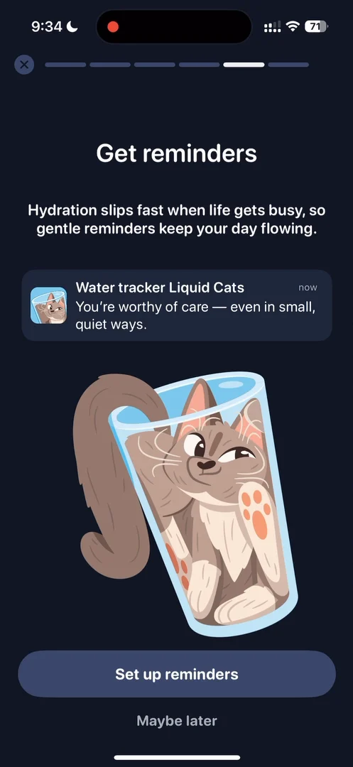
“It's a very smart way to prompt for notifications because it's in the flow. It's not disruptive. And they give you the value.” José, 1:35
“They are going value first and not permission first, and the button also says Set up reminders, so not Turn on notifications.” José, 1:52
But setting up reminders opens just a big alarm list, every hour of the day with a tick 2:01:
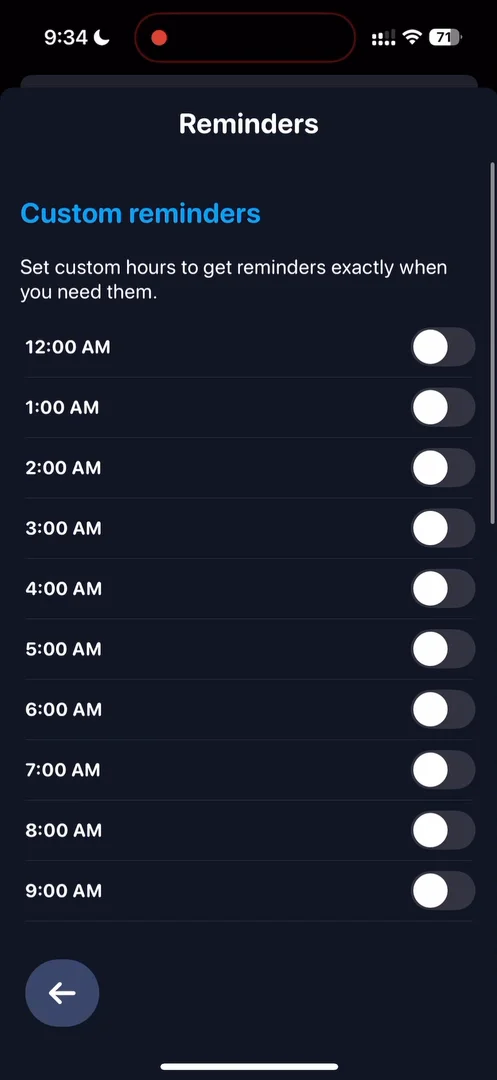
“This is definitely not the best UX for this kind of situation.” José
He picks 9 a.m., and then the app asks for notifications, which is smart, since he has just committed to an hour 2:12. But there’s no button to continue 2:20:
“it's a good example of what not to do in an onboarding because generally speaking on an onboarding you want to get the user moving through the flow” José, 2:24
On almost any flow, you want to keep people moving, always making progress, and not corner them somewhere 2:34.
What can you tap?
On the daily goal step, he taps the number, thinking he could edit it, and tries to slide the jug, since its water moves up and down 3:09. Neither works. You’re meant to tap the buttons:
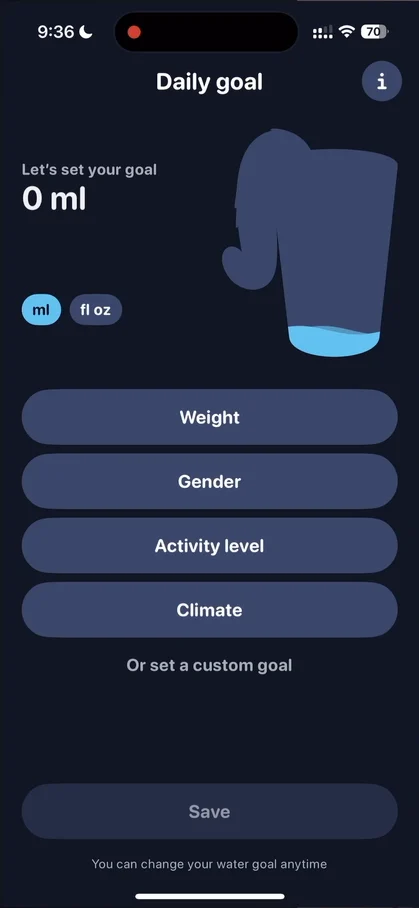
“I wish it was a little bit clearer what is tappable and what is not on the screen” José, 3:25
Or, he suggests, weight, gender, activity level and climate could be their own flow to set up the goal 3:42. And the half sheets aren’t native: they come in slowly and dissolve when dismissed 3:57.
It’s not the gospel, he says, but something he always likes to do:
“whenever you navigate somewhere you should be able to go back in the opposite direction so if a sheet comes from the bottom it should go to the bottom when you dismiss it” José, 4:20
It’s interesting that the app asks about your climate 4:40; it could even take your city into account.
A spinner that points at the exit
The paywall loads its close button with a little spinner at the top right. On a paywall, you want people to look at the benefits, the price, and ultimately the button to unlock premium, but none of those move:
“The first thing that my eyes went to were, was the spinner of closing this panel, so actually it had the opposite effect of what they wanted.” José
There are two fixes. The layout should give more emphasis to what matters. And a very small trick: no loader, just fade the close button in slowly after a while.
“because your eyes are drawn to movement more than color and if you slowly fade things in that's the way to make things appear on the screen without people realizing that it was never there” José
An empty state with nowhere to go
On the home, the jug is the main piece, with the goal and the drinks and sizes along the bottom:
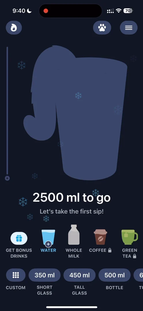
“We have the main piece, so the jug that you have to fill up.” José
The flame at the top opens your streaks and insights, and on a first visit it’s literally just an empty state 7:03:
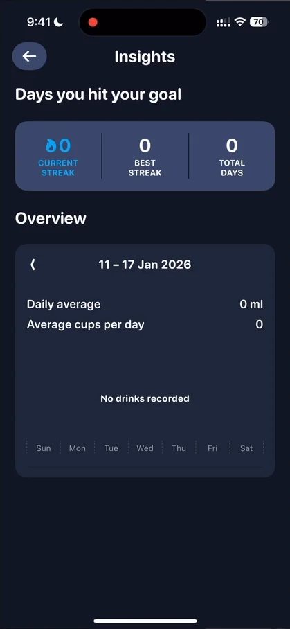
“Basically, and this is a general principle, never lead a user to dead ends, especially on their first session.” José, 7:15
“Everything should connect to the main point of the app.” José, 7:21
Here, he says, there could just be a big button to log your first drink.
Cats you don’t wait for
The paw opens the cats you can collect. He unlocks one just by tapping it:
“There could be a lot more celebration here. It feels very seamless, and so I don't really know that I unlocked something.” José
“It's a good example where a little bit of friction would actually make me appreciate the characters more.” José, 8:34
It doesn’t need to be very extra, he says: they could come wrapped and unwrap, or he could press open and watch them enlarge on the screen:
“there's little tricks to make people care about unlockables” José, 8:57
The cats with the little flame, which he guesses unlock with streaks, don’t say how many you need 9:07, and that screen has two back buttons, one at the top and one at the bottom.
One or two taps
Logging a drink: one drink is already picked, you choose a size, and the jug fills with a little build-up 10:21. Tap the log on the side, and a full list shows what you drank and when 10:26:
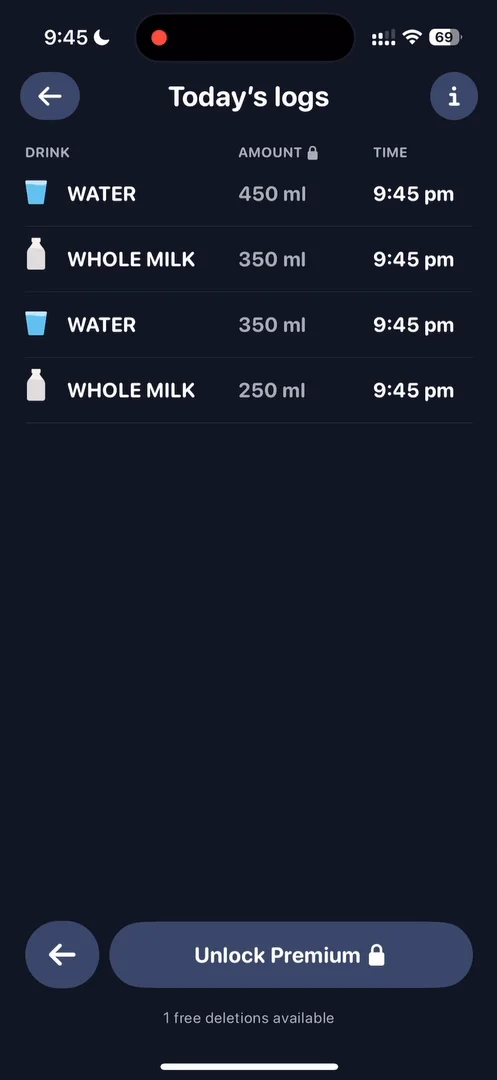
“I really like the logging on the side that complements the jug because the jug is a bit abstract” José, 10:51
The jug sits a little off center, though 10:57. And the bottom section is the one he loves:
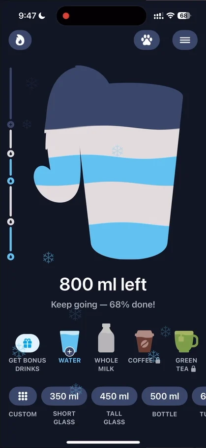
“And I really love this bottom section, actually, because it, it wouldn't be the way that I would design it just from intuition, but it feels extremely nice.” José, 11:04
“it's very interesting how they laid it out in such a way that there's no need for a panel there's no need for an extra menu there's no need for nothing you can just do it from here” José, 11:26
Bonus drinks unlock with streaks: a fruit juice, a black tea, then coffee. An interesting way to get people to come back, which he hopes they mention in the notifications too.
The verdict
“we have taken a look at a very fun very funky water tracking app” José
Among the things he loved: the main interaction, which he finds a very clever design, and most of all, the thing that grabbed him in the first place, the graphic design and the illustrations.
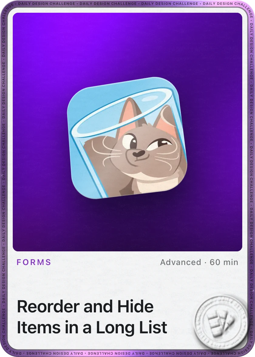
One design challenge from this episode
Learn design from the apps you love
Practice UI design every day with 300+ briefs from apps like Liquid Cats. Finish one and its card is yours.


