
App Breakdown #38 · Locals
The UI design of Locals, the app for meeting people at events
There’s a very large graveyard of apps for meeting new people. José reopens Locals, which he installed years ago, and finds an app that knows a few things.

Locals sits somewhere in the same category as Eventbrite, Partiful or Luma 0:00: an app to meet new people, join local events and things like that. There’s a bunch of these apps in the world, and a very large graveyard of them. José installed it some time ago, so he goes back into an account he already has.
It opens in an interesting way: instead of the splash screen going away, a view is pushed into it. It’s a bit confusing, because it’s fast and feels like you missed something.
An onboarding for people who were invited
The first screen offers Get started, or “I was invited to club or event”:
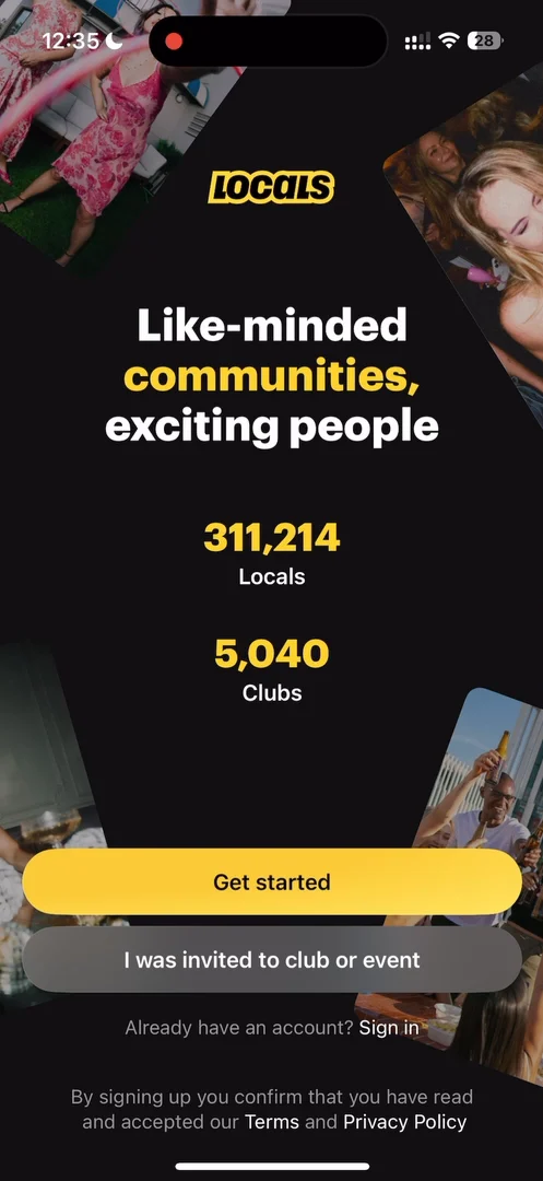
“Okay, this is a cool representation of what an onboarding can feel like if it's tailored for you from the first screen.” José, 0:58
He guesses there’s a flow for inviting people who aren’t on the app yet, and that anyone who comes in through it is probably connected to whoever invited them straight away, though he’s just spitballing.
“But I do like when onboardings are tailored to the kind of user that has been invited.” José, 1:20
Hide your logo under the Dynamic Island
On the home tab, the logo sits at the top left, as it has in a lot of apps lately. He guesses it’s there for screenshots, so people know which app a screenshot came from 2:20:
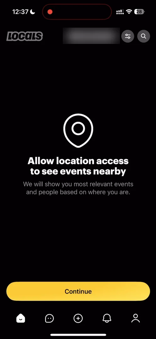
“You can hide your logo under the Dynamic Island and then it doesn't occupy screen real estate and it's there when people take screenshots.” José, 2:30
“So little hack, do not take screen real estate for your logo when you could have something better there. Just hide it under the notch.” José, 2:38
Paid for invites
A button at the top of the home opens a referral program: share the app, and if your friends subscribe, you get part of their subscription 5:02.
“I'm guessing it's like a pyramid scheme, but pyramid schemes are very successful, so I'm not going to judge them.” José, 5:07
“Okay very interesting approach I had not seen this in a social app actually literally just paying for invites.” José
He guesses it makes a lot of sense if you can keep the cost per install down.
Events that look good
Scrolling on, he notices that the images in general look very good. Not everyone can make things look good, so he guesses the platform helps a lot in creating events that do.
An event opens with a view from the right, where he wishes it had just expanded as a window. From there, you can tap the event itself, or the people, to see who’s hosting. The event page uses the same style of navigation as Airbnb, with a panel at the bottom and a background image at the top:
“Pretty standard information architecture here, but it is very clean and readable, so it's a nice one.” José
A title that stays at the top
A club’s page has a nice little detail. As you scroll, its title moves to the top and stays there, with a rounded cut-out under it:
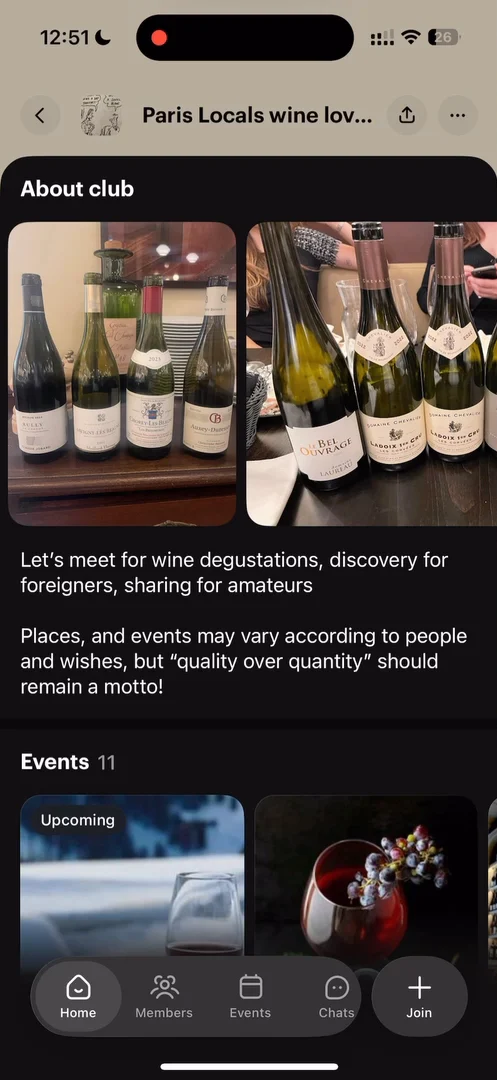
“Okay, very interesting design, actually. I like this one.” José
Locals takes all the hacks
The moment he asks to join a club, the app asks for a rating, and to add a widget to his Home Screen 14:10:
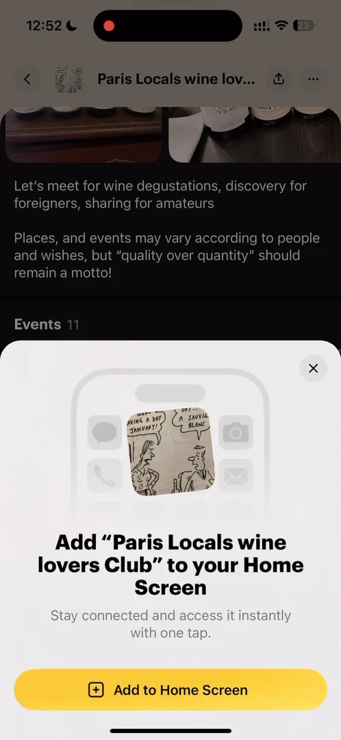
“I feel like Locals is just taking all the hacks from all the social apps and trying to jam them together.” José
A club page with too many buttons
At the bottom of a club’s page, the navigation is much more complex than on an event: home, members, events, chats, sessions and shop. But all of them are already on the club’s home, so they’re just shortcuts to its sections:
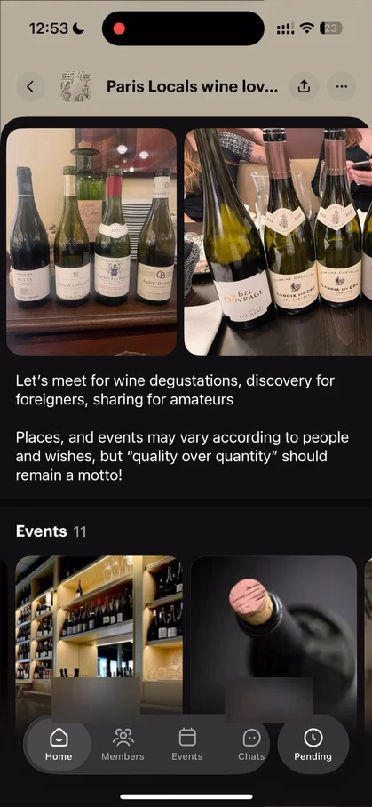
“This UX is questionable, because it makes club page look a lot more complex than it needs to be.” José
“If I can access everything just by swiping down, then why do I have all of these buttons?” José
He even backs out of the club’s page by mistake. It could be a lot simpler.
A profile for hosts
His own profile has a wallet 17:09:
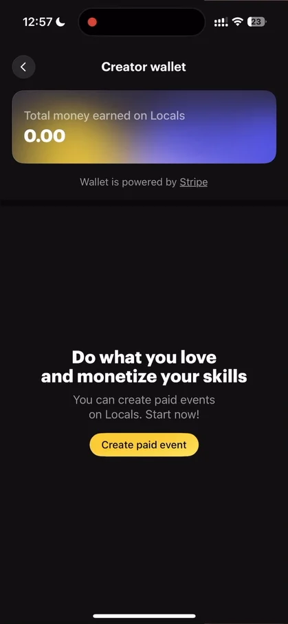
“So I guess they're really optimizing for the kind of person who wants to host events and actually charge for them and make money for their events.” José, 17:13
In that sense, it’s a lot more like Luma than Partiful 17:27. And the profile itself:
“But overall, I feel like this is a very solid profile. Actually, it gives you all the info you need. It has nice empty states. There's little dead ends and it's pleasing to look at.” José
Put the filter on the button
On the home, the filters at the top are just a date filter: today, any day, and so on.
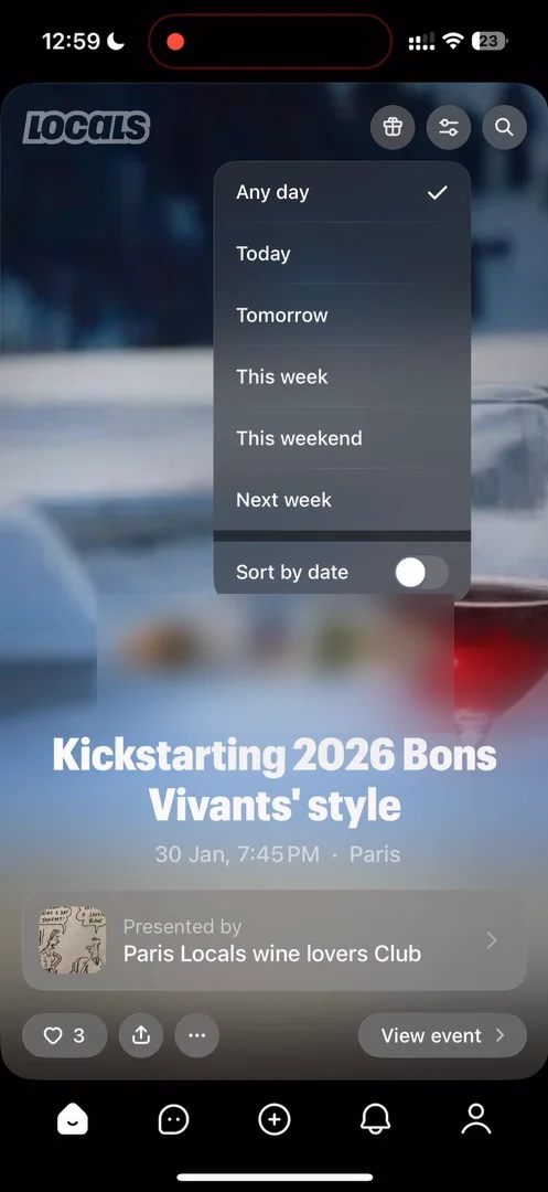
“If it's just a date filter, it should say the number on the button there.” José, 18:43
An icon like this one makes sense when a filter mixes dates, places and other things. But for one filter, the button should just say what it’s set to, like 24 hours or any day, so you know what you’re looking at and where to go to change it:
“It's a tiny detail, and again, the concept of pulling the information that's behind the button to the front of the button.” José
The verdict
“I really like their technique to attract people by actually just paying them.” José
“This app centers a lot around money. Nothing wrong with it. It's an interesting strategy.” José
Event and club pages look very clean, even though clubs have a weird navigation situation going on.
“I'm really glad I looked at this app again after a few years. They know a few things.” José
 1 of 6
Six design challenges from this episode
Learn design from the apps you love
Practice UI design every day with 300+ briefs from apps like Locals. Finish one and its card is yours.


