
App Breakdown #44 · McDonald’s
The UI design of McDonald’s, the fast food app
It’s 1 a.m. on a Friday, and José’s friends have been asking for this one. He opens McDonald’s for the first time in years, and comes away with one very good reminder.

Today it’s the McDonald’s app 0:00. It’s 1 a.m. on a Friday, José’s friends have been asking for this, and he’s questioning his life choices. He used the app a few years ago and hasn’t in a long time; he knows it’s about points or something.
It opens with a nice loading animation, though it’s too fast. He picks Portugal as his region. He thinks the app is available in almost every country McDonald’s is in, but not in the US. Then comes a screen of legal terms:
“This does not encourage me.” José
Permissions in a switched order
Then come the permission screens, in Portuguese. The copy about staying up to date comes before the location ask, and the screen asking where you are comes before the notifications ask:
“So it's just switch the permissions that they're asking for.” José
He declines them all, along with personalization and tracking:
“I don't want notifications from McDonald's, thank you.” José
An app for getting stuff for free
He thinks the whole point of the app is to get stuff for free, which would explain why it starts with an offer of discounts, and a single button to learn more 1:20. Then there’s a bunch of tabs 1:25, and the first thing it does is ask you to create an account 1:31. He won’t focus much on the UI, as the tab bar shows it’s not in the best state:
“But we're going to focus on actually what purpose does an app even serve for McDonald's.” José, 1:41
There are five tabs: news, points & offers, order, menu and more 1:46. News has what’s new on the menu, a big banner for discounts, a login, and promotional cards 2:00. Then there are points and offers 2:12, with the rewards you get when you buy stuff 2:22:
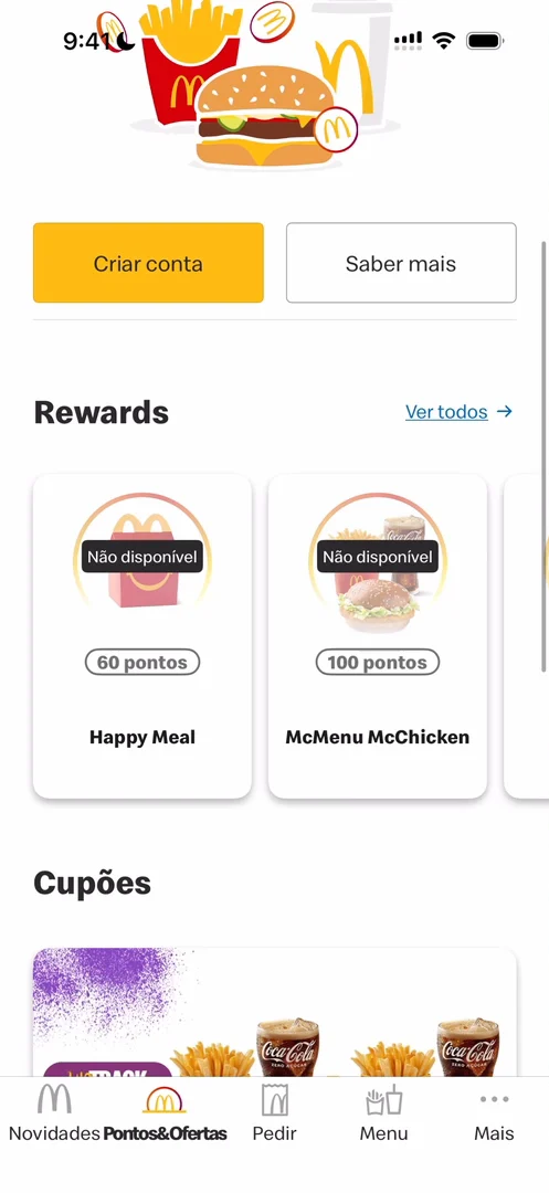
“I like the little carousel, simple and works.” José, 2:25
Below it are content cards, just like in news 2:28.
A login behind Create account
There doesn’t seem to be a button to log in 2:35, though he likes the little animation 2:37. Tap Create account, and the next screen offers to log you in:
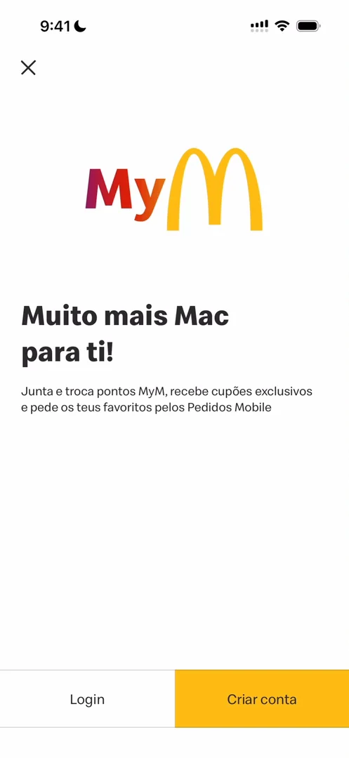
“Which obviously doesn't make sense.” José
A QR code that turns the brightness up
Once he has an account, the app shows the code you scan to collect points:
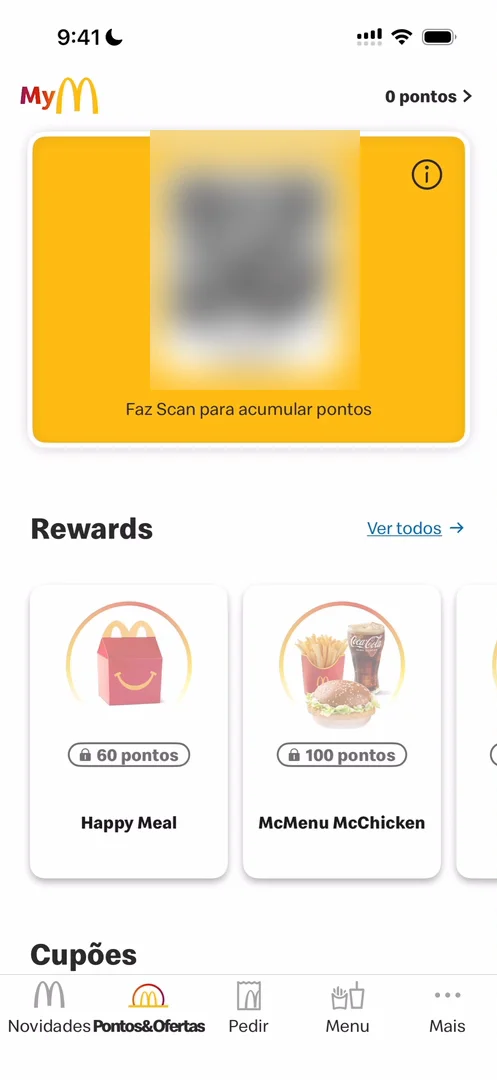
“I think if you're watching this, you can probably use this to give me points.” José
He taps the code 3:29. You can probably see the light on his face 3:33, so he points the phone at the camera:
“Actually, it's a great detail.” José, 3:39
“So look at the brightness of my screen. And now I'm going to tap the QR code. And as you can see, the brightness automatically goes to max.” José, 3:40
That’s so a scanner can read the code 3:48. It’s very basic: events apps do it, and the Apple Wallet does it 3:59. But it’s an amazing reminder that what you design lives in the real world:
“And when you're designing, you cannot just be looking at your little Figma squares. You have to imagine how the app interacts with the world.” José, 4:14
“And to actually play with the physicality of the phone, whether that's the button placement or the brightness of the screen or the haptics or the sound or any of those things.” José, 4:21
He’s glad to see it on the McDonald’s app, for the first time in the series.
A menu that’s a web page
The Menu tab is a web view, cookie banner and all:
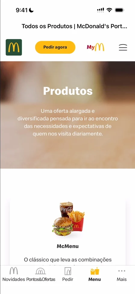
“For the menu, which is the simplest thing to do, they do a web view that is very bad inside.” José
He was expecting it to be at least some kind of native thing:
“We're not going to learn anything from WebView.” José, 7:50
The More tab is basically miscellaneous 7:52. And one of the news cards opens a web view too, asking for cookies again:
“This is a great way to learn how not to do things in this case.” José
A shortcut in the header
Then he notices something on the news header 8:32: the QR code up top, so you can reach it right when you open the app 8:41.
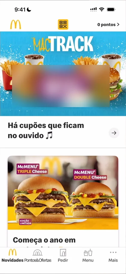
“That's kind of clever.” José, 8:47
“I wish they did that kind of header all throughout the app so that you can access the QR code from anywhere.” José, 8:48
Hipstamatic does it with the camera, which you can reach from anywhere, up top 8:53; McDonald’s could do the same.
The verdict
He’s honest: there aren’t many things to see in terms of design 9:01, and he did this one mostly for the fun of it. But it does have one very good reminder 9:06:
“So if the QR code needs to be scanned, it is your responsibility as a designer to increase the brightness.” José, 9:17
“I hope my friends are happy.” José, 9:32
One design challenge from this episode
Learn design from the apps you love
Practice UI design every day with 300+ briefs from apps like McDonald’s. Finish one and its card is yours.


