
App Breakdown #48 · Methods
Methods’ UI design: a clean app built on sheets
José opens Methods, an app that promises to pay anyone to record videos for brands. Its UI is minimal and polished, and it keeps pushing you toward the one thing it wants: recording videos.
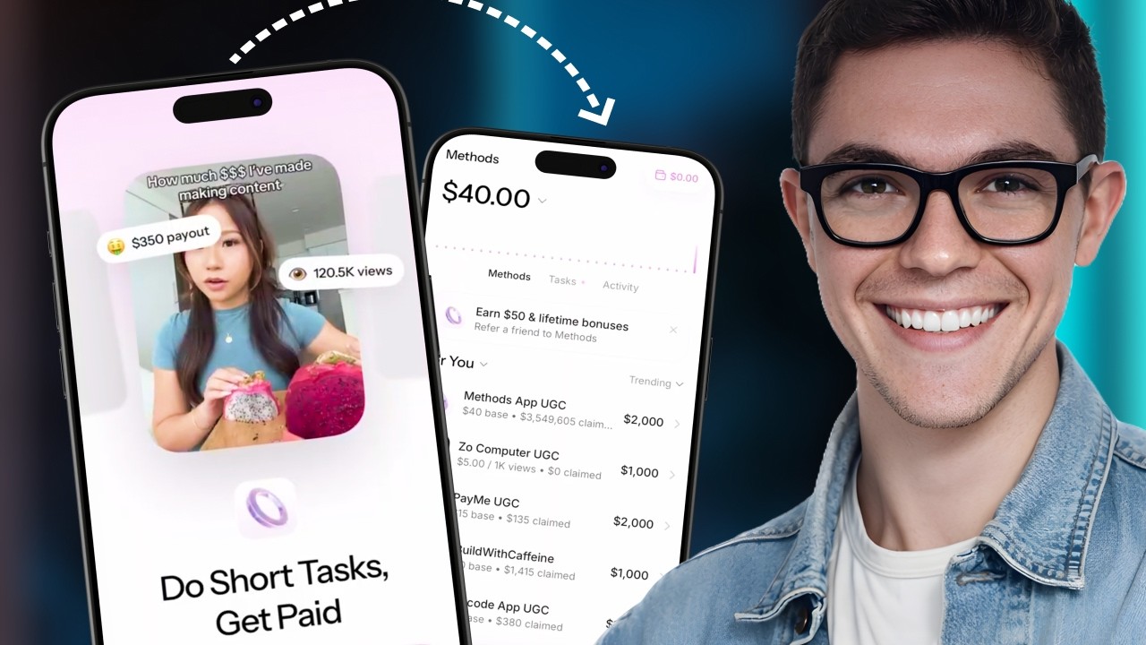
Methods is an app that lets anyone make money by recording UGC videos 0:00. The idea is simple:
“There’s a bunch of teenagers who want to make money online. There’s a bunch of brands who want to pay for exposure online. Methods links the two.” José, 0:29
José has no idea whether it works or is a scam, and says it isn’t an endorsement: he’s there for the design.
Glass, or something like it
The onboarding is long, and its answers sit on glassy buttons he likes:
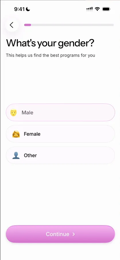
“I don’t know if it’s like their own interpretation of liquid glass or if they’re using some weird version of liquid glass, but I’m digging it.” José
Questions without the obvious answer
“What’s your goal?” offers completing tasks, creating videos and finding more jobs:
“How is it not make money an option here?” José, 1:45
Later comes a question José has rambled about before:
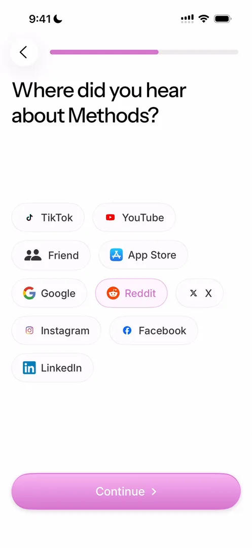
“I don’t have the data but I’m pretty sure that a lot of users lie on the screen so you’re getting fake data for nothing, the user is not getting any value out of it.” José, 3:23
“For example, I found this app in an article. Where is the option for article? It doesn’t exist. And I don’t have the option to skip. So I’m going to give them false data.” José, 3:41
A step many onboardings have now
José has seen this step before in the series. Opal works out how much time you’re wasting; water trackers, how much more you could drink; and a social anxiety app he thinks was called Bloom, what you could achieve 4:01. Methods does it with money:
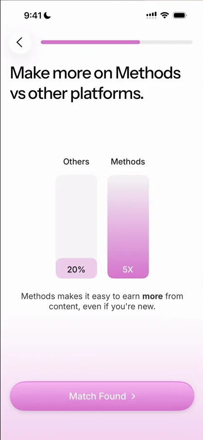
“Here’s all the money you can make with other people, here’s all the money we can make with us.” José, 4:26
“It’s very common for apps to have a step like this on the onboarding right now.” José, 4:29
Paid to finish the onboarding
Then the app offers $40 for uploading a first video 4:35:
“Okay, so this is like they pay you just to onboard properly on the app. I wonder how the economics of this works.” José
He skips the upload, and the app lets him:
“Yeah, they’re doing these skip steps very well. I’m not sure if they should or not.” José
A balance that’s never zero
On Home, he already has $40, though he skipped the upload that was meant to earn it:
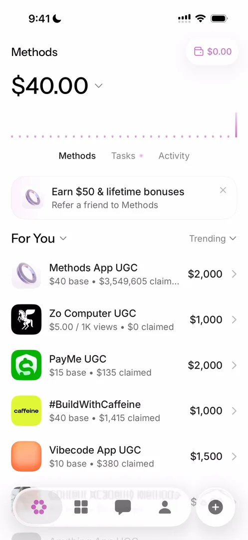
“I guess this is a good way to just never show zero. It’s basically like from the moment you enter Methods you have some money there, it’s never really zero.” José, 7:58
“This home screen is extremely clean. I’m really loving the way everything is laid out.” José, 8:30
He wishes the sub lines, which carry a lot of text, were a bit different 8:37.
The answer that comes back
Tasks opens as a sheet, and he recognises the number on it:
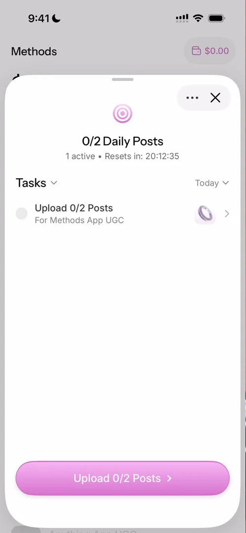
“Because on the onboarding I said that… I can do two posts a day, they’re now pushing me to do those posts.” José, 8:57
Brands as profiles
Each brand has a page with what it pays and who has applied:
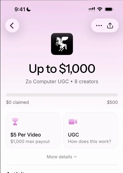
“So this is a profile of a brand and how much they’re paying.” José, 9:23
Applying means recording a video, much like a job application, which he guesses makes sense 9:50. And the requirements sheet morphs into the next one, so you barely notice you’re on a new page:
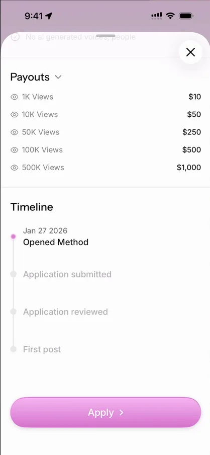
“Notice how this bottom sheet here morphs into the next one, that’s pretty cool.” José, 10:00
“I really love this kind of animation, it’s just extremely light, you barely notice it, and yet you’re in a different page now.” José, 10:06
Explainers as videos
Tapping the UGC card explains what UGC is and how to do it 10:43:
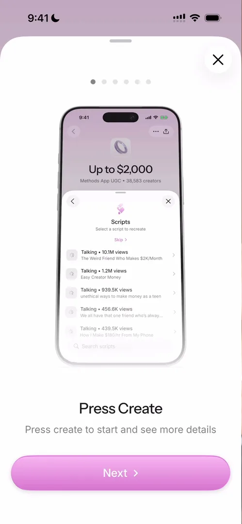
“I’m a big fan of these types of explainers in apps where instead of doing a detailed graphic or sending you to a blog post or anything like that, they just show you a little video of how it works.” José, 10:47
A swipe that doesn’t fit
On a brand’s page, swiping left and right jumps to the next company 11:13:
“I guess that makes sense. You’re browsing fast between things, but the animation itself is just not good.” José, 11:17
He wishes for another animation, one where the next company slides in, or one like Apple Books’.
No camera, on purpose
In the second tab, Library, a script comes with an example video. Watch plays it inside the app with a watermark 12:37. Tap Create and you can only upload:
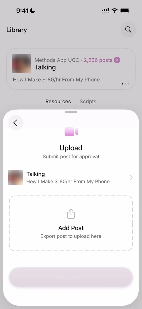
“There’s no camera inside the app, the expectation is that you do it elsewhere and then you import it into the app, which makes sense.” José, 12:46
“They don’t have to build the entire basically creation suite themselves.” José, 12:52
Below are resources: a handbook, background sounds, a course 13:00.
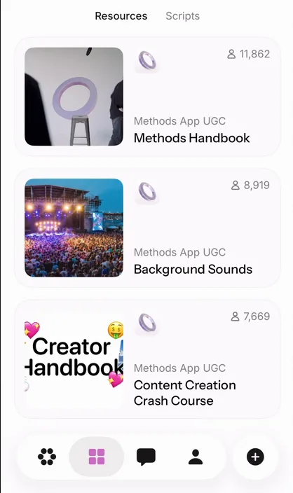
“They’re basically giving you all the things you need to create.” José, 13:06
The text inside the resources isn’t the most readable, with a lot of bullet points, but he likes the page itself 13:20.
Chat in a sheet
Chat opens in a sheet too:
“The chat appears inside of a sheet which I already like makes it feel very light.” José, 13:58
“In general there’s very little UI on this app and the very little UI that exists is very polished.” José, 14:30
One thing isn’t polished, though. Scrolling up to the oldest messages, the same swipe closes the sheet, and he loses the chat by mistake 15:22:
“If you do a chat inside of a panel you need to handle this very well, otherwise it’s just extremely frustrating.” José, 15:38
Its own symbols
Settings, at the top right of Profile, has icons of its own:
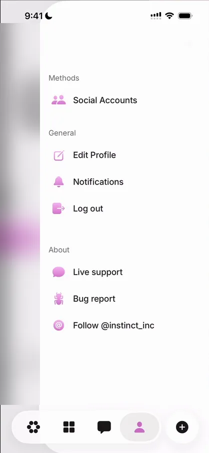
“They have their own little version of SF symbols with the pink.” José, 16:20
The plus at the bottom right opens a sheet that walks you through a post, from picking a company to choosing a script 16:29.
The verdict
“Designers really chose just a few elements for this entire app and they work very well.” José, 17:04
He calls out their great use of sheets and half sheets, and the morphing between the two 17:21. The flows inside some sheets run a bit long and almost deserve a full screen of their own, and the swipe between companies seems bolted on 17:26.
“As an app in general, I think they do a very good job of just pushing users towards doing the thing that they want them to do, which is recording videos.” José, 17:47
“Honestly, I’m a big fan of the design of this app.” José, 17:53
 1 of 4
Four design challenges from this episode
Learn design from the apps you love
Practice UI design every day with 300+ briefs from apps like Methods. Finish one and its card is yours.


