
App Breakdown #87 · Monologue
Monologue’s UI design: a dictation keyboard that breaks the mold
José tries Monologue for one reason, a keyboard unlike any he’s seen. Here’s what it gets right, and the parts that left him guessing.

Monologue makes dictation on your phone more effortless, and it looks very cool doing it 0:00. José’s reason for breaking it down:
“There’s a very specific reason why I want to break down this app, which is this keyboard that they have. I have never seen anything like this on any other app.” José, 0:27
It’s part of a wave of AI dictation apps, alongside Wispr Flow, which José uses on his computer 1:08. If one works as well on his phone, he’ll take it 1:20.
A welcome that sets the tone
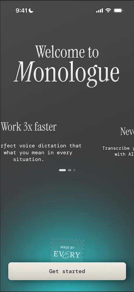
Monologue opens on a video of an original iPhone, then a stamp at the bottom that José likes, and its main promises: work 3x faster, never type again, context-aware AI 0:53.
The sign-in screen is less convincing:
“There were a lot of things on this login screen. It looked quite busy.” José, 1:34
A setup video that follows you into Settings
To use Monologue you have to add its keyboard in Settings, and a short video under the instructions shows how 1:40. Tap Open Settings and the video comes along, picture in picture, over Settings itself 1:49.
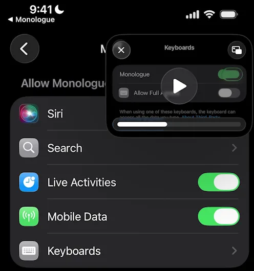
“Notice how the video was very useful because even me being someone who’s well versed on iOS, I didn’t know which button I actually needed to press.” José, 2:04
José’s tip from it:
“So picture-in-picture videos whenever you’re trying to get users to do something that is outside of the app, for example turning on a permission or installing a widget, installing something else on the home screen, those can be very useful.” José, 2:12
Once the switches are on and he comes back, the video is gone and the app moves him on; he guesses it can check they’re on 2:29.
The keyboard
Then comes the keyboard itself. José says it feels like an app from the 2010s, when skeuomorphism was all the rage and everything had textures.
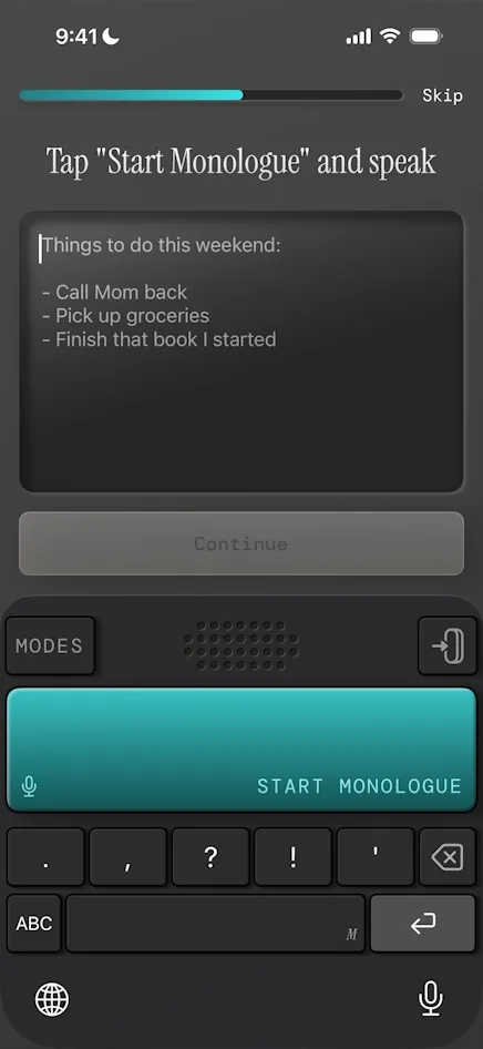
“I really really love it. Like the amount of depth on these keys is exceptional.” José, 4:06
Later he points out a detail that runs through the keyboard and the rest of the app:
“Something that they clearly do on the keyboards and everywhere else is this like double line, dark line, white line. If you’re a designer, you know what I’m talking about, but it just gives it a very cool effect.” José
The same effect done with shadows on the app’s other buttons doesn’t look as good to him.
Back at that first test, start recording, and sound waves fill the middle of the keyboard 4:14. No text shows up while he speaks, though, which he finds confusing:
“I guess I’ll trust it more if it was live.” José, 4:28
The words only arrive when he stops. Why bother, when the iPhone keyboard already has a microphone?
“The microphone button kind of sucks. It does the job but it misses a lot of words.” José, 4:51
Setup that shows off
The setup keeps asking him to try things. He can tap punctuation keys while he’s speaking, but what he taps isn’t worked into what he’s saying; it just sits in front of the dictated text, which he finds weird 5:26. Then it asks him to whisper:
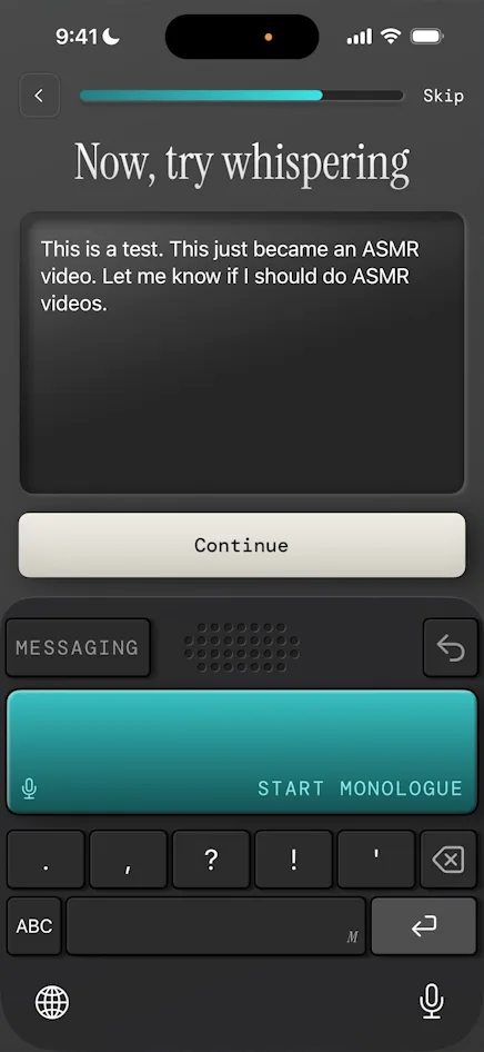
“As you can see it got it perfectly, which your standard iPhone dictation would really not get perfectly.” José, 5:55
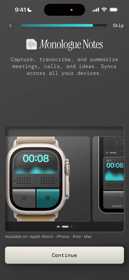
The next screen shows Monologue Notes on Apple Watch, iPad and Mac 6:03. It’s a whole ecosystem, and José guesses the notes all sync 6:11.
A screen of reviews comes next, and José reads it as a sign the paywall is close 6:23:
“No one ever shows social validation without a paywall.” José, 6:30
It is 6:46. There’s no free trial, and a close button sits at the top left. Closing it takes him into the app, which he didn’t expect: he thought Monologue was paid-only.
Inside the app
The app itself is simple. Its main button, to record a note, is hard to miss:
“This blue button here full of shadows… it does stand out, it’s very unique.” José
On the Notes tab, that button grows into “Create Note”. Tap it and the keyboard becomes a recorder, with Cancel, Pause and Stop:
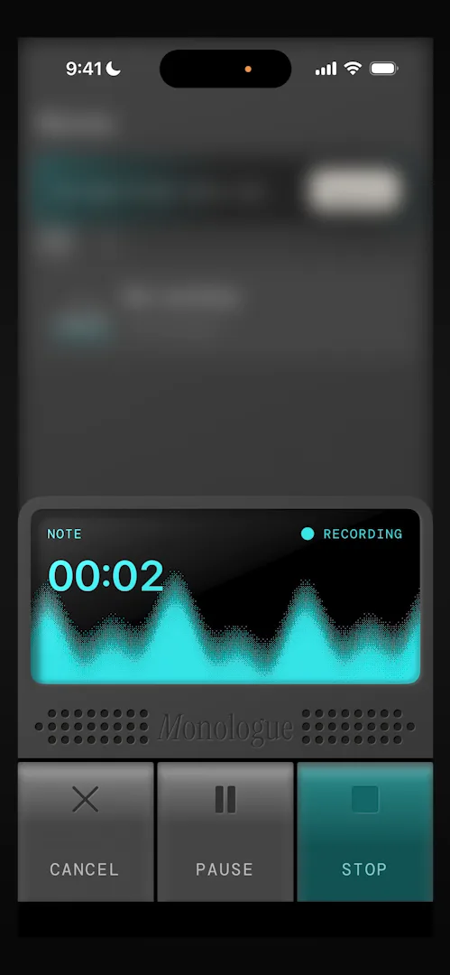
“We have a different version of the keyboard, this is very cool.” José
The note lands in his notes list, where the banner at the top runs into the buttons, a padding issue. Every tab has a banner up top; on Notes and Settings it pushes the upgrade 10:23. Settings has a dictionary, for the technical words and slang you use that a dictation app would otherwise miss 10:41:
“It’s one of the things that makes this type of apps so much better than standard dictation.” José, 10:51
The action button
On iPhones with an action button, Monologue can start dictating from it 11:00. José’s phone is a 14 Pro, so he can’t try it 11:35, but he likes the idea:
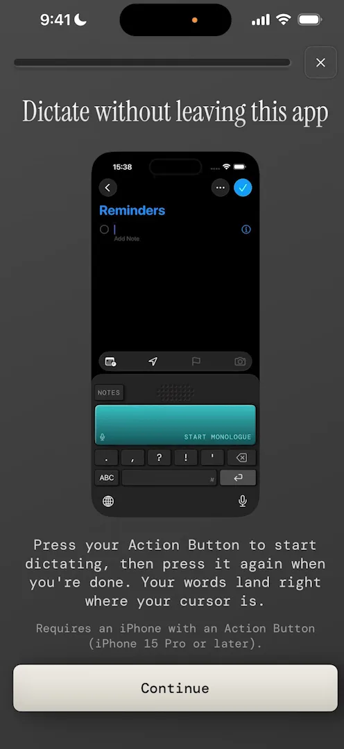
“So it’s an exceptional example of making your app or the value of your app live outside the app itself.” José, 11:14
“I’m guessing that if a user actually configures their action button to use Monologue, they are way way way more likely to use Monologue on a daily basis.” José, 11:22
Even he has a hard time working out the Siri shortcut:
“To be honest I’m even myself having a hard time knowing what exactly the shortcut does and how to do it.” José, 11:43
Where it really lives
“What to me is the most interesting part of this type of app is that it lives outside of the app itself.” José
In Apple’s Notes, the keyboard comes up as he starts typing, and he can dictate right there 13:27:
“If you’re someone who, for example, sends a lot of voice messages, but would like to send them with proper transcripts, this is for you.” José, 13:48
Few apps follow you through Apple’s ecosystem, he says, and Monologue is one, especially with its Watch and Mac apps 14:17. The keyboard also has modes, among them Fast, Messaging, Coding and Email 14:36.
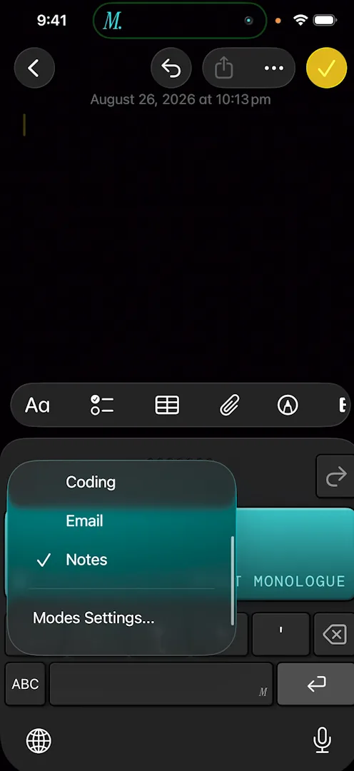
He picks Fast and speaks quickly, and clumsily on purpose 14:43:
“Man, this is exceptional. Look at how accurate it is.” José, 14:47
He guesses the other modes change how the text is formatted 14:55. An ABC key opens a keyboard for typing, so a correction doesn’t mean switching back to the iPhone’s 15:13:
“I don’t actually have to go back to the iOS keyboard.” José, 15:22
The verdict
José’s closing note is about how different Monologue is: it redesigns the iPhone keyboard, something few would try 15:32.
“It just takes the guts to redesign things that we usually just take for granted.” José, 15:52
“They designed their own keyboard, they broke the mold, they did something that is unique.” José, 16:24
Design challenges from the App Breakdown
Learn design from the apps you love
Practice UI design every day with 300+ briefs from apps like Vocabulary, Brink and ATC. Finish one and its card is yours.


