
App Breakdown #90 · Moonlitt
Moonlitt’s UI design: page transitions that teach you the app
José opens Moonlitt, the moon phase tracker from the makers of Sunlitt, for the first time. Its motion keeps showing him where things are. A few other parts get in his way.
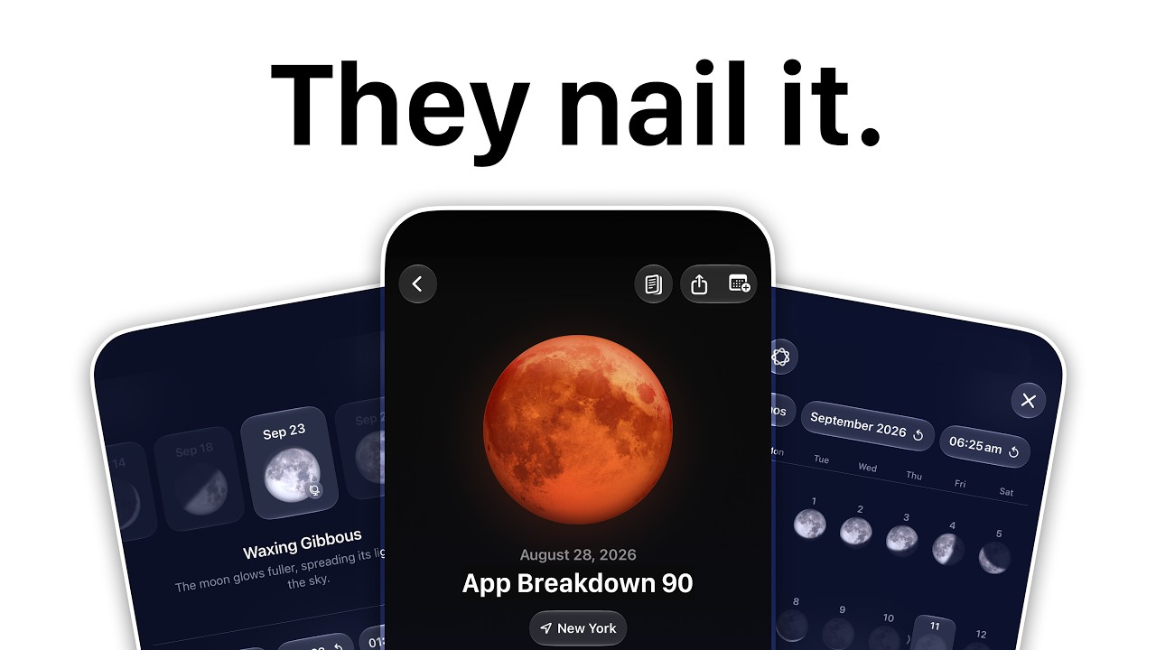
Moonlitt is a moon phase tracker, and it has won an Apple Design Award 0:00. It’s made by the team behind Sunlitt, which José broke down in episode 33: the same kind of app, for the sun 0:29. He loved Sunlitt, and opens Moonlitt for the first time on camera 0:39.
The home screen
The home screen shows a 3D moon on its path around a small white shape that stands for the Earth. A slider runs down each side: the time of day on the right, the day on the left 4:07. Without Pro, the day slider stays on today; drag it and a Pro prompt appears 4:11.
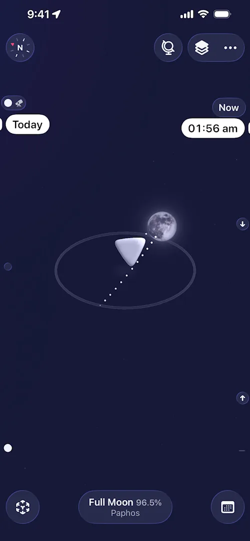
“I really love the little object that they put in the middle to represent Earth, like it’s very original.” José, 3:45
Controls that step aside
Touch either slider and the buttons at the top and bottom slide off the screen to give you a clear view of what you’re seeing, then come back in the order they left 4:22.
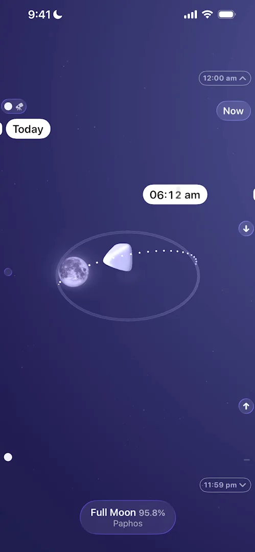
“It doesn’t just fade away or flash away, it goes up and away and then comes back in the same sequence, so the spatial model of the app is very clear.” José, 4:35
The small arrow markers beside the time slider grow as they move into place 4:48:
“This is basically exactly how I like these types of animations to be made.” José, 4:55
Moving the moon on the map does the same: the sliders and the buttons at the top ease out of the way instead of vanishing 10:01.
“It’s very smooth and it just makes for an interaction that is beautiful, like it’s worth using essentially.” José, 10:14
A page that folds back into its button
Details opens from a button at the top of the home screen. Close it, and the page shrinks down into the Full Moon pill at the bottom 8:28. José had opened it from the top, but after one close he knew exactly where to find it again 8:42:
“So animations and page transitions are not just aesthetic, they are also informative. You can teach a lot through animation.” José, 8:54
“Without wasting any time and without writing anything to me, they told me that the details page is here at the bottom. And this is the power of a good page transition.” José, 9:04
A widget guide on one sheet
At the bottom of Details there’s a row for widgets, and unlike some rows above it, it has no Pro badge 7:41. It opens a guide José calls new to him:
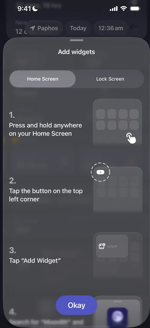
“We have a type of tutorial to install a widget that I have never seen before, so this breakdown was already worth it for me personally.” José, 7:55
It’s four short steps on one sheet, each with a small drawing, and a second tab does the same for Lock Screen widgets 8:00. That second tab matters:
“Most people still don’t know how to do it because there haven’t been a lot of viral apps that teach you how to do them.” José, 8:13
Selling Sunlitt by being useful
Further down Details, a card shows today’s sunrise and sunset, from Sunlitt 7:04. Tap it and Sunlitt opens 7:28.
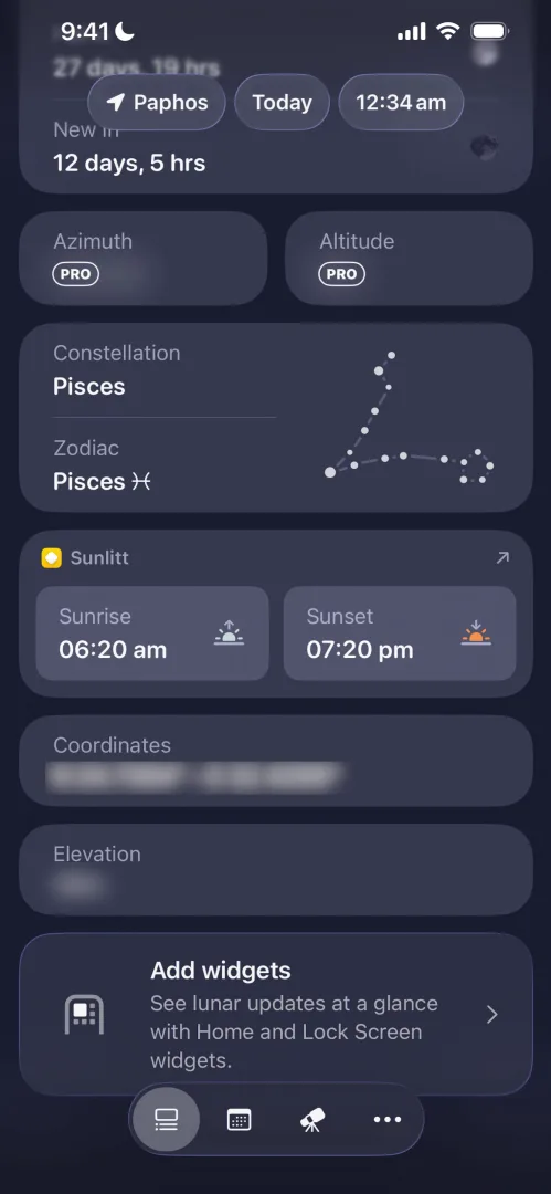
“Usually when a developer has multiple apps they try to use one app as top of funnel for the others, and this is the perfect way to do it, because they’re giving me information that the other app has, so they’re actually just giving me value and not upselling me on something.” José, 7:12
Settings has a second way in: Sunlitt’s icon, in a row of the team’s apps 11:45.
Small touches
The layers button switches between no map, a night map you can move around, and satellite. José thinks they filter Apple’s map, because it doesn’t look like the original 9:42. Search for a city and the moon moves there, and the time on the slider changes to match:
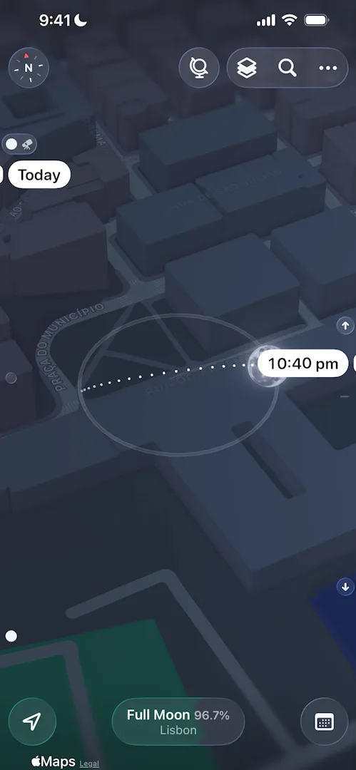
“Another interesting detail that I noticed is how the sliders actually move to different places. I’m guessing it’s to adjust to the time.” José, 10:46
Then he searches New York, and the slider moves again to match New York’s time 10:59.
Settings opens in a sheet, and Preferences has three app icons, a choice of fonts and a switch to start the Live Activity on its own 11:53.
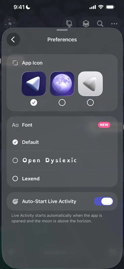
“I really love these types of navigations within sheets, like they’re extremely simple but they work so well.” José, 12:05
The AR view puts the moon where it is in your room, through the camera 12:48. What he says it’s good for:
“And you can actually plan, for example, a photo shoot or a video that you wanna do or a romantic date.” José, 13:21
Tap a day in the calendar tab in the bottom bar and a menu opens with that day’s details and options 13:51:
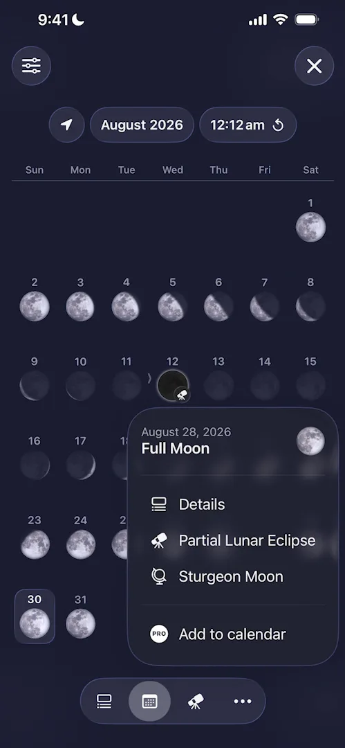
“It’s not usual to see a context menu that has like a title and subtitle and an image and then a bunch of options, but this one, like, it really works.” José, 14:03
Where it gets in the way
It slows down. The longer José uses the app, the worse it runs 3:51:
“If I kill the app and I come back on… the performance is great, but in a couple of minutes the performance is going to degrade, so the problem is with the app and not with my phone.” José, 3:59
A review prompt on arrival. The first time he opens Details, a prompt to rate the app lands on top of it 5:30.
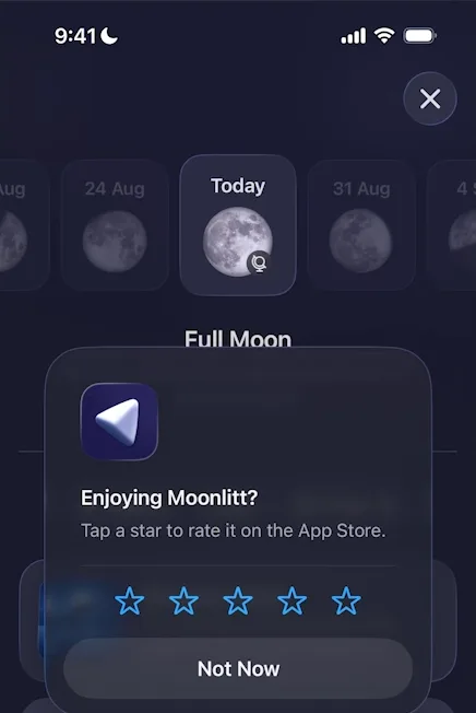
“Generally speaking, when your user is trying to get somewhere, the user just pressed to go to a page, you should not interrupt them for almost anything, let alone a review.” José, 5:36
Boxes everywhere. Details is clean and easy to read, and its background changes colour with the kind of moon 6:33. But nearly everything on it sits in its own box:
“There’s a lot of boxes everywhere and the boxes kind of conflict with the visual weight of the different pieces on the screen.” José, 6:09
He’d keep backgrounds on only a few of them, so the rest could breathe 6:16.
A page in a different format. An eclipse in the calendar opens a page in a format unlike the screens before it 14:15.
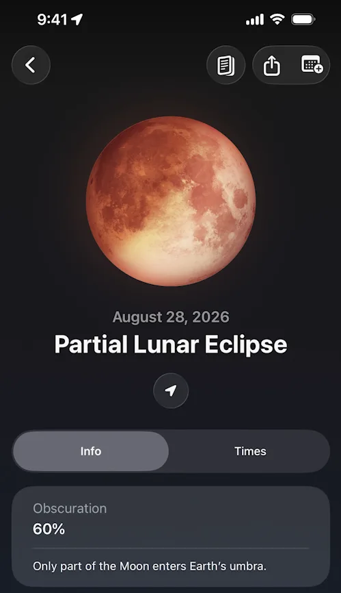
“Completely different page… it’s very different from what we were seeing just before and I don’t know how to access it apart from this place.” José, 14:23
It turns out the telescope tab in the bottom bar lists the year’s eclipses and supermoons, and that’s where the page lives 14:36.
Glass that won’t sit still. In that list, the liquid glass rows bounce as he moves through them 15:33:
“It’s one of my biggest critiques of liquid glass actually, is that it moves far too much when it shouldn’t.” José, 15:44
The same four options everywhere. The More (•••) button in the bottom bar holds the Live Activity, notifications, Pro and settings, which José feels turn up all over the app 15:54. He gets why they push them, but tapping through, it feels like a bit much.
The verdict
José signs off saying almost any screen in Moonlitt would make a great screenshot, and that this means it’s exceptionally well designed, as long as it works for the people it’s meant for. He adds that he isn’t one of them.
Design challenges from the App Breakdown
Learn design from the apps you love
Practice UI design every day with 300+ briefs from apps like Vocabulary, Brink and ATC. Finish one and its card is yours.


