
App Breakdown #57 · mymind
The UI design of mymind, a private place to save what you like online
mymind is a safe place to save anything you like online, away from ads and algorithms. José opens the iOS app basically for the first time and finds an app that works best from outside the app.

José opens the episode on mymind, the app that serves as a safe sanctuary to save anything you like online, away from noise and ads 0:00. It’s an exceptionally cool product 0:13, built on a simple premise: if you’re creative, there are a lot of things online you want to save, somewhere that feels safe and away from the clutter of the web 0:21. He used mymind years ago, he thinks only on the web, so this is basically his first look at the app 0:38.
Soft and not in your face
Straight away, you see mymind’s signature glows and gradients 0:53, and things load into view with a nice, smooth animation:
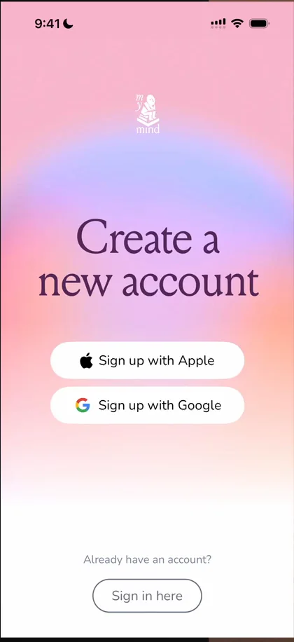
“So I think the theme for the app in terms of just general vibe animations is going to be soft and not too in your face” José
That, he adds, remains to be seen.
Leaning into AI
The onboarding cards say mymind is like your real mind, but enhanced with AI 1:42:

“Okay, so they’re fully leaning into AI now.” José, 1:44
He didn’t know they were leaning this hard into AI 2:09. The next card promises no folders, no collections and no time wasted organising 2:13, which he loves.
He admits he isn’t a mymind user himself: he keeps his own personal file instead 2:25. Ideally, you’d keep what you save for more than a decade, and you never know which products will last that long 2:39. Coming from social apps, he’s wary of putting too much into one app and losing it when the app dies 2:45.
It’s cool that they integrate into the share sheet 3:03. And the last card says it’s completely private:
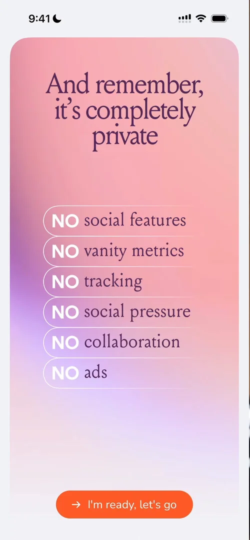
“So this I think is more the kind of positioning that they were going for before integrating AI so much” José, 3:13
He could be wrong, he says, but that’s what he remembers: no social features, no vanity metrics, none of the things a lot of VC-backed companies have to do.
Saving without opening the app
Adding things from outside the app is one of its most important parts 6:03. On a web page, he taps Share and picks mymind, though it’s a bit hard to find in the share sheet while the app is new, and he wishes they surfaced it more easily 6:35. mymind confirms the save on the spot, with a button to add tags or notes:
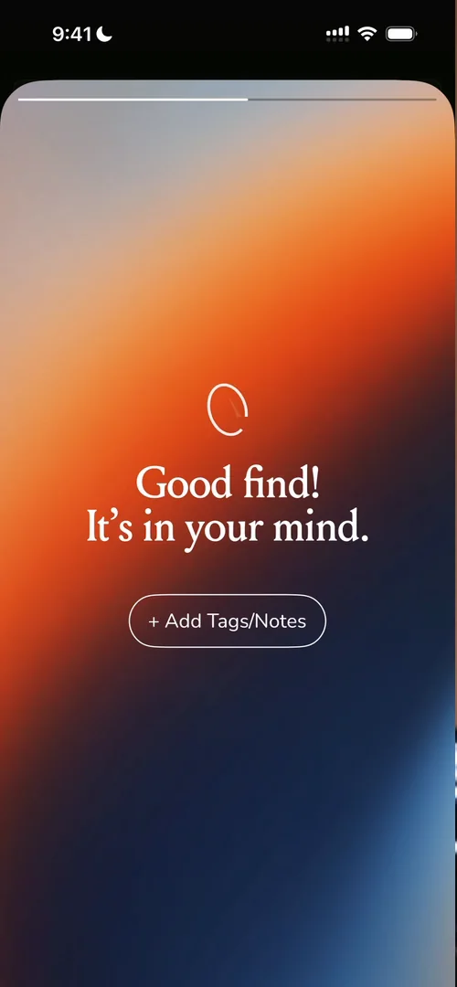
“So I’m not even inside the app. I did not break my flow as I was browsing something else.” José, 6:47
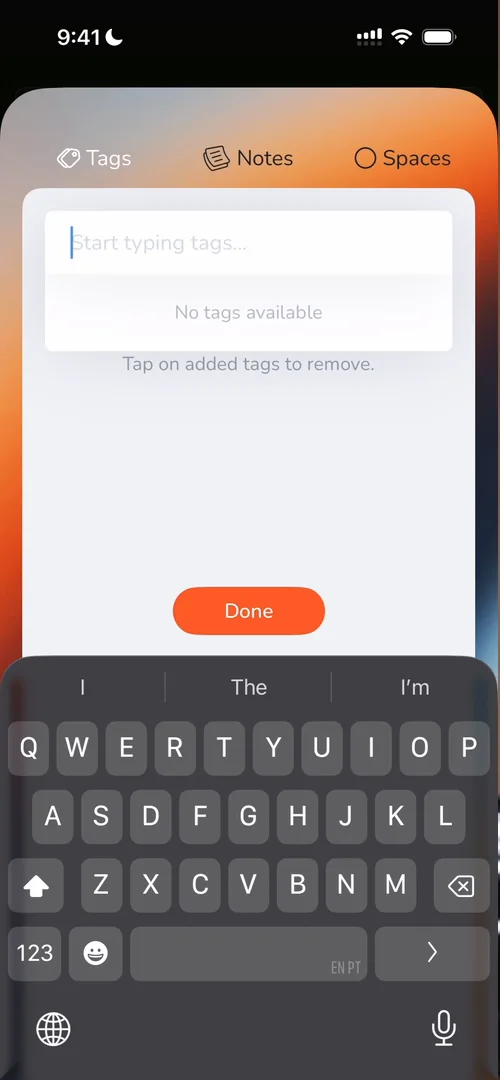
“I simply shared it elsewhere.” José, 6:52
It leads him into a rant: when people build apps, they tend to think only about the moment the user taps the app icon 7:23. But apps are much more than what’s behind the icon 7:27: the share sheet, Lock Screen widgets and buttons, App Intents, Home Screen widgets.
“So yeah, it’s a good reminder that the app doesn’t just live behind the app icon. The app lives on the OS level” José, 8:07
Every save, made useful
A saved link turns into an app when it detects one 8:30:
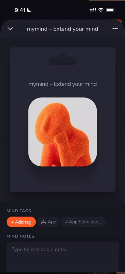
“Okay, that’s so cool” José, 8:44
The card has a little tab, like a product hanging on a store rack. One annoyance: swiping up the panel, he touched the note field, and the keyboard came up 9:07. He wishes it opened on a tap, not on touch-down. A link gets a preview, a TLDR and tags, and he’s really impressed by the tagging 9:30. There’s also “Top of Mind”, such a cool name in an app called mymind 9:48.
An image gets even more:
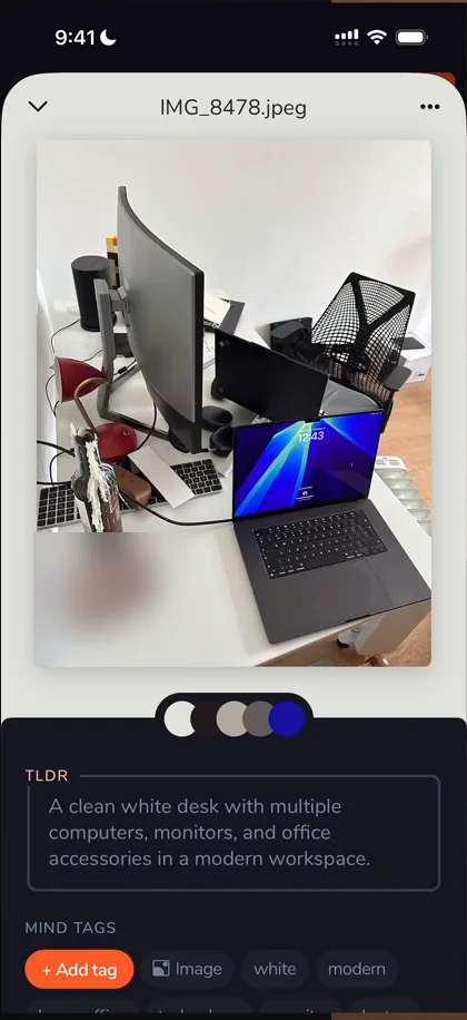
“We have the color palette. That’s incredible” José
The background adapts to one of the image’s main colours, you can copy each colour, and there’s a TLDR of the image itself.
Rough edges
Some of the interactions aren’t the best: the search bar sometimes sticks, and a note closed without him doing much. Search wasn’t as smart as he expected either 13:22: “laptop” didn’t find the photo of laptops.
A colour picker with delight
Creating a space asks you to pick a colour:
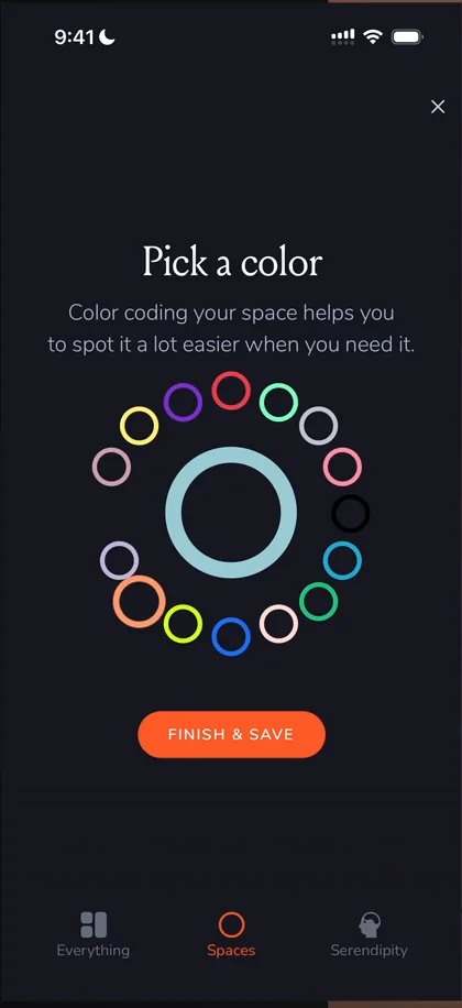
“Oh, this color picker is so cool.” José, 13:57
“This is the type of thing that is extremely unnecessary functionally but extremely cool just from like a delight perspective.” José, 14:00
“Who knew there is still innovation to be done on color pickers.” José, 14:09
In an empty space 14:16, though, the main action to add something is a bit hidden.
Serendipity
Serendipity unlocks after you save 50 cards 15:46, which is a lot to unlock a feature, but he loves the gradients behind it 15:51. It seems to be a way to refresh and reinforce your memory, not a recommendation algorithm.
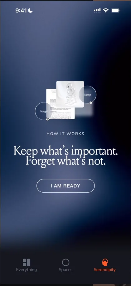
“I like how they made this much more of a like moment and journey than just a quick feature” José, 16:44
“Actually taking the time to do slow animations and have copy explaining things is rare in apps these days” José
You keep or forget each thing you’ve saved, so what you don’t care about any more doesn’t become noise. It reminds him of an app that’s making a killing doing this for your camera roll. Keep sends a card up and to the right; Forget sends it down and to the left.
The verdict
The thing he really loves is how it works outside the app: from anywhere, you can save things with no disruption to your workflow.
To be honest, he was expecting a bit more from the iOS app, considering how cool and evolved the web product is.
“But nonetheless, it’s still a great product.” José
 1 of 4
Four design challenges from this episode
Learn design from the apps you love
Practice UI design every day with 300+ briefs from apps like mymind. Finish one and its card is yours.


