
App Breakdown #37 · Particle
The UI design of Particle, the personalized news app
Particle turns dozens of articles about the same story into one. José has heard it has some cool design tricks, and opens it for the first time to find them.

Particle is a personalized news app 0:00. What it does is take the firehose of the world’s information and distill it for you in a way that’s comprehensible. José has heard it has some cool design tricks up its sleeve, but he hasn’t checked them himself.
Not a boring splash screen
“Okay, good start. So it's not a good old boring splash screen.” José
There’s no sound and no haptics, but it’s an interesting interaction, and it reminds him of the new Siri’s glow at the edges of the screen, which is probably where the inspiration came from. Then, as you move between the onboarding pages, there’s a 3D space behind them that scrolls along 0:51:
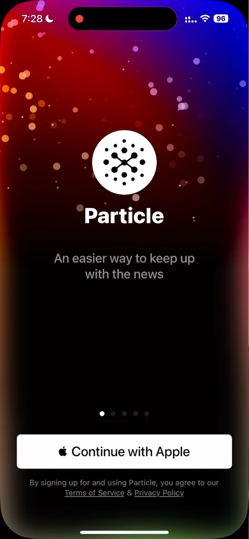
“This is actually very interesting. It's a cool idea that I was not expecting.” José, 0:57
It’s not the smoothest in the world: things shake a bit. But it’s much better than something static.
Use what Apple gives you
He signs in with Apple, and his name is already filled in 1:31:
“It's actually crazy how many apps, like, ask you to log in with Apple or Google or have access to your contacts or things like this, but then do nothing with that information.” José, 1:34
The Next button looks a bit deactivated, though; he wishes it popped out more 1:48.
Steps that stay on screen
“Very smooth onboarding here. I like that when you go through a step, it stays on the screen.” José, 2:07
You create an account, add your name, then your username, and each one stays on the screen as you go on to the next:
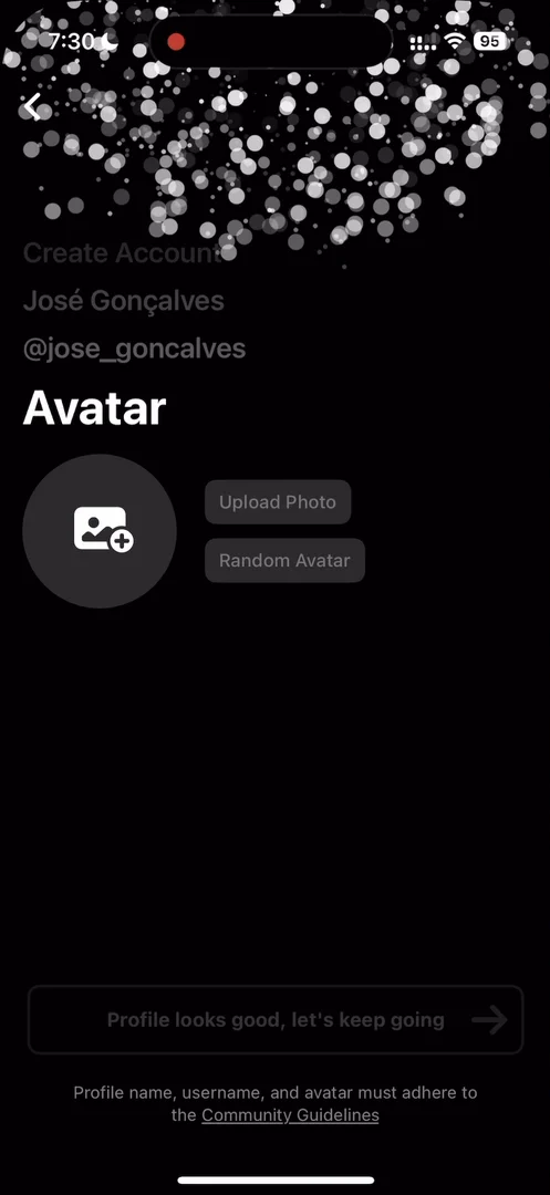
“I actually really like when apps keep some form of stored value throughout the flow, so you're completing things and you see that they are there. They don't just disappear into the void.” José, 2:17
Tuning by swiping
Next comes a Tinder-style stack of cards, to tell the app how often you want to see different types of stories 2:42:
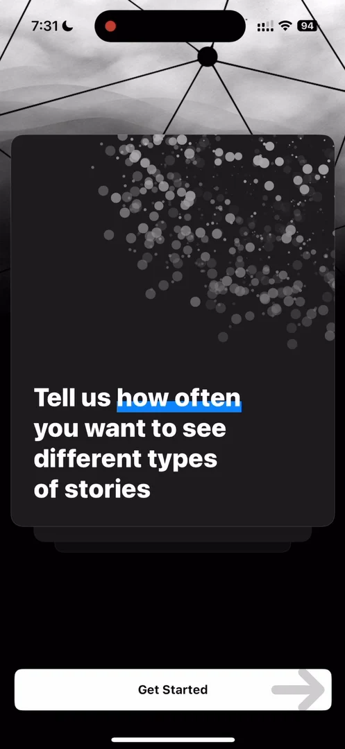
“What am I supposed to do here, because I can swipe the cards and I can hit Get Started?” José
He swipes the cards, and the Get Started button disappears 2:57:
“This navigation here is a bit confusing, because I had two options and now one of the options disappeared.” José, 3:00
What he’s doing, it turns out, is tuning his algorithm: the app learns which kinds of stories he likes and doesn’t.
Headlines you can rewrite
Tap the logo on the home feed, and you can rewrite the headlines: satire, depolarize, shorten and more 4:58.

“And it actually just rewrites the headlines, so it's very cool.” José, 5:11
“So basically you can psyop yourself into thinking that the world is a certain way when it really is another one.” José, 5:15
That’s the good and the bad of these AI tools: you can tune them to your liking, and you shrink your bubble ever so slightly with every personal interaction. A cool feature nonetheless.
A story that opens like a window
On the home feed, a side scroll reminds him a bit of Apple News or Apple Books. Tap a story, and it opens with a nice little window animation:

“Boom, nice little window animation.” José
It lags, though. The Post Comment and Ask Question buttons flash, because the bottom nav disappears 9:52, so there are a few tweaks to make before it’s a truly worthwhile animation. But you can swipe a story away from any direction 10:05:
“This is very important to make navigations feel light.” José, 10:09
Each story’s preview says how long ago it was and how many articles it summarizes. Particle takes, say, 20 articles on the same theme and gives you the narrative.
Modules for any story
He keeps counting different kinds of cards on the home feed, and that’s the point:
“When you're designing something like this it is much more important to design with scalability in mind than it is to make the one perfect news look good with the right image because you're never gonna have the perfect scenario anyway.” José, 12:55
You take ten stories and design one module that can take all of them, then a different way to display them, and another, so any kind of news fits any kind of module. One card has a slider at the bottom 13:08:
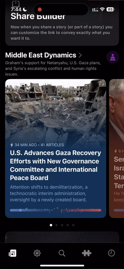
“It's just basically a polarization indicator, just tell me where it sits. Okay, this is an interesting visualization.” José, 13:17
The home scrolls forever 13:33. And the performance isn’t amazing 13:45.
Browse by topic
The second tab, Explore, has more cards on cards 13:50, some images he finds very random 14:01, and a list of topics to browse:
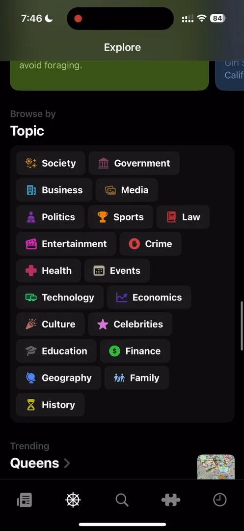
“Browse by topic, I also really like these. It's a very, it's a very interesting layout, actually.” José, 14:16
A profile for every topic
Search is a plain bar at the top over a grid of categories, so there’s no empty state 14:29. And searching for Portugal looks for topics before stories 14:45. Tap Lisbon, and a sheet opens with everything related to it 14:58:
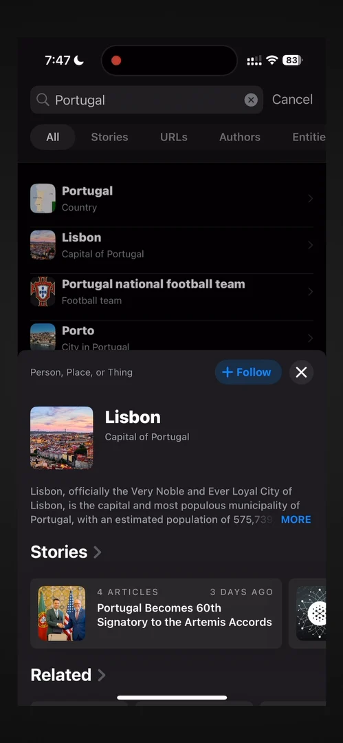
“Very interesting approach. It's not what I was expecting from search whatsoever.” José, 15:07
“Very cool approach, approach to search, actually, to give each topic its own little profile half sheet.” José
History
The last tab is history: the things you read and scrolled through.
“It's just basically a way to keep track of the things you saw, which is very important, because often in news websites, and just when you're browsing things in general, it's very hard to find something and then remember it and then go back to it.” José, 16:21
The verdict
He has seen what scalable design looks like, with modules that fit any kind of story; a good intro to animations, though the lagging performance kind of defeats the purpose; an interesting search pattern, with a little profile for each topic 17:00; and a cool splash screen, nothing too fancy, that worked really well to get his attention.
“Overall, I think there's a lot to like about this app, especially about every module that they designed. I'm going to be taking some inspiration from this.” José
 1 of 5
Five design challenges from this episode
Learn design from the apps you love
Practice UI design every day with 300+ briefs from apps like Particle. Finish one and its card is yours.


