
App Breakdown #51 · Partiful
The UI design of Partiful, the party invite app
Partiful is no stranger to the top charts, but José isn’t sure he has ever joined one of its events. He tries it, for what he thinks is the first time, with a real dinner to plan.
Partiful is an app that is no stranger to the top charts, because it makes it easy to create and join social events 0:00. José has seen it a lot, but he isn’t sure he has ever joined a Partiful event, mostly because most of the people he knows don’t use it 0:13. He feels it’s more of a thing in the US, though he might be mistaken 0:22; in Europe, people usually use Luma or Eventbrite 0:25. And he’s testing it on a real use case: he’s hosting a dinner at his place in an hour.
“it is exactly the kind of use case that you go for Partiful instead of a Luma or an Eventbrite” José
A sign-up that saves a tap
It opens on a nice video animation, though the logo looks a bit pixelated and the Get Started button doesn’t look amazing. Then comes the phone number and the code, and you can choose whether to get it by WhatsApp or SMS:
“I'm not sure why they even give me the choice. Like just send me the code.” José
But there’s a nice touch. iOS suggests the code above the keyboard, and the moment he taps it, the app moves on:
“So a lot of apps actually make you tap that and then wait for it to check the code and then click continue, but you don't actually have to do that.” José
The app can check the code itself in the background and, if it’s right, take you to the next screen 2:38. When you’re talking about onboarding, he says, all taps matter.
The profile picture step says you’re ten times more likely to get invited to parties if you have a profile picture 2:49:
“I don't like the the design of the tooltip but I like the little social indication there” José
Both that step and the birthday can be skipped, which he finds good: they don’t force these things on you. Then the app asks for notifications on top of the home page. That may look sloppy, as if no one designed a proper screen for it, but he has seen the numbers of a few apps that do it:
“actually the conversion for accepting notifications when they're prompted like this on the home page is actually quite high it tends to be high so it's very legitimate to do it” José
An event page built to be shared
Creating an event is where he has seen Partiful shine:
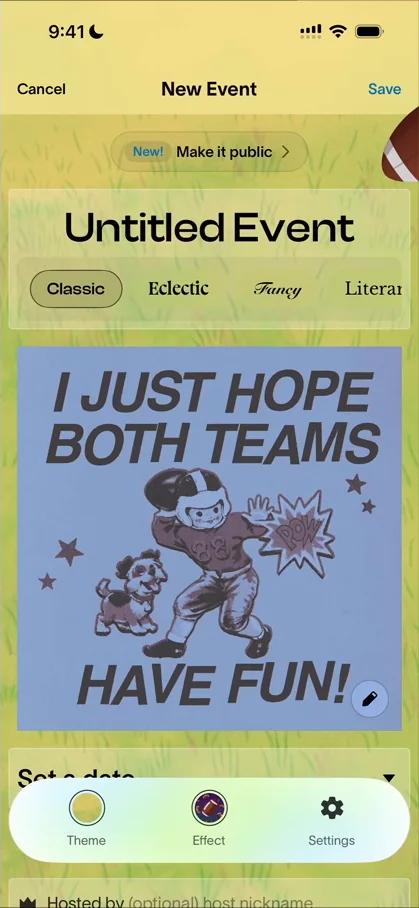
“it just shows how cool it is because you can personalize all of these things” José, 8:17
“it's also one of the main reasons why they grew so much because people love sharing these kinds of invites” José, 8:21
He names it “Dinner with friend” and picks a font. The themes remind him a lot of Canva 8:56:
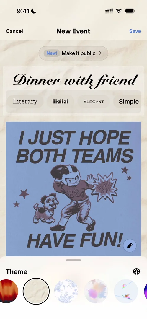
“which in this case, it's not a compliment, but they have all the cool features you might want to have” José, 8:56
The effects seem to add drawings across the background. He picks flames:
“Oh my god this looks so bad. Let's keep it. Perfect.” José
Further down, you can limit the spots and get a waitlist, and charge a cost per person, which opens its own monetization menu. You can add an RSVP deadline and a playlist, and change the RSVP options. He wanted to take “maybe” off 10:56:
“That ruins social coordination. Like you should never have maybe on an event. Either you go or you don't.” José, 11:01
That, he adds, is just his life philosophy, and it doesn’t matter for the app. In the settings there’s Chip In 11:18, which he guesses is for when you don’t want to charge your friends but would like some money towards it:
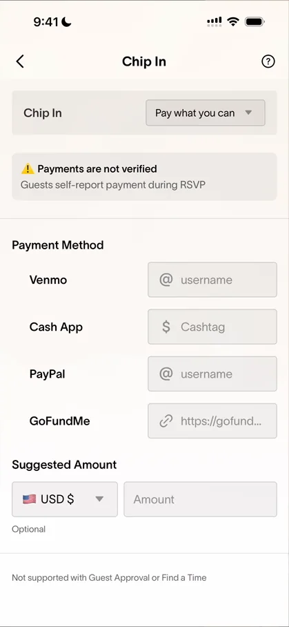
“That's a very cool feature. I didn't know it existed.” José
Once the event is saved, the whole layout looks much better:
“I don't know why they don't just use this layout to begin with.” José
Twelve buttons and a flyer
He counts twelve buttons at the bottom of the event page 12:38:
“like that's a lot so I don't know why they they don't just remove the bottom nav here” José, 12:46
Blast sends one message to all your guests at the same time:
“As an organizer, that's very useful.” José, 13:25
Under More, you can make a flyer:
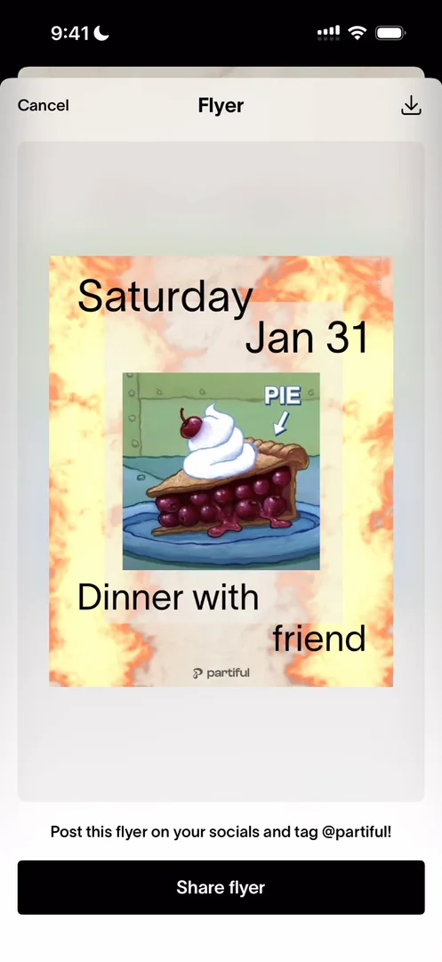
“exceptional flyer i love this” José
Cards, for when you’re not going anywhere
The plus tab opens a sheet: create a new event, or send a card.
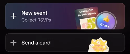
“we can either create a new event or send a card” José
Cards are for birthday wishes, announcements and more. You pick a theme, a font 17:14 and an effect:
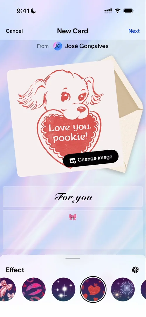
“little hearts little hearts boom beautiful” José, 17:19
Then it loads with nice animations 17:26:
“so they do have some work to make the animations actually feel triple a this feels very web” José, 17:30
“but they are cool so that's a good step” José, 17:39
Then something he has to call out 17:45:
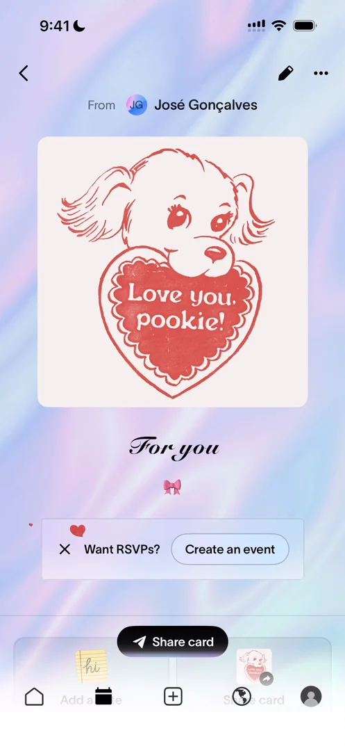
“As a user, I just went through the hassle of creating something. And I created something because I wanted to share it because that's the whole point of the feature.” José, 17:47
On the screen where you’re meant to share it, the bottom nav stays and the button is small 17:55:
“this share card should just occupy the entirety of the bottom of the phone or they should even pop up the share sheet for me” José
Effects on other hosts’ events
Other people’s event pages have effects behind them too:
“They look very cringe it's very like 2010 internet but I really love it” José
It seems hosts can also personalize the RSVP button: one event’s button had a heart where another’s had crossed fingers. Some panels, though, he’s pretty sure aren’t native code; they look very web.
A profile with the people you’ve partied with
The profile asks you to celebrate your birthday. He liked being able to skip it in onboarding, but now he feels they should have made him add it during onboarding 22:58:
“as a user it's cool when i'm not forced at the onboarding but from a platform from an app perspective it gives them a lot of value” José, 23:01
“in this case if I'm thinking as Partiful, I'll force people to add their birthdays” José, 23:14
Your name sits at the top left, which means you can have more than one profile. Mutuals lists the people who have been to the same events as you. At an event with fifty people, you might remember the names of three you spoke to and forget two others you liked; this list lets you come back and find them. Below it are the cards you’ve made:
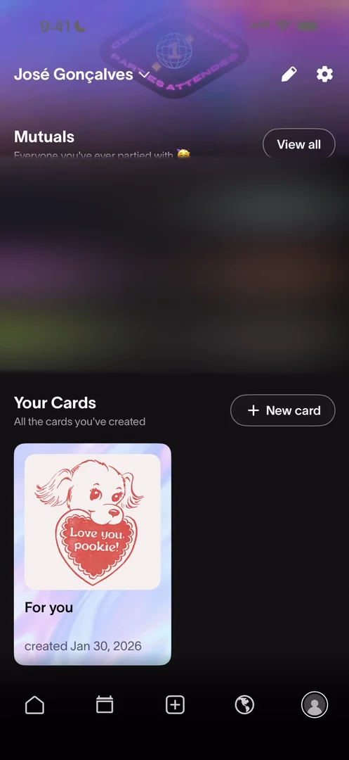
“the top of the profile is quite basic I like the badges section it could be a little bit further explored but these two bottom rows are actually very cool they add a lot of value” José
A message for people who aren’t on the app yet
You can’t message someone from your contacts, and he sees a chance for growth there 25:29, though maybe it’s not worth it, since he doesn’t know how much the chat is used. Imagine he has just created his dinner and invited ten people over iMessage or WhatsApp 25:35, and some of them have no account yet:
“It would be very cool if I can just type a new message and actually message people who are not already on the app.” José, 25:50
“So this would be a growth leverage to them because they could send links to them saying that they have a message to read and that pulls them to download the app” José, 25:56
And it would let him organize the whole event from the app.
The verdict
The event creation was very cool. He likes the cards for two reasons. First, it’s a wholesome interaction: you send someone something that reminds you of them. Second, from a business point of view:
“What cards do is they give you a reason to use Partiful even if you're not going anywhere” José
He guesses it’s Partiful branching out a bit from events: unless you’re extremely outgoing, you don’t go to that many ticketed events a month, so cards give people another reason to open the app. The third and last thing he calls out is the bottom section of the profile:
“I feel like this adds a lot of value and I also like how it's laid out here.” José
 1 of 5
Five design challenges from this episode
Learn design from the apps you love
Practice UI design every day with 300+ briefs from apps like Partiful. Finish one and its card is yours.


