
App Breakdown #66 · Perplexity
The UI design of Perplexity, the AI app built like a better Google
Perplexity is the AI giant whose branding every new startup seems to copy. José looks at its UIs and animations, and finds an app trying to replace Google.

José opens the episode on Perplexity, the AI giant whose branding apparently every new startup wants to copy 0:00. Perplexity clearly knows how to make something beautiful 0:10, so he’s mostly on the lookout for UIs and animations 0:14. He has used it before, but not in a long time, and never much, since he’s mostly a Claude user.
An empty first screen
The home is a logo and a text box. Compared with other AI apps, what’s missing are prompts telling you what to do. As a tech nerd, he knows how to use these things, but a new user who doesn’t really know AI might not, and Perplexity targets a lot of those people:
“Like tell me what to search because an empty screen like this, it’s very daunting.” José
People will probably just use it like Google. Maybe that’s the goal, he says, and that’s fine, but if not, they should show some prompts to first-time users.
A gestural app with its own art
The profile button doesn’t just push a new screen. There’s a whole view you can also reach by swiping:
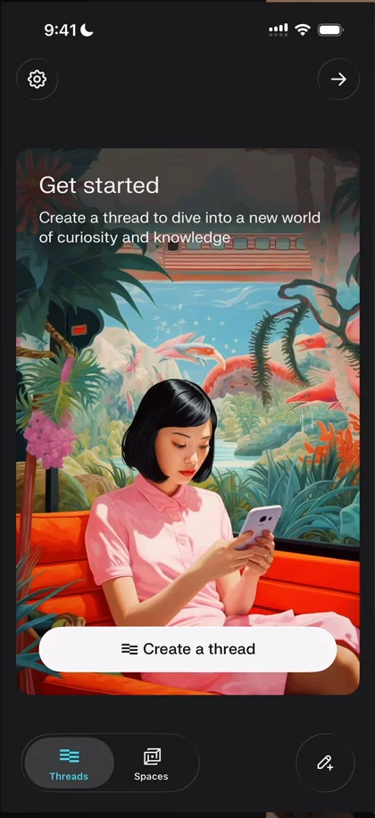
“So the app feels gestural. That’s very cool. It makes things feel light.” José
The Get started card has one of Perplexity’s signature illustrations. He’s not sure whether they use Midjourney or their own model, but the brand style is very consistent 2:17:
“And this is the part that most startups are trying to just straight up rip off nowadays” José, 2:22
“I love that I can just swipe between it and like it’s just a nice nice touch” José
A news feed written from sources
The stories at the top right turn out to be news. It’s one thing that sets Perplexity apart from Claude and ChatGPT 3:10:
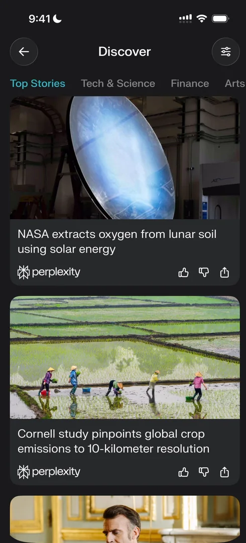
“Perplexity pushes very hard into this like news feed direction” José
Each story comes with its sources, 44 for one NASA story, and is written by Perplexity 3:25. That makes it your new place to get news: you no longer need to go to the Financial Times or the New York Times 3:35. As a way to make money, it makes a lot of sense, since people pay for news 3:51. To the average AI user, he says, Claude, ChatGPT and Perplexity all give AI answers 4:14, but the other two don’t have a news feed 4:27.
Story pages
The animation between pages is interesting but not the best 4:58:
“Like there’s no persistent element through it. So that’s a bit of a letdown I’m gonna be honest” José, 5:02
What he does like is the gradient at the top of a story, which matches its image 5:14:
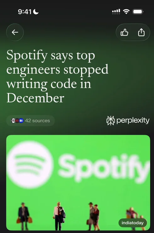
“That’s such a nice touch” José, 5:18
“Also I love the font that Perplexity uses” José, 5:20
The sources come up in a nice little half sheet 5:48.
Sources, given their own tab
Asking a follow-up on a story opens a thread. At the top, a tab holds the sources behind the answer:
“I really love this view. I wish other AIs had this view.” José
Don’t make the sources an obscure thing, he says, because that’s often what he wants to go to:
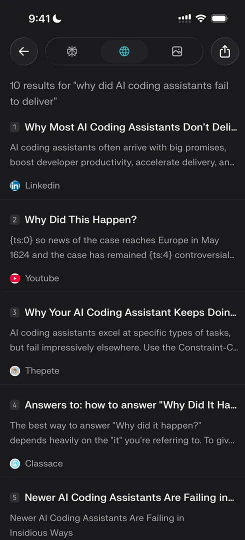
“So I love that they have an entire tab just for sources” José, 6:42
The images tab, in this case, is rubbish 6:50. But you can clearly see them trying to replace Google: news, links and images, applied to AI 6:52. A video tab later gives him YouTube links for his question:
“So this is just like Google, but better.” José
The input bar
“The star of the show, the input bar” José
Every AI app needs a rock-solid input bar nowadays, so the demand for designers and engineers who can make a very good one is sky high. Perplexity’s is made with Liquid Glass:
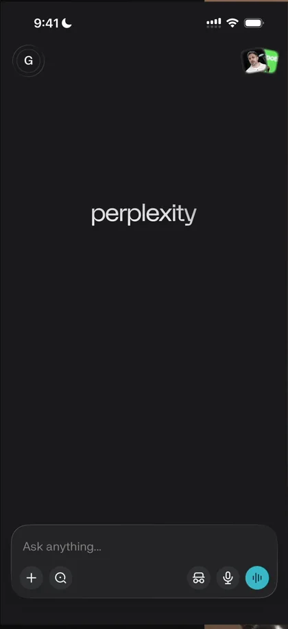
“So you can see the corners are shining through and you can see that when I type it becomes activated with light” José
A thread’s bottom bar
Inside a thread, the bottom bar changes completely, which he calls a very odd choice. It just says “Ask a follow-up”, and the keyboard isn’t up by default. You can’t switch to voice or incognito in the middle of a conversation, and the button to start a new one sits at the bottom right, which feels too accessible.
But maybe he’s misinterpreting it: if Perplexity is really going after Google, the point is to get an answer fast and then maybe another, and the button makes sense.
“So that’s a cool design decision from them.” José
A keyboard that’s hard to close
Something a lot less positive: on iOS you usually close the keyboard by swiping down or tapping away. But the thread is its own view, so swiping down closes the whole thread, not just the keyboard. The only option is to tap away, and tapping almost anywhere opens something, the video, the sources or the first prompt:
“So basically there’s very very little space to close the keyboard without typing something and that’s definitely a problem.” José
“So this is just a tiny UI detail that Perplexity should definitely consider.” José
Voice, with a glowing outline
The microphone lights up the text box as you speak, and the transcription seems to work very, very well:
“The outline around the text box is so, so, so cool.” José
Voice mode 20:38 has a lot to love:
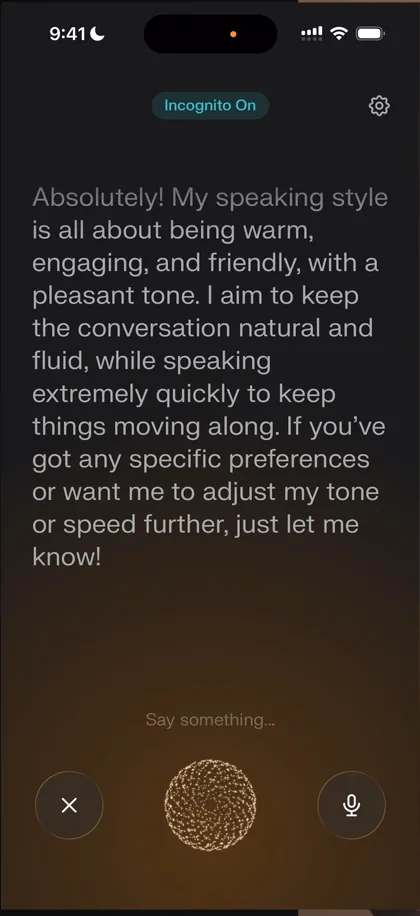
“There’s a lot to love in this UI. First, the pulse at the bottom, it feels extremely alive but also geeky” José, 20:44
Thin lines usually look very bad, he says, but Perplexity does them in such a nice way 20:57. Tapping the pulse moves it to the middle 21:15:
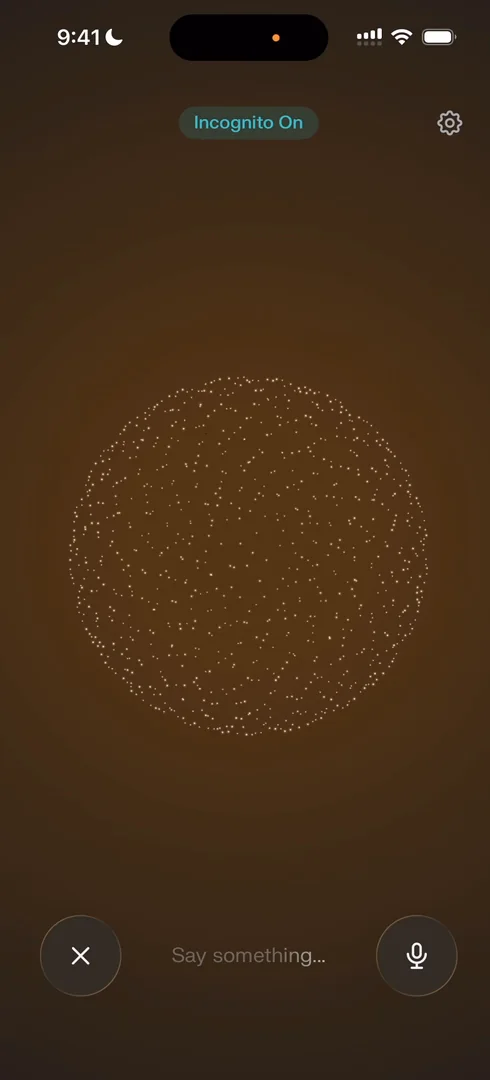
“It looks like a whole like cosmos thing going on” José, 21:18
Claude also has a very cool voice mode, but he thinks this one beats it in terms of UI 21:49. He would expect smaller text, since there’s a lot of it when you speak 21:56, but it’s extremely readable 22:13.
Voice is the next input
“I love this voice AI and this leads me into a bit of a rant about voice.” José, 22:34
Right now AI apps are all about perfecting the input box 22:40, but he predicts the demand for designers and engineers who can do good voice experiences is going to skyrocket 22:48. Heavy users of coding tools are probably already speaking to them, people already speak to ChatGPT, and they send voice notes to their bots 22:57. Over the long run, voice will replace more and more of text 23:10:
- It’s less friction: when you’re alone, speaking is easier and faster than typing 23:24.
- You almost for sure say more when you speak, so the AI gets more context and gives better answers 23:32, which makes you speak again 23:44: a very good flywheel 23:50.
- It allows new interfaces, like smart glasses, a watch or an AI pin 23:55.
“If you’re a designer right now or an engineer looking for things to focus on, I think voice will be exceptionally important and in a very, very high demand.” José, 24:13
The verdict
“There’s a lot to love from the animations, the look and feel, the UI, the illustrations” José
There are points to work on, he says, especially closing the keyboard, which is such a core flow that he really thinks they should fix it.
“But in general it is another exceptional app to take inspiration from and the work that they’re doing is just top notch” José
 1 of 5
Five design challenges from this episode
Learn design from the apps you love
Practice UI design every day with 300+ briefs from apps like Perplexity. Finish one and its card is yours.


