
App Breakdown #67 · Pika
The UI design of Pika, the app that promises to turn you into an AI agent
Pika promises to turn you into an AI agent that makes you more productive and even earns you money. José builds his AI self for the first time and finds beautiful screens around flows that often don’t work.

José opens the episode on Pika, the AI self-agent that promises to turn you into an AI agent, make you more productive and even somehow earn you money 0:00. It’s the first time he has opened it 0:15. He has used another product from the same company, so he guesses they pivoted 0:18.
A welcome that shows what’s coming
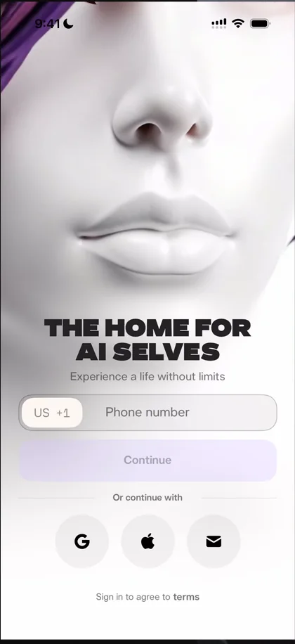
“The home for AI selves” José
He really loves the video playing behind the sign-up screen: it kind of teaches you what you’re about to see, and it’s engaging.
Notifications, asked straight away
Right after he signs in with Apple, the app asks for notifications. Asking that way, with no screen of its own and no animation, can work very well, he says: put the prompt at the right time, and people will mindlessly tap through it and say yes 1:13.
“So always remember that it’s worth testing putting your notification prompt either as the first thing in the app or the first thing on top of the home page” José, 1:18
Building your AI self
He takes a photo of himself for his AI self’s appearance. The camera’s UI is extremely basic 1:51, just circles with some icons and a header that doesn’t really make sense. Then the app asks his name:
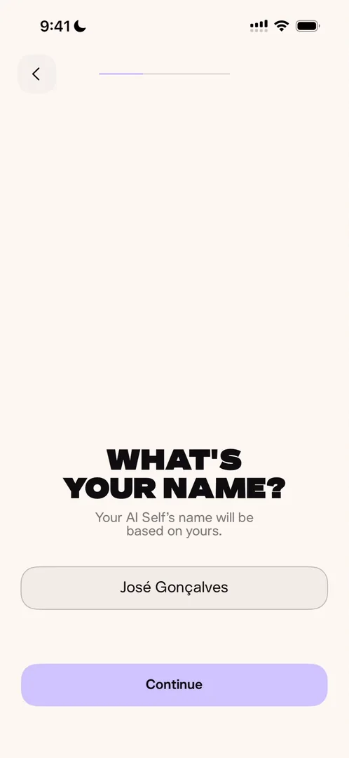
“Okay now I’m more impressed” José, 2:04
The question appears letter by letter, with custom haptics on each letter 2:10, and his name is already filled in from signing in with Apple 2:14. They’re doing a few things very right, he says, though the screen is very empty 2:18.
Then you read a few lines aloud so your AI self sounds like you 2:23:
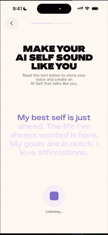
“This is so cheesy.” José, 2:39
It didn’t recognise him properly at first 2:44, and when it did, the transcription itself wasn’t the best. The step that follows has a description so long that he would never read it as a regular user.
Audio first, please
When the app asks if there’s anything more to add, he can only type, and says:
“I wish I also had audio.” José
“But if you’re building an AI app, please build audio first features.” José, 4:33
Not because it’s the cool thing 4:38, but because AIs need a lot of context to work well 4:41, and the best way for people to give context is to just speak 4:49:
“Because if I’m speaking to the app, I’m going to say a lot more things than if I’m writing.” José, 4:53
An ID card worth sharing
Then he meets AI José:
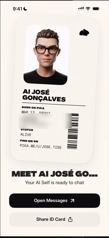
“I really like the the ID like this is very very shareable and it’s beautiful with minimal details on it” José
But sharing it just saves it to his photos:
“Why doesn’t it pop up the share sheet just like every other good sharing flow?” José
A home, and a chat that isn’t yours
The home shows his AI self’s name, credits, skills and a menu 6:50, though the header isn’t the most readable. Below sit the AI face made from his photo and counts of his earnings, visitors and messages 6:58:
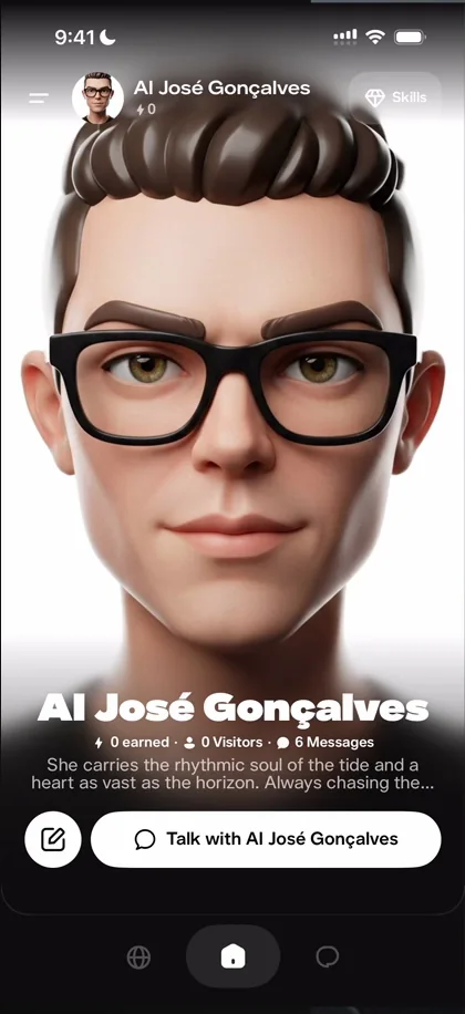
“I’m gonna say the readability of the header is not the best.” José, 6:55
The chat already has messages in it, his own photos sent back and forth as part of the onboarding 7:14. He understands why they’re there 7:18, but he didn’t send them:
“So straight away Pika basically broke the trust and taught me that this chat is not really mine.” José, 7:27
Don’t build a chat if you can avoid it
“Building a chat is extremely hard” José, 7:53
It’s hard to design, hard to make fast, and hard to handle its edge cases: if you can avoid building a chat, avoid it 8:02. He has built two. An AI app that talks has to have one 8:10, and the big ones do a good job, but smaller apps usually aren’t as good. He likes apps like Poke that put their chatbot inside iMessage, Telegram or Slack instead 8:26:
“If you can use the UIs of other people because then you don’t have to maintain them” José, 8:39
Here, the input bar doesn’t come up, and the chat jumps up and down as he taps 8:56. It looks like it’s made in React or Flutter, he guesses, and keyboard handling in cross-platform apps is never great 9:09.
A voice button he likes
Holding to talk is a different story 9:35:
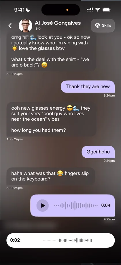
“Oh, I really like this interaction of the pill expanding” José
You tap the microphone, it opens an audio-only bar, and as you hold to talk the pill expands.
“We have already seen a UI detail that I really like” José
Skills that lead elsewhere
The skills screen is the next thing he opens. Real-time video chat sends him outside the app, to pika.me, which he finds very weird: if you have a video chat skill, he says, why not put it in the app?
“I actually really like this screen. It’s very clean, it has the information you need.” José
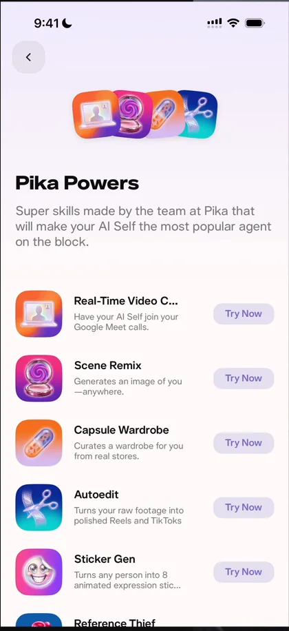
“I’m digging the way they organize content. They really know how to do that.” José, 12:13
But Try Now does nothing on two of them 12:21, and every AI he tries in Explore fails with “channel not found” 13:19. Something is clearly wrong, he says, though he doesn’t know what 13:36.
Text isn’t the last interface
The profile is another page they do a fantastic job on 13:41:
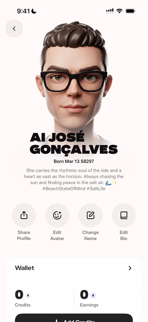
“They’re like very clean, very bold. I like them.” José
But editing his avatar happens in the chat, and that reminds him of the argument that text is the ultimate interface:
“That’s bullshit because I would much rather be editing my avatar with some sliders and some buttons and some presets than doing it through a chat.” José, 14:25
If text were the last UI, all these AI apps wouldn’t be building UIs 14:34:
“Everyone that started in the CLI is now building their own apps because UIs matter, experience matters” José, 14:43
It’s very in vogue to say text is the ultimate UI, he says, but he thinks that will be defunct in very little time 14:59.
The verdict
“To be honest I’m very disappointed. We didn’t really get to try much, the flows are kind of broken” José, 15:30
“So yeah, I wish it was a bit better.” José, 15:41
 1 of 2
Two design challenges from this episode
Learn design from the apps you love
Practice UI design every day with 300+ briefs from apps like Pika. Finish one and its card is yours.


