
App Breakdown #76 · Riot Mobile
The UI design of Riot Mobile, the companion app from Riot Games
José has spent years playing League of Legends, but didn’t know Riot had a mobile app until just before recording. He opens it for the first time to see whether it gets the care Riot puts into its games.

José opens the episode on Riot Mobile, the standalone social media app by Riot Games 0:00. He has spent many years playing League of Legends, and loves Teamfight Tactics too 0:08. He’s a huge fan of Riot’s work, and thinks they have some insanely talented people working there 0:12. So the question is whether they put the same effort into a mobile app he honestly didn’t know existed until ten minutes before 0:18.
Notifications, asked first
The app asks for notifications on its very first screen 0:33:
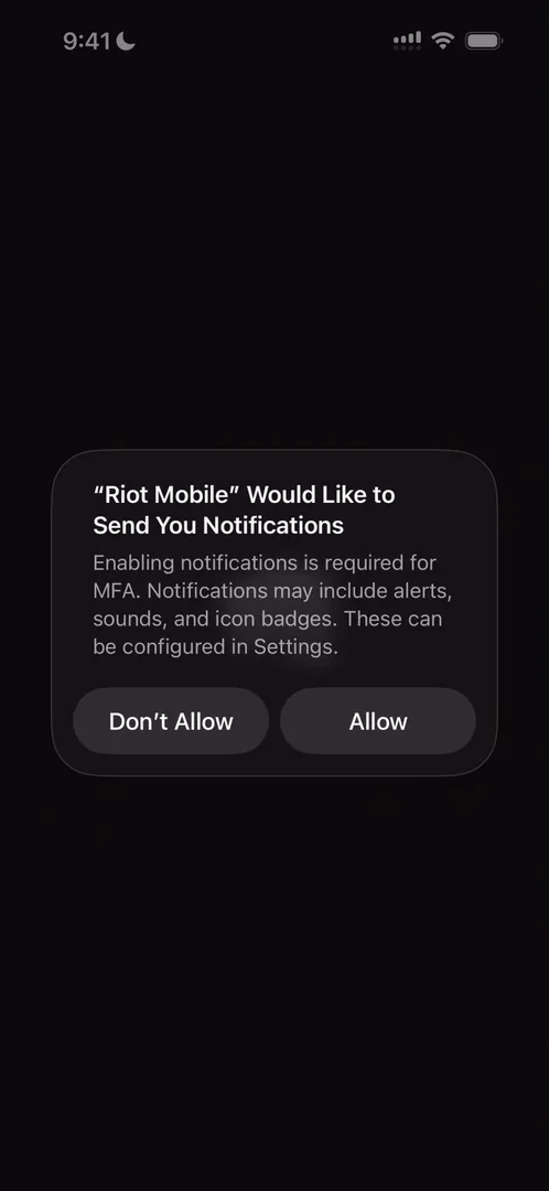
“Prompting for notifications right when the app opens with no introduction, no nothing, is actually a very good way to get good conversion on the prompt without any extra work.” José, 0:39
If you’re making a new app and wondering where to ask for notifications, he says, this might be the right place 0:50.
A welcome made of what Riot does best
The welcome screen plays a very nice video in the background 1:02:
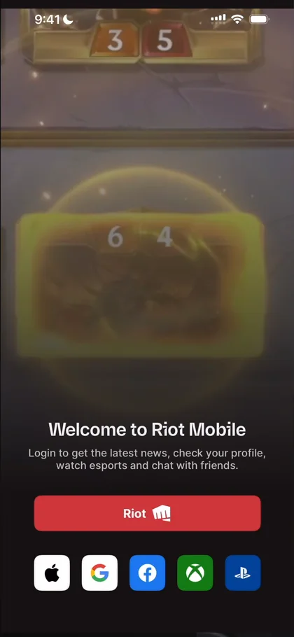
“This is what they’re exceptional at doing” José, 1:04
He signs in with Apple:
“Apple sign in is just so good, I love it every time.” José
A home built from content made elsewhere
Once his account is set up, he reaches the home:
“The homepage looks very cool.” José
Moving between its feeds, the performance isn’t great 4:00. What he likes is the content:
“I like how diverse the content feels just because the images within it are so good.” José, 4:30
“It’s not even about the UI itself, it’s more about the content within it.” José, 4:34
The loading isn’t amazing, though, and that breaks the experience a bit 4:38. Patch notes are there too, which are very important if you play seriously 4:56, but they open in a web browser that slides in from the right and doesn’t look amazing 5:14.
Under the latest streams, View All just switches the feed over to Streams 5:26:
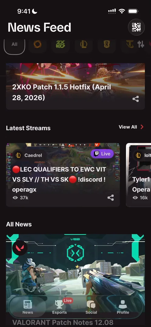
“This is obviously a lazy approach to showing content” José, 5:30
At the same time, if it works, it works. You’re probably overthinking the design of your app, he says: Riot can get away with stuff like this, so you probably can too.
Past the streams, a YouTube video gets a page of its own, with the description below it 6:25. Most of the rest, he thinks, just opens in the web browser 6:36:
“The entirety of the home is nothing but like displays of content from different sources” José, 6:46
It’s content Riot makes for other things, gathered on the home page of this app.
Social, with no public side
The Social tab is empty, because he has no friends on the app yet:
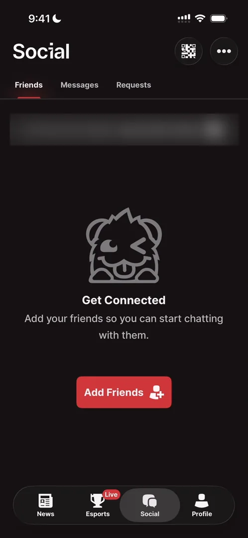
“I was expecting here to see like the best player or the most active player or players that are streaming now.” José
“Give me content outside of my network.” José
There’s no way to bring in your contacts or your Discord. If you can link a Discord account to your Riot account, he doesn’t see why importing Discord wouldn’t be a huge unlock for them, to add more people to play with 11:56.
“It is one of the areas where gaming companies still need to get up to spec with social companies” José, 12:05
The area he means is the social graph: growing it, maintaining it, and seeing what makes sense to show 12:11.
“There are things at which gaming companies are much much better than mobile app companies and then there are things in which they’re still behind.” José, 12:18
A profile that sells the games
The profile opens with a tip:
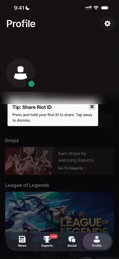
“Oh, we have some tooltips that look very bad, to be honest.” José, 12:39
It reminds him a bit of Discord’s profile 12:47. You can set a status, nothing too special 12:56. A banner that seems empty does nothing when he taps it, so he doesn’t know how to edit his profile 13:05. Below are Riot’s games, League of Legends, Valorant, Teamfight Tactics and Legends of Runeterra:
“So basically you’re just upselling me the games on my profile.” José, 13:19
Maybe, if he had played the games on this account, his scores would show up there 13:28. He feels he’s missing out on features, with no friends and no games played, but he wanted the first-time experience.
The verdict
There’s one part of the app he takes away for his own work. Other than that:
“The app is subpar and it is very, very subpar compared to the kind of quality that Riot knows how to do.” José
He’s a bit disappointed, though the app isn’t Riot’s main thing. If Riot wants to make it better, he says, they should implement a few things from this video 14:22, and if anyone there wants to up their social game, he’s happy to give some tips for free 14:26.
 1 of 6
Six design challenges from this episode
Learn design from the apps you love
Practice UI design every day with 300+ briefs from apps like Riot Mobile. Finish one and its card is yours.


