
App Breakdown #77 · Shazam
The UI design of Shazam, an app built around one big button
José has used Shazam through iOS but doesn’t think he had ever opened the app. He opens it for the first time and finds a home screen tailored to its one job, a song page richer than he expected, and a lesson that reaches past the app itself.

José opens the episode on Shazam, a product so good that Apple acquired it in 2018 0:00. He has used Shazam before, since it comes built into iOS 0:08, but he doesn’t think he has ever actually opened the app 0:15.
A playful wordmark
It starts with a nice little intro animation 0:26, the logo making a swirl 0:32. Then:
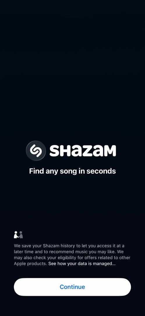
“I didn’t realize that their wordmark is so like squishy and playful.” José, 0:38
Continue is very Apple style 0:45, with a nice shared element transition: the icon from the splash screen is the one that carries over to the home page 0:47.
A home built around one button
If you don’t know Shazam: when you hear a song and want to know what it is, you tap a button, and it listens and recognises the song for you. The main feature is very obvious, and the rest is pretty much accessories: settings at the top right, what you recently found, and the navigation and search at the bottom 1:12.
“I love that it is painfully simple and I love that it is straight to the point and it’s not trying to upsell me into anything.” José, 1:30
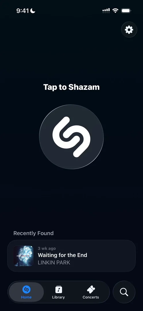
“And actually the main screen is very well thought out for the type of thing that you use the app for.” José, 1:38
You come to the app because you hear a song around you, so the button to recognise it needs to be very big and easy to reach, with nothing around it 1:48. Or you come because you Shazamed a song in the past and want to remember it, and it’s right there on the home screen, without tapping anything 1:56.
“They really tailor the app for the use case” José, 2:07
Shazam as a verb
Notice how the button says “Tap to Shazam”: they use Shazam as a verb 2:14.
“It’s very cool when apps turn into words” José, 2:18
While it listens, he wishes there were haptics to go with the moving circle, but there are none at all. He says it again later:
“Once again, I really miss the haptics of just the movement of the circle.” José
He was expecting it to be faster, too.
A song page richer than expected
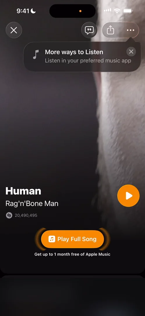
“So we have a full screen page. We have UI tailored for the song.” José
It’s probably taking the colour from the album, and there’s a video in the background.
“It’s like really really rich” José
A pop-up offers more ways to listen, in Apple Music, Spotify, YouTube and others. He wasn’t expecting the page to be this complete, and calls it an amazing surprise. Play Full Song, he notes, is Shazam’s entry point for upselling you on Apple Music.
Further down, Top Songs scrolls sideways, and the module doesn’t feel great to him: he wishes it were paginated, to feel more cohesive with the modules Apple usually makes. Highlights turn out to be Instagram-story-style videos from concerts on Apple Music. The lyrics open full screen, playing very much like Apple Music:
“This is amazing, I love it” José
Sharing has no custom experience, just the iOS share sheet. And tapping the video opens a full screen he wouldn’t expect, which looks cool, “but so what?”
Recent finds, one swipe away
Back on the home screen, what he recently found has turned into a carousel. You can reach every song you found recently in one swipe:
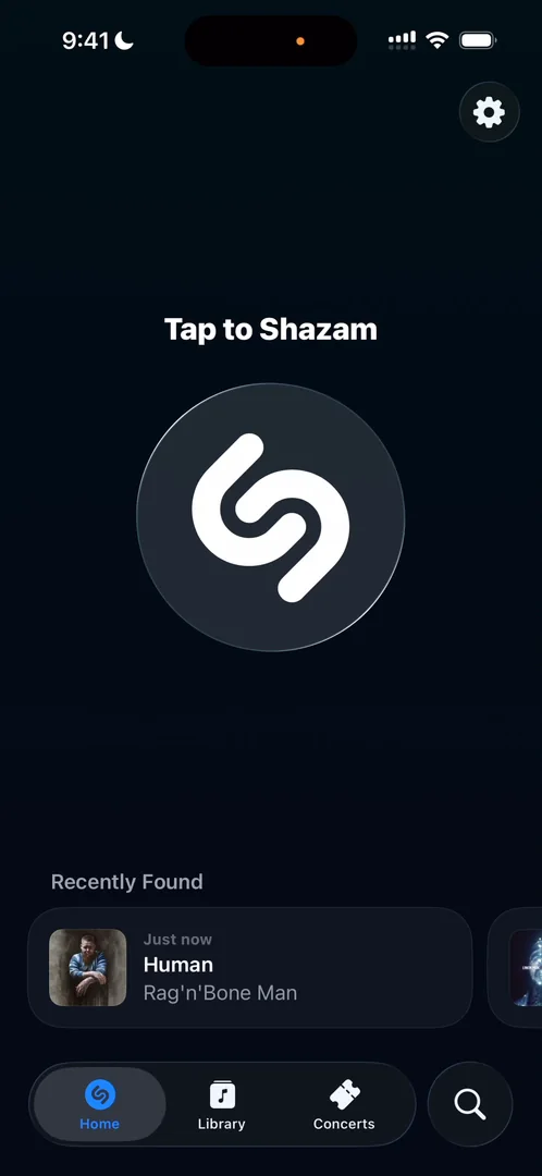
“One of the most important things of an app is how fast you give users value” José, 6:32
If you know a user is looking for something, give it to them on the first screen, without them having to do anything 6:38. They probably did their research, he says, saw in the metrics that a lot of people came into the app to find songs they had Shazamed before, and put them on the home screen as a carousel 6:44.
“It works beautifully” José, 6:55
A fancy list
The second tab, Library, holds the songs you’ve Shazamed 6:56. It doesn’t seem to connect with his Spotify or Apple Music at all 7:02. A pop-up offers to unlock songs on Shazam with Apple Music, and Try Now just takes him to Apple Music 7:13: he was looking forward to some kind of paywall inside Shazam 7:23. A song’s page adapts its look to the song 7:29, and otherwise keeps the same format as the page he saw earlier, “which is not a bad thing by the way, it just looks very good”.
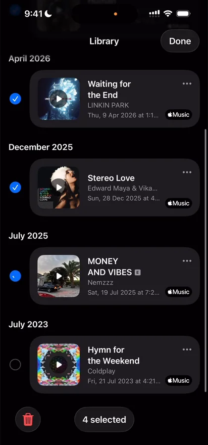
“Very cool with the check marks coming in with the tiny animations” José, 7:50
When he deletes one:
“Beautifully, like it just morphs into what it was before” José, 7:59
Swiping left is standard iOS, and swiping right does nothing 8:06.
“I feel like it’s a very good example of how to make a list functional and feel premium.” José
Concerts, notifications and web views
The third tab is for concerts, which surprised him. A few of his notes from that part of the app: the gradient and emoji at its top don’t look like the rest of the app, and a banner there doesn’t really look tappable. Tickets lead out to Ticketmaster on the web. And when he saves a concert, Shazam asks whether he wants to be notified about it:
“This is an exceptional way to prompt for notifications.” José
“10 out of 10 for this notification prompt. I love it.” José
On a concert’s page, the artist’s “Listen to” module is paginated where the song page’s Top Songs wasn’t, an inconsistency within Apple’s own products:
“They should always do the pagination on horizontal scrolls” José
And Shazam Charts, one of the app’s sections, opens as a web view:
“I hate web views inside of apps, please don’t do it” José
The verdict: think outside the app
Before closing, he points to what he calls a very important thing, which isn’t inside the app at all: the Shazam button in Control Center.
“This is what great integration with the OS looks like” José
“So whenever you’re doing an app try to think outside the app as well” José
It’s very easy to get sucked into working on screens, menus and nested menus. For Shazam, the value is a tap away in Control Center. For your app, it might be a widget, a Lock Screen widget, the Action button, Siri, Spotlight, the Watch or the Mac.
“It’s just very, very worth it to explore those options if your app can benefit from them.” José
 1 of 4
Four design challenges from this episode
Learn design from the apps you love
Practice UI design every day with 300+ briefs from apps like Shazam. Finish one and its card is yours.


