
App Breakdown #74 · Sketchar
The UI design of Sketchar, a drawing app that claims 12 million downloads
Sketchar promises to teach you to draw through daily activities, and says it has more than 12 million downloads. José finds an app full of cool features and joyful details that don’t add up to one design.
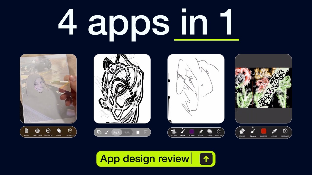
If you want to build an app that actually teaches people, has advanced features and optimises for monetisation, José says, Sketchar is the one to look at 0:00. It promises to teach its users to draw with daily activities 0:12. It has a ton of users 0:17, more than 12 million downloads according to them, and advanced features like AR 0:21.
Twelve million, or eleven
The landing screen has drawings passing by, and a number:
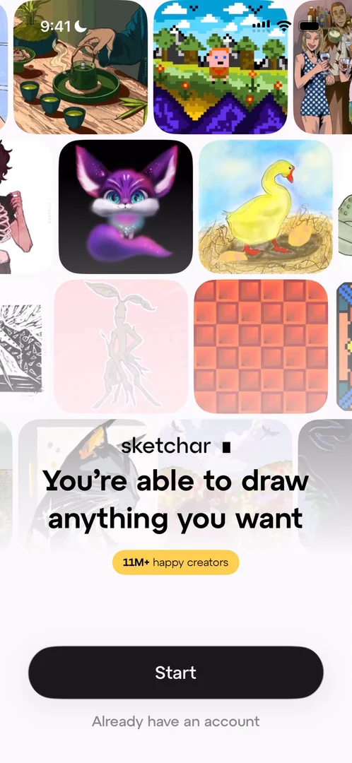
“So before they said 12 million one of the two is a lie.” José, 0:46
Problem, solution, problem, solution
The move to the next screen is very smooth 0:52, and the loading bar at the top suggests a long onboarding 1:01. There are cool illustrations and animations:
“I mean it’s a drawing app if you didn’t have that there wouldn’t be much credibility.” José, 1:08
It’s the standard kind of onboarding, he says, that gets you to invest in the app before it tries to upsell you 1:14. But he likes how it goes about it, with nice transitions between questions 1:50:
“I’m really liking the kind of onboarding that they’re doing here because it’s not just the standard boring questionnaire.” José, 1:57
“It’s more like problem solution, problem solution, problem solution. So it adds a little bit of flair to it.” José
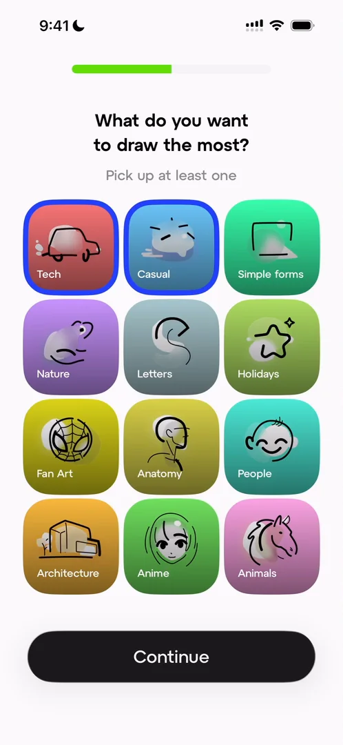
“Nice little selectors here. I like them.” José, 2:14
A video introduces the AR feature 2:20, under a “Patented technology” label. He doubts the patent is worth much:
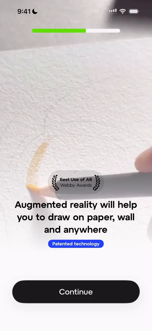
“For some reason like it’s AR guys let’s get real” José, 2:27
A fake prompt that defeats itself
Then it asks for notifications, with a screen that first explains why they’re worth it, and a mock of the iOS prompt:
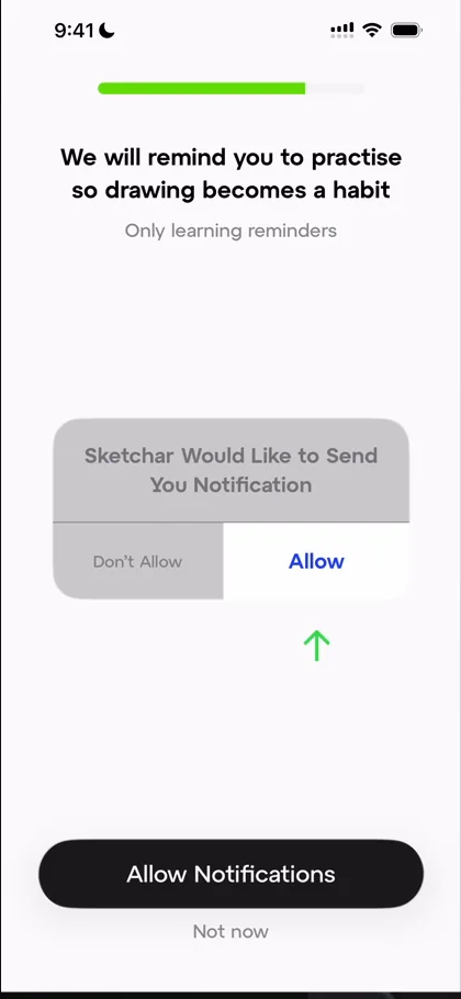
“And we have what is a quite terrible notification prompt” José, 2:46
The introduction to why notifications are valuable is amazing 2:54. But the fake prompt doesn’t work the way it should: you can’t tap Allow on it, and they want you to tap the other button instead, which defeats the purpose of a fake prompt.
A plan, then paywalls
Once the questions are done, the app builds a learning plan from what he said during the onboarding 3:37:
“Actually I’ve come to like more this type of onboarding experience than I did previously” José, 3:41
Then comes the paywall, with annual and weekly plans, now the standard for subscription apps. He’s not mad about it 4:12:
“Apps exist to make money, most of them.” José
If they can make more money and still give value to users, that’s fair game 4:15. Skipping it brings a first promotion, which only lasts two minutes 4:25, so the urgency is great 4:30. And it looks completely different from anything before it 4:32.
Two ways to upgrade, and stories
On the home screen, the first thing he notices is that there are two separate buttons to upgrade, one up top and a banner with a countdown at the bottom 4:41:
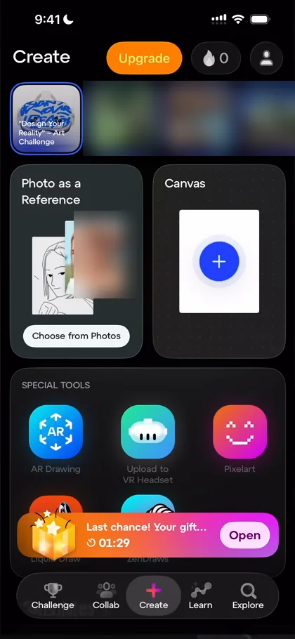
“That almost reminds me of AliExpress” José, 4:51
At the top is a carousel of Instagram-style stories about the app’s features 5:09, and that format doesn’t win him over:
“I don’t love when apps do this style of like instastory thing” José, 5:26
Realistically, he says, as a user he is never going to click through them and actually enjoy them 5:30, so he doesn’t like when apps add the format mindlessly 5:36. Below, the cards stack on top of each other as he scrolls, instead of the screen scrolling 5:53:
“I’m not a fan of this type of scrolling.” José, 6:03
“It is new, it is innovative, but I will say it’s not great.” José, 6:05
Making a drawing
He creates a new canvas and draws. He isn’t incredibly impressed by its UI at first glance: he thought it would be a bit more like Procreate, a bit more fancy. The drawing itself feels nice, with a nice easing to the curve, and its half sheets are cool. Adding an image is a pro feature, behind another paywall:
“So far we’ve seen like three different styles of paywall in the same app.” José
It looks like the same paywall as before in a different design, and he wonders if they forgot to update it. They probably know better than him, he says, but it looks kind of inconsistent.
When he finishes, the app makes a time lapse of the drawing. A lot of artists like progress videos of themselves drawing 9:02:
“So this is super cool.” José, 9:05
One app, four styles
Publishing asks him to create an account:
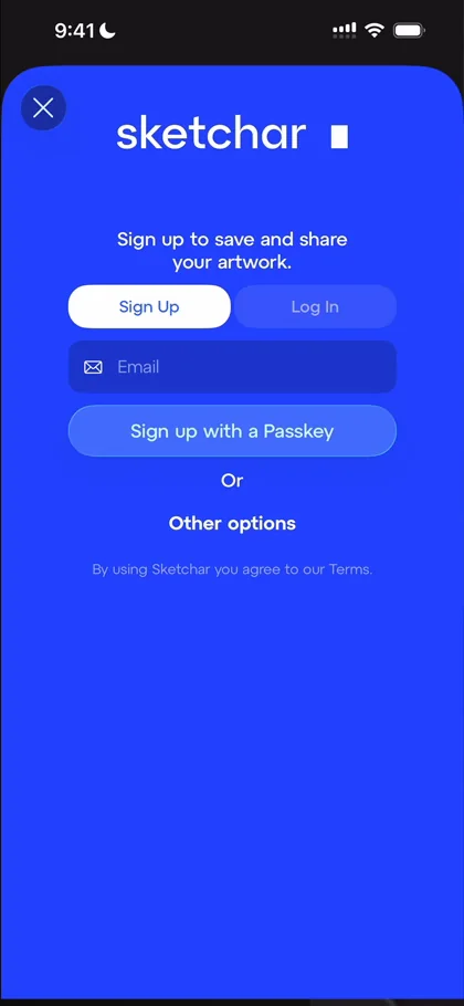
“I am a big fan of this like full blue screen just pushing you to do something.” José, 9:15
“Again it looks nothing like the rest of the app.” José, 9:23
He feels he has seen about four completely different design styles in the app so far 9:25. Then streaks:
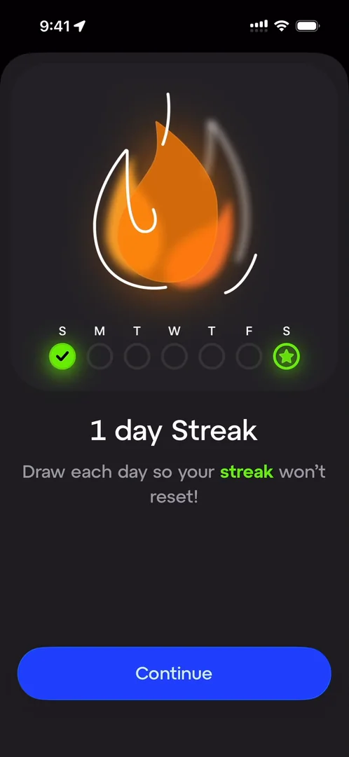
“Now that I have seen streaks I think that this app is going to fall into that category of doing a lot of things well but also doing far too much” José, 9:39
They have AR, drawing, the stories, streaks, publishing and time lapses, and he hasn’t even seen four of the tabs 9:49. Which probably means, he says, that there are four different successful products you could build out of this 10:02.
AR, and drawing split in two
He tries the AR drawing 10:10, which places a picture on the paper in front of the camera:
“I’m actually very impressed by this.” José
But the flow loses him: he thought he was only placing the picture, when he was finishing the drawing.
“So that flow is like clearly broken there.” José
There’s also a liquid drawing mode, a funky version of drawing with some better lines. To him, this kind of feature could just be a toggle, a brush or an option in the regular drawing, like Procreate and other apps do, instead of a separate way to draw:
“So simplification matters a lot.” José
Challenges, rooms and collabs
The first tab is Challenge 13:42. He was expecting some kind of leaderboard 13:45. Tapping a card opens it:
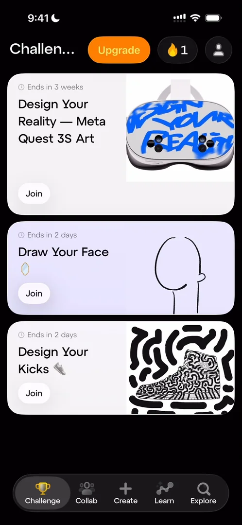
“Oh nice little card transition with a card expanding” José, 13:56
It’s not the smoothest, not the best animation, but still a very nice touch 14:00. Inside a challenge are the leaderboards he expected, with the top three and their drawings 14:05, and everyone’s drawings for it:
“It is pretty wholesome” José
But there are so many design details going on that it all feels disjointed:
“Like this app does not have a very coherent design style.” José
The second tab, Collab 14:59, turns out to have rooms where you draw live, on the same board as someone else:
“Once again, like live drawing with other people is an exceptional feature but one that I did not expect to see here, especially as buried as this is.” José
There are only a few rooms, and most of them have zero or at most one person in them:
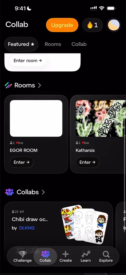
“So this feature is clearly not used.” José
Joining a collab leaves him confused:
“Some of the flows on this app honestly are not amazing because I’m just lost” José
Learn, Explore and a profile
The Learn tab has a drawing of the day, like a daily challenge 17:11, and courses 17:15. The Explore tab has the week’s leaders, categories and an art challenge archive 17:30:
“It seems more like an archive than a explore type of thing.” José, 17:53
Then the profile, at the top right:
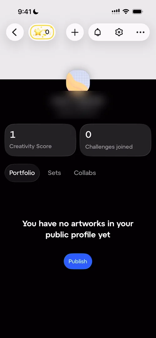
“Oh, the profile looks once again, very good, very cool, but very disjointed from the rest of the app” José, 18:02
It has stars you can buy with micro purchases on top of the subscription, and give to other people.
The verdict
His lesson from the app: if you have an app that does a hundred different very cool things, you have basically two options 19:39. Either you choose which of the hundred are worth keeping and keep only those, because the rest is just noise, and the metrics will tell 19:53:
“Or you keep all of them but you make them very coherent in the design language which this app does not do a good job at.” José, 19:56
What he thinks they do extremely well is come up with cool features and integrate joy into little details, like the stars, the different paywalls and the banners 20:03.
“Those are very cool, I just wish they were joined in a better way.” José, 20:15
If you want to explore lots of cool features, how to push people towards monetisation, or just a breadth of fresh ideas, he says, check out this app 20:19.
 1 of 2
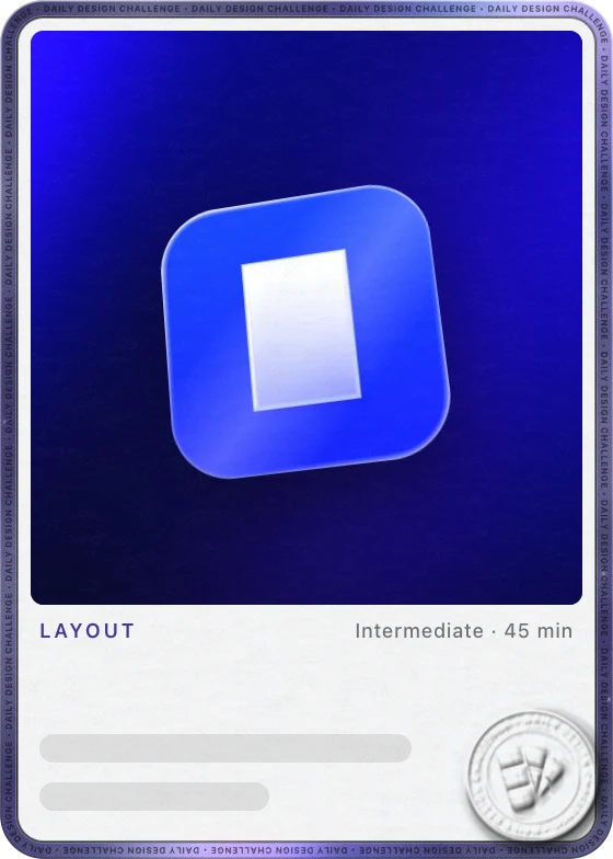
Two design challenges from this episode
Learn design from the apps you love
Practice UI design every day with 300+ briefs from apps like Sketchar. Finish one and its card is yours.


