
App Breakdown #49 · Sleepiest
The UI design of Sleepiest, the sleep stories app
Sleepiest calls itself the number one sleep app. José, who barely slept the night before, finds an app that is very good at animation and very bad at picking images.

Sleepiest calls itself the number one sleep app on the App Store 0:00. What is a sleep app? José has no idea; he’s going to find out with you. He barely slept because of a windstorm, so a sleep app felt fitting.
A familiar onboarding
It’s the style of onboarding that frames a problem, then gives you the solution, which is the app 2:01. There are some glows on the background 2:12:
“nothing too fancy honestly, i'm not a i'm not a big fan of this aesthetic” José, 2:12
“Okay, yeah, this is exactly the same onboarding pattern as Opal and other apps.” José, 2:51
He doesn’t know where they’re all taking it from, probably the same product or Twitter thread 2:56. Then you pick a voice for your bedtime stories 3:21:
“They're using some pretty like stock images. I would expect a bit better with AI.” José, 3:29
The model is freemium by default 4:16: you get Pro for free for seven days and then it’s taken away. The notification ask comes with the classic fake Apple popover pointing at where to tap, before the real one. And at the end, you can create an account, or choose not to, which he finds interesting.
A chatbot in a sleep app
Then a sleep coach appears, something nothing in the onboarding prepared him for:
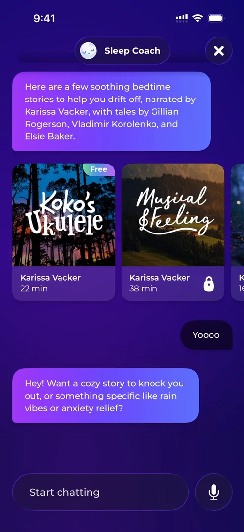
“if you give users an open field chatbot you cannot prevent them from asking pretty much anything out of them” José, 6:24
Without very specific guardrails, people will ask it everything. It won’t be good at everything, because you’re not OpenAI, and then people see your app as lower quality, because it’s wrong about things that aren’t your specialty 6:36.
“Whenever I can I always advocate for defining very well the use cases that you want people to use your chatbot for and usually what happens is you realize that you don't need a chat bot” José, 6:53
If you do want one, give suggestions for what people might ask, and explain what it’s good and not good at 7:06. Otherwise, people will open a sleep app and ask for a meat recipe 7:14. It’s a general thought, now that every app adds an open-field chatbot.
A home that keeps moving
The home starts with tooltips 7:44. Up top there’s the streak, gems, and an Unlock button for the paid plan:
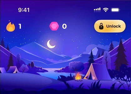
“I really like the style of that button and the shine” José, 7:59
Then a carousel that doesn’t stop moving 8:02, and an illustration at the top that does nothing when you tap it, but is quite cool 8:13.
The streak panel is very complete 8:19:
“I love the little koala playing with the streak. Like these guys are good at animation.” José, 8:21
The loot box shining reminds him a lot of Clash Royale 8:29. There’s a calendar of your streaks, a streak freeze 8:32, a custom card for sharing it, and perks that look like badges. It all seems taken out of Duolingo:
“streaks are good are cool. Everyone has seen them. Everyone knows what they are, which is both a good thing and a commoditizing aspect” José
Touch down or tap up
In the gem shop he keeps opening things by mistake, and it’s a good cautionary tale. When you build an app, you can trigger a button on tap, when your finger goes down and lifts, or on touchdown, as soon as it lands. Here, the Streak Freeze card only reacts on tap, so you can scroll over it, but its “Requires Login” button fires on touchdown.
“there's very specific use cases for triggering things on touchdown instead of on tap and these are mostly for stationary buttons” José
People rely on the tap without knowing it: you hold Send, change your mind, and slide your finger away before lifting it.
“With this implementation of basically triggering things on touchdown, you would prevent that from happening, which in the case of sending a message is catastrophic” José
In other cases, it makes an app feel a lot snappier, because you save a few hundred milliseconds. As for the panels themselves, he really likes their layout, the most balanced thing in the app so far. And of the app as a whole:
“They're very good at animation, but they're very bad at picking images. So that's an interesting mix.” José
A home you can rebuild
The home goes on and on: starting guides 12:13, a top 10 with a different style of carousel, a promotional banner, and creator updates:
“They basically just take their TikToks and put them inside of the app” José
That can be very powerful, if there’s a real connection between the audience and the creators. There’s also a map of people going to bed and waking up, though it doesn’t show anyone on it 13:11. And at the bottom, you can edit the whole home 13:22:
“This is so cool because this kind of feature of editing the home tab is exactly the kind of thing that most apps probably shouldn't do” José, 13:25
Only power users will edit it, the ones who do may not be happy with their own order, it’s more work for the user, and the team can no longer rework the home in later updates 13:35. But as a user, it’s cool to know you can 13:50:
“I'll probably never use it, but you know that it's there. So it's a bit of a double-edged sword.” José, 13:56
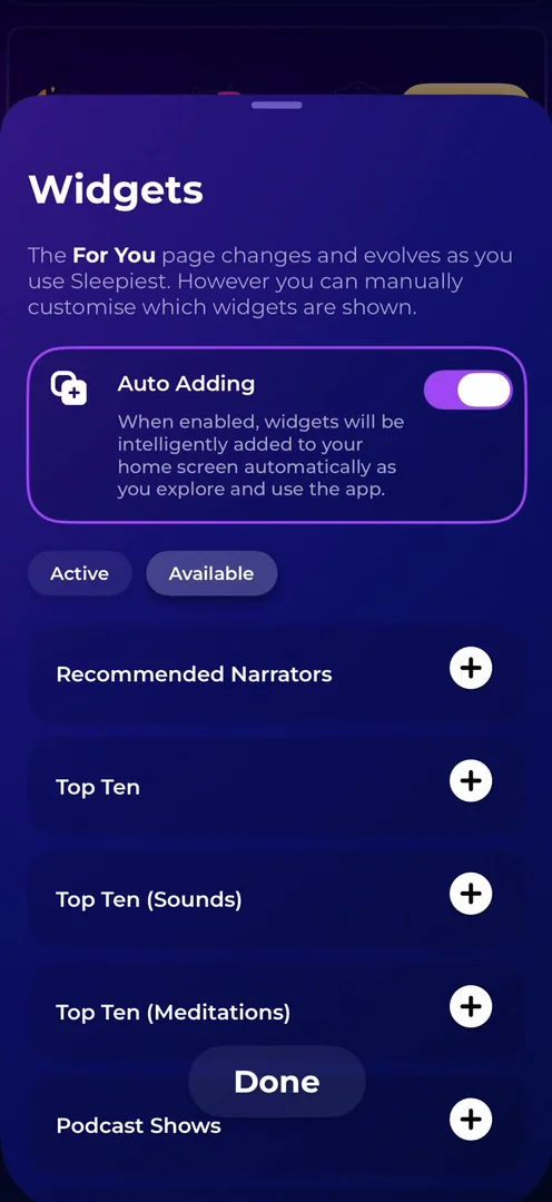
“Oh, we have so many sections that we can add.” José, 14:08
He understands why they did it now.
Sleep rankings by country
Further down there’s an invite-friends widget 14:31, an animation that moves as you scroll 14:37, and carousels with a little parallax on their images 14:50. Then rankings by country:
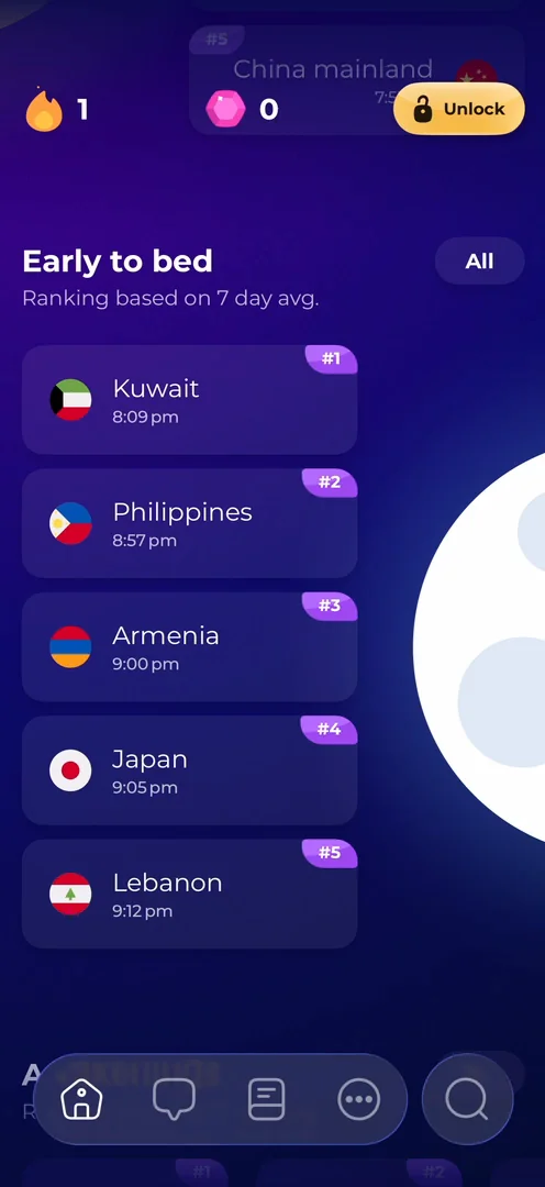
“so they do a lot of competition around countries which is not something i would expect from a sleep app” José, 15:09
“it just proves that basically creativity is your limit” José, 15:15
There are so many different ways to organize information here:
“it's really goldmine” José, 15:36
A guide that feels bolted on
The second tab is the sleep guide. It didn’t save the conversation from before, and it doesn’t keep the app’s navigation model: it fades in as a completely different view 15:46.
“breaks the spatial model of the app so yeah this i think this entire sleep guide thing feels a bit bolted on” José, 15:55
On the third tab, at least the bottom nav stays, so you have a reference point 16:10.
A TikTok-style player for meditations
Inside a meditation, a new bottom nav takes over, so you know you’re in a different space of the app:
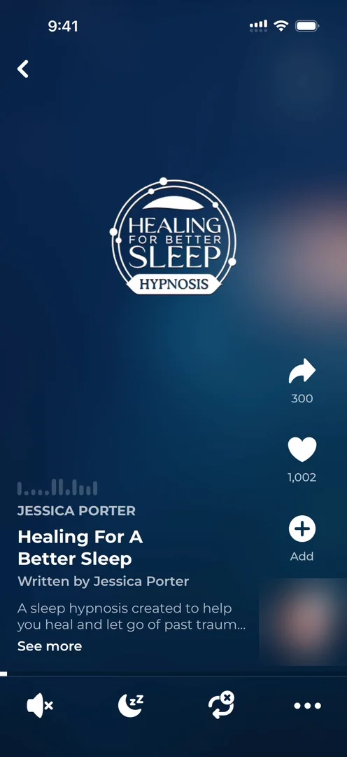
“I like how textured it feels at the bottom. It feels very solid, very real.” José, 17:21
There’s a TikTok-style column for liking and sharing 17:26, and he likes how they use the typefaces for the title, subtitle and short description 17:37. You can even swipe between meditations 17:45:
“So if you're meditating and your attention spam is two seconds, you can do two-second meditation.” José, 17:49
He’s kidding, but meditating in a TikTok-style feed does seem a bit weird. It makes sense for discovery 18:02:
“I see the pros. It's still very ironic.” José, 18:03
At the bottom there’s a sleep timer and a loop button 18:04, and once you leave, a mini player sits above the nav bar.
Sleep tracking, barely
He expected a sleep app to rely a lot more on sleep tracking, but it lives on the More tab, one of its smaller sections 19:00. He doesn’t log in, because the app already gives him a lot without it 19:15. Search is their own take on the new iOS 26 pattern 19:36:
“I'm not the biggest fan, to be honest, but I'm not the biggest fan of Apple's implementation either.” José
The verdict
Among the things that stood out: the player for a meditation, with its UI treatment; a complete streaks feature, which reinvents nothing but just works, because people recognize it 20:23; and an app that gives him a lot of value without logging in 20:24.
“as a user, just trying to test things, it feels really refreshing to not have to give so much personal information just to try things out.” José
 1 of 3
Three design challenges from this episode
Learn design from the apps you love
Practice UI design every day with 300+ briefs from apps like Sleepiest. Finish one and its card is yours.


