
App Breakdown #52 · Structured
The UI design of Structured, the day planner
José had never used Structured; he found it five minutes before recording. What looks like a basic to-do app turns out to be simple, but very well thought out.
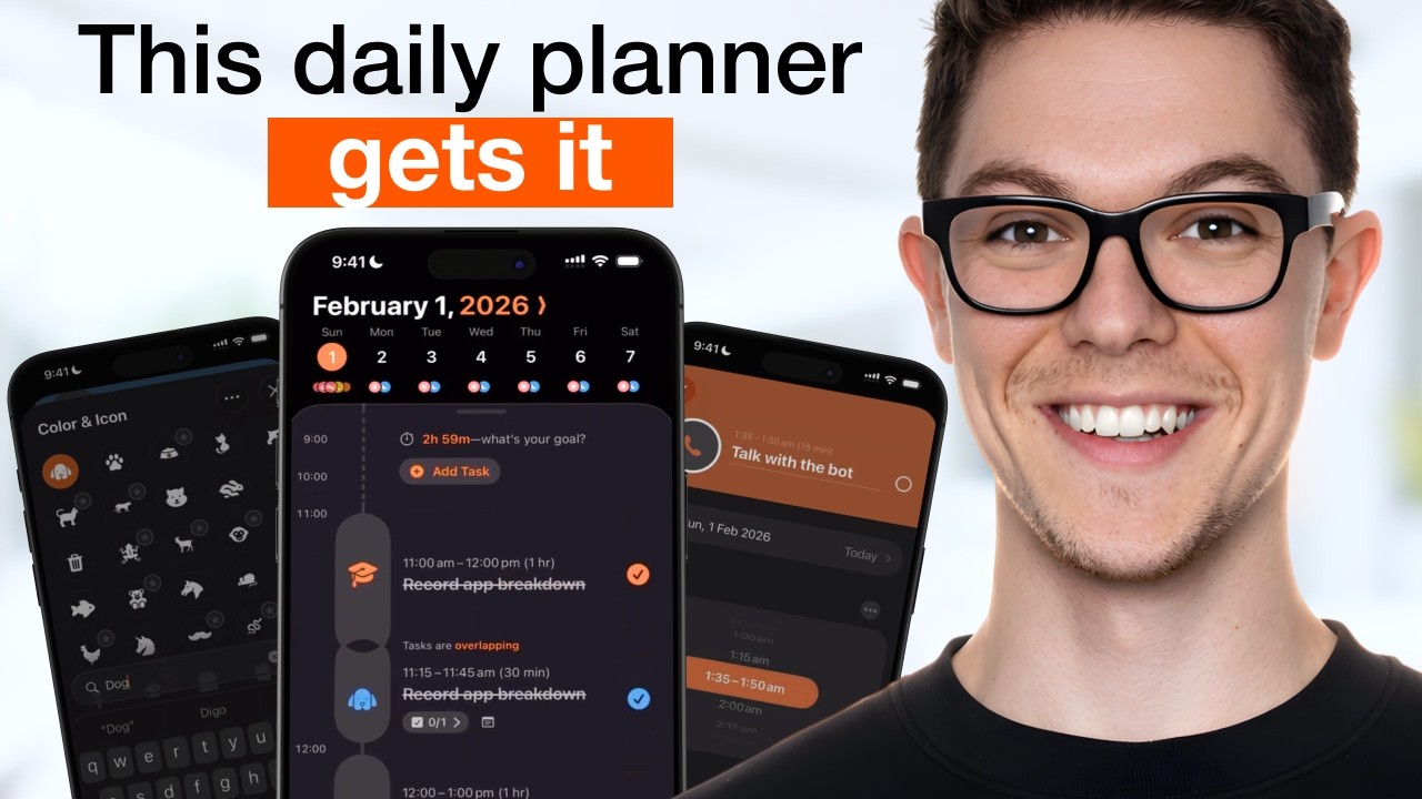
Structured is a daily planner app and a finalist in the 2025 App Store Awards 0:00. José had never used it; he discovered it five minutes before recording, while researching apps. It caught his eye for its pink illustrations, and for the App Store Awards badge.
A familiar start
The welcome carousel gets a quick look:
“Oh, I like the fade of the background between the colors. The text fading is terrible, but other than that, nice little carousel.” José
There’s Continue at the bottom right and Skip at the top right 0:43. Then come the questions, with a back arrow at the top left, a progress bar and a skip, in a style he has seen many times:
“I'm getting a bit tired of so many apps having this style of onboarding to be honest” José
A color that repaints the app
One step has you pick a color, and as you do, the whole interface changes color with it 3:21:
“So I'm not sure if that's cool because it looks cool or if it's misleading because it feels like you're changing the theme of the entire app, and maybe you are, but then the copy shouldn't be change the color of your task” José, 3:27
You can choose from an infinite number of colors. The next question asks whether to set the color as the default, which makes more sense: that’s where you set the theme.
Building a task
The plus button opens the creation flow. Name a task and the app picks an icon for it, a phone for “Talk with the bot”:
“I really love their automatic icon selection it's just such a nice touch” José
The day is a standard calendar, and you just swipe the time and the duration 6:33. Then the header expands 6:38:
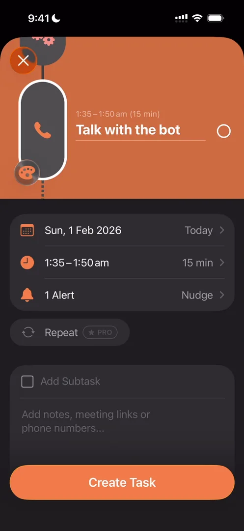
“The header expands, takes up more space and you actually see the other tasks in context” José, 6:44
“I quite like this interaction actually” José, 6:55
The color and icon menu 7:43 has suggestions and a lot more icons when you expand it. Many of them are paid 7:55, and you can search them:
“so this is another way to upsell you into the premium” José
The app isn’t very fluid there 7:40, and the sheets don’t perform well, something he comes back to at the end.
The app teaches itself with its own to-do list
The star of the show is the list on the timeline, which starts with “Get Started with Structured!”:
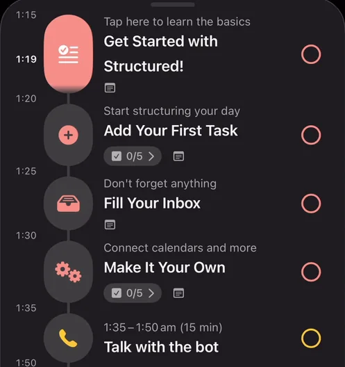
“They actually use their own interface, their own to-do list to set you up with the app.” José, 9:02
Each item is something to do in the app itself 9:08:
“It's actually a very clever way of onboarding and actually making people understand and set up your product by using it. Like this is a lot better than just some tool tips or random tutorials.” José, 9:14
One item explains the inbox and tells you to tap the tray icon to add something:
“this is perfect they basically wrote the script for me” José
After he adds his first inbox task, a sheet pops up advertising Awake, an alarm app for planners:
“oh so they're upselling me into another app okay maybe another episode not today” José
An inbox apart from the timeline
The inbox holds tasks that have no time yet. Open one 12:06 and tap the plus, and the app puts it on your calendar in a free slot and gives you a nudge 12:18. It’s no longer in the inbox, because it’s on your timeline 12:29:
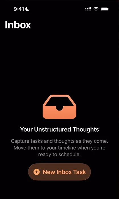
“okay that's a pretty cool mental model actually for organizing things you have all the shit you don't know when you want to do but you know that you want to do at some point and then you have the things that you've actually committed to.” José, 12:32
“I gotta say I'm a big fan of this way of thinking about to-dos and I might actually become a user just because of that because I feel like the other to-do and organizing apps miss this.” José
A week you can scrub through
Pull down on the timeline and you get a complete view of the week, with every task side by side. You can select individual tasks, and a little preview at the bottom shows the one you selected:
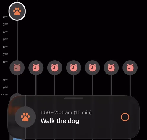
“you see it scrolls through all the other ones and it gives you a spatial reference for where the task sits” José
“so I really love this interaction it gives you a great spatial model of the app just through that little interaction well done this one” José
Expanding and collapsing the panel isn’t the best, though not too bad. And the AI tab, he finds, is all an upsell to Pro:
“which is fair like if you want to use the ai feature you pay” José
Energy and cycle seasons
Settings looks like a fairly general set of settings, until the features: Replan, Energy Monitor and Cycle Seasons. The energy monitor works out how much energy your schedule requires:
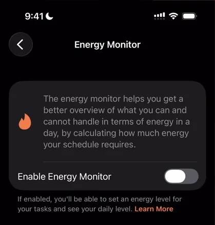
“the energy monitor helps you get a better overview of what you can and cannot handle in terms of energy in the day” José
Once it’s on, the day’s energy level sits at the top of the timeline, and you can set your own limit for the day:
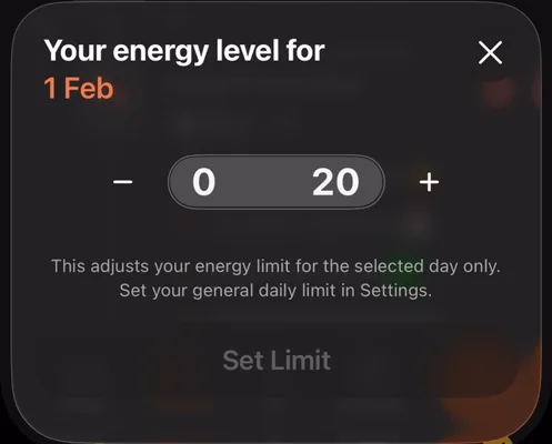
“And if I tap that, I can just set my own energy level for this day.” José
Cycle Seasons lets you track a menstrual cycle, probably through Apple Health and apps like Flo, so the tasks you plan can fit around it 15:34.
“I'm loving that what seemed to me when I downloaded like a very naive and basic to-do app is not at all that and it's actually simple but very well thought out” José
When he creates one more task, its energy shows up in the creation sheet 16:44:
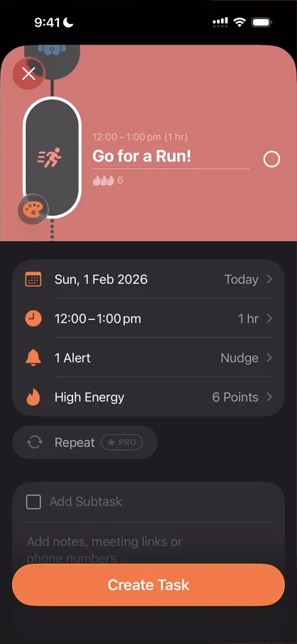
“Notice how below go for a run it says six points of energy and I can actually edit that.” José
Create it, and the day now shows six of 21 energy points spent 16:55.
The verdict
First, the app uses its own tasks to teach you how to use it, and when 17:23:
“I think that's extremely cool.” José
Second, the split between an inbox and a timeline:
“I think it makes a ton of sense, at least for the way I organize mentally.” José
Third, parts of the creation flow: the suggestions, the energy each task takes, and the icons picked from the name.
What he wishes was better is the app’s performance, whether in the panels, the creation sheet or the way it registers gestures:
“I wish they work on that a bit more but I was very very pleasantly surprised by Structured” José, 18:19
 1 of 5
Five design challenges from this episode
Learn design from the apps you love
Practice UI design every day with 300+ briefs from apps like Structured. Finish one and its card is yours.


