
App Breakdown #83 · Suno
How Suno’s app design feeds its growth
Much of Suno’s app is built to get more songs made and shared. José’s breakdown shows where that works, and where a new user falls out of it.
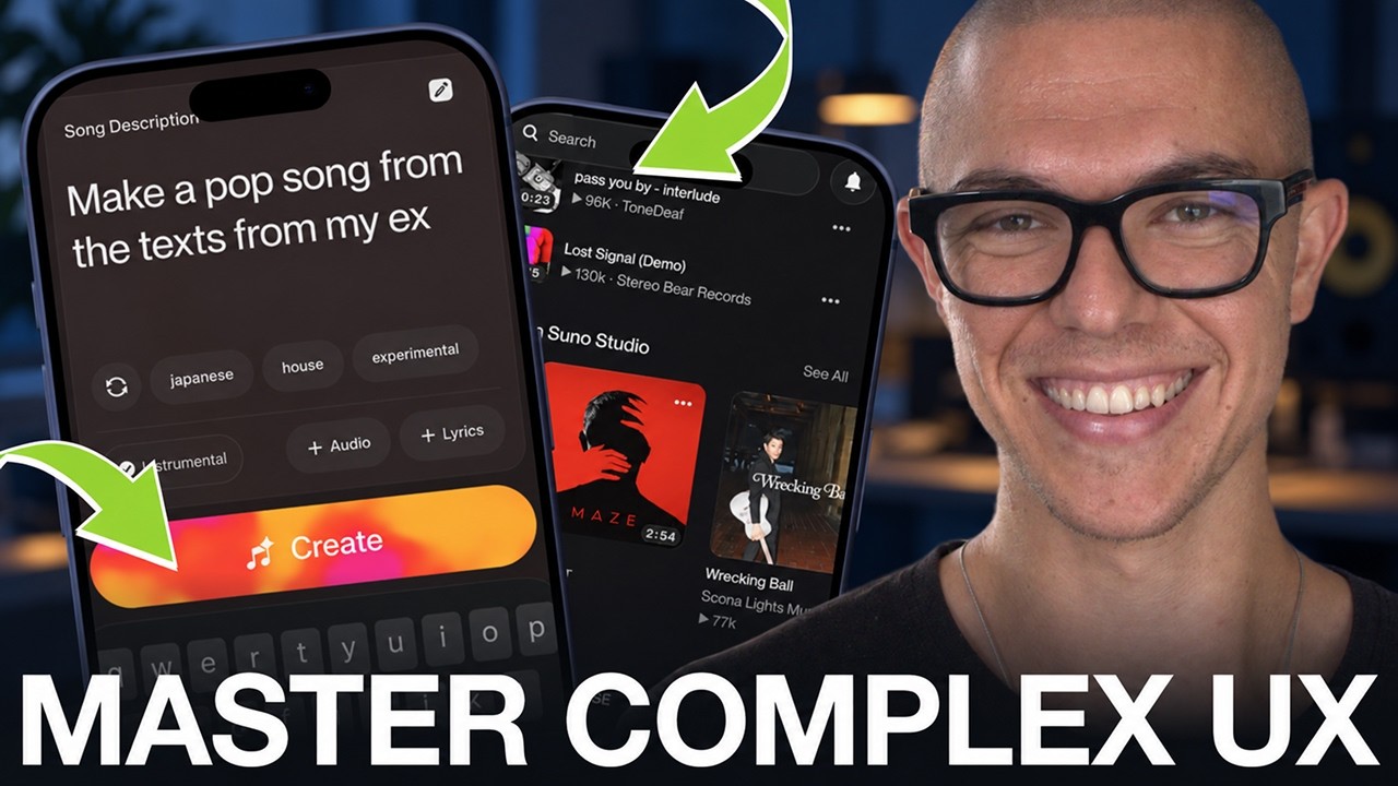
José opens the episode with the numbers:
“Suno is one of the biggest winners of the AI app era. They’re worth billions. They’re number three on the rankings right now.” José, 0:06
Suno makes songs from a text prompt. José calls the quality of those songs one of the most important things for the company, and leaves it aside on purpose 23:46. What he looks at is the app around them, and a lot of it is built to bring more people in and get more songs out.
A tool that needs a network
The first sign comes in onboarding. Suno asks for your birthday, which a music tool doesn’t need. José’s read is that Suno onboards you like a social app:
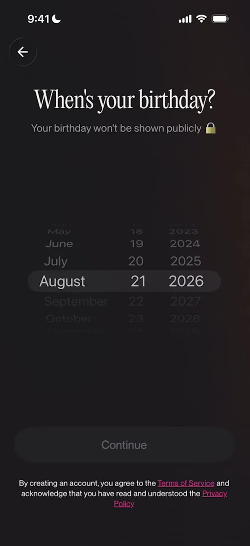
“Apps like Suno, they’re often just tools, but at the end of the day they live or die by the network they create.” José, 1:55
The same idea comes back on your profile, which suggests creators to follow so that you start building your social graph 21:11.
Making songs is the loop
Suno puts Remix on a lot of screens: at the top of the full-screen player’s buttons, and as one of only two controls on the mini-player.
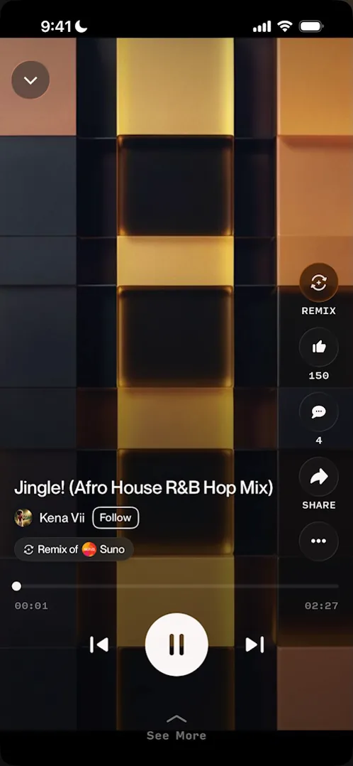
“This tells me that remixing is one of the main ways that people create songs.” José, 9:47
Discovery shows what Suno wants
The Search tab is mostly shelves, and José says it does an exceptional job at discovery even though it’s mainly a search screen 12:28. Each shelf is a cut of the same catalogue, chosen for a reason. Staff Picks shows off the best output. Made in Suno Studio is there to get people into the Studio. Songs to Remix asks for remixes.
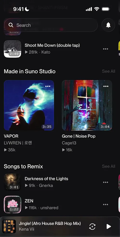
“The types of data that an app chooses to show you tells you what they are incentivized to show you and what they’re optimizing for.” José, 13:13
The share button points to TikTok and Instagram
On the song José made, the share button turns into the TikTok logo, then the Instagram logo, a few seconds apart, to get people to tap it. Share a hook and Suno opens its own sheet, with a button for each place to share.
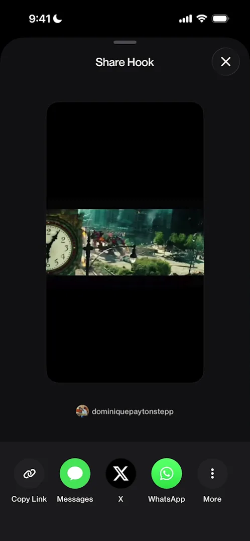
“A share sheet like this gives you an opportunity to generate the best possible content for every single network, therefore increasing the engagement on the network and the sharing rates.” José, 23:04
Its own sheet also tells Suno where people share, which the iOS sheet can’t 22:40. It fits a company that, in José’s words, does “a great marketing job on TikTok and elsewhere.” 24:06
Where new users fall out
Someone on their first day meets gaps. A full-screen sheet promotes a new feature before they’ve seen the app 2:53. The “+ Hook” button opens a song picker with nothing in it 7:12. The empty library says “Get started below”, with nothing below it to get you started. And the creators to follow move as you tap them, so following several in a row is hard 21:20.
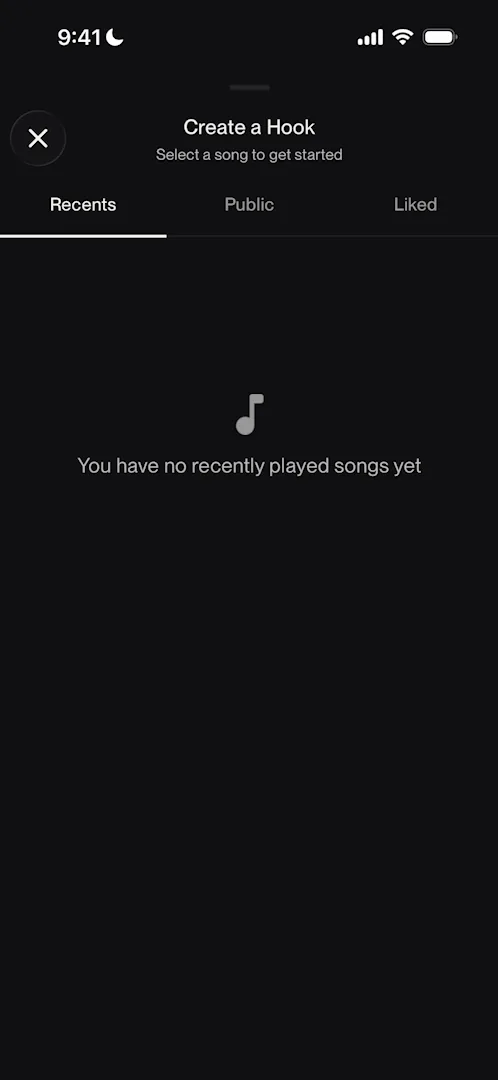
“Like always lead me to the next thing.” José, 7:38
The verdict
“Suno really is an exceptional app with quite some rough edges.” José, 23:30
“If they polish these things out, you can very easily see how it can become the default for creating AI songs. Actually, it kind of already is the default.” José, 23:56
 1 of 6
Six design challenges from this episode
Learn design from the apps you love
Practice UI design every day with 300+ briefs from apps like Suno. Finish one and its card is yours.


