
App Breakdown #81 · The Outsiders
The Outsiders’ UI design: Apple’s patterns, built for trust
José opens the endurance-training app from the team behind Gentler Streak. It leans on what Apple already does, adds touches of its own, and wins him over, with a few gaps.

The Outsiders is a tracking app built for endurance athletes, and a 2026 Apple Design Award finalist 0:00. It comes from the team behind Gentler Streak, which José has broken down before, so his expectations are high 0:37.
A heavy start
The first screen, “Serious Tool for a Serious Athlete”, sits over a large, colourful illustration of a running shoe. The next keeps the shoe and brings in a bold button and text that types itself in 0:48. Something is pulling his eye from the text, and he isn’t sure whether it’s the shoe, so colourful and so big 0:56:
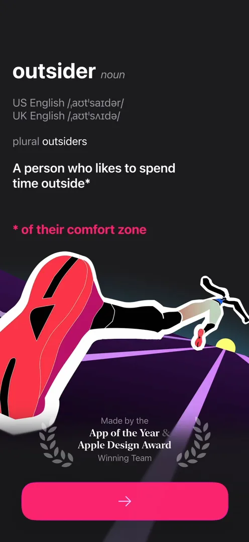
“The bottom of this screen feels very very heavy compared to where the actual information is up top.” José, 1:03
He’d maybe change that, since he doesn’t think people feel like reading it at all 1:07.
Signature illustrations
Illustrations in the same style come back on the last onboarding screen, and José calls them signature illustrations:
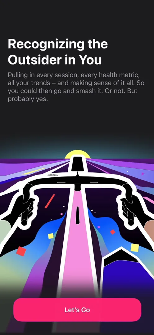
“I don’t know who does this but they are phenomenal. I almost want to put like a painting on the wall of this.” José
A paywall that breaks the spell
Then comes the paywall, on top of the home screen:
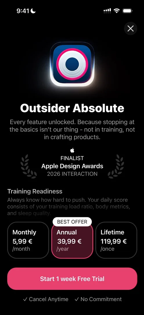
“It feels very much just like a standard paywall, whereas everything else before it was like custom made with care.” José, 3:22
The icon at the top even looks pixelated to him 3:30.
A home screen that doesn’t sell
Close the paywall and you’re back on a custom, beautifully built screen, very Apple in style 3:41. Home is simple: today’s readiness, Training Balance and body metrics, and not much else 4:30. José expected more, since apps like this usually put the main numbers up top, then secondary metrics, then upsells 4:38.
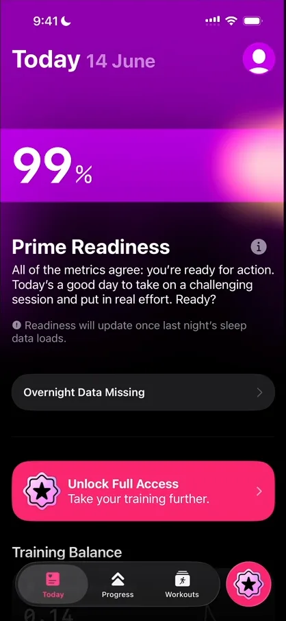
“This type of simplicity on the homepage usually can go two ways.” José, 4:52
“You either already have very good product market fit and so this does not hurt metrics and actually makes people trust your product more, because it never seems like you’re trying to upsell things.” José, 4:56
Without that fit, he says, not upselling can hinder growth, and Home would be a good place to show what more the app can do 5:10. He understands their choice, but it’s something to keep in mind 5:25.
Tapping the big 99% does nothing, though he was “like 99% sure” it would open something 5:33. Tapping “Overnight Data Missing” does, with a beautiful expansion 5:42:
“It’s these little details that I really love.” José, 5:50
A hierarchy you can squint at
Training Balance opens its own page, over a gradient 6:04:
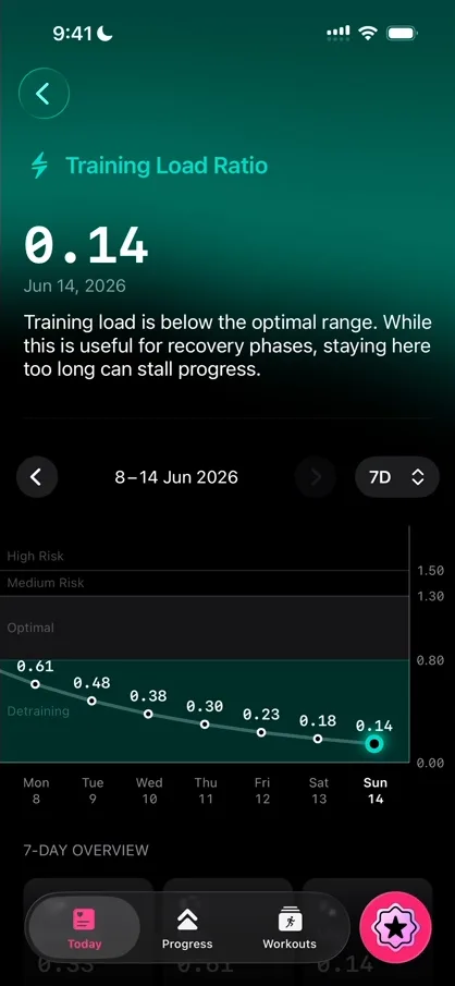
“I haven’t read anything but just like if I squint my eyes there’s a very clear hierarchy on all the text, all the colors and it just seems very very balanced.” José, 6:15
“This graph feels extremely readable and very beautiful.” José, 6:38
There’s nothing to do on the page, though, only information, beautifully displayed 7:07. A few minutes in, he says:
“So far the app seems very passive almost. I haven’t found anything to do yet.” José, 7:15
Apple’s patterns, used everywhere
Open a body metric and its tile grows into a page built almost like a sheet:
“If you noticed they use the same style of transitions as Apple Books does.” José, 7:32
Swiping between metrics, as you can between books in Apple Books, brings up the paywall instead 7:43. The heart rate page seems to be organised much like the Training Balance one 8:02:
“It’s consistency, it teaches me to read the information throughout the app, and it’s just a good way to reuse UI.” José, 8:09
A lot is locked, even changing the time frame 8:16:
“This app is very very much for the paid user and not for the free user, which is completely fine.” José, 8:29
At the bottom of Home, Customize opens a list of modules to switch on and off 8:38:
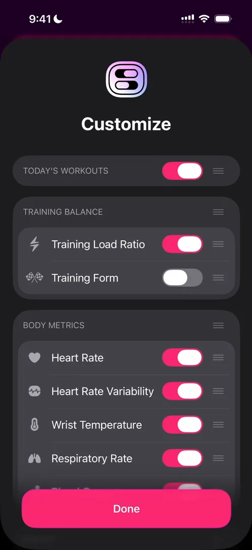
“I really love these customization menus. Like I know that they’re kind of just iOS standard… they’re so clear and so easy to use, I really love it.” José, 8:41
Switch on Training Form and its page uses the same information architecture again, with a new gradient up top 9:03.
Progress
The Progress tab has a lot more data. The page’s colour changes with each metric you pick at the top 9:33. The sheet for adding a goal is oddly slow to respond 9:47, but once it’s set, the goal shows up as a ring, with a dancing figure in the middle (he picked Dance):
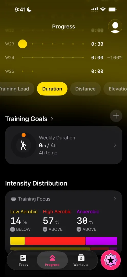
“These types of rings and colors very much remind me of Apple Fitness and Apple Watch. I’m sure that’s where they got the inspiration from, and rightfully so, because it’s an awesome design.” José, 10:23
Not every chart lands, though:
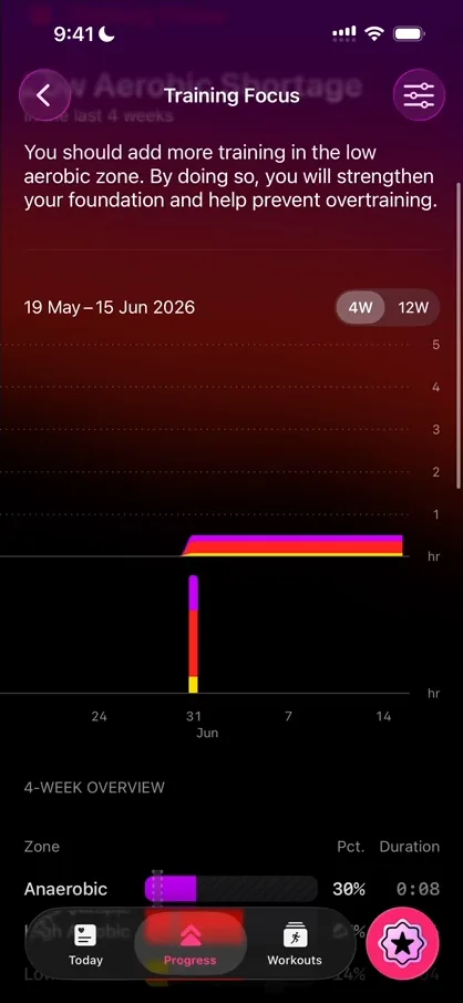
“How do you even read this chart? Okay, I have no idea how to read this chart actually.” José, 10:38
He guesses that isn’t the best way to show it, or that he’s missing something 10:44. Each page ends with a Learn More section on a different background, which keeps information apart from the upselling 10:51.
Workouts
Workouts, the third tab, has a gradient up top too:
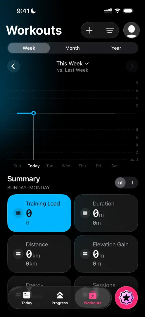
“So it’s consistent across the three tabs with the gradient there.” José
The verdict
José’s conclusion: the app feels clean and familiar at the same time, and he explains why:
“They mostly use components from Apple or that mimic Apple very closely, which is a great technique if you want people to trust your app by default.” José, 13:45
It isn’t just copying Apple, he says. The team takes the tools Apple gives developers and designers, uses them everywhere, and adds its own touch 14:08:
“Don’t reinvent the wheel when it comes to designs, use the standards and give them your own little taste.” José, 14:25
“In terms of design, I really love this app, especially for UI and for information organization.” José, 14:35
 1 of 3
Three design challenges from this episode
Learn design from the apps you love
Practice UI design every day with 300+ briefs from apps like The Outsiders. Finish one and its card is yours.


