
App Breakdown #78 · Things take time
The UI design of Things take time, a logbook built by a designer for designers
Things take time tracks the small things in a dense, monospaced grid. José breaks down an indie logbook made by a fellow designer: the details worth borrowing, and the flows that trip him up.

José opens the episode on Things take time, a logbook built entirely by a fellow designer, Chester 0:00. Apart from following each other on X, they don’t really have a connection, but he likes a lot of Chester’s work, and from what Chester has posted, he has high expectations for the UI and the little interactions 0:14.
“You can tell this was built by a designer for a designer” José
Crosses for dots
The app opens on a quote by Van Gogh, set in a monospace font. Then comes a carousel:
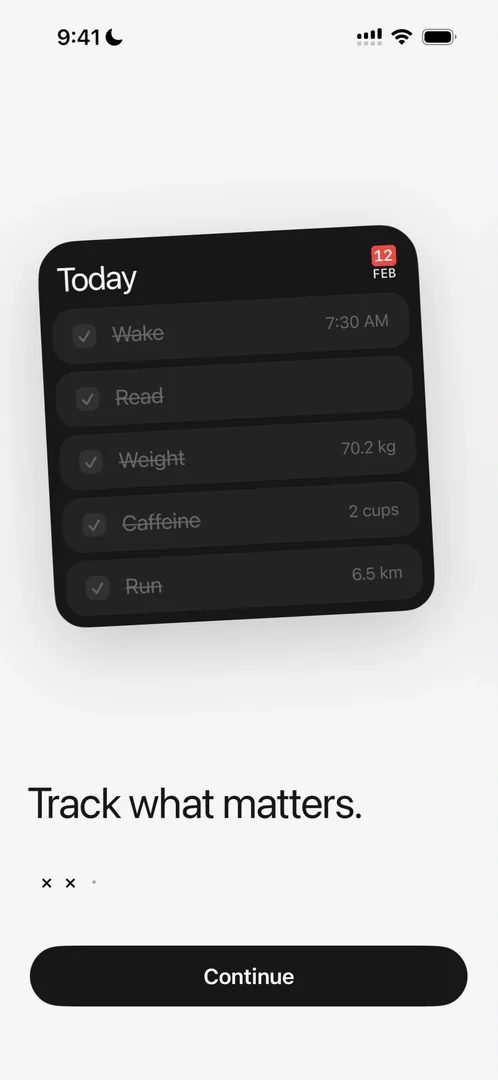
“Oh I like that the dots turn into crosses on the carousel” José, 0:44
He guesses it ties in with the app being about crossing things off, though he says he’s only speculating 0:50. The last page shows a whole grid of entries:
“This is very data dense. I kind of love it.” José
“I haven’t seen a tracking app that is like very dense and just basically lists” José
Fields that appear when you need them
Creating a tracker opens a sheet that reminds him a lot of the Joy planner, an app from one of the first episodes. You name the tracker, give it a symbol of up to five characters for the grid, and pick a type: completion, distance, weight, time, count or notes. Some types bring their own field, like a unit:
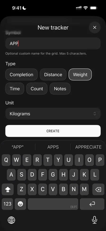
“I like these like custom fields that appear only when necessary” José, 2:48
He wouldn’t say it’s the best design choice, though 2:54:
“I prefer when there’s like an accordion and things kind of flow in and out so you always know where they are.” José, 2:56
He’s working on something visually similar, and having things flow in and out keeps an app grounded, he says, instead of feeling digital, with things appearing out of nowhere.
A paywall when you reach for more
The tracker’s own page sets its details in the mono font, and he loves the effect:
“Just makes things look like very technical even though it’s just a logbook for my own life.” José
Then, opening the all-time stats:
“Oh and we see a paywall for the first time.” José, 4:31
He hadn’t even realised there was a paid version 4:34, because the onboarding never showed one. It comes up only when he reaches for a paid feature 4:38. He calls it a very designer-style paywall 4:43, with no big promotions or discounts, just clear words, what you get, the price and a white button to upgrade 4:52. Upgrading gives unlimited trackers, iCloud backup, full analytics and future updates.
Edit is create, reused
Edit on a tracker’s page opens the sheet that created it:
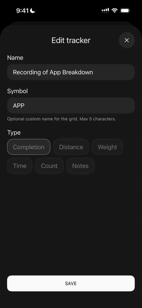
“A very good example of reusing UI instead of having new UI for editing” José, 5:11
“Reusing UI is extremely important” José, 5:18
Delete asks again in an iOS-style dialog before anything goes 5:25.
Small days, two ways to track
Back on the calendar, you can tap any other day, but:
“I will say the tap targets on the days are like extremely small” José, 5:39
If you’re looking away for even half a second, or on the move, it will be very hard to hit the right day, he says. Once you do, a sheet comes up from the bottom:
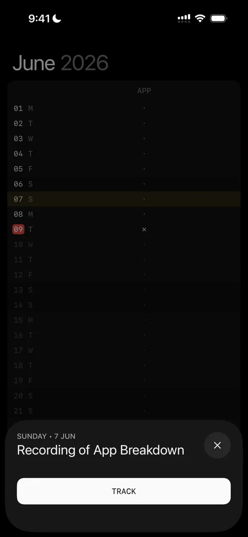
“Oh and it’s interesting that the UI is different from the one we just saw” José, 5:58
For today, he had a line item to cross out. Here it’s a full-width button, which threw him off: he thought he was doing something different 6:09.
“I wish there was just more consistency to it” José, 6:27
Up, down, and never ahead
The arrows at the bottom move a month up or down 6:35, and pulling hard past the bottom of a month scrolls on to the next, a nice force pull, he says 6:41. You can’t go into the future 6:49. The more button opens very classic iOS settings 6:56, with a row to rate the app. It goes to the App Store, and he wishes there were an in-app prompt instead 7:05.
A cursor and a keypad of its own
He adds a second tracker, a run in kilometres, and notices the text cursor:
“I like the custom color for the cursor. I hadn’t even noticed that it’s the same type of red that he’s using on the selected date” José, 7:29
Logging the run brings up a number pad he didn’t expect:
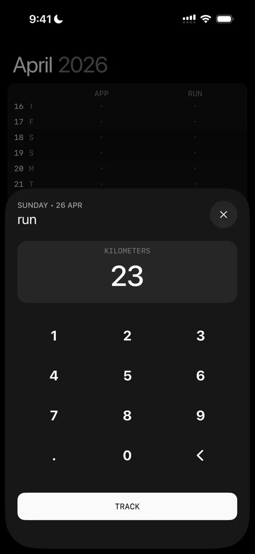
“Very cool keyboard actually I did not expect the keyboard to be custom” José, 7:49
The button that said 26 Apr
That run went in on the wrong day:
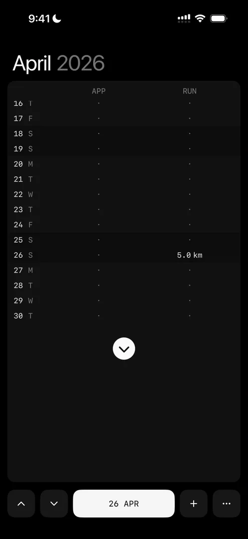
“You’ll notice that I clicked on the bottom thinking that I was clicking on today” José, 7:58
He was actually on 26 April, a day he had selected earlier and forgotten about. How naturally he did it, he says, “proves that it’s the wrong UX in this case” 8:12. He selected today only so he could tap the bottom button, and selecting it pushed him into another flow. As the main flow, he feels it should be a bit better worked 8:26.
Three trackers, then paid
A third tracker, for weight, uses the same keypad. A fourth brings the paywall back 8:50:
“Fair enough. That makes a lot of sense.” José, 8:56
Apps that wouldn’t exist otherwise
That leads him into a tangent:
“I absolutely love that apps like this exist now” José, 9:03
He means very simple apps, made clearly by someone with a passion for them, that likely wouldn’t exist if AI didn’t make building so easy. If you like one, you can support it, and its maker can earn from a passion:
“I am all for all sorts of people publishing apps and monetizing them and making decent money from them” José, 9:31
If you’re on the fence about making your app, he says, try the latest AI coding tools and ship it. It’s very fun to build.
The verdict
Before he wraps up, he opens Trackers from settings. The page slides in from the right inside the sheet, which can still be dismissed at any moment. He loves that kind of navigation, and uses it in his own projects. Then:
“Very simple app, very delightful app, lots to learn about typography and hierarchy from it.” José
He thanks Chester for making it.
One design challenge from this episode
Learn design from the apps you love
Practice UI design every day with 300+ briefs from apps like Things take time. Finish one and its card is yours.


