
App Breakdown #86 · Vocabulary
Vocabulary’s UI design: a simple app, optimised end to end
José breaks down Vocabulary, a very simple app that makes a lot of money. What’s exceptional, he says, isn’t the word a day. It’s everything around it.
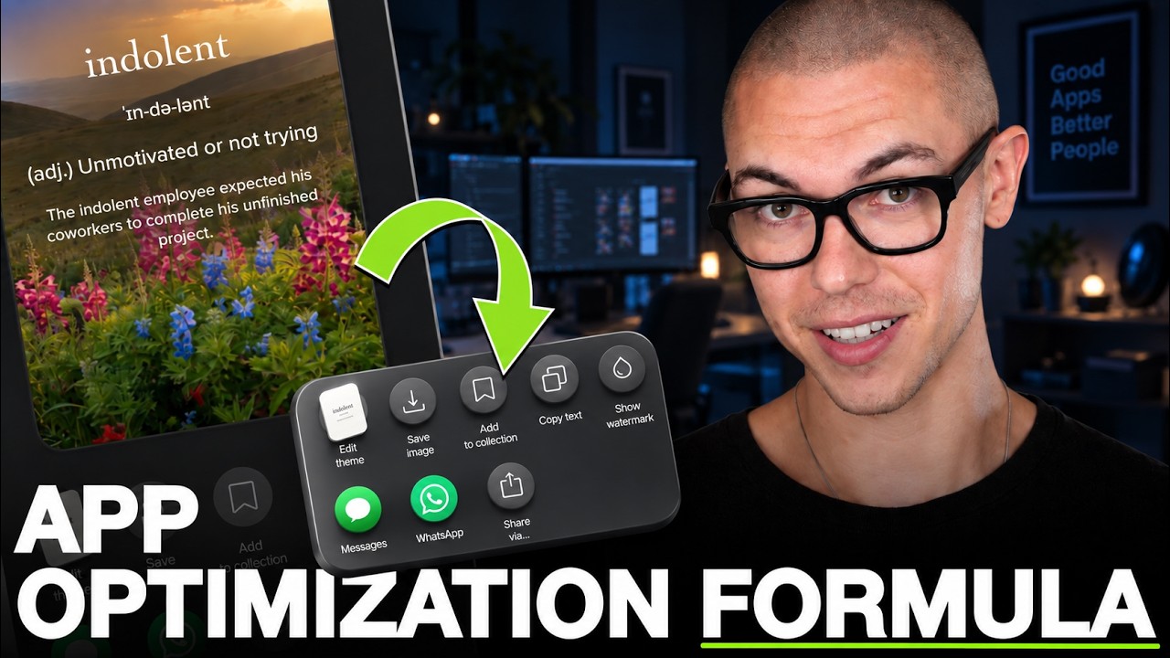
Vocabulary is an extremely simple app that makes a lot of money and has been an Apple Design Award finalist 0:00. It’s made by Monkey Taps 0:14:
“They’re a company that is exceptional at taking very simple ideas and then running ads on them and creating cash cows of all kinds.” José, 0:19
A splash screen that sells
From the first screen you get a taste of the kind of company behind it: an illustration, a clear promise, and social proof 0:36.
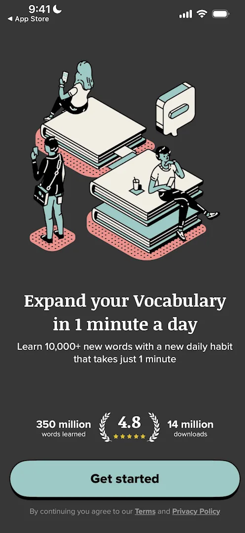
“The kind of company that does a splash screen as clear as this one, with illustration, value prop, social proof, big button to get started, is a company that knows how to optimize design.” José, 1:18
The tracking prompt comes only after Get started. José wonders if that’s so people read the splash first 1:31.
Questions it asks anyway
Next, the app asks how you heard about it:
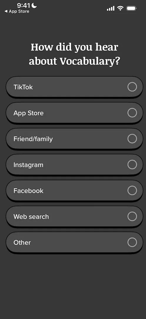
“My guess is that a lot of people are just going to lie here, and so this doesn’t actually give you any proper data.” José, 1:56
Then again, he says, a company doing this at Monkey Taps’ scale is probably using the answers for something 2:04. The screens that follow change with plain transitions he doesn’t like 2:22, and the first few, like age, can be skipped 2:27.
A streak from day zero
Then, still in the onboarding, a streak 3:02. Everything about the app says it’s for every day, from its full name, “Vocabulary – Learn words daily”, to the splash’s promise of a minute a day 3:14. And the streak doesn’t start at zero:
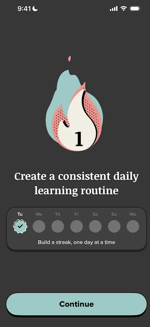
“Streaks are only valuable in so far as you don’t want to lose them, so if your streak is at zero you don’t really have a motivation to go the next day and put it at one, because you have nothing to lose.” José, 4:02
“But right now, they already gave me a flame to lose, so I am more attached to the streak.” José, 4:14
Losing a streak is bad for the app too, since people who lose one tend to drop off. That’s why Duolingo offers streak freezes and second chances 4:29. Later, the Stats tab shows his streak at two days 17:02. He had noticed it as soon as he reached Home:
“I’m going to assume that this is a bug, because there’s no way they actually just give me one day to make me feel special, or actually there is. Maybe that’s a dark pattern that I just haven’t seen yet and it’s actually genius.” José
Icons, themes, voices
Then the onboarding lets you pick an app icon, a theme and a pronunciation:
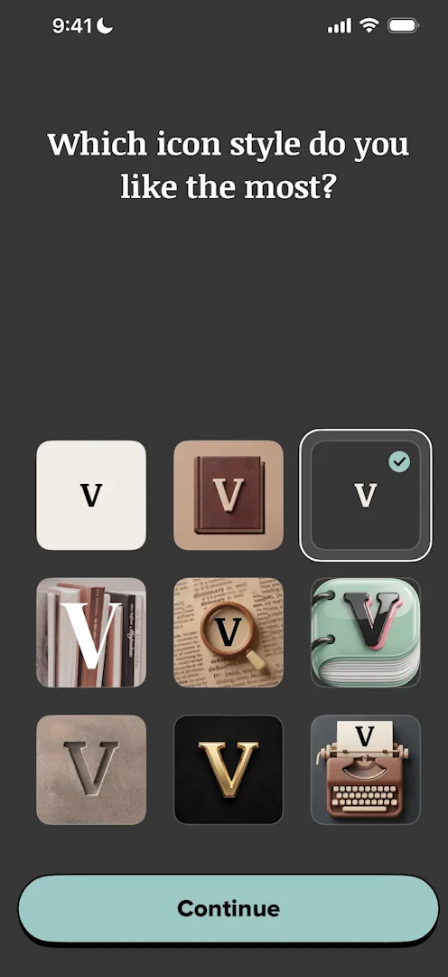
“It’s not very frequent for apps to actually give you icon styles from the get-go.” José
“They all kind of look AI generated, I’m not a big fan of the design here.” José, 6:01
Five apps in one tap
Then comes what José thinks is the most distinctive part of the onboarding so far:
“What they’re doing here is upselling me into all of their other apps.” José, 6:33
He isn’t sure the App Store’s guidelines allow it, since they’re blurry on cross-promotion 6:37. The upsell’s Get bundle button leads to an App Store feature few people know about 6:56:
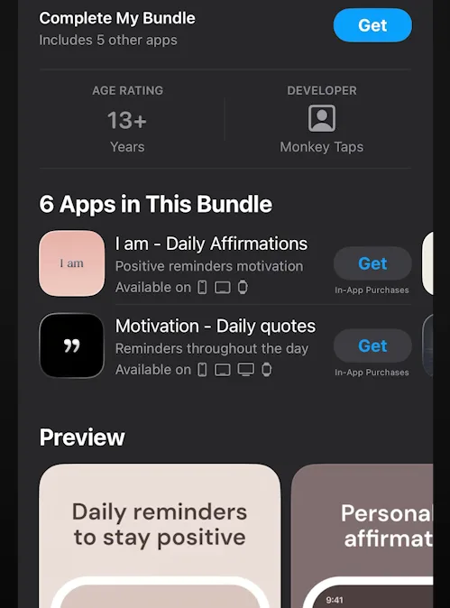
“So on the App Store if you do an app bundle you get to show a screen like this where with one tap I will download five different apps.” José, 7:01
“I think this is extremely underused by developers that do things like Monkey Taps and it’s an insane growth lever.” José, 7:12
A long onboarding
By now there are a lot of questions 8:06:
“People might read the first three screens, they’re not gonna read the 25th one.” José, 8:27
Home, at last
Home is a single word, very clean 11:03:
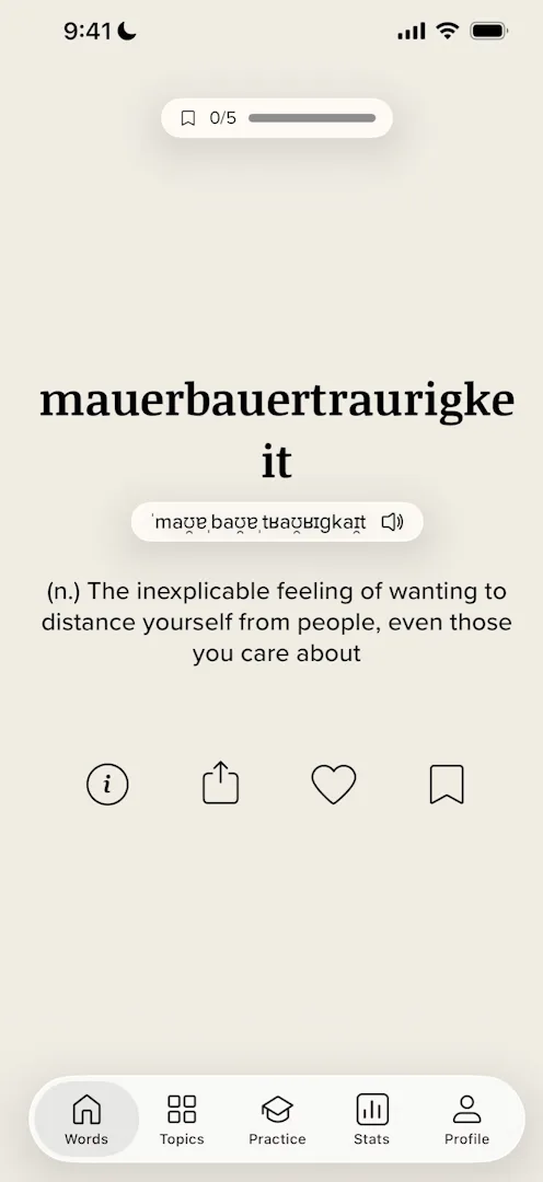
“We have a very sleek way of actually introducing me to the spatial model of the app with just this little swipe up and movement of the cards.” José, 11:38
A few words in, after he’s used the app for a little while, it asks for a rating 14:41. José thinks the timing is right:
“It’s the first session so the drop-off is small and they get a higher chance of asking people for a rating.” José
Always somewhere to go
Next comes a test; José guesses the app noticed him swiping fast 15:03. It ends with his level and how far the next one is:
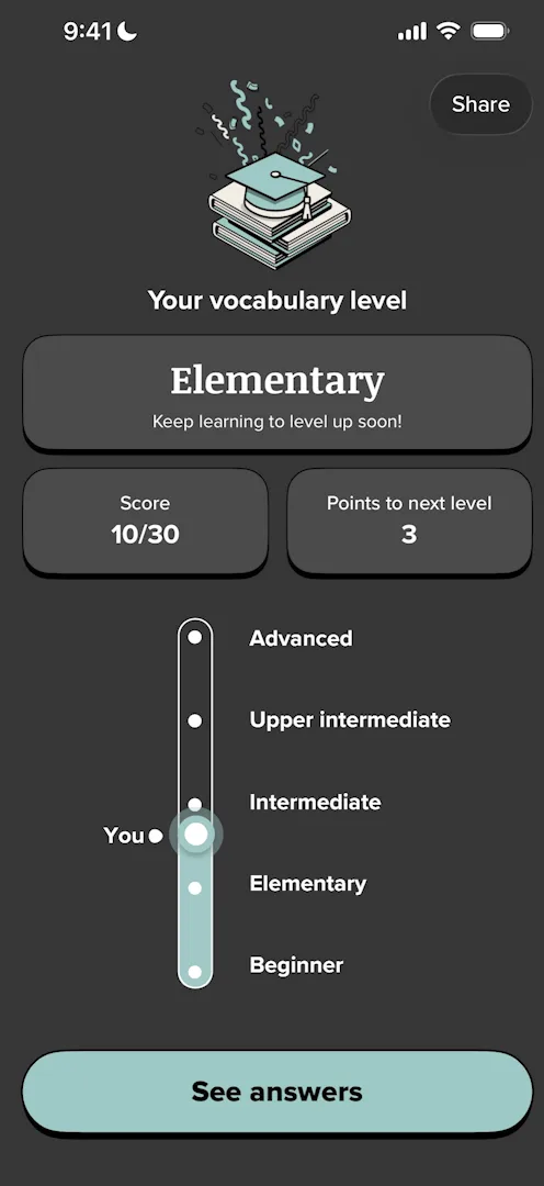
“Always very important to give your users a sense of future, like this is where I want to go.” José, 15:59
He’s less keen on the answer cards, which aren’t very readable 16:35. Stats works as a dashboard of his progress 17:16.
Everywhere on your phone
Profile surprises him:
“This is an interesting choice. I don’t think I’d ever seen an app on the profile, instead of putting the stats here, they put a whole section for customization.” José
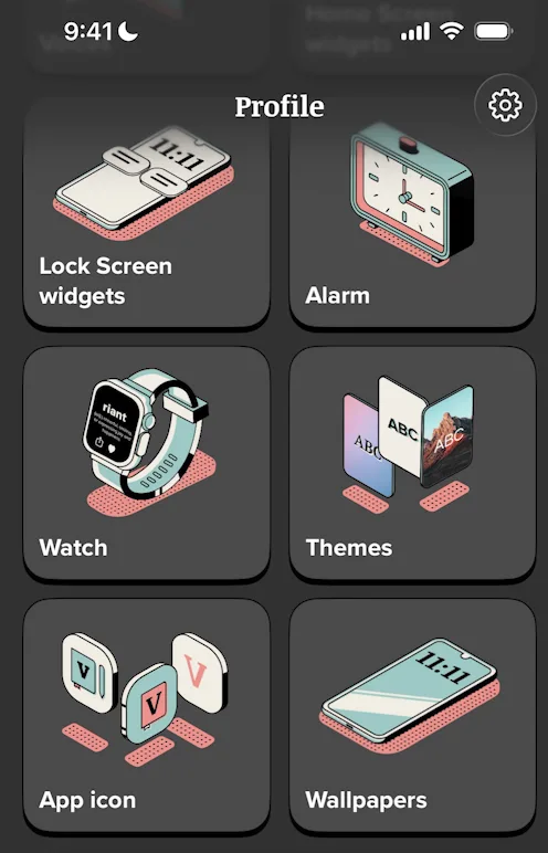
“They want to occupy all the real estate possible within your phone.” José
Widgets, reminders, voices, Watch, themes, app icons, even wallpapers:
“If they get even like 2% of users or 1% to set a wallpaper, every time that person uses the phone, they’re reminded of the app.” José
Timers and lives
Practice puts his level on display again, after Stats and Profile 19:51, and lists his mistakes, much like Duolingo 20:00. Its game modes, like Rush, are the same quiz with a twist 20:26:
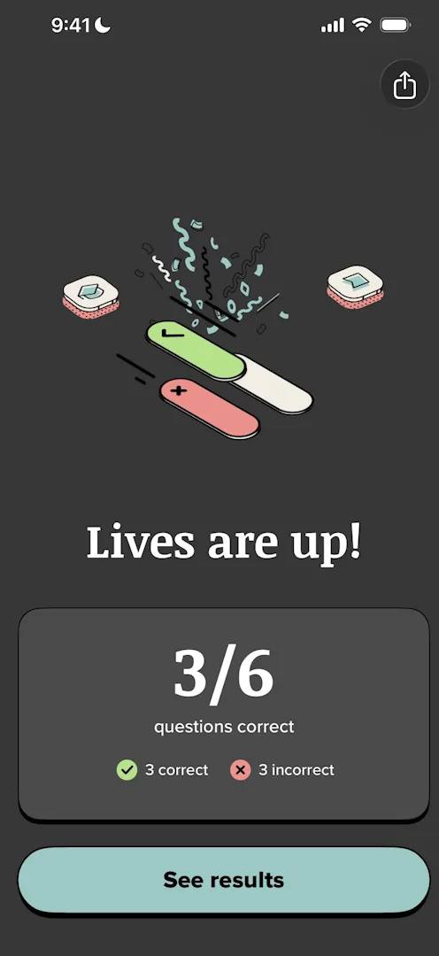
“It’s a good example of how to take a simple questionnaire, add a timer, add lives, and all of a sudden make it a lot more exciting.” José, 20:44
He thinks the app is perfect proof of a simple rule:
“You just need to design like two or three different components and you can… reuse them for everything, and users are okay with that.” José, 22:00
The verdict
“If you actually look at this app from a bird’s eye view, what is really exceptional is the shell, the onboarding, the added engagement loops and the marketing, not the actual core feature of teaching a word every day.” José, 23:01
“You could swap teaching a word every day with pretty much any topic and this app would most likely still be successful, provided that you could do good content distribution for it.” José, 23:16
 1 of 5
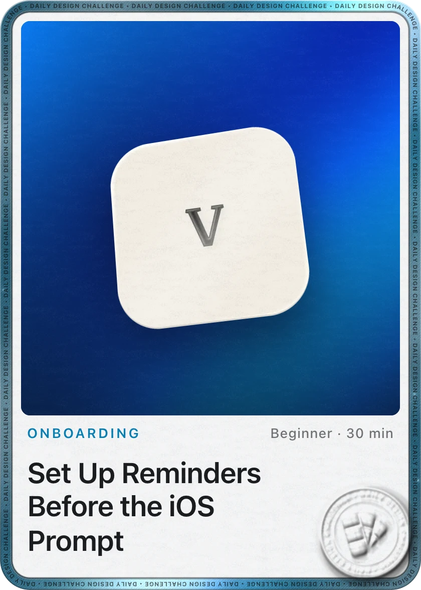
Five design challenges from this episode
Learn design from the apps you love
Practice UI design every day with 300+ briefs from apps like Vocabulary. Finish one and its card is yours.


