
App Breakdown #47 · Whatnot
The UI design of Whatnot, the live shopping app
Live stream shopping is a huge category that José admits he doesn’t know much about. So he opens Whatnot, which he thinks is one of its biggest standalone apps, to see how it’s put together.

Whatnot is an app that lets you buy and sell things while on live streams 0:00. José first heard about it a few years ago through a friend 0:09, and got very interested in the whole market of live stream shopping apps: it’s clearly a very big thing inside Facebook, Instagram and TikTok, and on standalone apps like Whatnot.
“I think Whatnot is one of the biggest players in the space as a standalone app.” José, 0:25
It’s number two in shopping, according to the App Store tracker, so they must be pretty big 0:31. The category basically exploded during COVID, then maybe wound down a bit, or maybe didn’t 0:35:
“I just don't know enough about the category.” José
He created his account that morning, so he expects to miss the onboarding, but the app still starts by asking what he’d like to shop for.
A splash screen that says it all
He calls the splash screen gorgeous, and closes the app just to see it again:

“it's one of those splash screens that just tells you exactly what the app is about in a very fun way in one second I love it” José
A menu that falls from the top
Then a full modal sets out to find you something to shop for 1:20. He picks men’s fashion 1:24:
“Whoa. Okay. Very nice menu.” José, 1:26
He was expecting some kind of expansion of the card, or a panel 1:32. Instead:
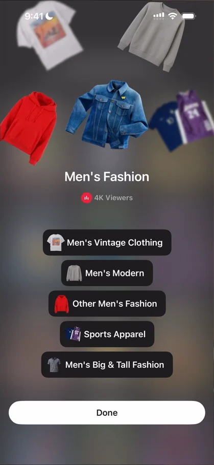
“this is really cool where we have the images coming from the top in different blurred states. So it gives like a depth effect” José, 1:38
Then there are buttons for all the things inside it. He also picks coins and money, and tools. The app is trying to get to know him, so that it knows what to recommend 2:05:
“a screen like this makes a lot of sense in the context of an onboarding for an app that is going to recommend you things to buy” José, 2:09
A live stream with a lot on screen
Inside a live, there’s a lot on the screen. On the top left, the creator’s information, with shipping in two days. On the top right, the number of viewers and a dropdown 6:41. On the left, the chat, overlaid on the live 6:45, and on the right, a column of controls: more, clip, share, wallet and shop 6:47. At the bottom, what he thinks is the last item sold and who bought it, with animations over all of it:
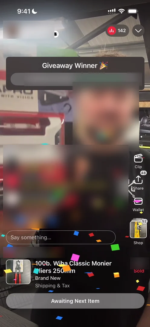
“So we have all of these animations that we were just watching also overlay. Those are pretty cool.” José
He swipes up to the next live without thinking about it, even though the app never taught him to: vertical videos are everywhere now, so it just makes sense.
A profile two panels deep
Tapping the seller at the top left opens a little panel, but it isn’t the profile 8:42: you can view the profile from there, and the panel is more like an action center for it.
“That's an interesting approach. It's a bit like buried.” José, 8:49
They’re burying the profile, and he guesses that can make sense 8:52. View profile opens another panel 8:57:
“So they could definitely fit the other actions into this panel and just reduce one layer of navigation.” José, 8:59
The profile has ratings, shipping time, the number of items sold, followers and following, a description and tips 9:05, then the seller’s shows, shop, reviews and clips:
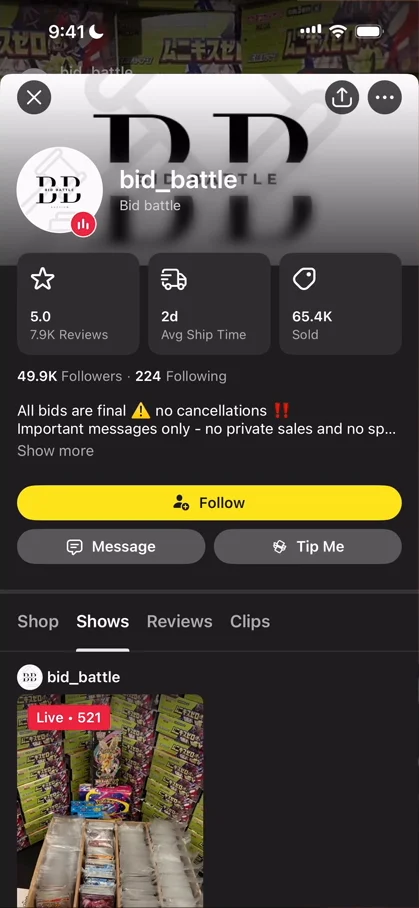
“this is basically like going into a more social Shopify which is a pretty cool concept” José, 9:20
Nobody here, with 530 people watching
The viewer count at the top right opens Friends in Live 9:31:
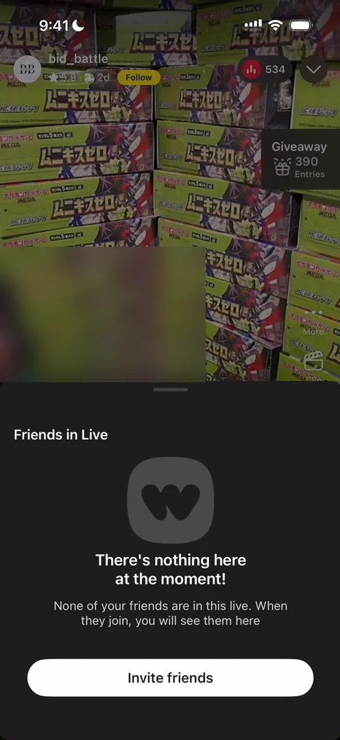
“what do you mean there's nothing here at the moment there's 530 people” José, 9:38
None of his friends are there, which is fair enough:
“but why why don't they show me everyone else that's here” José, 9:43
“it seems like a missed opportunity like there's a lot of people here some of them probably have interesting profiles I wish I could see that” José
The dropdown next to the count puts the live into picture in picture, and it stays on screen when you leave the app.
A chat that’s hard to read, on purpose
There’s no full-screen chat: you tap, and the keyboard comes up 10:48. He sends a little “yo” 10:57:
“It's pretty hard to read, but at the same time, they can't really cover the live because that's the most important thing. So it makes sense, their decision here.” José, 11:01
On the side, Clip makes a clip of the live 11:11, and Share opens a custom share sheet, with the live at the top left and the usual suspects to share it to.
Categories inside categories
Back on the home, there’s search at the top, and a search icon at the bottom too:
“So that's a bit funky.” José, 13:29
The gift icon, pulsing, opens a classic referral page. Then there’s a carousel of categories up top 13:40:
“I'm a big fan of these types of carousels they're just like easily accessible and they tell you what you need to know” José, 13:44
Go into one, and there’s sub-navigation 13:51:
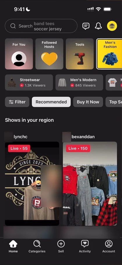
“this is a good example of handling complex navigations” José, 13:54
Say you have a bunch of categories, with more categories inside them, and more inside those. You cover it all up and show just the top-level categories, and only when you go into men’s fashion do you see its subcategories, and here, even their subcategories:
“sub sub categories might be a bit too much but categories definitely not” José
Search that doubles as history
Search suggests the users you viewed recently:
“So these basically function as a way to go back to things that you viewed, which is pretty handy, especially when you're navigating video and you don't really know how to get back to things” José, 14:54
The results are very plain and simple, just one-liners 15:10: who you’re looking at, their name and their number of followers. And double-tapping the Home icon takes you back to the home 15:30:
“very basic but very handy navigation mode” José, 15:39
Illustrations you don’t have to read
The second tab is Categories 15:42:
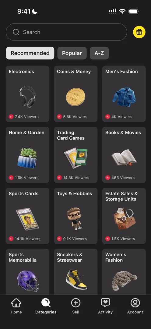
“I'm really loving their little illustrations on the cards like these look nice they look much better than if it was just text because I'm not even reading the text for most of these and I know what they are” José, 15:46
Tap one, and it’s a different kind of navigation 16:01: the card expands in place, accordion style.
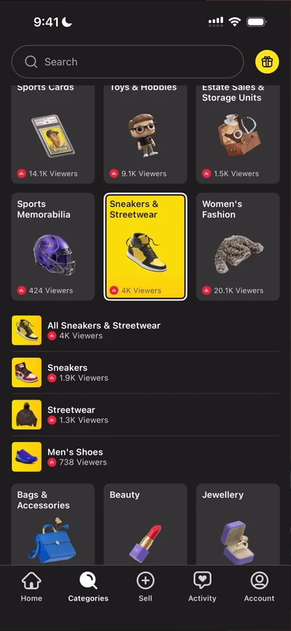
“on the first screen of the video the one where I was choosing my categories this was the kind of navigation that I was expecting” José, 16:04
So it’s inconsistent with the first one, but:
“I guess the first one was more like a show piece so it's not as much of an inconsistency as it is just different use cases” José
In the first one, they want to impress you and get you to choose categories. Here, you’re trying to browse through things fast.
Selling takes an application
The middle button of the tab bar is Sell. He picks coins as what he’d sell, since he actually has a very interesting book about coins in front of him. Then the app starts putting him through its seller onboarding, and he closes it:
“so you have to apply to be able to sell which I guess makes sense because this is like the perfect ground for scammers” José, 17:20
That, he guesses, is why there’s so much emphasis on reviews and shipping time, all the way on the profile 17:26.
An Activity tab with nowhere to go
Activity has no purchases, no bids, no offers, and one saved item, which he did save 17:38. He wishes the empty purchases had deep linked him somewhere 17:51:
“It's something that I talk about a lot, like just never lead users into a dead end. And in this case, they are leading me into a dead end.” José, 17:54
“this could be a good opportunity for them to just tell me to buy something and actually direct me there” José, 18:08
And while the home uses a top navigation for its categories, Activity uses a line with bids, offers and saved instead 18:15:
“doesn't look very consistent I definitely prefer the earlier one” José
Settings first, profile second
The account tab has a promotional card, your profile, and then mostly a list of things to handle: it’s just settings. You can add multiple accounts, which he guesses is for having one account for buying and one for selling. Then he taps View profile:
“so once again the profile is buried under two different layers so they choose to surface settings more than the actual profile here” José
The verdict
Among the things he really liked is the bid UI at the bottom of a live: very satisfying, with a nice haptic, and a tiny detail. He isn’t sure they do it on purpose, but it feels extremely fast to bid, because you don’t have to swipe all the way across:
“You only have to swipe like one centimeter and then you bid. So they remove all the friction from buying something or bidding on something to buy.” José
He also really likes the overlays whenever someone wins a giveaway or buys something:
“I think those giveaways add a lot to the experience.” José
Like the one playing as he speaks, selecting a winner, then confetti:
“So it just makes it an experience.” José, 20:08
He likes that the chat is overlaid 20:10, and the way they handle the sheer amount of categories, with headings and subsections below them 20:13.
“Super interesting app.” José, 20:21
He would love to know how it’s actually doing, with this many people on its live streams 20:22.
 1 of 6
Six design challenges from this episode
Learn design from the apps you love
Practice UI design every day with 300+ briefs from apps like Whatnot. Finish one and its card is yours.


