
App Breakdown #60 · YAZIO
The UI design of YAZIO, the calorie tracker with a very long onboarding
YAZIO’s AI Calorie Tracker competes in a very crowded category. José opens it for the first time, and finds an onboarding that is far too long but rewards you as you go, and a recipe section he loves.

José opens the episode on the AI Calorie Tracker by YAZIO, an app in a very competitive category 0:00. It’s the 60th episode, recorded one a day for 60 days in a row 0:20.
A notification ask on the first screen
Straight away, the app asks for notifications 0:32. Prompting as soon as someone opens the app may seem lazy 0:40:
“But generally speaking it has very good conversion rates so this can actually work very well for your app with no effort whatsoever.” José, 0:48
“So it’s always worth A-B testing.” José, 0:57
Then comes social proof 1:02, and from the UI of the onboarding, he can tell it’s going to be a long one 1:15, one that gets the most information out of him before asking him to create an account. “How did you hear about YAZIO?” makes no sense in an onboarding unless you’re using that data very seriously 1:34.
Little treats along the way
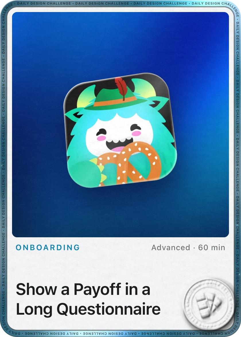
A mascot appears, and he wishes they used it more, from the very beginning, like Duolingo and Brilliant 1:59:

“Whenever you have a very big onboarding on an app, it’s good to basically give users little treats throughout the onboarding.” José, 2:39
Say you have a 12-step onboarding 2:48. You don’t want people worn out by step 10, so at steps three, six and nine you show a cool animation congratulating them 2:59. That’s clearly what YAZIO does with the mascot 3:13, and it tends to decrease the drop-off throughout the onboarding.
“And if you have cool animations, haptics and things like this it can just turn a very dull and long onboarding into a cool experience.” José, 3:26
The app tells a story too: restrictive dieting can cause a yo-yo effect 3:39, so everything else you’ve tried doesn’t work, and you should use their app instead.
“So it’s all about the narrative here” José, 3:57
A few steps later, the treats come right on cue 4:15.
Hold to commit
Then the app asks him to tap and hold its icon to commit 4:23:
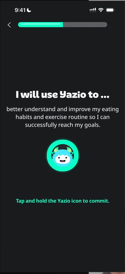
“And through this little friction, they’re making me put weight on my own decisions.” José, 4:41
“It makes your decision feel more important than just mindlessly tapping through a few buttons.” José, 4:53
Joyful animations
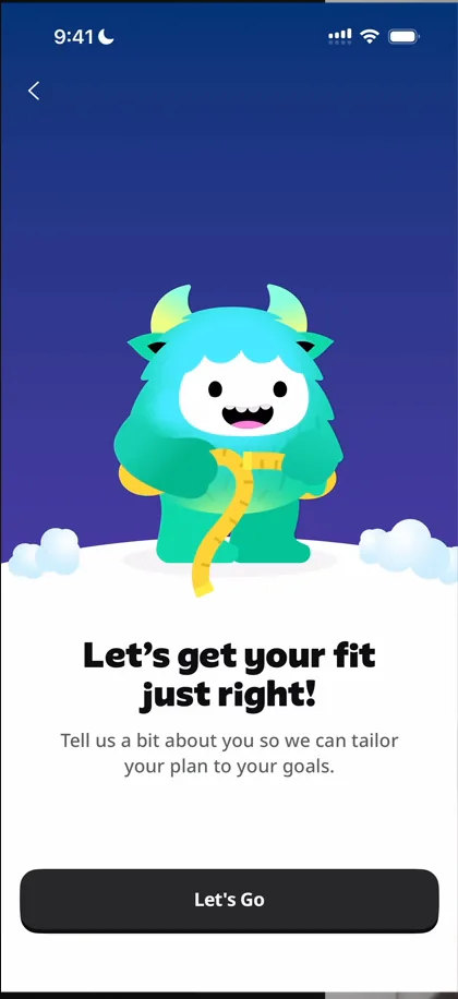
“I’m really loving these types of animations. I feel like 2D with some gradients and movement in characters is very in vogue right now.” José, 5:21
When it asks to connect Apple Health, the two icons animate together 5:45:
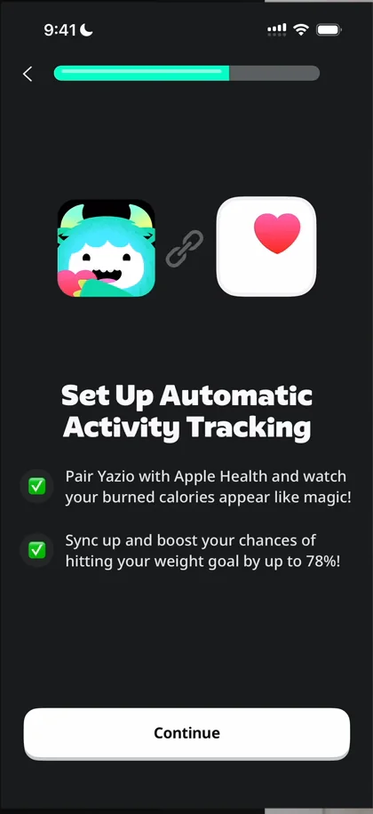
“They basically take two otherwise dull icons, make them interact and make this screen a lot more joyful than it needed to be.” José, 5:49
When he declines, they do nothing 6:04. Further on come the classic before and after photos, which these days might be AI 6:20:
“If it looks too good it’s probably too good” José, 6:34
A rating prompt, and too many questions
During the onboarding, the app asks him to rate it:
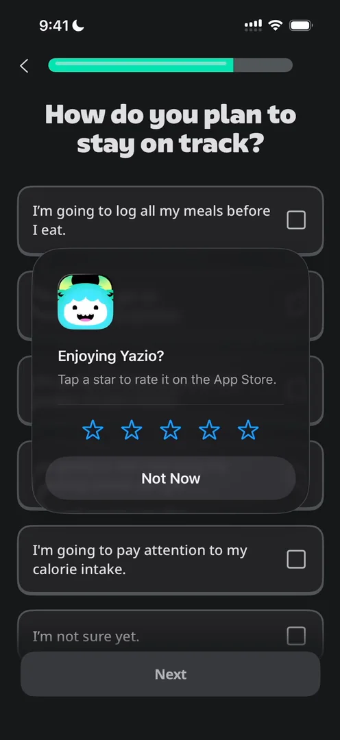
“Awful place to ask for a rating.” José, 6:52
Still, while being too long, it’s a good example of how to do it with those little rewards in between 7:04. But all of the UI looks the same, so it feels like doing the same thing over and over 7:29:
“Whereas with tiny UI differentiations and different ways to ask the question, this could look like a more evolved experience.” José
Then come more questions, and more:
“To be honest, I’m getting quite fed up. If I was a user, I would have probably dropped off.” José, 9:57
A wheel to spin, then an account
If you skip the paywall, a wheel appears that you spin for a discount:
“Oh my god, this looks like a cheap online shop” José
“This is as black hat as it gets” José
Then, finally, comes the account. He admits asking so many questions might make sense in their data, but sometimes you just have to say enough is enough: there’s no way they need that much information to give you value on day one, and the first experience feels like filling in your taxes. A screen then says “Only 57% get this far”, likely a made-up number to make you feel good. But if it’s real 12:20, it means 43% of people drop off during the onboarding, which would mean they shouldn’t ask so many questions.
Tracking food
The mascot shows up again to point out where you can change how you track 13:47. Foods, Meals and Recipes sit side by side, but only Foods is filled:
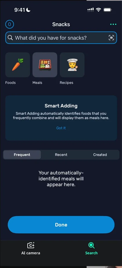
“If you have three things side by side and one of them is filled up with things that you didn’t put there, then the other two should also be filled with things that you didn’t put there.” José, 14:24
One tiny detail is cool 14:54: when he adds something, the number at the top left goes up 15:01.
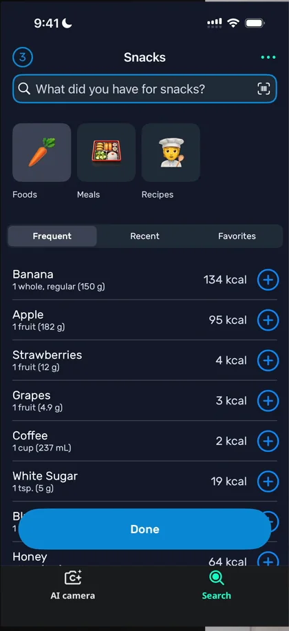
“And it’s a great example of just teaching through animation, through tiny little cues.” José
The plus on breakfast on the home doesn’t add anything 16:31; it just leads to a place where you can add things 16:40. For a calorie counter, adding food has to be fast, and from the home it takes a scroll or a few taps. Taking a photo of your meal would be even simpler, and they support it with an AI camera that only works with Pro 19:11.
A recipe section that could be its own app
The Recipes tab organises recipes by type of meal, by calorie range, by how easy they are to cook, by diet, by cuisine and by occasion:
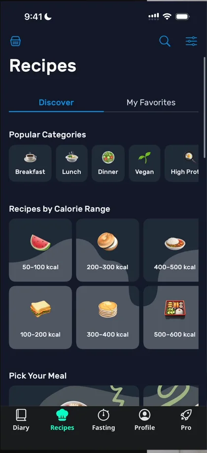
“I’m loving this classification” José, 20:47
“Because pretty much whichever way you want to look, you can find something here.” José, 20:57
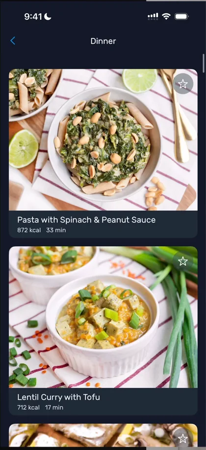
“So it’s actually very complete this recipe section. It’s very well organized and it has great photos.” José, 21:42
“I think this recipe part of the app could be an entire app in itself and seems to be better designed than the home screen” José, 21:49
Fasting
He jokes that he loves fasting apps because most of them are literally just a timer 22:05: he once downloaded one, then switched to his phone’s timer. YAZIO has the timer, but also popular trackers and a quiz:
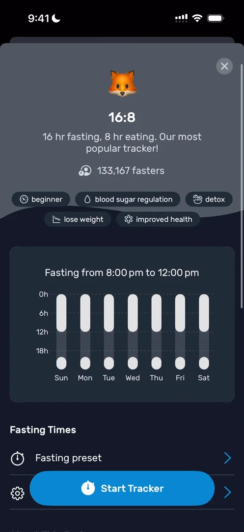
“I like this design. It gives you a very clear overview of the type of fasting you’ll be doing.” José, 23:01
It also shows how many people are doing it 23:06. In the profile, it connects to Apple Health, Fitbit, Garmin and Polar Flow, which he didn’t expect 23:26, and there are buddies for accountability 23:36. That surprised him at first, though he reasons that people losing weight may not want to share it, so it’s fine to keep it out of the onboarding.
The verdict
What stuck out most was how the recipes are organised. You never know where someone will start their search: on Airbnb, you might pick a place first, or a date first 24:38.
“And here they’re doing a very good job at handling all of the possible search scenarios that a user might go for.” José, 24:56
“The thing that I would highlight here is just how good the recipe search is” José, 25:14
He would also highlight the rewards throughout the onboarding, though the onboarding is way too long and its questions look too similar 25:20:
“But they do a very good job of giving you that little gratification that keeps you going during the onboarding.” José
 1 of 4
Four design challenges from this episode
Learn design from the apps you love
Practice UI design every day with 300+ briefs from apps like YAZIO. Finish one and its card is yours.


