
App Breakdown #39 · Yume
The UI design of Yume, the dream journal
José knew close to nothing about Yume, only one very cool interaction he saw online. He opens it to see what else it has up its sleeve, and it makes him smile.

Yume is a dream journal, with some very nice skeuomorphic interactions up its sleeve 0:00. José knows close to nothing about it 0:09: he just saw one very cool interaction from it on Design Spells, and he wants to dig deeper to see what else it has.
Notifications, up front
Straight away, the first screen asks for notifications. Quite a few apps do this, and the conversion is actually not bad at all 0:44. Sometimes, he says, designers and developers go to the trouble of putting notifications in a flow, with a nice animation and a nice excuse to ask for permission 0:48:
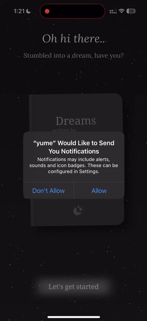
“And then those flows perform worse than doing this.” José, 0:57
“So if you have your own app and you have not tested the conversion rates of just asking for notifications up front, do it because you might be surprised how well this converts.” José, 1:01
It really depends on the app and on the intent, he adds.
A home with two big buttons
After a short onboarding, the home has two absolutely gigantic buttons, your book, the date, and settings at the top right 5:56:
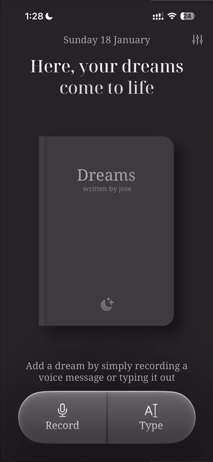
“We have two absolutely gigantic buttons.” José, 5:56
The settings panel is nothing too special 6:06:
“It seems like the standard iOS settings, but skinned for this app.” José
Tap the book, and you can go through its pages:
“Very cool. Notice how I'm smiling just doing it.” José
A handle that pinches to a point
At the bottom of the open book there’s a panel with a calendar, and a nice touch on its handle: as you pull it up, it becomes a little point, then goes back.
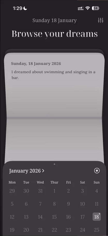
“I had never seen that. Okay very cool.” José, 7:00
It’s not the smoothest, though 7:04: the gestures aren’t always recognized well. But it has a little haptic when you pull it, and the handle comes to the middle. In the calendar, you can only tap days that have entries.
A panel that loses the book
On the home, the two big buttons are your quick actions: they’re the first thing you see when you open the app. Type, though, doesn’t open the book. It opens a separate black panel where you choose the date and write:
“It's a bit weird that it's not the book UI, because, like, I am writing to the book. It just doesn't fit within my mental model of the app.” José
“Like, if I'm writing on this black panel, where is it being saved? Why is it not being saved on the book?” José
Maybe they did it to be faster 11:09, but he feels you should still get the sense that you’re saving to the book. His dream was saved to the book after all 11:28, but it didn’t seem like it:
“So here, I think it's a bit of a miss.” José, 11:36
A vortex for your voice
Then he hits record 11:38. As he speaks, a vortex rotates, and the words he says appear and fade away 11:44:
“This is such an amazing interaction, honestly. I'd never seen anything like this.” José, 11:51
Stop speaking, and the vortex stops; speak really fast, and it goes very fast 11:55.
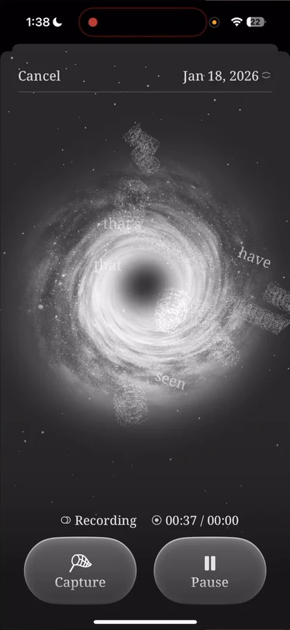
“I feel like this is one of the the best interactions I've seen.” José, 12:00
“If you do a voice recorder, you can make something extremely boring, or you can make something that is playful but still very much as a voice recording.” José, 12:08
From a practical standpoint, you don’t know whether the transcription is right, because you don’t see all the words 12:27:
“But like this, this brings joy. This is why we do the app breakdown. And this is why I actually go out of my way to learn from other apps because I will not come up with this.” José, 12:34
Again there’s no connection to the book, which he calls such a miss: after capturing, the panel just goes away 12:53, and he doesn’t know what day it was saved on 13:08. It turns out there’s no transcription at all: you play the recording back 13:31. On the book, a recording gets its own stamp:
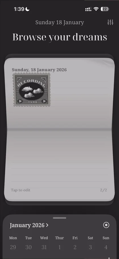
“I do like that's a little stamp on the book. It's a very nice touch.” José
You can even move the book around, another nice little easter egg.
The verdict
Looking back, he picks out, among other things, a very original recording setup.
“This one made me smile, so very cool episode.” José
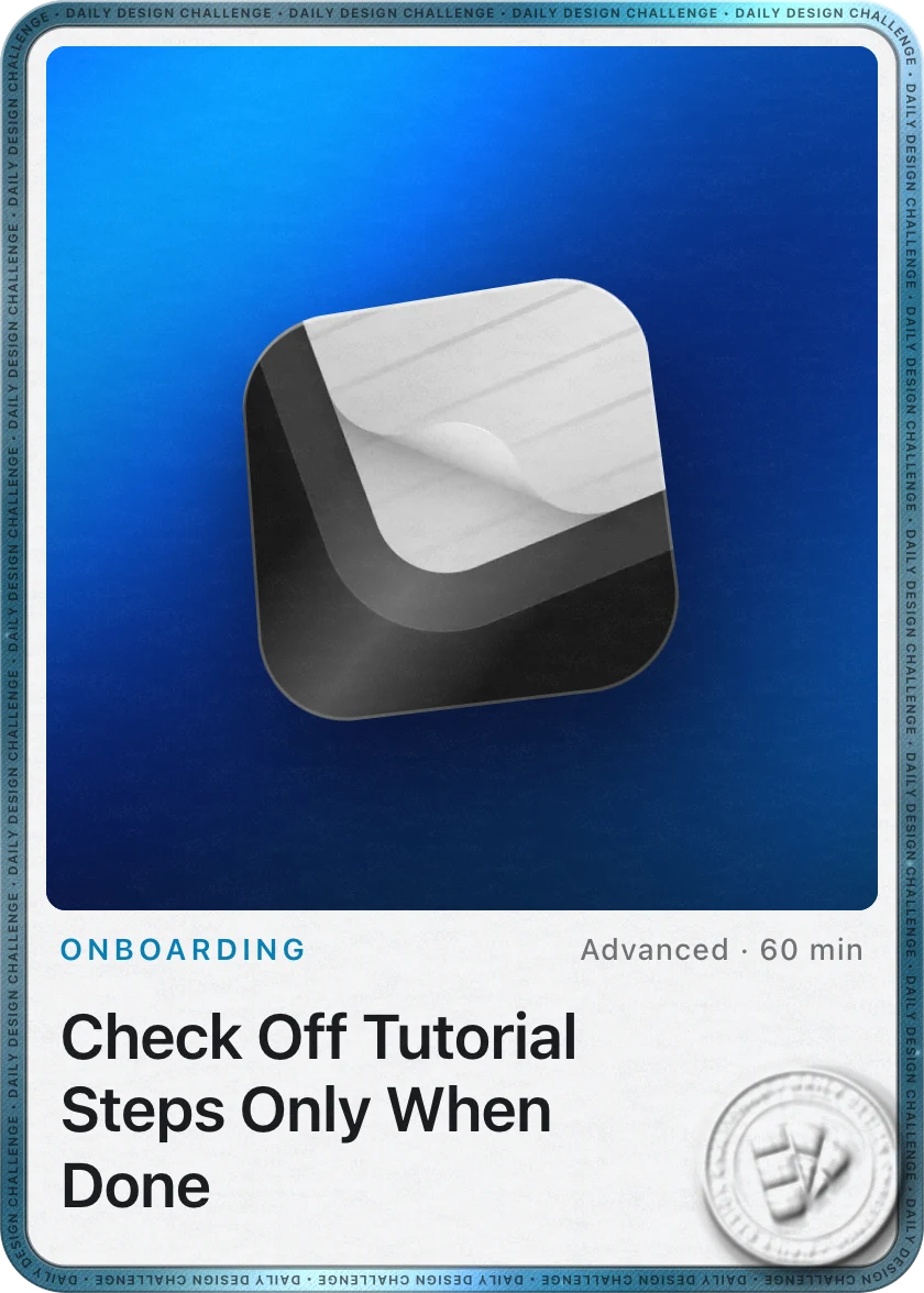 1 of 2
Two design challenges from this episode
Learn design from the apps you love
Practice UI design every day with 300+ briefs from apps like Yume. Finish one and its card is yours.


